Project overview
The client is a brand focusing on pet lifestyle products, mainly selling collars, leashes, pet clothing, sleep products, toys and personalized customized products. As the product line gradually enriched, the original page could no longer meet the new marketing needs in terms of brand atmosphere, product classification display and shopping guidance. Therefore, the customer came to us and hoped to reorganize the website visual and homepage structure on the Shopify platform. The focus of the project is to create a pet brand website with a sense of warmth, quality and commercial conversion capabilities. Through lifestyle scenes, seasonal themes, category entrances, package combinations, personalized customization and user reviews, it will be easier for consumers to understand the brand positioning and quickly find products of interest. We carried out overall planning around brand tone, visual hierarchy, product display and shopping paths to upgrade the website from a mere product display to a more complete and emotionally connected pet lifestyle shopping experience.
| บริการ | Industry | แพลตฟอร์ม |
| Website design and decoration | pet supplies | shopify |
| Project requirements | target market | design style |
| Establish a professional and unified brand official website image | ระดับโลก | Fresh | Warm | Exquisite |
| project budget | Delivery content | Delivery time |
| ¥5900 | Website construction and full-site page design | 17 working days |
Project Challenges
The core challenge of this project is to maintain the warm and lively visual atmosphere of the pet brand while preventing the page from becoming cluttered due to the wide variety of products and rich pictures. We need to solve the problems of unintuitive product classification, lack of high-end sense of small accessories, insufficient connection between brand story and sales content, and trust information that easily destroys the overall vision. In the early preparation stage, we first sorted out the brand positioning, target users and core product structure, studied the browsing and purchasing paths of users in the Shopify store, and layered information on homepage navigation, category entrances, main visuals, package combinations, personalized products, reviews and brand concepts. At the same time, establish unified colors, fonts, picture proportions and layout specifications to form a clear, stable and transformational visual basis for subsequent page design.
Our Shopify design process
1. Brand exploration and visual direction
Clarify the emotional positioning of the brand
Every good Shopify website design should start with brand positioning. Before actually designing the page module, we first need to clarify how the website wants to give users a feeling.
For pet lifestyle brands, this feeling usually falls somewhere between “lively and fun” and “refined and advanced.” The Foggy Dog prefers a light-hearted, gift-friendly, and editorial brand direction rather than the visual style of a traditional mass pet supplies mall. It is this difference in positioning that will directly affect every subsequent design decision.
In our design process, we usually build a visual strategy around the following questions:
- What type of pet owner is the brand primarily hoping to attract?
- Is the brand more boutique, high-end, interesting, or practical?
- Should the website emphasize more on the sense of season, classic, or trend?
- Should the content on the homepage be mainly about lifestyle scenes or product display?
For a pet branding project like this, we usually recommend using warm pastel colors as the main colors, with soft neutrals as secondary colors. At the same time, it combines textured serif fonts with simple sans-serif fonts to form a richer visual hierarchy.
In terms of photography, we will also put more emphasis on lifestyle and brand atmosphere, making the products look more like lifestyle items worth collecting and matching, rather than just functional pet products.
Build a complete visual system, not just a mood board
Our design work doesn’t stop at the Pinterest-like inspiration map or mood board stage.
After determining the visual direction of the brand, we will further transform it into a design system that can be used for a long time, which usually includes:
- Rules for using brand colors
- Page spacing and white space rhythm
- Display logic of different modules
- Image cropping and proportion specifications
- CTA button style
- Product Category Card Specification
- icon style
- Title and text level
This is especially important for Shopify sites.
Because Shopify stores usually constantly add new products, seasonal events, marketing banners, and different promotion modules. If the website does not have a unified design system, as the content continues to increase, the pages can easily become confusing.
By establishing stable visual design specifications, even if the website continues to update content later, it can maintain a unified, professional and brand-recognizable visual experience.
2. Information architecture and home page planning
Simplify the information consumers see at first glance
A very obvious advantage of The Foggy Dog website experience is that the top navigation structure is very clear.
The category names of the website are simple and easy to understand, and they are in line with consumers’ real shopping habits. Users can quickly enter corresponding categories based on product type, usage requirements or seasonal series.
We apply this same principle when designing Shopify websites for our clients.
An excellent homepage should reduce the user’s decision-making pressure rather than presenting users with too much information at the same time.
For pet Shopify brand websites, we usually plan the homepage according to the following logic:
First screen main visual Hero Banner

Quickly convey the current season, product series or brand marketing theme through key visual images with a lifestyle atmosphere.
Quick classification entrance
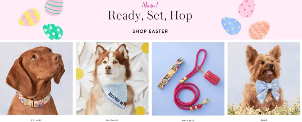
Use visually appealing category cards to allow consumers to quickly access core product categories, such as:
- pet collar
- Pet headscarf
- traction rope
- pet bed
- pet toys
Selected product display
Organize product recommendations based on themes rather than random products, such as:
- Spring floral series
- Pet wedding series
- Gift selection
- Hot products
- Seasonal limited series
This method can make the product display more story-telling and increase users’ interest in continuing to browse.
Personalized customization module
Set up an independent display area for products that support customization.
Personalized products often increase the perceived value of the item and are more suitable as gifts, so they deserve higher visual weight on the homepage.
Trust and Brand Community
Further strengthen product quality and brand credibility through user reviews, social media content, brand concepts and other information.
This homepage structure is in line with the browsing habits of modern e-commerce users:
First build interest through visuals, then quickly access the products of interest, and finally enhance purchasing confidence through reviews and brand information.
3. Establish a clear visual hierarchy
Make Hero Above the Fold Really Work
Many Shopify websites waste the most important Hero area on the homepage, displaying only a generic brand image.
Our design ideas are different.
The Hero area not only needs to look good, it should also serve a clear business function.
The Foggy Dog’s homepage uses contagious lifestyle images, combined with seasonal event themed copy, and clear CTA buttons to guide consumers to the corresponding product series.
This is exactly what a good Hero zone should do:
It not only establishes a brand atmosphere but also drives users to take the next step.
When designing Hero areas for clients, we typically focus on four areas:
- The subject must be clearly visible on both desktop and mobile
- Users need to understand the event theme or core selling points within seconds
- CTA buttons must be obvious
- The photography style needs to be consistent with the brand’s price positioning
For example, the image texture, composition and lighting of a high-end boutique brand should not use exactly the same visual language as a mass promotional brand.
Balance editorial sense with commercial transformation
A very common problem in Shopify website design is that brands want the website to have a high-end magazine-like visual effect, but also want the website to actually sell products.
There has to be a balance between the two.
Our solution is to control the visual rhythm of the page.
We don’t give each module the same strong visual weight, but instead create rhythm changes between different pieces of content.
ตัวอย่างเช่น:
Large lifestyle images can be followed by a more compact product grid;
After the brand story module, you can connect to the category entrance;
After the large-area visual banner, you can receive selected product recommendations.
The Foggy Dog’s homepage follows this approach, alternating between full-width branding visuals, category modules, curated collections, and merchandise displays.
This can prevent the website from turning into a monotonous product catalog, and at the same time, it will not make the page too artistic and lack a purchase entrance.
The result is a more natural balance:
It is not only suitable for brand exploration, but also has a clear business transformation path.
4. Promote browsing and purchasing through product display design
Organize products by lifestyle stories
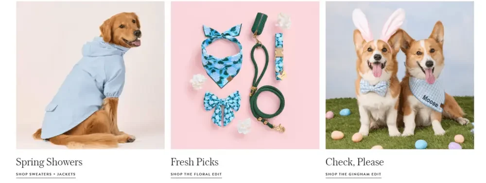
One very clever thing about The Foggy Dog’s homepage is that it doesn’t display all products as separate SKUs.
On the contrary, the brand organizes multiple products into a complete lifestyle portfolio through theme series and matching relationships.
ตัวอย่างเช่น:
- Seasonal limited series
- Collar and bow combination
- Pet outing set
- Theme color series
This display method allows consumers to naturally imagine a complete match, rather than just thinking about buying a single product.
Website navigation and recommended categories further strengthen this shopping logic, such as:
- Walk Sets
- Collar + Bow Sets
- Charms + ID Tags
- Personalization
This is where Shopify visual design can directly impact sales.
When the website displays the products in a complete visual scene and matching system, consumers are more likely to have the idea of combination purchase.
In our design methods, we usually focus on planning the following product display formats:
Stylized sorting cards
Establish a category entrance with brand recognition through a unified picture style, concise emotional copywriting and clear CTA buttons.
Matching product recommendations
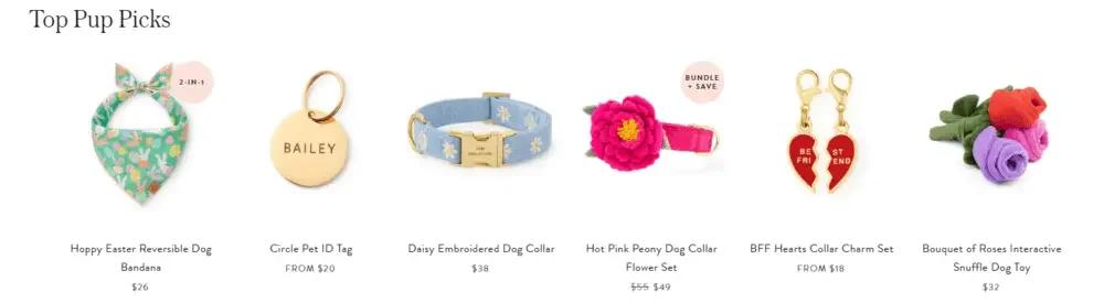
Display multiple related products in the same recommendation area according to color, season, usage scenario or product combination relationship.
ตัวอย่างเช่น:
The collar can be paired with a leash, tag, bandana or other pet accessories to create a complete product package.
Cross-selling visual guidance
Through reasonable page visual logic, consumers are guided to browse naturally from one category to other related products.
ตัวอย่างเช่น:
It extends from pet collars to identity tags, and then to headscarves, leashes, pet beds or gifts.
This design does not make users feel forced to sell, but increases the possibility of purchasing multiple items in combination through natural browsing logic.
Turn personalized customization into a high-value service
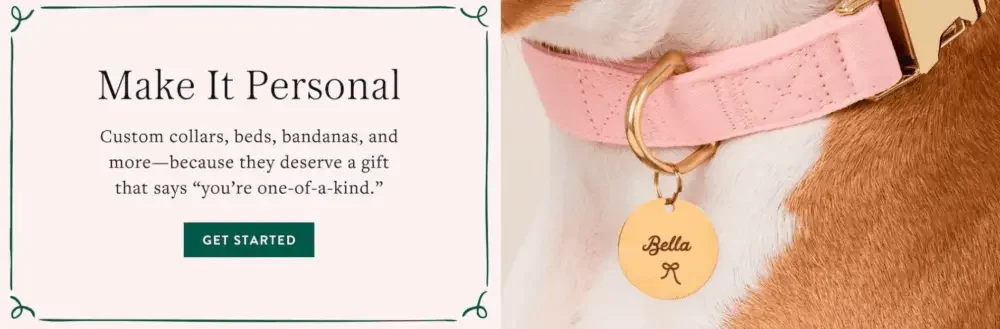
Personalized products should not be just ordinary categories on the website.
It is actually a service that can significantly enhance the sense of value of the product.
As you can see from the homepage of The Foggy Dog, the brand has set up a separate key promotion area for personalized products, which is a very reasonable design decision.
Because customization can simultaneously improve:
- emotional value
- gift properties
- product uniqueness
- perceived value
Therefore, in our Shopify design projects, we usually don’t simply put “personalization” in the navigation menu.
Instead, we will design it as a focused module with a complete visual story.
For example, through more intuitive customized effect display, emotionally appealing title copy, and more visually weighty module layout, consumers can be aware of:
Personalization is not just an additional feature, but can become a very important feature service and core selling point of the brand.