Project overview
GetFPV is a professional e-commerce brand focusing on FPV drones, aerial photography equipment and related accessories. Its products cover multiple categories such as drone sets, FPV glasses, motors, propellers, batteries, racks and electronic accessories. As the number of products continues to increase, the original pages are gradually unable to meet the needs of professional players for quick browsing, comparison and purchase in terms of category display, information level and shopping guidance. Therefore, the client came to us and hoped to reorganize the visual and page structure of the website on the Shopify platform, strengthen the brand’s professional image in the FPV industry, and at the same time improve the efficiency of product discovery and shopping experience. The project focuses on the home page layout, navigation logic, product classification, promotional information, visual hierarchy and conversion path. While maintaining a professional and technological sense, the complex product system is presented more clearly, orderly and with greater commercial conversion capabilities.
| บริการ | Industry | แพลตฟอร์ม |
| Website design and decoration | Digital 3C | shopify |
| Project requirements | target market | design style |
| Improve brand influence and user experience | ระดับโลก | Professional technology | Hard-core functions | Efficient e-commerce |
| project budget | Delivery content | Delivery time |
| ¥13000 | Website construction and full-site page design | 24 working days |
Project Challenges
GetFPV’s product system is huge, covering complete machines, parts, batteries, video transmissions, remote controls and a variety of FPV accessories. Different users have different concerns about brand, specifications and compatibility when purchasing. Therefore, the core problem we need to solve is how to keep the page clear despite the large amount of information, and shorten the path for users to find products and complete purchases. Before starting the project, we first sorted out the main product categories, target users and shopping scenarios. We also analyzed the existing page structure, navigation level, visual style and key conversion entrances, and referred to the display methods of similar professional drone e-commerce websites. Based on these preparations, we further determined the information priority, module layout, and visual direction in the Shopify page to establish a unified and efficient structural foundation for subsequent designs.
Information architecture and page layout strategies
Page design for large-scale product quantities
GetFPV has a very rich product inventory, including drone sets, FPV glasses, motors, propellers, electronic components, batteries, racks and other categories. If the page structure lacks clear planning, a large amount of product information can easily confuse users and make it more difficult to find target products.
We have focused on optimizing the following aspects:
Clear product classification
Through a clear classification structure, users can quickly judge the relationship between different products and quickly enter the corresponding product page.
Highlight Featured Categories core categories
Set up an eye-catching selected category section on the homepage so that new users can quickly understand which products the website mainly sells without having to navigate in depth.
Industry classification by application scenarios
For different application directions such as Cinematography (film and television shooting) and Education (education), products and content are grouped more logically, so that professional users can browse according to actual usage needs.
Strengthen the visual distinction between different product sections
Through white space, background changes and section spacing, different types of product content can maintain clear boundaries and reduce information congestion on the page.
The entire homepage is designed to provide a clear user conversion path:
แบนเนอร์ฮีโร่
Quickly establish first impressions with brand visuals and flagship products.
Trust information and logistics instructions
Highlight key information such as delivery services to reduce users’ purchasing concerns.
Product Category Overview
Help users quickly enter different product categories.
Featured products
Focus on displaying key sales or high-profile products.
Industry application classification
Further guide users according to different professional application scenarios.
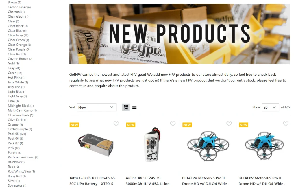
New product area
Help old users quickly discover the latest products on the shelves.
Clearance area
Drive price-sensitive users to complete conversions through preferential products.
Education and Content Section
Enhance brand professionalism through knowledge content and help users further understand the product.
This structure can naturally guide users from brand awareness to product exploration, and finally complete purchase.
Hero above the fold design – establish a sense of professional authority in seconds
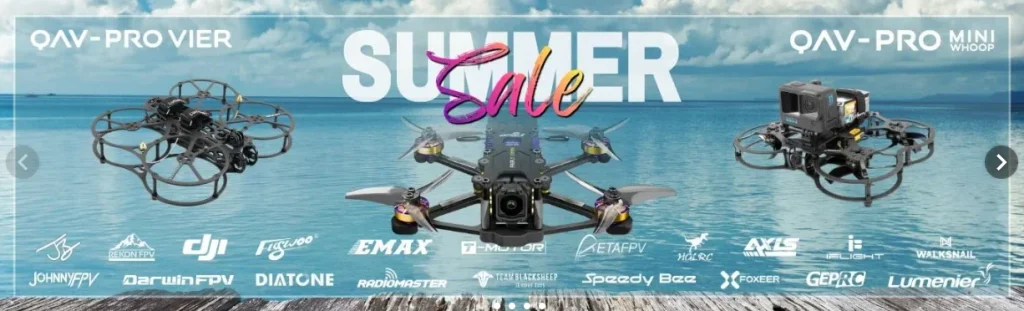
Hero’s first screen is one of the most important visual areas on the entire homepage.
Our design goals include:
Highlight flagship drone products
Quickly convey the core business of the website through large-scale product visuals.
Use bold model fonts
Strengthen specific product models and brand recognition through clear and powerful typography.
Keep contrast high
Make sure there is enough visual contrast between text, product and background to allow users to quickly read the core information.
Set a clear “Shop Now” action button
Guide users directly into the shopping process with a clear CTA.
Rather than stacking too much information in the Hero area, we focused more on visual impact and information efficiency.
By combining large-size product images with streamlined copywriting, users can quickly understand the key points of the page even if they enter the website for the first time.
The core goals are very clear:
Let your visitors know what this website mainly sells in three seconds.
Visual hierarchy and conversion-oriented design
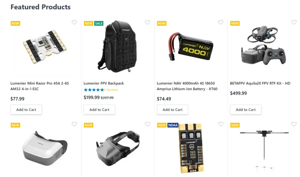
Selected product area design
Replace visual noise with a clear product grid
Product listings need to be balanced between multiple pieces of information, including:
Product thumbnail
price
Rating
Promotional tags such as NEW, SALE, etc.
To avoid overcrowding the page, we try to keep the product cards simple.
Each product card mainly contains:
Clear product images
Allow users to quickly identify product appearance and type.
Condensed product name
Avoid lengthy titles that affect browsing efficiency.
Clearly display prices and discounts
Highlight the selling price through visual hierarchy and clearly present discount information.
Simple Add to Cart button
Reduce the purchase operation steps so that users can directly complete additional purchases.
Spacing is also very important throughout product grid design.
We use uniform padding and ample white space to improve page scannability.
FPV enthusiasts often compare multiple models and accessories at the same time during the shopping process, so clear information display can help them make faster judgments and enhance purchase confidence.
Promotional strategies that don’t interrupt user experience
The website contains a variety of promotional and operational information, such as:
Same Day Shipping Same Day Shipping
Strengthen distribution efficiency advantages.
Stock Clearance Clearance Zone
Display discounts and inventory disposal items in one place.
Loyalty Program Membership Program
Enhance users’ long-term repurchase willingness through membership rights.
Discounts & Coupons Coupon Area
Help users quickly discover currently available discount information.
Instead of using a large number of forced pop-ups to display promotional content, we naturally integrate the offer information into the rhythm of the page.
Applied design principles
Promotions should be part of the brand experience, not an intrusion into the user’s browsing experience.
Through moderate use of accent colors, banners, and visual distinction between sections, you can quickly draw users’ attention to offers while maintaining an overall professional feel and credibility to the site.
Navigation and user browsing path optimization
Clear top-level navigation structure
For professional vertical Shopify stores, the navigation structure will directly affect whether users are willing to continue browsing the website.
We have mainly optimized the following aspects:
Highlight core product categories
Give users direct access to key product categories.
Provide Shop by Brand brand entrance
For users familiar with FPV products, searching by brand is often more efficient than browsing by product type.
Keep drop-down menus structured clearly
Properly group menu content to avoid stacking a large number of links together.
Keep the header visually lightweight
Even if the website has a large number of product categories, try to avoid making the header look heavy and complicated.
An overcrowded Mega Menu can easily increase the user’s cognitive load.
Therefore, while retaining the depth of classification, we simplified the information hierarchy to make it easier for users to navigate.
Strengthen website trust through micro design
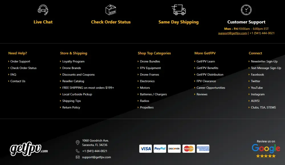
For higher-priced FPV drones and professional electronic equipment, user judgment of a website’s reliability is particularly important.
We enhance trust through multiple details:
Star rating displayed below the product
Reduce purchasing decision risk with real feedback from other users.
Clearly display delivery policies
Allow users to quickly understand logistics and delivery rules during the shopping process.
Set up membership plan section
Strengthen long-term relationships between brands and users.
Provide customer support entry in footer
Ensure that users can quickly find after-sales and consultation channels.
Design doesn’t just determine whether a website looks good or not.