Project overview
The client of this project is a cross-border ecommerce brand that specializes in women’s fashion shoes. Its products cover multiple categories such as high heels, sandals, wedges, wide women’s shoes, and boots. As the number of products in the store increases, the customer hopes to further enhance the overall visual quality of the SHEIN store and strengthen the brand tone, product classification and shopping atmosphere through unified poster design, so they approached us for visual optimization of the entire store. The customer hopes that the picture can not only conform to the young, fashionable, and fast-browsing consumption characteristics of the SHEIN platform, but also avoid the problem of being too promotional in traditional e-commerce posters. We ultimately took light luxury, elegance, and femininity as the core direction, and established a more complete and recognizable visual system for women’s shoe stores through model scenes, product categories, natural light and shadow, and unified tones.
| บริการ | Industry | แพลตฟอร์ม |
| shein store design | Shoes and bags | เชอิน |
| Project requirements | target market | design style |
| Improve click-through rate | ระดับโลก | Light luxury, elegance, simplicity |
| project budget | Delivery content | Delivery time |
| ¥700 | 8 posters | 6 working days |
Project Challenges
The core challenge of this project is to establish a unified and recognizable SHEIN women’s shoe store vision despite the rich product styles and obvious differences in styles. We need to highlight the features of different products such as high heels, sandals, wedges and boots, but also avoid each poster being self-contained, resulting in a cluttered page style. In the early stage, we first sorted out the customer’s existing products, main shoe styles, target consumer groups and the visual characteristics of the SHEIN platform, and analyzed the composition, color, model scenes and information level of similar women’s shoe stores. On this basis, we decided to use warm beige, natural light, feminine models and light luxury typography as a unified visual language, and then re-planned the scene, composition and copywriting focus for different shoe styles to ensure that the entire set of posters was both unified and varied.
The first picture: Use multiple types of shoes to create a visual entrance to new products
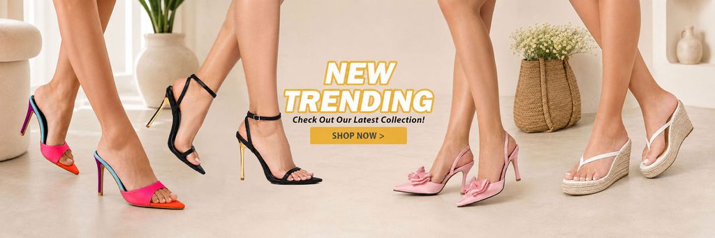
The first poster serves as the “new product entrance” for the entire store, so we did not focus on a single shoe style, but displayed the legs of multiple models and different shoe styles at the same time.
The image includes colorful high heels, black stiletto sandals, pink bow high heels and white wedge sandals. We distributed the products to the left and right to naturally surround the central copy, and placed “NEW TRENDING” in the visual center.
The advantage of this composition is that after entering the page, consumers can quickly understand that the store mainly sells women’s shoes, and they can immediately feel the richness of product styles.
We chose a light beige interior as the background to give the shoes of different colors enough visual contrast. At the same time, vases, green plants and furniture only serve as atmosphere decoration and do not steal the attention of the shoes.
The yellow button in the center strengthens the promotion and click attributes, giving this picture both image display value and obvious shopping guide function.
Second picture: Use minimalist space to enhance the temperament of women’s commuting shoes
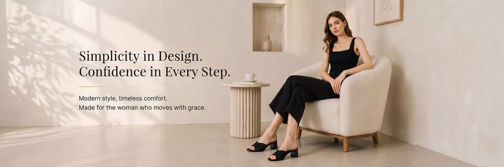
The second poster begins to shift from “multi-product display” to “single lifestyle expression”.
We had the model sitting on a cream lounge chair wearing a black outfit, which she paired with low-heeled black sandals. Black clothing and black shoes form a unified vision, making consumers’ attention naturally fall on the overall style of the outfit.
We leave a lot of white space on the left side and place “Simplicity in Design. Confidence in Every Step.” as the main copy.
This large area of white space can significantly improve the visual quality and make the poster closer to a fashion brand advertisement rather than an ordinary e-commerce promotional image.
We use natural window shadows and soft daylight to create a sense of real life, making the scene suitable for both home and light commuting, thereby conveying the “simple, comfortable, mature” shoe positioning.
The third picture: Highlight the elegance of bow-tie high heels
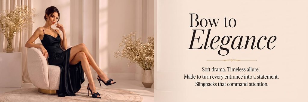
The third poster is designed for bow-tie high heels that are more feminine, date-feeling and party-feeling.
We had the model sit on a soft side chair wearing a black satin gown and black bow stilettos. Compared with the everyday feel of the second picture, this picture is obviously more delicate and romantic.
We divide the screen into two: the left side is responsible for character and product display, and the right side is responsible for large-area copywriting.
“Bow to Elegance” directly corresponds to the bow design element of the shoe, which also strengthens the sense of elegance, sophistication and ceremony.
Instead of stacking too many selling points on the right side, we used a few short sentences like “Soft drama. Timeless allure.” to set the mood.
This design idea is more suitable for theme activities, series recommendations or special entrances on high heels in SHEIN women’s shoe stores, because it can quickly establish female consumers’ imagination of “elegant occasion shoes”.
Photo 4: Create a minimalist lifestyle through natural light
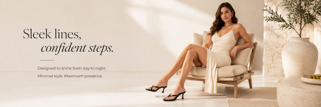
The fourth image continues to use the model scene, but we further weaken the decoration and focus the visual focus on the space, people and shoes.
The model wore an off-white dress while sitting on a lounge chair, paired with black stiletto sandals. Black shoes form a strong focus in the overall light-colored environment.
We put the copy on the left side and used “Sleek lines, confident steps.” to emphasize the lines of the shoes and female confidence.
The large vases, natural stone, wooden furniture and sunlight in the picture jointly create a natural, quiet and high-end indoor atmosphere.
This kind of scene will not make consumers feel too far away, but can help them think of real dressing situations such as daily dates, afternoon tea, and resort hotels.
We hope to tell consumers through this design: shoes are not only a commodity, but also a part of the overall lifestyle and personal temperament.
Picture 5: Use product classification to reduce browsing costs
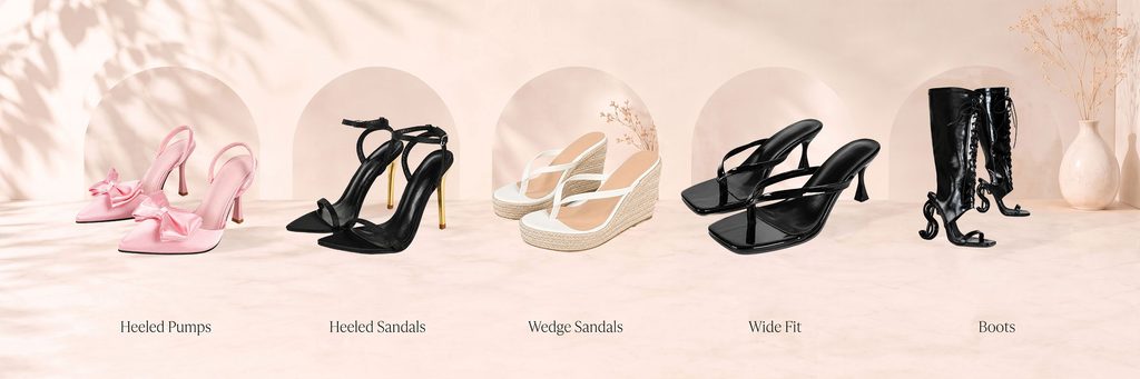
The biggest difference between the fifth picture and the previous ones is that it plays the role of “categorization navigation”.
We put the five major women’s shoe categories of Heeled Pumps, Heeled Sandals, Wedge Sandals, Wide Fit and Boots into one picture.
In order to prevent the five groups of products from appearing crowded, we used a continuous arched background as a visual frame to allow each type of shoe to have an independent display area while maintaining overall coherence.
The background still continues with light pink beige, natural light and shadow, and dried flowers, so even without the model, the image doesn’t look like a regular product catalog.
We deliberately maintain spacing between shoes and unify product perspective relationships so consumers can quickly differentiate between different types.
This kind of classification map is especially important for SHEIN stores because platform users usually browse quickly. Clear classification vision can reduce the time of searching for products and allow consumers with different needs to enter the corresponding product area faster.
Picture 6: Three groups of shoe styles enhance product richness
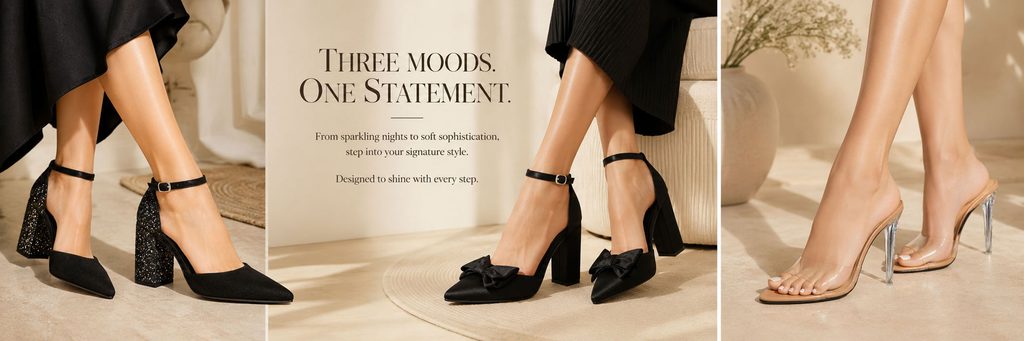
The sixth poster adopts a three-column composition, showing diamond block heels, bow block heels and transparent stilettos respectively.
Different from the fifth classification picture, this picture emphasizes the changes in outfits for “different emotions and different occasions”.
We use the middle area as the visual center, place the text “THREE MOODS. ONE STATEMENT.”, and let the left and right shoes form an enveloping structure.
The shiny diamond block heels on the left are more for parties and dinners, the bow-tie high heels in the middle are more elegant and feminine, and the transparent high heels on the right are more sexy and light.
Through three close-ups of the legs and shoes, consumers can more clearly observe the toe, heel, material and wearing effect.
We used the same warm color environment to unify three different scenes, making the picture look like a magazine collage without appearing fragmented.
Photo 7: Create a night party atmosphere with boots
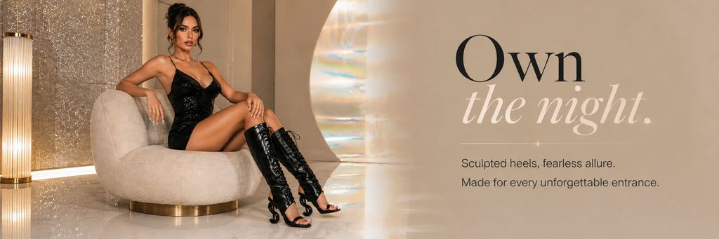
The seventh poster mainly shows black high-heeled boots, so we did not continue with the daytime home atmosphere from the previous one, but moved to a more night-time and party-like space.
The model wore a black sequined skirt and sat on a single chair. Black boots became the most eye-catching item in the entire look.
The background adds metallic texture, light reflection and slight rainbow light and shadow, giving the picture a more fashionable blockbuster atmosphere.
“Own the night.” on the right uses large font size to directly strengthen the product mood of night, party and confident women.
We did not use a complex nightclub scene because too many lights and people would diminish the details of the shoes. Instead, we used materials, lighting and reflections to create a high-end sense of night, so that the boots remain the absolute subject.
This picture also makes the entire store vision no longer limited to softness and elegance, but adds a layer of sexiness and personality.
Picture 8: Complete the visual ending with a bright holiday scene
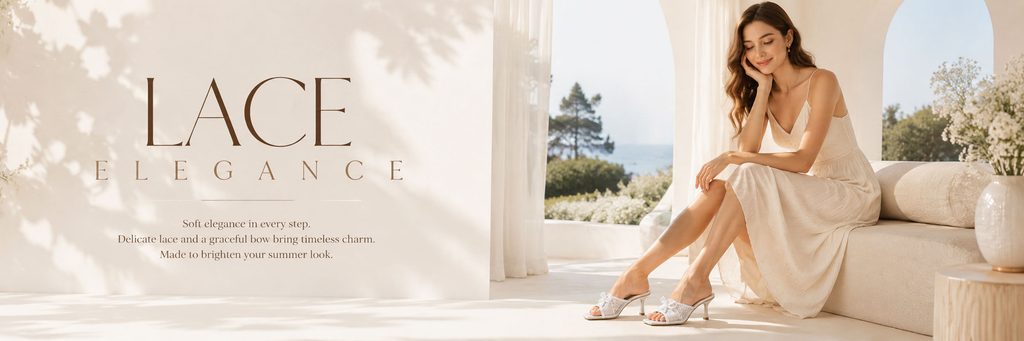
The final poster returns to a bright, pastel summer vibe.
The model wore a cream maxi dress while sitting on a window-side sofa, which she paired with white lace stiletto sandals. The natural scenery outside the window, white floral arrangements and ample daylight combine to create a relaxing vacation feel.
We use large font “LACE ELEGANCE” on the left side to directly emphasize the lace and exquisite attributes of the shoes.
Compared with the rich elegance of the black bow shoes in the third picture, the temperament of this poster is lighter and softer, and it is more suitable for spring and summer.
We use a lot of white space and soft light to keep the white shoes clear even in light-colored scenes, while allowing consumers to naturally associate them with wearing scenes such as weddings, vacations, dates, and summer parties.
Using this bright picture as part of the entire visual set can also balance the visual weight brought by the more black shoes in the front.