Project overview
The product picture of the food vacuum sealing machine needs to be organized separately according to the performance theme, mode, accessories and food use. This case focuses on the existing 6 Ozon Russian works, dismantling the arrangements for product identification, theme description and condition verification. For brands and sellers who are preparing to produce pictures of similar products, the focus is not only on the style of the pictures, but also on understanding how different pictures distribute information so that product-related questions have corresponding reading positions.
| บริการ | Industry | แพลตฟอร์ม |
| Ozon product primary and secondary product images design | Home department store | โอโซน |
| Project requirements | target market | design style |
| Organize performance themes, modes, accessories and ingredient uses separately | Russia | Fresh and eye-catching|Parameter-oriented|E-commerce informatization |
| project budget | Delivery content | Delivery time |
| ¥400 | 6 case display pictures | 7 working days |
design challenge
The sealing machine has a lot of pressure, power, modes and accessories, so it is easy to be overloaded in the first picture. The design needs to layer technical parameters and operations, ingredients and packaging lists, allowing users to search based on their own questions, rather than treating the topic of freshness as actual measurement results.
Design strategy: Let the entire group of works form a clear information relationship
01 Allocate information tasks first, and then arrange the key points of the screen
The work is unfolded according to “product overview → packaging scene → working mode → complete accessories → use of ingredients → cutting and sealing details”. Figure 1 establishes the identification first, and then switches the composition and description position according to the actual theme. This division of information allows different questions to have their own place, reducing the need to pile up all the text in the first image, and preventing subsequent images from simply repeating the same product photo.
02 Use a consistent visual language to connect different reading tasks
The white and green background echoes the theme of ingredients and freshness, with the black body forming a contrast and orange numbers emphasizing key points; dotted lines, cards and photos of ingredients take on different illustrative tasks. The unified style serves the entire group identification, and composition changes serve different contents; the main title, auxiliary labels and product proportions in the picture jointly determine the reading order.
03 Reduce the explanation to specific parts, actions or choices
The focus of this body of work is to organize performance themes, modes, accessories and ingredient uses separately. When dismantling, look at the correspondence between the whole machine and parts, themes and conditions: when there is structural information, look at the positional relationship, when there is scene information, look at the objects used, and when there are numbers, look at the categories and limiting conditions. Letting each picture answer a specific question has more explanatory value than repeatedly emphasizing the excellence of the product.
Dismantling the work: explaining the screen arrangement and information responsibilities of each picture
Figure 1|Product Overview: Distinguish between the body and information summary
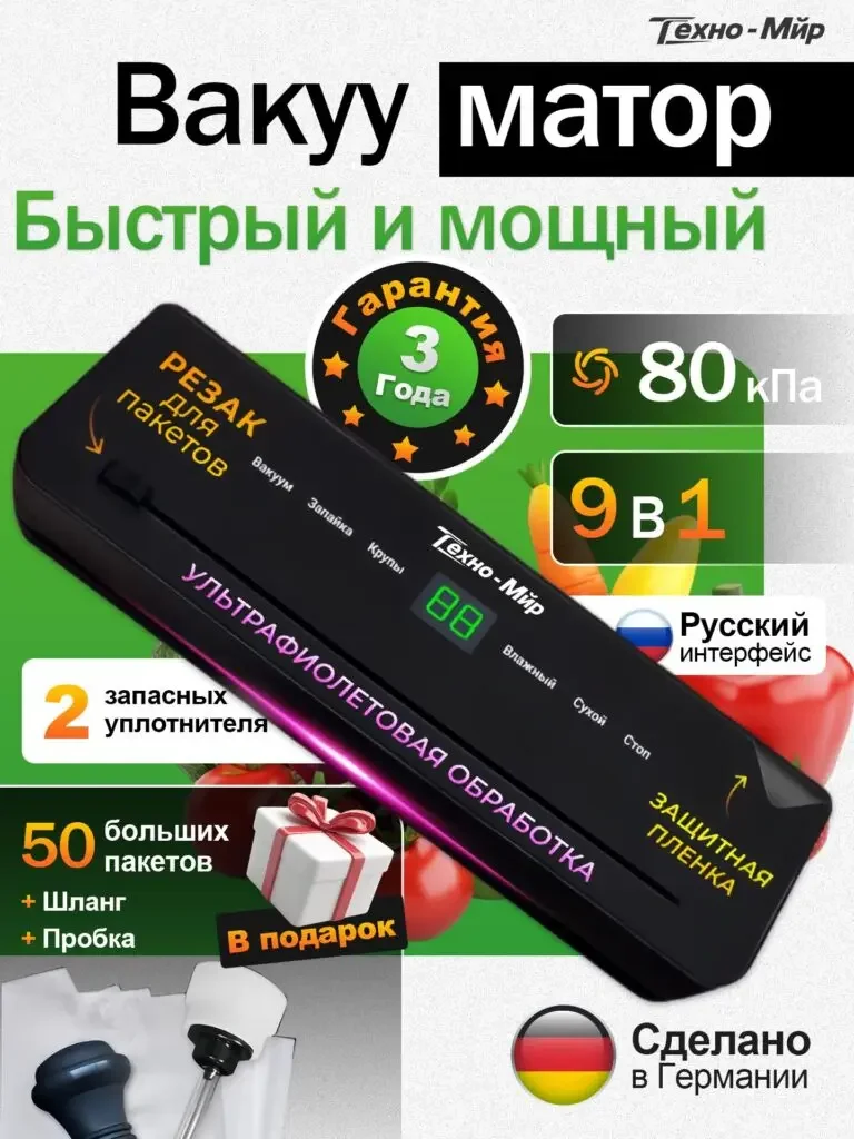
The black sealing machine is diagonally across the screen, with labels for pressure, mode and warranty themes respectively, and accessories tips are located at the bottom.
The fuselage is still the main object, and the label forms a summary; the origin or warranty mark is only displayed as stated in the picture and is not rewritten as an independent certification.
Figure 2|Encapsulation scenario: map parameters to work objects
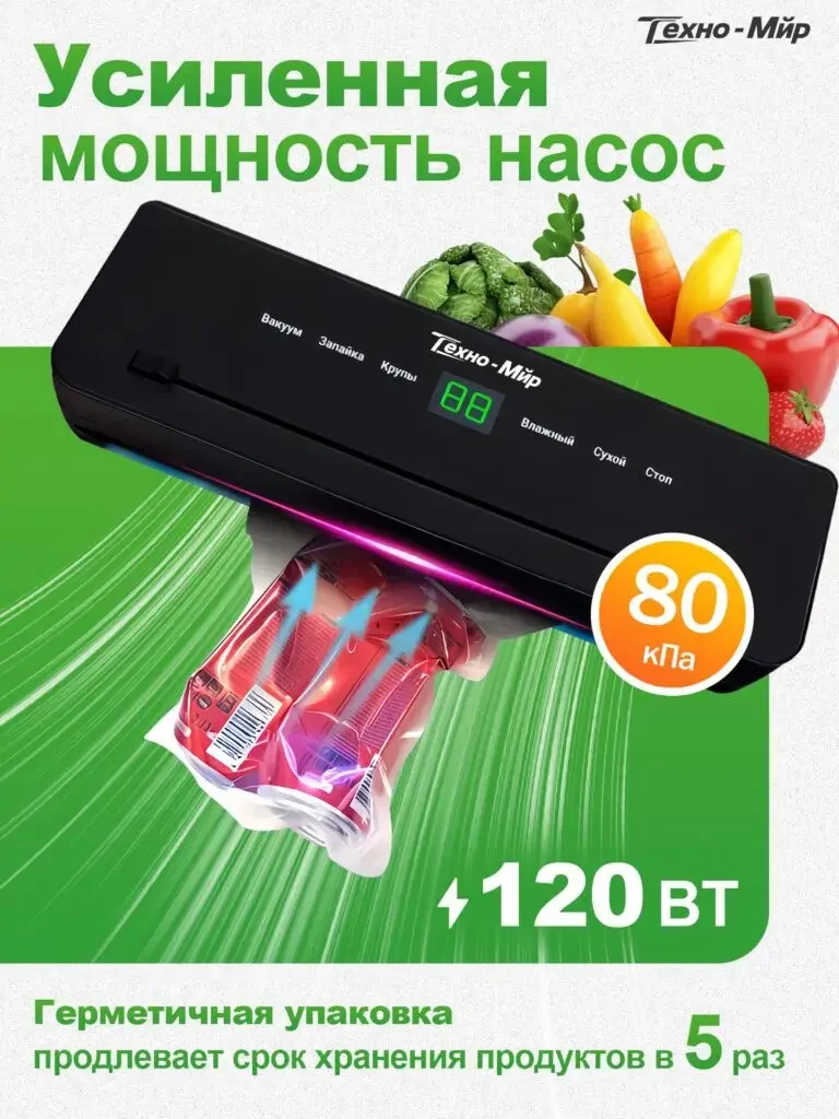
The sealing machine is on the same page as the ingredients in the package, with 80kPa and 120W on both sides, and the green line reminds the performance theme.
Ingredients and packaging bags have specific uses, and the values have their own units; material text such as preservation times are not used as the actual measured performance in this case.
Figure 3|Working mode: two columns clearly list the options
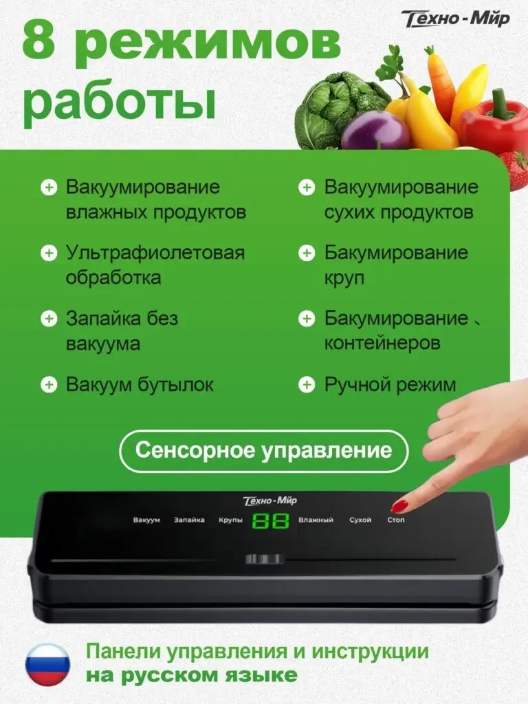
The 8 modes are listed in two columns on the left and right. The fingers at the bottom are close to the control area, and the whole machine is placed on a white background.
Category lists answer what options there are, hand movements answer where to operate, and the number of modes is no longer an isolated selling point.
Figure 4|Complete accessories: Use tags to connect included items
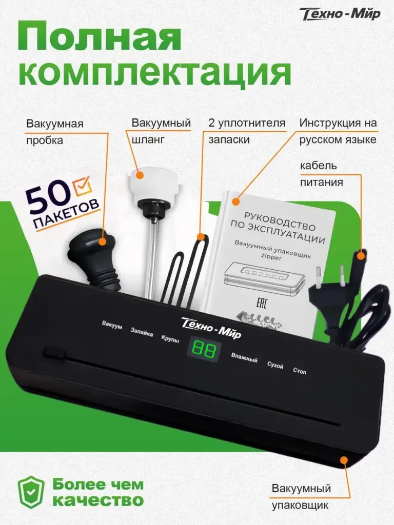
The main unit, bags, hoses, plugs, instructions and power cords are unfolded separately, and the guide wires are connected to the name.
The list page supports checking the content you see to prevent accessories from appearing in the corner of the main product image with only gift slogans.
Figure 5|Usage of ingredients: establishing entrances for different needs
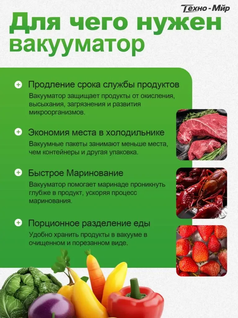
The four paragraphs of instructions on the left correspond to the themes of storage, space, marinating and portioning, and the small picture of the ingredients on the right provides reference.
Text grouping works with food object objects to explain how uses are classified, rather than directly claiming that the storage effect has been verified.
Figure 6|Cutting and sealing: put the numbers in the operating position
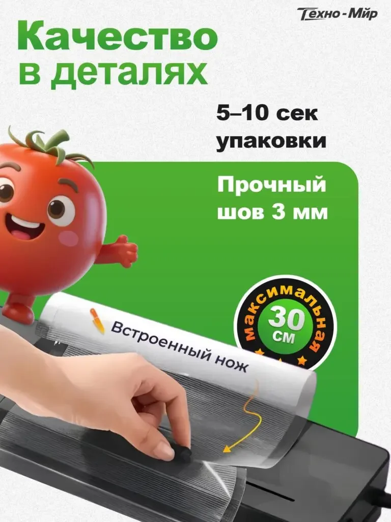
Hand operated cutting area, 5–10 seconds, 3mm and bag width themes are located above and to the side respectively.
The detailed picture corresponds the numbers to the sealing and cutting parts, and the end page returns from the purpose to the actual operating conditions.
Delivery summary and design value
The entire team delivers with a clear division of labor
The 6 works in this case respectively cover “product overview → packaging scene → working mode → complete accessories → use of ingredients → cutting and sealing details”. The number of images depends on the actual content, and each image has its own theme while maintaining an overall identity through color, text hierarchy, or composition.
Procurement issues can be more easily mapped to specific information
Focusing on the food vacuum sealing machine, the work will “separately organize performance themes, modes, accessories and food uses” into different pictures. When brands plan similar designs, they can first list the content that consumers need to identify, understand and check, and then determine the tasks and order of primary and secondary product images.
Value is based on interpretive methods and authentic works
The whole machine, part, scene and information cards provide different reading entrances, helping to organize product descriptions more clearly. The value of this case is the visible design expression and information division of labor; changes in click-through rates, sales, and conversion rates require additional statistical or test data support.
The parameters, materials and functions in this article are used to explain the content of the accompanying pictures. The specific specifications, applicable conditions and accompanying items are subject to the product information of the corresponding model.
Plan clearer product images for your Ozon products
If you also need to plan primary and secondary product images for your Ozon food vacuum sealer, you can submit product links, existing pictures or product information to AIRSANG, explain the target market and required picture group range, and communicate the information organization and visual direction suitable for the product.
Consultation email: [email protected] · Telephone: 177-5952-2770