


ไม่มีสินค้าในตะกร้า.

Designing a high-performing โอโซน main image set for a sofa requires more than aesthetic appeal. We focus on clarity, hierarchy, emotional positioning, and conversion logic. In this project, we created a complete visual system for a foldable corduroy sofa-bed, ensuring that every image communicates a distinct selling point while remaining aligned with Ozon’s platform standards and Russian consumer expectations.
Below is a full breakdown of our design strategy and the thinking behind each image.
| ระยะเวลาจัดส่ง | หมวดหมู่ | แพลตฟอร์มแอปพลิเคชัน |
| 8 วัน | Sofa | โอโซน |
| นักออกแบบที่เกี่ยวข้อง | ค่าใช้จ่าย | ผล |
| แนนซี่ | $150 | Sales volume📈235% |
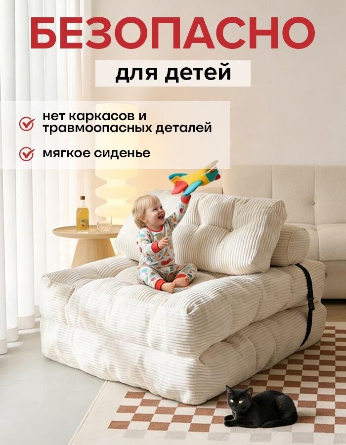
The first image highlights safety for children. We placed a toddler comfortably sitting on the sofa, holding a toy airplane, while a cat rests nearby. This composition immediately communicates softness, stability, and domestic warmth.
The headline translates to “Safe for Children,” supported by bullet points:
We deliberately chose a neutral-toned interior with soft daylight to reduce visual aggression. The ribbed fabric texture appears plush and tactile. By showing a real-life scenario instead of a plain product cutout, we reduce perceived risk. On Ozon, emotional reassurance is critical—especially for furniture intended for family environments.
This image builds trust instantly.
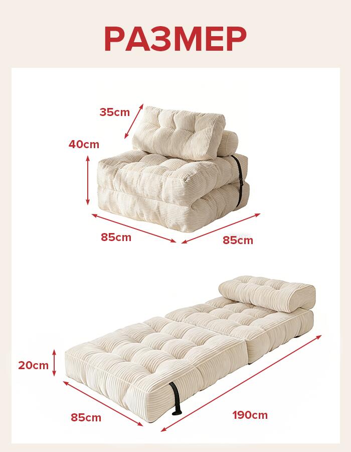
The second image focuses on technical clarity. We presented two configurations:
We clearly labeled dimensions:
Many furniture returns on marketplaces happen because customers misjudge size. We eliminate ambiguity by presenting proportional dimension arrows in clean red markers against a white background.
This image answers logistical questions before they arise:
Will it fit my room?
Is it suitable for sleeping?
How thick is the cushion?
Clarity reduces hesitation and improves conversion.
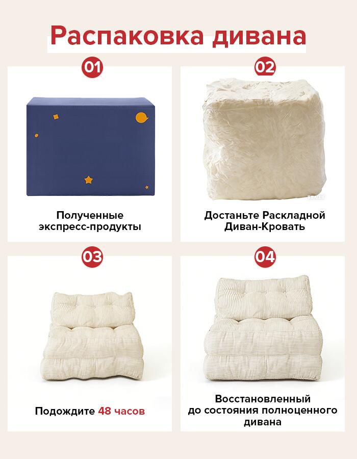
Compressed foam furniture often surprises buyers. We prevent confusion by clearly explaining the unpacking process in four steps:
01 – Receive the package
02 – Remove compressed sofa
03 – Wait 48 hours
04 – Fully restored form
By visually guiding customers through the recovery period, we eliminate negative feedback related to “deformation” immediately after unpacking.
This step-by-step layout uses clean segmentation, numeric hierarchy, and realistic product progression shots. We intentionally show the compressed cube to set realistic expectations.
Managing expectations reduces returns and protects ratings.
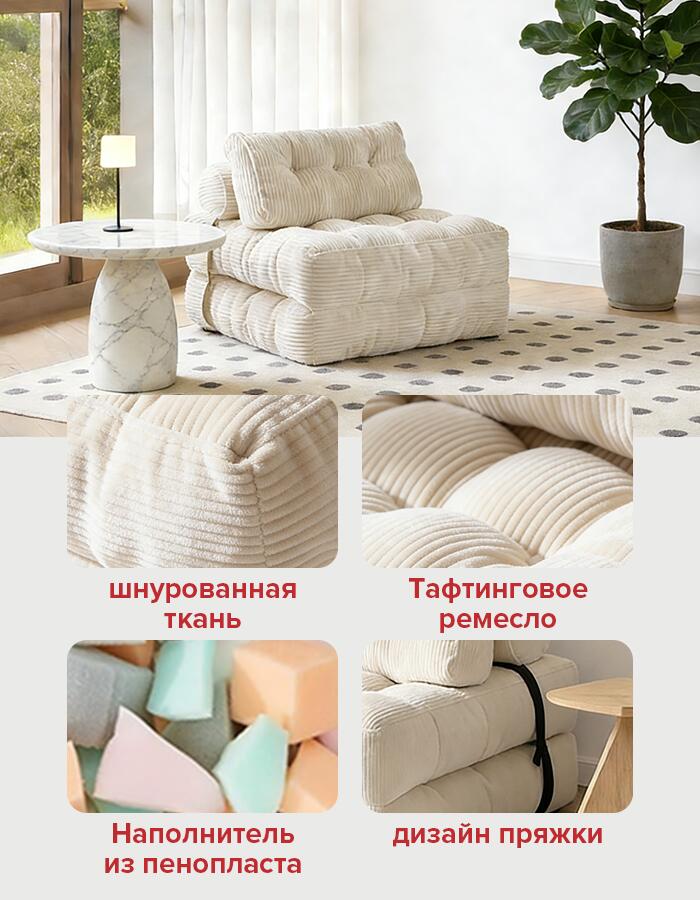
The fourth image showcases material details:
We use close-up macro shots to emphasize the ribbed texture and button tufting depth. Texture photography is crucial in online furniture sales because customers cannot touch the product.
The strap detail communicates structural stability. The foam filling close-up reinforces softness and rebound capability.
We present this section like a materials board. It elevates the sofa from “simple floor seat” to “crafted furniture.”
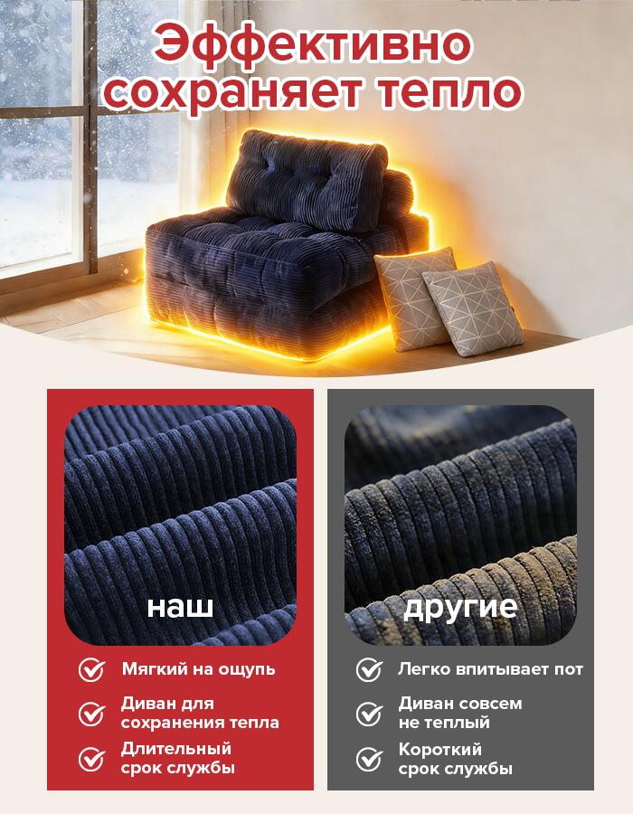
One of the most persuasive visuals is the warmth comparison.
We designed a split layout:
Left – Our sofa glowing warmly in a winter setting
Right – Competitor fabric comparison
The headline: “Effectively Retains Heat.”
Under “Our”:
Under “Others”:
The glowing under-light effect around the sofa visually reinforces warmth retention. We intentionally create a strong contrast in tone and lighting between our fabric and competitor material.
This is emotional marketing combined with functional logic.
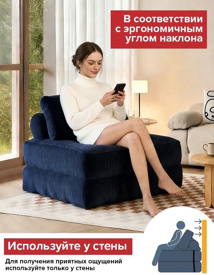
In the next image, we demonstrate ergonomic positioning.
The model sits comfortably while using her phone, positioned against a wall. The headline explains that the sofa follows an ergonomic tilt angle.
We also include a usage instruction: “Use against a wall for optimal comfort.”
This serves two purposes:
By guiding correct placement, we increase user satisfaction after purchase.
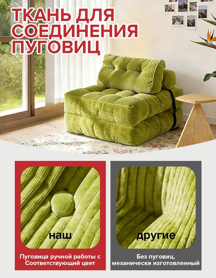
The next section highlights handcrafted button detailing.
We show:
Left – Our hand-matched button
Right – Generic mechanical stitching
The headline emphasizes “Button Connection Fabric.”
We zoom into stitching precision and fabric alignment. The color-matched button reinforces premium positioning.
Small details create perceived value. Ozon buyers often compare listings side-by-side; detail differentiation wins that battle.
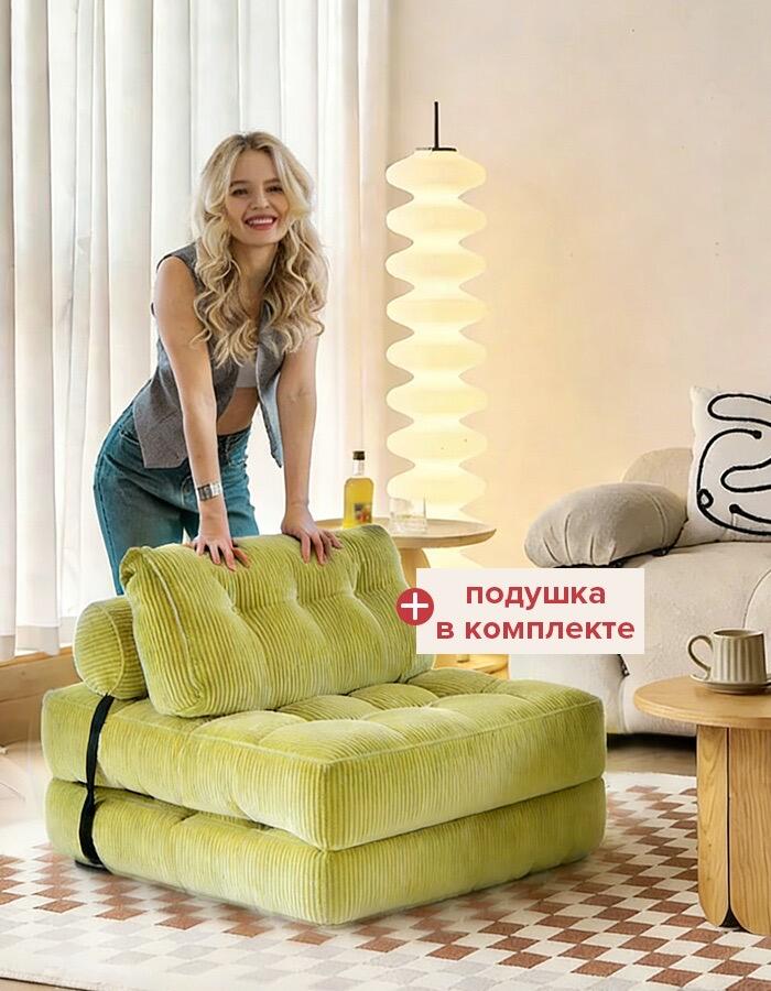
The final image presents a vibrant green version of the sofa with a smiling model leaning casually on it. We highlight “Pillow Included.”
This image shifts from technical persuasion to emotional desirability. The bright color option demonstrates style flexibility. The inclusion of a pillow adds perceived bundle value without increasing complexity.
We end the visual journey with positivity and lifestyle energy.
We structured the image sequence in this order intentionally:
This follows a psychological purchase path:
Trust → Understanding → Assurance → Value → Superiority → Practicality → Detail → Desire
Each image answers a different type of buyer question.
Ozon requires:
We avoided cluttered layouts and used:
All dimensions, comparisons, and claims are visually supported.
We also localized all text in Russian to improve search relevance and buyer comprehension.
Across the entire series we maintained:
Color accents (red typography) create brand recognition and scanning clarity.
The ribbed texture remains the visual anchor across all frames.
Key conversion boosters embedded in the design:
• Real-life usage scenario
• Technical dimension transparency
• Unpacking expectation guidance
• Fabric close-up authenticity
• Competitive comparison
• Ergonomic guidance
• Craftsmanship highlighting
• Bonus accessory emphasis
Each element reduces a specific objection.
This sofa listing succeeds because it does not rely on beauty alone. It communicates.
It reassures families.
It clarifies size.
It explains recovery time.
It proves material quality.
It demonstrates warmth retention.
It guides correct usage.
It highlights craftsmanship.
It adds lifestyle aspiration.
The design moves the customer from curiosity to confidence.
บน โอโซน, confidence converts.
If you are building furniture listings for marketplace platforms and want strategic, conversion-focused main image systems rather than decorative visuals, this is exactly the methodology we implement at AIRSANG.


