


การแนะนำ
Designing a high-performing main image for an iron on โอโซน requires far more than simply showing the product. On competitive marketplaces like Ozon, shoppers make decisions in seconds, often based on visuals alone. Our goal as designers is to translate technical features into instantly understandable benefits while respecting Ozon’s visual standards, mobile-first behavior, and buyer psychology.
For this handheld iron project, we approached the main image set as a structured visual narrative rather than a collection of isolated pictures. Each image plays a specific role: grabbing attention, explaining functionality, reducing hesitation, and reinforcing value. The design language, color system, layout rhythm, and iconography were all carefully selected to guide users through the product’s strengths without overwhelming them.
Below, we break down every main image in this Ozon listing and explain why each design decision was made, how it supports conversion, and how it fits into a cohesive marketplace strategy.
| ระยะเวลาจัดส่ง | หมวดหมู่ | แพลตฟอร์มแอปพลิเคชัน |
| 7 วัน | iron | โอโซน |
| นักออกแบบที่เกี่ยวข้อง | ค่าใช้จ่าย | ผล |
| หลิน จาง | $150 | Sales📈298% |
Image 1: Hero Main Image – Instant Recognition and Power Messaging
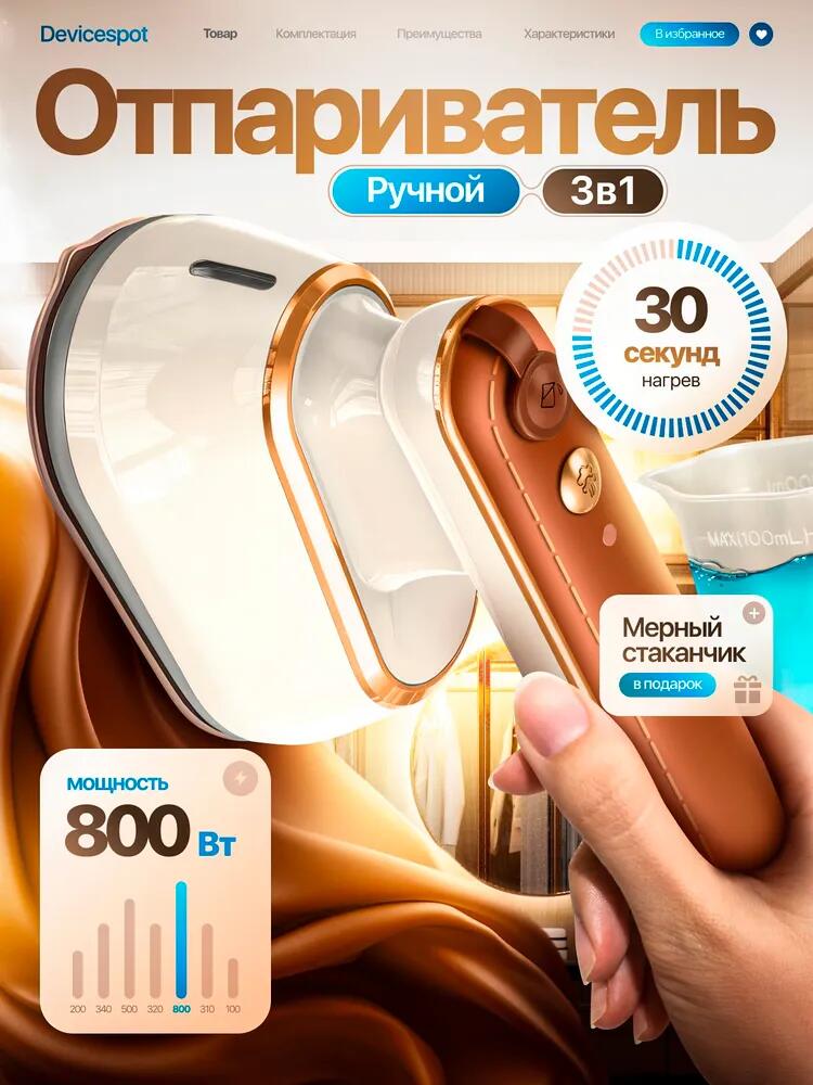
The first image is the most critical asset in any Ozon listing. It determines click-through rate and sets the tone for the entire product experience.
We designed the hero image to immediately communicate three core messages: this is a handheld iron, it heats fast, and it delivers strong performance. The product is shown at a dynamic angle in use, with visible steam output, which instantly differentiates it from traditional flat irons. Instead of a static product shot, we chose an action-oriented composition to signal efficiency and modern usage.
Key visual highlights such as “800W power” and “30 seconds heating” are presented in bold, rounded badges. This ensures readability even on small screens, which is essential for Ozon’s mobile-dominant traffic. The warm background fabric reinforces the product’s purpose while adding a premium lifestyle feel.
By combining technical specs with emotional cues—speed, convenience, and control—we ensured the first image works as both a billboard and a value proposition.
Image 2: Precision Design – Solving Real Usage Pain Points
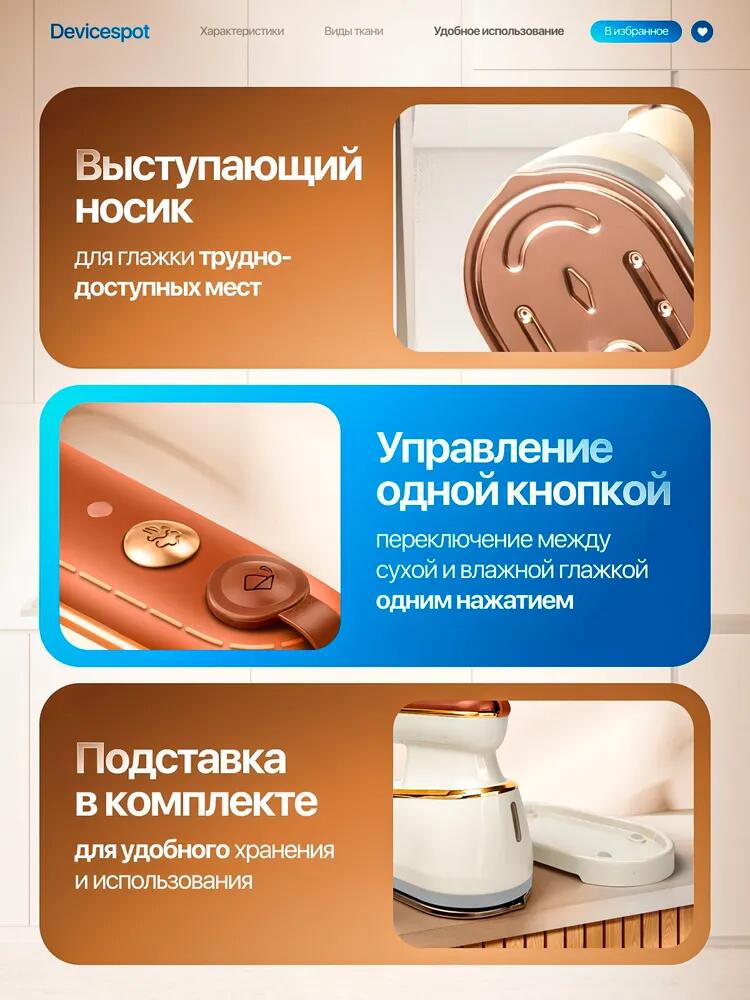
The second image focuses on functional design details that solve everyday ironing frustrations. Instead of repeating general benefits, this visual zooms in on the iron’s protruding steam nozzle and one-button control system.
We deliberately used close-up macro shots to emphasize precision. The protruding tip is positioned as a solution for hard-to-reach areas like collars, seams, and buttons. The accompanying text is concise and benefit-driven, explaining ทำไม this shape matters rather than merely describing it.
The one-button control is highlighted with clean iconography and minimal copy. On marketplaces like Ozon, users value simplicity. Showing that both dry and steam modes are controlled with a single button removes perceived complexity and lowers the mental barrier to purchase.
This image builds trust by demonstrating thoughtful product engineering rather than generic claims.
Image 3: Compact Size and Portability – Designed for Modern Lifestyles
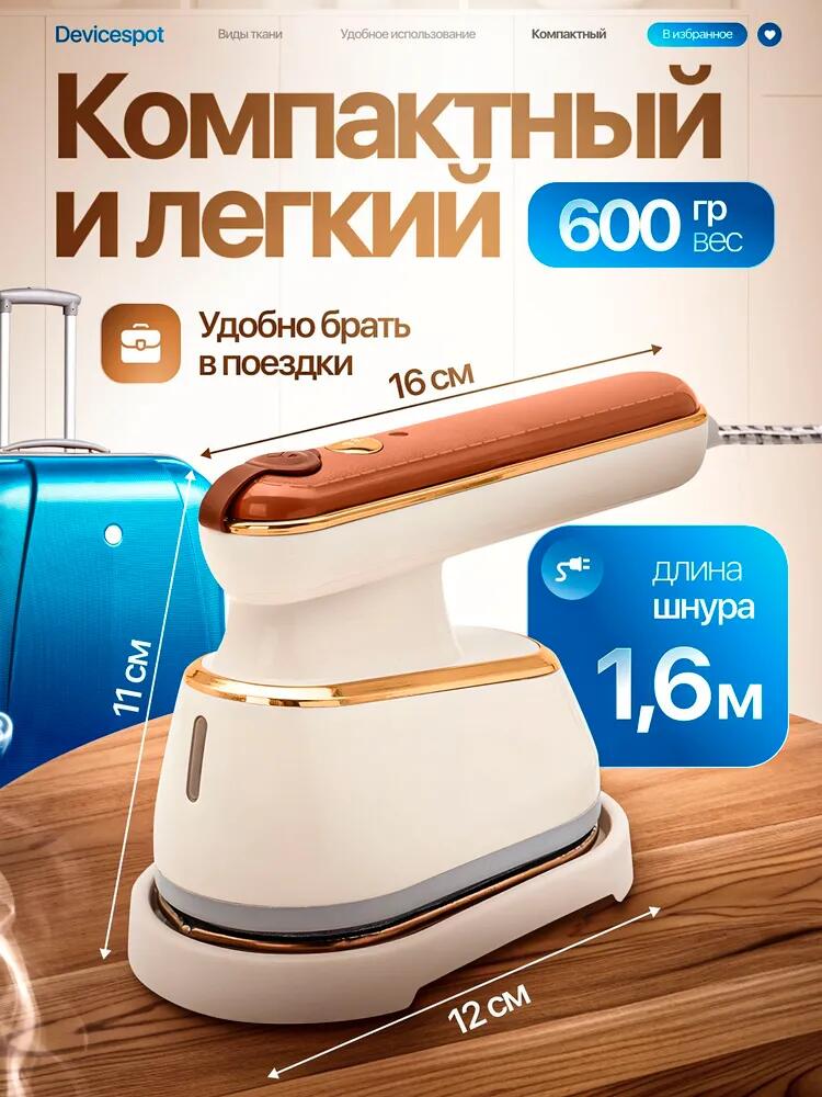
Portability is a major selling point for handheld irons, especially for urban users and travelers. In the third image, we visually quantified compactness using clear dimensions, weight indicators, and contextual props.
The iron is shown next to a suitcase to instantly communicate travel-friendliness. Instead of relying solely on text, we used visual scale references—length, width, and weight overlays—to make size tangible. Measurements are placed cleanly around the product without cluttering the main visual.
We also emphasized the 600g lightweight body and 1.6m power cord, addressing two common buyer concerns: hand fatigue and usage flexibility. The neutral background keeps attention on the product while maintaining consistency with the overall color palette.
This image reassures users that the iron fits effortlessly into daily routines, whether at home or on the go.
Image 4: Four Working Modes – Visualizing Versatility
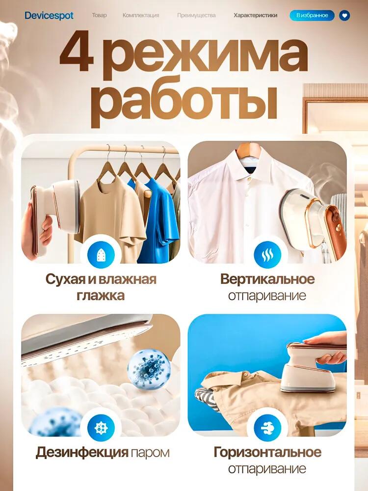
In the fourth image, we introduced the product’s versatility through a structured four-panel layout. Each panel represents a different usage mode: dry ironing, steam ironing, vertical steaming, and horizontal steaming.
Instead of listing modes in text, we used real-life scenarios to demonstrate application. Hanging shirts, flat garments, bedding, and steam output visuals make each mode instantly understandable without translation effort.
The grid layout creates visual order, while consistent icon placement ensures clarity. On Ozon, where shoppers often skim rather than read, this visual storytelling approach dramatically improves comprehension.
This image positions the iron not as a single-purpose tool, but as a multi-scenario solution for modern households.
Image 5: What’s Included – Eliminating Purchase Uncertainty
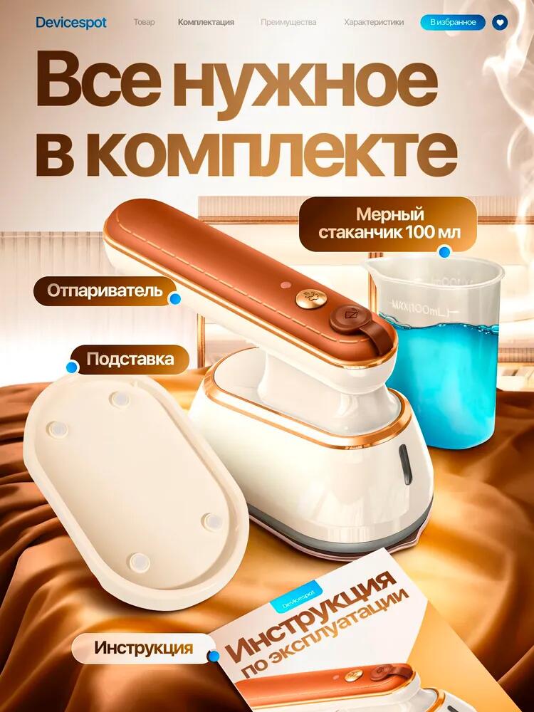
Uncertainty about included accessories is a common reason for hesitation on marketplaces. To address this, the fifth image clearly displays everything included in the package: the iron, base stand, measuring cup, and instruction manual.
We used labeled callouts with subtle pointers to guide the eye without clutter. The measuring cup is filled with water to visually reinforce its purpose, while the base stand is shown in a real placement context to suggest stability and organization.
By showing the complete set in one image, we reduced post-purchase disappointment and reinforced value perception. This approach aligns with Ozon buyers’ expectations for transparency and completeness.
Image 6: Fabric Compatibility – Building Confidence Across Use Cases
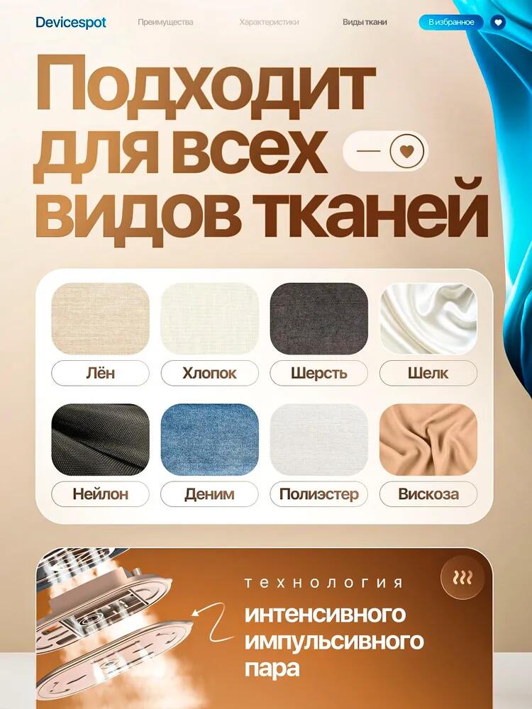
The sixth image addresses a critical buyer concern: fabric safety. Many users worry about damaging delicate materials, so we designed this image to clearly show fabric compatibility.
We displayed common fabric types—linen, cotton, wool, silk, nylon, denim, polyester, and viscose—using texture-rich swatches. Each fabric is presented in a clean, evenly spaced grid to ensure visual balance.
This layout communicates universality and safety without overloading the user with technical settings. It reassures buyers that the iron adapts to different materials, making it suitable for the entire household.
Image 7: Stronger Than a Traditional Iron – Expanding Use Scenarios
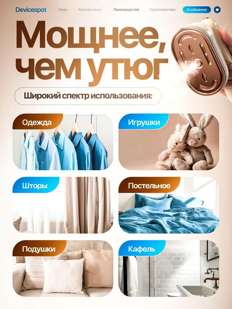
The final image broadens the product’s perceived value by showing applications beyond clothing. We highlighted usage on curtains, bedding, pillows, toys, and even tiled surfaces.
Each category is represented with a clear visual tile and label. This structured layout reinforces the idea that the iron is not just a garment tool but a multifunctional household device.
By positioning the product as more powerful than a traditional iron, we elevated its value proposition and justified its place in a competitive category. This image works particularly well at the bottom of the listing, where users seek final reassurance before purchase.
บทสรุป
นี้ โอโซน iron main image design project demonstrates how strategic visual storytelling can transform a functional household appliance into a compelling marketplace product. By carefully sequencing images, emphasizing real-world benefits, and aligning every design choice with buyer behavior, we created a cohesive visual system that informs, reassures, and converts.
Each image serves a distinct purpose while contributing to a unified brand narrative—clarity over clutter, benefits over features, and usability over decoration. This approach ensures that the product stands out in Ozon’s crowded environment and communicates value within seconds.
ที่ AIRSANG, this is exactly how we approach marketplace image design: combining data-driven structure with strong visual storytelling to help products perform better in competitive global platforms.


ออกแบบและสร้างเว็บไซต์ WordPress หรือเว็บไซต์องค์กรพร้อมระบบอีคอมเมิร์ซครบวงจรสำหรับคุณ.
ช่วงราคา: $200.00 ถึง $2,500.00ข้อกำหนดเฉพาะหรือใบเสนอราคาพิเศษ
ราคาเดิมคือ: $2.00.$1.00ราคาปัจจุบันคือ: $1.00. ภาพหลักสำหรับการออกแบบอุปกรณ์กายภาพบำบัดที่บ้านของ Amazon (อธิบายรายละเอียด)
บทนำ: การสร้างภาพลักษณ์ที่น่าเชื่อถือสำหรับอุปกรณ์บำบัดที่บ้านบน Amazon เมื่อออกแบบภาพหลักสำหรับอุปกรณ์บำบัดที่บ้านบน Amazon สิ่งสำคัญอันดับแรกของเราคือ...

ภาพหลักสำหรับการแปลงลิปสติกเป็นสินค้าสำหรับ Amazon
บทนำ: การออกแบบภาพหลักลิปสติกที่ขายได้บน Amazon เมื่อเราออกแบบภาพหลักสำหรับลิปสติกบน Amazon ความรับผิดชอบของเราไม่ได้จำกัดอยู่แค่...

อะไรทำให้รองพื้นชนิดเหลวของ Amazon (ภาพหลัก) ขายดี?
บทนำ การออกแบบภาพหลักสำหรับรองพื้นชนิดเหลวบน Amazon ไม่ใช่แค่การทำให้ผลิตภัณฑ์ดูสวยงามเท่านั้น บน Amazon ภาพหลักและ...

การออกแบบภาพหลัก Amazon ที่มีประสิทธิภาพสำหรับตลับกรอง
บทนำ การออกแบบภาพหลักสำหรับ Amazon ไม่ใช่แค่การทำให้สินค้าดูน่าดึงดูดเท่านั้น แต่ยังเกี่ยวกับความชัดเจน ความน่าเชื่อถือ และความเข้าใจได้ในทันที โดยเฉพาะอย่างยิ่งสำหรับ...

เปรียบเทียบธีม WordPress สำหรับสัตว์เลี้ยง 5 แบบ
บทนำ การเลือกธีม WordPress ที่เหมาะสมสำหรับธุรกิจเกี่ยวกับสัตว์เลี้ยงนั้นไม่ใช่แค่เรื่องของการออกแบบเท่านั้น แต่ยังส่งผลโดยตรงต่อการใช้งาน ความสามารถในการขยายขนาด และการเติบโตของธุรกิจในระยะยาว การดูแลสัตว์เลี้ยงและ...

การสร้างเว็บไซต์ WordPress ที่ปรับขนาดได้สำหรับแบรนด์ที่ขับเคลื่อนด้วยวิทยาศาสตร์: โครงการ AminoUSA
บทนำ ในยุคดิจิทัลปัจจุบัน เว็บไซต์เป็นมากกว่าแค่สถานที่สำหรับแสดงรายการสินค้า สำหรับแบรนด์ที่ขับเคลื่อนด้วยวิทยาศาสตร์ซึ่งดำเนินงานในอุตสาหกรรมที่มีการควบคุมหรือเน้นการวิจัย...

สร้างร้านค้า Shopify ที่ปรับขนาดได้สำหรับแบรนด์ใบมีดระดับโลก: โครงการ CoolKatana
บทนำ ในธุรกิจอีคอมเมิร์ซข้ามพรมแดน เว็บไซต์ Shopify เป็นมากกว่าแค่หน้าร้าน สำหรับแบรนด์ที่ดำเนินธุรกิจในกลุ่มเฉพาะหรือกลุ่มที่ขับเคลื่อนด้วยวัฒนธรรม เว็บไซต์ต้องทำมากกว่านั้น...

การออกแบบร้านค้า Shopify ที่มีอัตราการแปลงสูงสำหรับขายการ์ดโปเกมอน
บทนำ ในโลกของอีคอมเมิร์ซสินค้าสะสม โดยเฉพาะอย่างยิ่งในตลาดเกมการ์ดโปเกมอน (TCG) เว็บไซต์จะต้องทำมากกว่าแค่แสดงรายการสินค้า...

ดีไซน์ Shopify ที่เพิ่มยอดขายสำหรับแบรนด์อิฐสั่งทำพิเศษ
บทนำ ในสภาพแวดล้อมการแข่งขันอีคอมเมิร์ซในปัจจุบัน โดยเฉพาะอย่างยิ่งในตลาดของขวัญส่วนบุคคลและของสะสม เว็บไซต์ Shopify ต้องทำมากกว่าแค่แสดงสินค้า...

กรณีศึกษาการออกแบบเว็บไซต์ Shopify สำหรับแบรนด์ดอกไม้ระดับพรีเมียม
บทนำ ในสภาพแวดล้อมการแข่งขันอีคอมเมิร์ซในปัจจุบัน เว็บไซต์ Shopify ต้องทำมากกว่าแค่แสดงสินค้า มันต้องสื่อสารคุณค่าของแบรนด์ได้ทันที และแนะนำผู้ใช้...

กรณีศึกษาการออกแบบร้านค้า Shopify: ร้านค้าเกมย้อนยุค
บทนำ ในสภาพแวดล้อมอีคอมเมิร์ซที่มีการแข่งขันสูง ความชัดเจนทางด้านภาพและการเชื่อมโยงทางอารมณ์มักเป็นตัวกำหนดว่าผู้เยี่ยมชมจะกลายเป็นลูกค้าหรือไม่ โดยเฉพาะอย่างยิ่งใน...

กรณีศึกษาการออกแบบบน Shopify: แบรนด์ Tactical Rescue
บทนำ เว็บไซต์ Shopify ที่แข็งแกร่งนั้นทำมากกว่าแค่แสดงสินค้า—มันยังสื่อสารจุดประสงค์ สร้างความไว้วางใจ และชี้นำผู้ใช้ไปสู่การตัดสินใจซื้ออย่างมั่นใจ โดยเฉพาะอย่างยิ่ง...

กรณีศึกษาการออกแบบเว็บไซต์ Shopify สำหรับแบรนด์จักรยานไฟฟ้า
บทนำ ในตลาดจักรยานไฟฟ้าที่มีการแข่งขันสูงในปัจจุบัน เว็บไซต์ Shopify ต้องทำมากกว่าแค่แสดงสินค้า—ต้องเล่าเรื่องราว สร้างความน่าเชื่อถือ และให้คำแนะนำแก่ผู้ใช้งาน...

แพลตฟอร์มอีคอมเมิร์ซ Shopify ที่ปรับขนาดได้สำหรับแบรนด์สร้างสรรค์
บทนำ เมื่อแบรนด์สร้างสรรค์เติบโตขึ้น เว็บไซต์ของพวกเขามักประสบปัญหาในการปรับตัวให้ทัน เนื่องจากสายผลิตภัณฑ์ขยายตัว เนื้อหาเพิ่มขึ้น และปริมาณการเข้าชมสูงขึ้น แบรนด์ที่เน้นภาพเป็นหลักหลายแห่ง...

กรณีศึกษาการออกแบบเว็บไซต์ Shopify สำหรับแบรนด์สินค้าตกแต่งบ้าน
บทนำ ในตลาดสินค้าตกแต่งบ้านที่มีการแข่งขันสูง ภาพลักษณ์ของแบรนด์ไม่ได้เป็นเพียงแค่เรื่องของความสวยงามอีกต่อไป แต่ยังส่งผลโดยตรงต่อความไว้วางใจ พฤติกรรมการเลือกชมสินค้า และการตัดสินใจซื้อสินค้า สำหรับ...

กรณีศึกษาการสร้างเว็บไซต์สมัครสมาชิก WordPress ที่ปรับขนาดได้
บทนำ สำหรับแบรนด์อีคอมเมิร์ซสมัยใหม่ เว็บไซต์ไม่ได้เป็นเพียงแค่หน้าร้านดิจิทัลอีกต่อไปแล้ว มันคือกลไกสำคัญที่สนับสนุนการสมัครรับข้อมูล การเล่าเรื่องราวผ่านเนื้อหา การสร้างความไว้วางใจ...

ดีไซน์ WordPress ที่เพิ่มอัตราการแปลงสูงสำหรับแบรนด์สำหรับผู้ใหญ่
บทนำ ในตลาดอีคอมเมิร์ซที่มีการแข่งขันสูง ภาพลักษณ์ที่สวยงามเพียงอย่างเดียวไม่เพียงพอ เว็บไซต์ WordPress ที่ประสบความสำเร็จต้องนำทางผู้เข้าชมผ่านเส้นทางที่ชัดเจนและตั้งใจไว้ ซึ่ง...

เว็บไซต์อีคอมเมิร์ซตุ๊กตาเซ็กส์ WordPress ที่ปรับขนาดได้
บทนำ การเปิดตัวเว็บไซต์อีคอมเมิร์ซข้ามพรมแดนที่มีประสิทธิภาพสูงนั้นไม่ใช่แค่การนำสินค้าขึ้นออนไลน์เท่านั้น สำหรับแบรนด์ที่ดำเนินธุรกิจในตลาดที่มีการแข่งขันสูงและเน้นภาพลักษณ์เป็นหลัก เว็บไซต์...