Project overview
The client of this project is a cross-border ecommerce brand specializing in wigs and hair styling products. It hopes to further expand overseas markets through the brand website and enhance the brand’s professionalism and online sales conversion. When the customer found us, they already had a relatively clear product direction, but the original page still had a lot of room for optimization in terms of brand vision, product display, purchase guidance, and overall page hierarchy. Customers want us to be based on ช็อปฟี่ The platform re-plans the visual and page structure of the website for the wig category, focusing on different hairstyles, colors, lengths and wearing effects. At the same time, it reduces consumers’ choice costs through real model scenes, clear product classifications and more attractive layouts. Focusing on the purchasing habits of users in the wig industry, we systematically designed the homepage, product display and brand content to create a more fashionable, professional and conversion-oriented Shopify wig brand website.
| บริการ | Industry | แพลตฟอร์ม |
| Website design and decoration | Beauty and personal care | shopify |
| Project requirements | target market | design style |
| Optimize website structure and user browsing experience | ระดับโลก | Bright and simple|Model-led|Strong sense of e-commerce |
| project budget | Delivery content | Delivery time |
| ¥14600 | Website construction and full-site page design | 24 working days |
Project Challenges
The core challenge of this project is how to simultaneously solve the problems of insufficient brand recognition, unclear product differences, and high user selection costs in the fiercely competitive fake e-commerce market. Wig products usually involve multiple dimensions such as color, length, curl, and wearing effect. If the information level on the page is not clear, it can easily affect user judgment and purchasing decisions. Before starting the project, we first systematically sorted out the customer’s product structure, target consumer groups, brand positioning and similar overseas Shopify wig websites, and analyzed the complete path of users from homepage browsing, product screening to final ordering. At the same time, we organized product images, model materials, core selling points and classification logic, determined the overall visual direction and page information priority, and established a clear foundation for the subsequent design of the home page, product display and conversion modules.
Home Page Design: Create a Powerful First Impression
Above the fold area: Quickly establish visual appeal
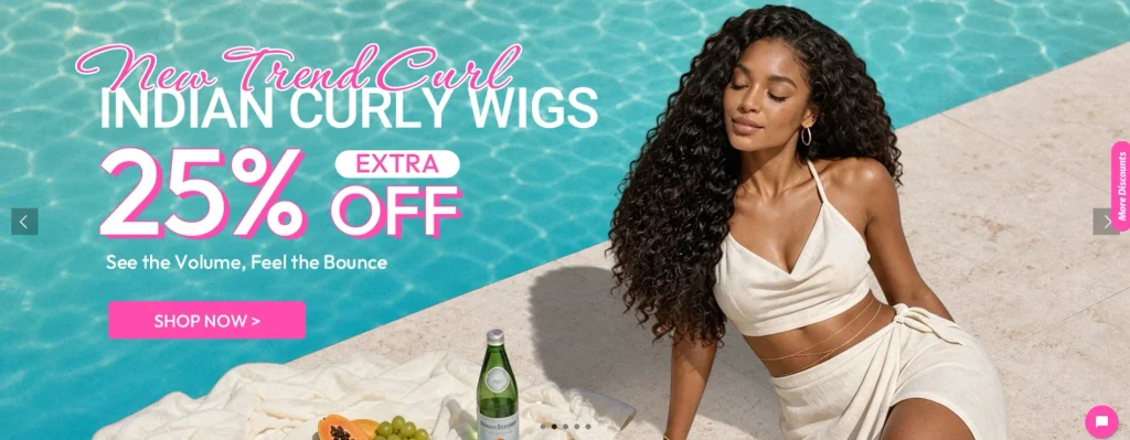
The first screen area is the first emotional touch point for users after entering the website. Our design highlights include:
Demonstrate diverse wig styles in real scenes
Through real-person wearing and life-like scenes, users can more intuitively understand the actual effects of different wig styles.
Use eye-catching seasonal event banners
For example, theme visuals such as summer promotions and festival activities can enhance the freshness and marketing atmosphere of the page.
Highlight core product selling points
Focus on displaying key information such as “Glueless” and “Beginner Friendly” so that users can quickly understand the brand and product value after entering the page.
Through these designs, users can clarify the brand positioning in a short time and quickly understand the product advantages.
Navigation design: product classification as the core
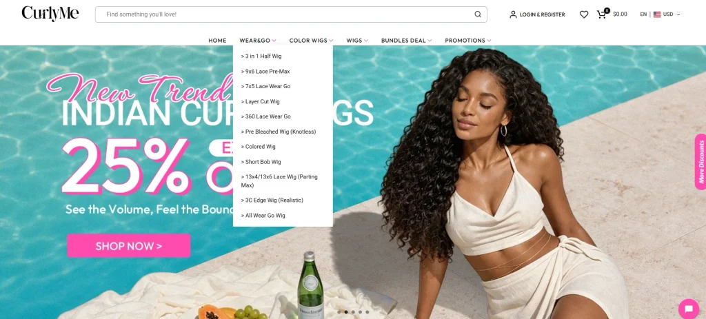
In order to avoid users’ browsing pressure caused by too many options, we redesigned the navigation structure based on consumers’ real shopping habits.
Classification by wig type
ตัวอย่างเช่น:
- 360° glue-free wig
- Lace forehead wig
- Bob short hair wig
Classified by usage scenarios
ตัวอย่างเช่น:
- wedding
- work
- Daily wear
Sort by trend or promotion
Help users find the products they are currently interested in more quickly through new products, popular models, discounts and other portals.
This category-first navigation method can reduce operational friction when users find products and shorten the path from browsing to purchasing.
Visual hierarchy and page layout
We use a simple but dynamic page layout to maintain a clear visual hierarchy between different content modules.
Use large, high-quality images
Highlight the styling effect, texture and overall style of the wig through high-definition model pictures and product scene pictures.
Maintain clear module spacing
Reasonably control the white space between different sections to avoid overcrowding the page content.
Use eye-catching title fonts
Focus on key activities, product selling points and core information, strengthen the information level through more visually impactful fonts.
The overall goal is to guide users to naturally move from browsing and understanding products to purchasing.
Product Page Design: Boost Conversions with Clear Messages
Product Image Strategy
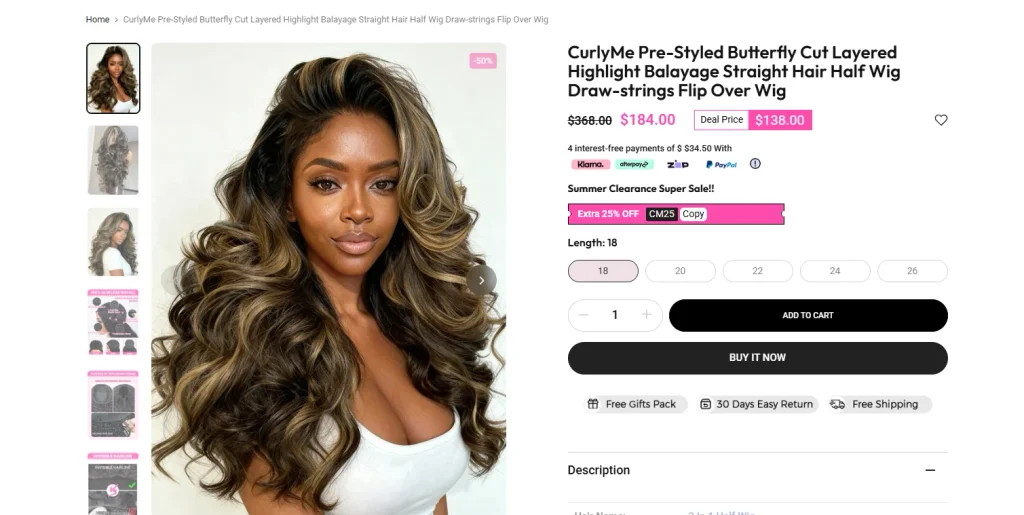
We have focused on planning different types of product pictures so that users can understand the products as comprehensively as possible online.
lifestyle scene map
Show the wearing effect of wig in real life environment, making it easier for users to feel immersed in it.
Product details close-up
Focus on displaying details such as lace, hair texture, and hairline to help users judge product quality.
Comparison pictures before and after wearing
Through visual changes before and after use, the product effect is more intuitive.
Installation and wearing instructions
Use pictures to show the installation steps and wearing methods of wigs to lower the threshold for new users.
Together, these images help users “experience” the product more closely without being able to actually touch the product.
Information architecture design
To avoid presenting too much information at once, we split product content into easier-to-understand modules.
Core advantages
Highlight the product’s most important selling points and advantages through eye-catching visual forms.
product specifications
Use a concise and clear way to display product parameters such as length, color, material, lace type, etc.
Frequently Asked Questions and Care Instructions
Issues frequently concerned by users and wig care methods are organized separately to help users quickly obtain the information they need.
A clear information structure can effectively reduce users’ reading pressure and enhance purchasing confidence.
Action button optimization
We have focused on optimizing the CTA action buttons on the page.
Improve button visual prominence
Make your buy button more visible to users through size, location, and visual hierarchy.
Keep button positions consistent
Maintain unified interaction logic in different pages and different product areas to reduce users’ learning costs.
Paired with trust information
Add shipping, returns and exchanges, reviews and other relevant information near the purchase button to further reduce user concerns.
This way, users always know what to do next as they browse.
Auxiliary page design: extending the overall shopping experience
Product collection page
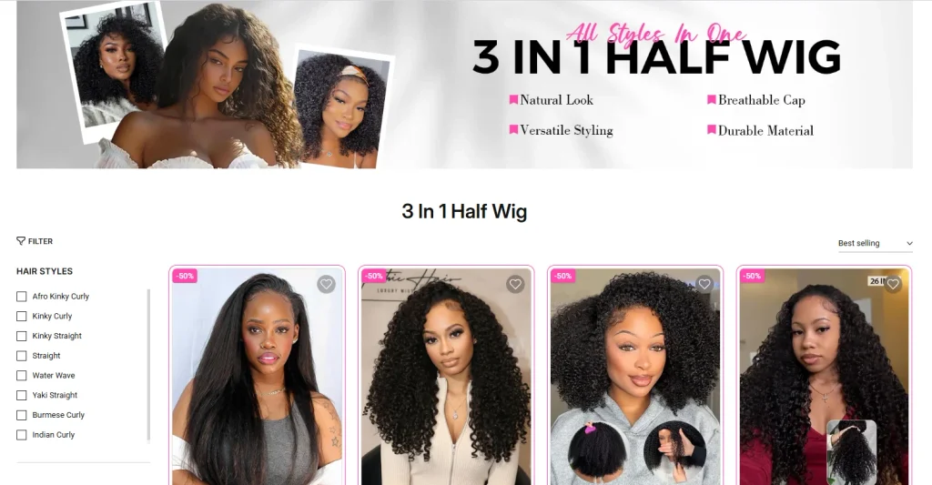
The product collection page is designed to be a browsing experience similar to a curated product gallery.
Simple grid layout
Use unified product cards and a neat grid structure to make the page cleaner.
Supports quick visual browsing
Allow users to quickly compare different styles with clear product images and key information.
Reduce irrelevant interference
Reduce unnecessary complex elements and focus on the product itself.
Such a collection page design can help users browse and filter products more efficiently.
Social word-of-mouth content integration
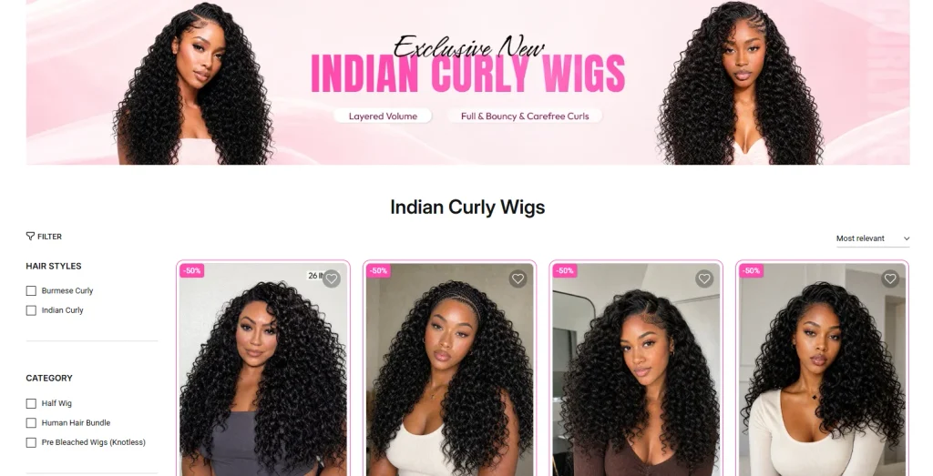
One of the important design strategies is to integrate Instagram-like social content into the website.
Real customer photos
Show the effect of consumers actually wearing the product.
Master styling case
Provide users with more styling inspiration through the matching methods of bloggers, experts or influencers.
Real usage scenarios
Show the application of wigs in different scenarios such as work, dating, travel, parties, etc.
This kind of social content can not only enhance product credibility, but also transform the website from a simple e-commerce store into a brand platform with a more community atmosphere.
Trust building module

We have reasonably laid out a variety of trust information on different pages of the website.
Return and exchange policy
Clearly explain the return and exchange rules to reduce users’ concerns before purchasing.
Logistics and delivery information
Clearly display the shipping time and delivery method to make it easier for users to judge the purchase cycle.
Wholesale services
Provide a clear cooperation entrance for customers with bulk purchasing needs.
Customer testimonials
Show real consumers’ experience and feedback to further enhance brand credibility.
These trust modules can effectively reduce user hesitation and help improve the overall purchase conversion rate.