การแนะนำ
Medical tourism is not a simple service category. Visitors do not arrive on a website only to compare prices or scan a list of treatments. They arrive with questions, concerns, expectations, and a strong need for reassurance. For a custom medical tourism website like Medical Tourism China, the page design must do more than look polished. It must guide international visitors through a complex decision journey with clarity, confidence, and emotional comfort.
The website positions itself around premium medical tourism to China, lower treatment costs, comprehensive service support, personalized care, consultation, insurance, visa guidance, treatment information, and travel planning. That means the design needs to balance healthcare credibility with a smooth service experience.
| ระยะเวลาจัดส่ง | หมวดหมู่ | ประเภทเว็บไซต์ |
| 18 วัน | Healthcare | เว็บไซต์ที่สร้างเอง |
| นักออกแบบที่เกี่ยวข้อง | ค่าใช้จ่าย | ผล |
| หลิน จาง | $2100 | Sales📈244% |
ภาพรวมโครงการ
Medical Tourism China needed a custom website design that could introduce its service clearly, build trust quickly, and help potential patients understand the value of receiving medical care in China. The website could not feel like a generic clinic page, a travel agency page, or a basic service landing page. It needed to combine all three ideas into one professional digital experience.
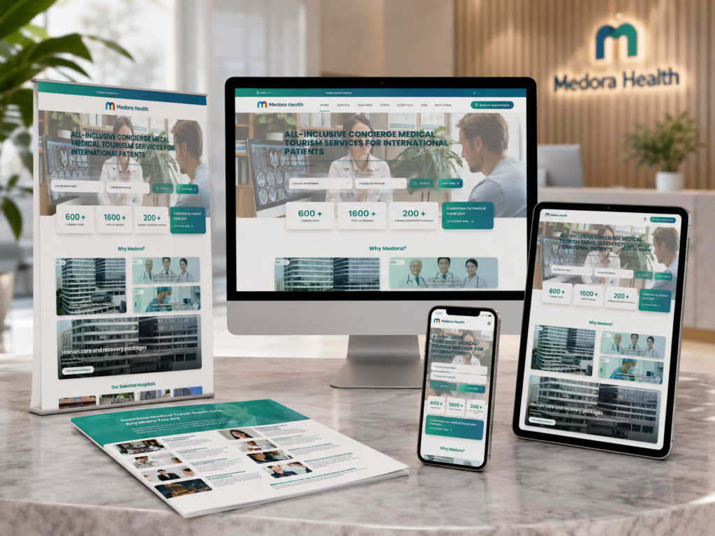
The homepage became the key entry point. It had to explain the brand promise, introduce the benefits of medical tourism in China, show the service process, and lead users toward consultation. Other pages, such as treatment-related pages, visa guidance, insurance, packages, and free consultation, supported the full user journey.
Our design direction focused on one core goal: make a complex medical decision feel organized, safe, and approachable.
The Objective
Creating a Website That Builds Immediate Confidence
The first objective was to create trust within the first few seconds. In healthcare and medical tourism website design, users often judge credibility before reading detailed content. A confusing layout, weak visual hierarchy, or inconsistent design language can make visitors leave before they understand the service.
For this reason, the homepage needed a strong first screen. The hero area had to communicate the value proposition clearly: premium medical tourism support in China, access to quality care, and personalized guidance. Instead of relying on heavy paragraphs, the design needed direct messaging, calm visuals, and clear calls to action.
Turning Service Complexity Into Simple Navigation
Medical tourism includes many steps: researching treatments, comparing costs, checking travel requirements, understanding insurance, planning a trip, and speaking with a care coordinator. If the website presents all of this information at once, users can feel overwhelmed.
We structured the design so visitors could move naturally from awareness to action. The homepage introduces the main promise. Supporting pages expand each topic. Consultation pages help users take the next step. This creates a clear website experience rather than a scattered collection of pages.
Supporting Both Emotional and Practical Decisions
Medical decisions are emotional, but medical travel also requires practical planning. The website design needed to support both sides. We used a clean, professional visual system to reduce anxiety, while also organizing practical content into sections that users could scan easily.
This approach helped the site feel trustworthy without becoming cold or overly clinical.
The Design Strategy
Homepage-First, Journey-Second
We treated the homepage as the central storytelling page. It needed to explain who the service is for, why China is a strong destination for medical tourism, what support the company provides, and how users can begin the process.
The homepage design likely works best when it follows a clear conversion path:
1. ส่วนฮีโร่
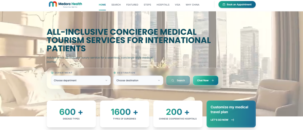
The hero area should immediately answer three questions:
Who is this service for?
What problem does it solve?
What should the visitor do next?
For Medical Tourism China, the hero section should focus on trust, cost savings, quality care, and guided support. A strong call-to-action such as “Get a Free Consultation” helps move users forward without pressure.
2. Trust-Building Value Section
After the first impression, the page should quickly explain why visitors should consider medical tourism in China. This section can highlight advantages such as treatment affordability, hospital access, personal coordination, travel support, and transparent guidance.
The design should present these benefits in clean cards or icon-based blocks. This makes the information easier to understand, especially for international users who may be comparing multiple destinations.
3. Service Process Section
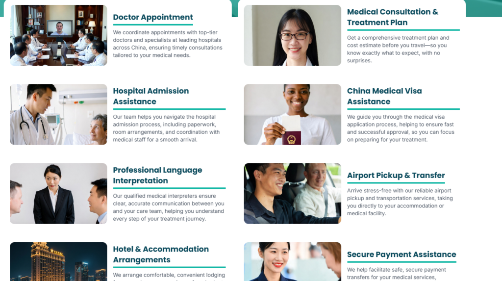
Medical tourism can feel intimidating. A step-by-step section solves this problem. We would design the process as a guided path: inquiry, consultation, treatment planning, travel support, hospital visit, recovery, and follow-up.
This type of section does not only explain the service. It reduces uncertainty. When users can see the journey, they feel more prepared to take action.
4. Treatment Categories or Procedure Highlights
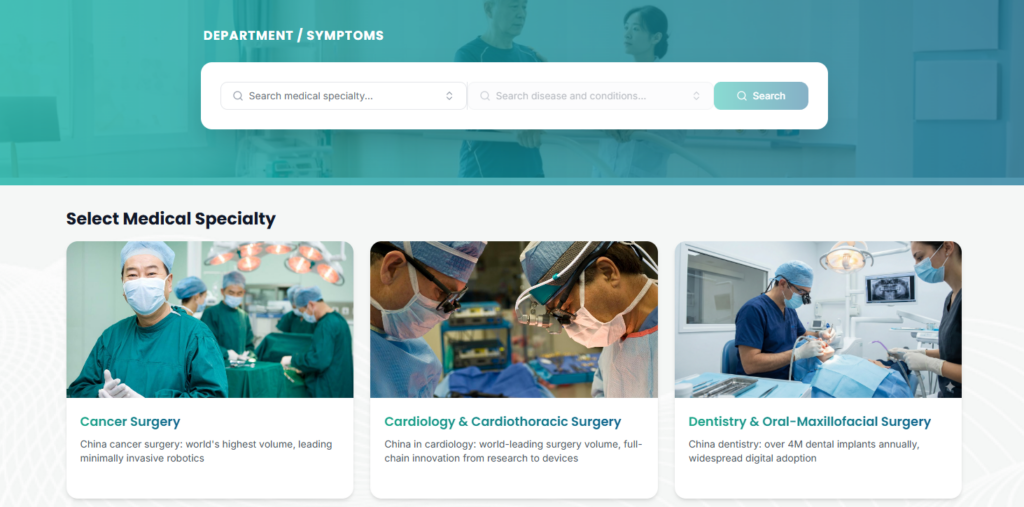
The website also benefits from treatment-focused navigation. Instead of forcing visitors to search manually, the homepage can present major medical categories or featured procedures. This improves usability and helps users find relevant content faster.
5. Consultation CTA
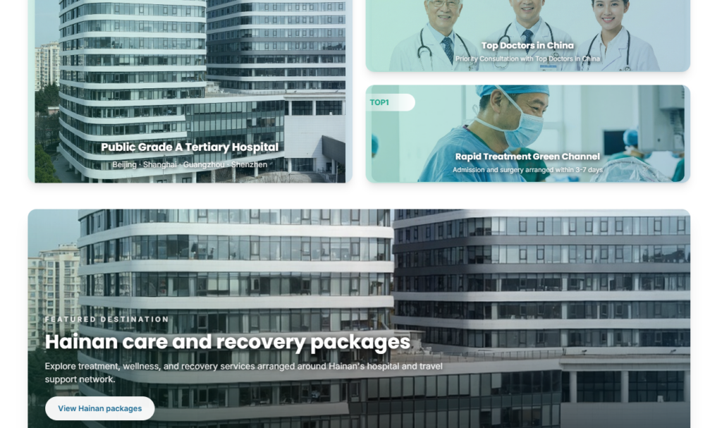
A medical tourism website should not hide the next step. The consultation call-to-action should appear several times across the page, but it should not feel aggressive. The design should use clear buttons, supportive microcopy, and enough surrounding space to make the action feel safe.
Visual Direction
A Clean Healthcare-Inspired Design Language
For this project, the visual design needed to feel modern, premium, and dependable. Medical tourism is a high-trust category, so overly decorative design can weaken credibility. At the same time, a plain clinical layout can feel cold and uninviting.
The ideal direction uses a balanced visual language: clean spacing, soft backgrounds, professional imagery, strong section structure, and refined typography.
Color Palette
A medical tourism website should use colors that communicate care, stability, and professionalism. Soft blues, clean whites, muted neutrals, and subtle accent colors can help create a calm visual experience.
The color system should avoid extreme contrast unless it supports call-to-action visibility. For example, the main CTA button can use a stronger accent color while the rest of the interface remains calm and polished.
Typography
Typography plays a major role in healthcare website design. Visitors need to scan information quickly, especially when they are comparing treatments, costs, and service steps.
We would use a strong headline font for clarity and a highly readable body font for longer explanations. Headings should feel confident but not loud. Body text should have enough line height and spacing to support comfortable reading.
Imagery
Medical tourism websites must choose imagery carefully. Generic stock photos can make the brand feel less trustworthy. Overly clinical images can feel intimidating. Travel-heavy images can make the service feel too casual.
The best image direction combines professional healthcare environments, supportive human interaction, travel confidence, and calm lifestyle moments. The imagery should show care, guidance, and international accessibility.
Homepage Design Highlights
Clear Above-the-Fold Messaging
The homepage must communicate the brand’s value immediately. For Medical Tourism China, the first screen should not only say what the company does. It should also explain why the visitor should care.
A strong homepage opening can focus on premium treatment access, personalized medical travel support, and cost-conscious care. This gives the page a clear business position and helps users understand the website without scrolling too much.
Trust-Oriented Layout
Trust is not created by one badge or one statement. It comes from the full design experience. The homepage should use consistent spacing, polished section transitions, professional icons, strong CTA placement, and organized content blocks.
Every section should feel intentional. When the layout feels organized, users naturally assume the service is organized too.
Scannable Benefit Blocks
Many users will not read every paragraph. They will scan. That is why benefit blocks are important. We would design short sections that highlight service advantages, such as personalized care coordination, treatment planning, travel support, visa information, insurance guidance, and consultation access.
These blocks should use short headings, concise descriptions, and consistent icon styling. This helps users absorb the value quickly.
Human-Centered Service Explanation
Medical tourism is personal. The website should not feel like a database of procedures only. The homepage should explain how the service supports real people before, during, and after their medical journey.
A human-centered section can show how the team helps users choose options, prepare documents, plan travel, and feel supported throughout the process.
Conversion-Focused CTA Placement
The homepage should guide visitors toward consultation without making the experience feel pushy. CTA buttons should appear in natural decision points: the hero area, after the benefit section, after the process section, and near the end of the page.
Each CTA should feel connected to the content around it. For example, after explaining the service process, the button can invite users to request a free consultation.
Supporting Page Design
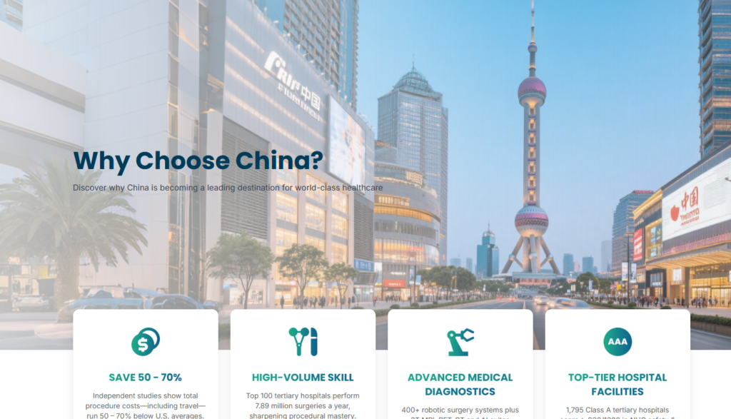
Why Choose China Page
A “Why Choose China” page plays an important educational role. Many international visitors may not immediately understand why China is a strong medical tourism destination.
The design should present this page as an informative, confidence-building resource. It can use comparison sections, benefit cards, hospital-related visuals, and structured content blocks. The goal is to answer objections before users ask them.
Treatment and Procedure Pages
Procedure pages need a different design rhythm. Users visiting these pages often want specific information. They need clear headings, simple explanations, cost-related context, expected process information, and a path to consultation.
The page design should avoid overwhelming users with dense medical language. Instead, it should break information into sections: overview, benefits, who it may suit, journey steps, and consultation CTA.
Free Consultation Page
The consultation page is one of the most important conversion pages. It should feel simple, reassuring, and low-friction.
The design should avoid unnecessary distractions. A clear form, supportive copy, privacy reassurance, and a short explanation of what happens after submission can help users complete the action.
Insurance Page
Insurance content can feel complicated. The page design should make it easier by using FAQs, short paragraphs, icons, and clear section hierarchy. The goal is not to overwhelm visitors with policy language, but to help them understand that travel and medical planning can be handled with guidance.
Visa Page
Visa information is practical and detail-heavy. This page should use a structured layout with step-by-step guidance. Visitors should be able to scan the page and understand what documents or preparation steps may be needed.
A clean design makes the page feel more reliable and reduces confusion.
Packages Page
The packages page should help users understand the full journey. Instead of presenting packages like simple products, the design should frame them as care pathways. Each package card should explain what is included, who it is for, and how users can take the next step.
This page can also use visual timelines to make the service feel more organized.
The Challenges
Challenge 1: Creating Trust in a Sensitive Industry
Healthcare-related websites carry a higher trust requirement than many other business websites. Users need to feel safe before they share personal details or request consultation.
The design solution was to use a calm, professional layout, consistent visual language, and clear messaging. Every section needed to reduce doubt.
Challenge 2: Explaining a Multi-Step Service Clearly
Medical tourism is not a single transaction. It includes healthcare research, travel planning, documentation, communication, and follow-up. The challenge was to present this journey without making the website feel heavy.
We solved this through structured content blocks, process sections, guided navigation, and repeated CTA points.
Challenge 3: Balancing Medical Credibility With Travel Appeal
The site needed to feel medical enough to be credible, but not so clinical that it felt cold. It also needed to reference travel without feeling like a vacation website.
The design balanced these ideas through clean healthcare visuals, calm colors, human-centered imagery, and practical planning sections.
Challenge 4: Supporting International Visitors
International users may have different concerns from local visitors. They may worry about language, cost, hospital access, travel logistics, insurance, and visa requirements.
The website design needed to make these concerns visible and answerable. By creating dedicated pages and clear navigation paths, users can find the information they need without feeling lost.
Our Design Method
Discovery and Brand Positioning
Before designing the pages, we defined the role of the website. It needed to act as a trust-building platform, an educational resource, and a lead-generation tool.
This positioning shaped the entire page structure. We did not design the site as a simple brochure. We designed it as a guided decision experience.
Information Architecture
We organized the website around the questions visitors are most likely to ask:
What does the company offer?
Why should I consider China?
What treatments or procedures are available?
How does the process work?
What about visa and insurance?
How do I request help?
This structure helps users move through the website naturally.
Homepage Wireframe Planning
The homepage wireframe focused on clarity and conversion. We planned each section based on user intent. The top section introduces the service. The middle sections build trust and explain value. The lower sections move users toward consultation.
This creates a smooth flow from interest to action.
Visual System Design
We created a visual system that supports healthcare credibility. This includes consistent spacing, refined typography, clear buttons, icon styles, image treatments, and section backgrounds.
A strong visual system helps the website feel premium and unified across all pages.
Mobile-First Experience
Many users will research medical tourism on mobile devices. The mobile experience needs to feel simple and fast to understand.
We designed the page structure so sections can stack cleanly on smaller screens. Buttons remain easy to find. Text blocks stay readable. Important trust signals remain visible.
Conversion-Focused Refinement
After building the page direction, we refined the experience around action. A beautiful website is not enough. The design must encourage the right behavior.
For this project, the main conversion behavior is consultation. Every page should make consultation feel like a natural next step.
The Advantages of This Design Approach
It Builds Trust Before Selling
The design does not push users too quickly. It first builds confidence through clear messaging, professional structure, and helpful content. This is important for medical tourism because users need reassurance before they take action.
It Makes Complex Services Easier to Understand
The design turns a complicated service into a guided experience. Process sections, service blocks, and dedicated pages help users understand what happens next.
It Supports SEO-Friendly Content Structure
Clear H2, H3, and H4 sections help organize long-form content. This also supports keyword relevance around medical tourism website design, healthcare website design, custom website design, medical tourism China, and consultation-focused service pages.
It Improves Lead Quality
When users understand the service before submitting a form, they are more likely to become qualified leads. The website does not only collect inquiries. It educates visitors before they contact the business.
It Creates a Premium Brand Impression
A custom page design helps the website stand apart from basic templates. The refined visual direction supports a premium service position and helps visitors feel that the company can manage a serious medical travel journey.
The Result
The final design direction gives Medical Tourism China a website experience that feels professional, clear, and conversion-ready. The homepage introduces the service with confidence. The supporting pages explain important topics like consultation, treatment planning, insurance, visa preparation, and medical travel packages.
The design connects healthcare credibility with international service support. It gives users a calm path through a complex decision. It also gives the brand a stronger digital presence in a competitive medical tourism market.
Most importantly, the website design turns information into trust. It helps visitors understand the service, feel supported, and take the next step with more confidence.
บทสรุป
A successful medical tourism website must do more than look modern. It must reduce uncertainty, explain the journey, organize complex information, and create trust from the first screen to the final consultation form.
This custom website design shows how strong page structure, professional visual direction, user-focused content, and conversion-centered layouts can help a healthcare-related service communicate with international visitors more effectively. It reflects the kind of design-led website service that AIRSANG provides for brands that need a clear, credible, and high-converting online presence.