Project overview
Customers of this project Solakon It is a brand that focuses on balcony solar systems and plug-and-play new energy solutions. It mainly provides solar panels, inverters, installation kits and related accessories for home users. As the product line continues to improve, customers hope to further improve their online brand image and e-commerce conversion efficiency, so they come to us and hope to reorganize the existing Shopify brand website visual design and page structure. This project focuses on optimizing the homepage, product pages, product portfolio display, brand trust information and mobile experience. While retaining the attributes of the professional new energy brand, it transforms the more complex technical parameters into clearer, more intuitive and easier-to-understand visual content, lowers the user decision-making threshold, and creates a Shopify e-commerce website that takes into account brand professionalism, user experience and sales conversion through more reasonable information levels, product selling point display and purchase paths.
| Services | Industry | Platform |
| Website design and decoration | Sports and outdoor | shopify |
| Project requirements | target market | design style |
| Optimize website structure and user browsing experience | Global | Refreshing and professional · Technology and environmental protection · Transformation orientation |
| project budget | Delivery content | Delivery time |
| ¥12500 | Website construction and full-site page design | 24 working days |
Project Challenges
The core challenge of this project is that balcony solar products involve a lot of professional information such as power, installation methods, energy-saving effects, safety certifications, and accessory combinations. If the technical parameters are directly stacked on the page, it will easily increase the user’s understanding cost and affect the purchase decision. At the same time, new energy products are related to household electricity consumption, and consumers are more sensitive to brand credibility, safety and ease of installation. In the early stage of the project, we first systematically sorted out the client’s existing Shopify website, focusing on analyzing the navigation structure, product classification, product page information level, mobile experience and conversion obstacles, and sorting out the core selling points, trust content and package logic based on the purchase path of the target users. On this basis, we re-planned the information architecture, visual hierarchy and content sequence of the homepage and product pages to establish clear conversion logic for subsequent designs.
Our Shopify design process
The first stage: demand research and UX path sorting
At the beginning of the project, we first conducted a systematic structural review of the client’s existing Shopify website, focusing on the following content:
Navigation clarity
Check whether the main navigation of the website is intuitive and whether users can quickly find the target products and core pages.
Product classification structure
Analyze the classification logic between different solar products, packages and accessories to determine whether the existing classifications are easy to understand.
Product page layout
Evaluate the information hierarchy between product images, selling points, price, technical specifications, trust information, and the buy button.
information depth
Determine whether the professional technical content is too much, appears too early, and whether it increases the cost of understanding for consumers.
conversion barriers
Look for key issues that influence users to continue browsing, choose a plan, and add to their cart.
Mobile performance
Check the information arrangement, button size, browsing rhythm, and overall user experience of the mobile page.
We further sorted out the complete path that users take from entering the homepage, to learning about products, comparing plans, and then generating checkout intentions.
During the analysis, we discovered several major issues:
- Too much professional and technical information appears in the early stages of user browsing
- The core value of the brand cannot be understood at the first time
- User reviews and social trust information are located too deep
- The combination logic between different solar packages is not clear enough
Based on these issues, we redesigned the UX information architecture of the entire website.
Home page strategy and visual hierarchy
The homepage is one of the most important sales entrances for the brand, so we regard the homepage as the core of the entire Shopify website optimization.
Redesign of the Hero area on the first screen
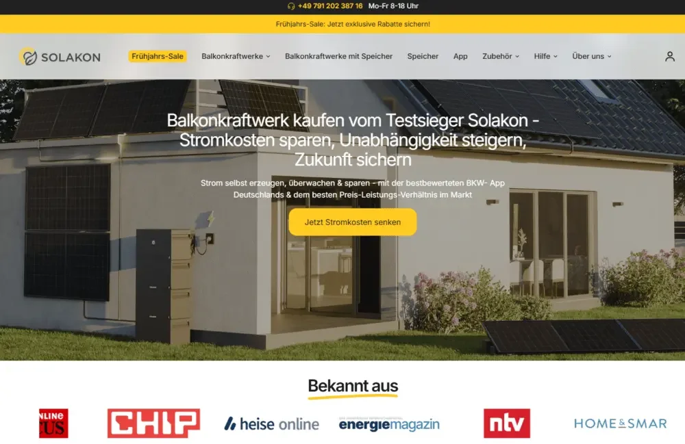
The first screen design mainly focuses on the following directions:
Clear seasonal promotion information
Let users quickly understand current offers through concise and clear promotional content.
Quickly communicate core values
Highlight the core brand value of “making balcony solar energy easier” so that users can immediately understand the purpose of the product.
Emphasis on savings ratio
Put energy saving and cost saving information in a more obvious position to enhance the purchase value.
Clear action buttons
Reasonably arrange the position of the CTA button to guide users to continue browsing the product or enter the purchase page.
Enhance real usage scenarios
Use environmentally friendly product images to help users understand how solar products are used in real home scenarios.
Visually, we avoid stacking too many elements and instead focus on strengthening:
- information readability
- Energy saving value
- brand trust mark
- Product safety in use
Above the fold, you need to answer three questions within five seconds:
What product is this?
Why is it worth paying attention to?
Why is this brand worth trusting?
Modular content structure
In order to avoid presenting a large amount of solar energy information to users at the same time, we re-established a modular homepage structure.
Home page content process
Brand trust module
Display media reports, awards and brand endorsements to quickly enhance brand credibility.
Product Category Overview
Help users quickly understand different types of solar products and accessories.
save data module
Use digital information to demonstrate the long-term savings that solar energy systems can deliver.
Product function disassembly
Display core functions through modular graphics and text to reduce the difficulty of understanding technical information.
Package comparison card
Visually compare different solar packages to facilitate users to make quick choices.
Product carousel module
Display key products and allow users to further browse different models.
Accessories purchase module
Display installation accessories and related products to increase cross-selling opportunities.
User evaluation module
Enhance purchasing confidence with authentic reviews.
Brand story
Introduce the brand philosophy and business background to build deeper user trust.
FAQ FAQ
Focus on solving common questions about installation, security, compatibility, etc.
Customer support CTAs
Provide further consultation portal for users who still have questions.
Each module has a clear purpose.
We have reduced unnecessary visual interference and made the entire page clearer through more reasonable white space, font contrast and a unified icon system.
Product page design strategy
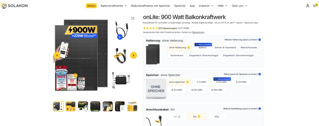
The product page is the page that most directly affects sales conversion in the entire e-commerce website.
First screen area optimization
The home screen of the product page mainly emphasizes the following content:
High quality product images
Allow users to quickly understand the product structure and actual appearance.
Clear product name
Reduce complex naming to allow consumers to quickly identify products.
Energy output information
A concise summary of core power and energy performance.
Saving value
Highlight the potential energy cost savings that users will receive with their purchase.
Delivery time reminder
Reduce user uncertainty through clear delivery information.
trust mark
Showcase certification, assurance and related brand trust content.
Simplify the add to cart area
Reduce information interference in the purchase area and make the purchase operation more direct.
Instead of placing complex technical parameters at the top of the page, we first present value information that can influence users’ purchasing decisions, and then place detailed technical specifications at the bottom of the page.
This can prevent technical information from prematurely interrupting the user’s buying mood.
Package display and purchase decision simplification
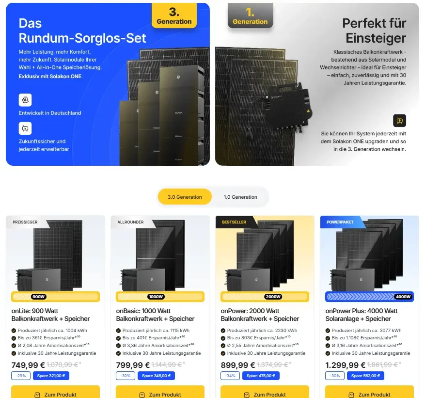
Balcony solar packages usually contain multiple components, such as:
- solar panel
- inverter
- Installation kit
- Optional accessories
In order to make it easier for users to understand the differences between different packages, we have redesigned the way the packages are displayed.
Package visual comparison
Display different combinations side by side through a clear card structure.
“Best value for money” label
Highlight more recommended solutions and reduce user selection costs.
Structured Advantage Description
Use short selling points instead of long descriptions.
Energy yield icon
Use visual icons to help users understand the power generation capabilities of different packages.
These designs can reduce users’ thinking burden and help increase the average order amount.
Design challenges and solutions
Challenge 1: Complex technical information
Renewable energy products naturally contain a lot of technical data. If a large amount of professional content is directly displayed, it is easy for ordinary consumers to feel complicated.
Our solutions
We transform complex information into more intuitive visual expressions.
Use icons instead of long text
Quickly express different functions through icons.
Visual energy output comparison
Allow users to directly understand the performance differences between different products.
Structured parameter module
Categorize technical specifications.
layered information architecture
Show more in-depth information only when users need to know more.
This allows ordinary users to browse quickly, while also meeting the needs of professional users to further view parameters.
Challenge 2: Establish credibility in a market with high trust requirements
Solar equipment is connected to a home’s electrical system, so consumers are often more cautious about safety and reliability.
Our solutions
We have focused on strengthening the following:
Product certification
Highlight relevant safety and quality certifications.
media reports
Showcase third-party endorsements your brand has received.
Real user reviews
Use feedback from real buyers to increase credibility.
Installation guarantee
Reduce users’ concerns about construction difficulty through installation instructions.
FAQ information transparency
Answer any safety, installation and regulatory questions consumers may have in advance.
This trust information does not appear just once, but is continuously distributed throughout the purchase process.
Challenge Three: Balance Promotional Sense with Brand Professionalism
Discounts and offers can promote purchases, but if the promotional message is too strong, it may also weaken the sense of professionalism that a new energy brand should have.
Our solutions
We control the overall vision by:
Simple font
Keep your brand page clear, modern, and professional.
Restrained use of color
Yellow is only used as an accent color, rather than covering a large area of the page.
Clear page structure
Maintain a sense of order through a unified grid and modular design.
Professional product images
Use visual materials that are realistic, clear, and have application context.
Ultimately making offers look strategic rather than overly promotional.
visual design system
color strategy
We retained Solakon’s original brand yellow, but regained control of the proportion of yellow used on the page.
yellow as accent color
No longer used as a large area background.
CTA button
The main action button is highlighted using the brand color.
save data
Key energy saving numbers are highlighted in yellow.
core value information
Used to highlight important selling points and data.
The overall page uses more neutral color backgrounds to provide ample breathing space for visual content.
font hierarchy
We built a cleaner font system.
value-emphasis title
Core selling points are in bolder, bolder fonts.
module title
Differentiate different content areas through clear font size hierarchies.
Text
Use highly readable sans serif fonts.
Auxiliary copywriting
For supplementary assurance, instructions and reminder information.
Such a font system improves the efficiency of quick browsing of the page, which is very important for Shopify website conversion.
Icons and visual language
We have established a unified icon system for the website, mainly used to express:
energy output
Quickly demonstrate the product’s power generation capabilities.
Ease of installation
Help users understand the difficulty of installation.
Product warranty
Emergency after-sale protection.
energy efficiency
Demonstrate product energy-saving performance.
security
Strengthen users’ trust in household electricity safety.
Replacing some complex technical paragraphs with icons can significantly improve the speed at which users understand information.
Conversion-focused UX optimization
Social trust information layout
Rather than lumping user reviews all together at the bottom of the page, we disperse trust information to different nodes along the purchase path.
Insert user reviews in the middle of the page
Let consumers continue to see real feedback during the browsing process.
Show star rating near price
Add social proof at the most critical points of your purchasing decision.
Add real installation scenarios
Strengthen credibility by using images from real users.
This can provide social proof information in advance before users hesitate to purchase.
FAQ optimization
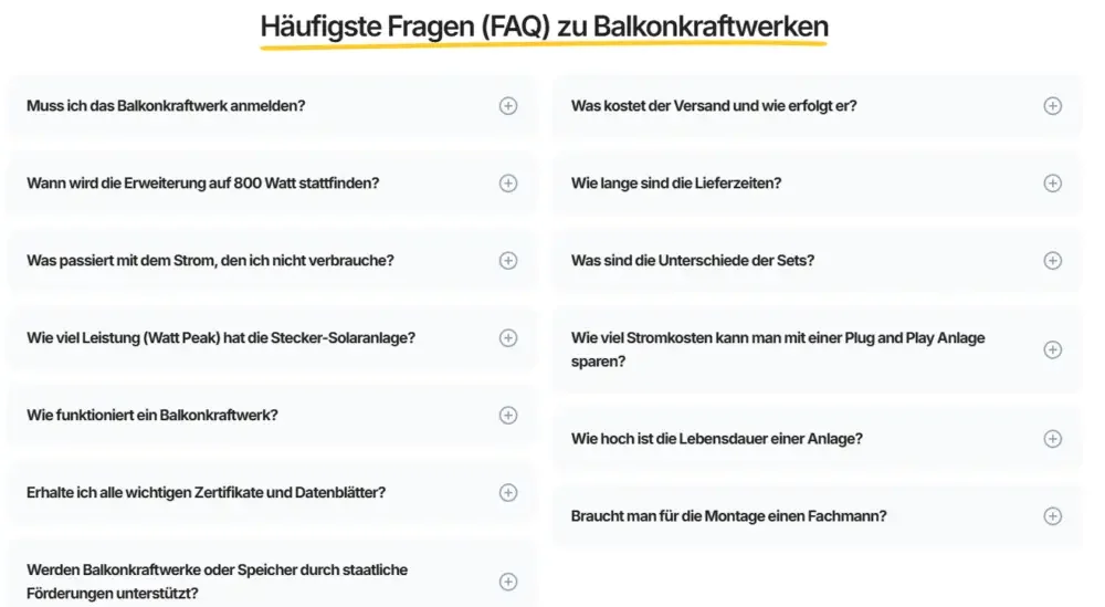
We’ve redesigned the FAQ module to focus on:
Respond to common purchasing concerns
Solve problems that consumers may have in advance.
Explain regulatory requirements
Help users understand the usage regulations that may be involved in different regions.
Emphasis on simple installation
Reduce users’ concerns about the difficulty of installing solar equipment.
Explain product compatibility
Help users confirm whether different equipment, accessories and installation environments are suitable.
We use a folded accordion structure to keep the content neater and prevent the page from becoming overly long and crowded.
customer support display
We’ve added a more visible customer support module.
Contact CTA
Allow users to quickly access consultation channels.
Professional support tips
Highlighting the brand can provide assistance with product selection and installation.
Friendly brand tone
Reduce the sense of professional distance that new energy products bring to users.
Energy products typically require more confirmation before purchasing, so we made customer support more accessible throughout the site.
Mobile-first Shopify design
More and more consumers will learn about new energy products through mobile phones, so the mobile experience is also an important part of this design.
We have mainly made the following optimizations:
Simplify content stacking order
Rearrange the order of mobile modules so that key content appears first.
Optimize button size
Make sure your CTA button is easier to click on mobile.
Reduce vertical visual burden
Control the height of individual modules to reduce fatigue caused by long scrolling.
Show trust information in advance
Put important certifications, reviews and other content in a higher position.
Shorten body paragraphs
Split long paragraphs of text into content more suitable for reading on mobile phones.
The mobile terminal as a whole still maintains the same conversion logic as the desktop terminal, but reduces browsing pressure through a more compact information structure.
Project results and transformation performance
After the website was launched, the overall optimization effect was clearly reflected.
Major performance improvements
Add to cart interaction improvement
More users are willing to enter the purchasing process.
Increased time spent on product pages
Users can gain a deeper understanding of the product.
Package selection becomes clearer
The differences between different solar packages are easier to understand.
Improved home page interaction performance
Users are more likely to continue browsing after entering the website.
Bounce rate reduced
Websites can convey brand values faster and reduce the number of users who leave immediately after entering the page.
Most importantly, the redesigned Shopify website can convey stronger brand professionalism, credibility and product value when users enter the page, making Solakon’s solar products easier to understand and more conducive to subsequent purchase conversions.