Project overview
This project is a series of store posters designed for home furnishings and Halloween products for Shopee Philippines. Through differentiated scenes, clear selling points and unified visual language, it highlights product functions and festive atmosphere, and enhances store professionalism, product attractiveness and consumer browsing experience.
| Services | Industry | Platform |
| shopee store design | Home | shopee |
| Project requirements | target market | design style |
| Improve click-through rate | Global | Scenery and atmosphere |
| project budget | Delivery content | Delivery time |
| ¥450 | 6 shopee posters | 4 working days |
Project Challenges
The core challenge of this project was to simultaneously handle the two distinct visual styles of home furnishings and Halloween products. We not only need to ensure that various products have a design language that suits their own consumption scenarios, but also maintain the overall professionalism and unity of the Shopee store. At the same time, we highlight the main body of the product, core selling points, and usage scenarios within the limited poster space to avoid excessive information that affects consumers’ quick browsing and understanding.
1. Rotating jewelry storage box: Use exquisite scenes to establish a sense of product value
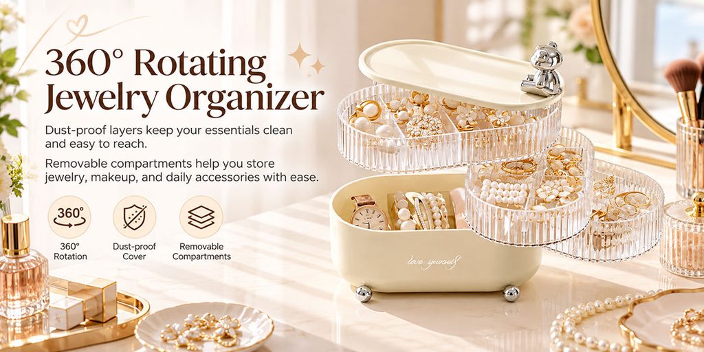
The first poster shows a 360° rotating jewelry storage box.
For this type of product, we did not simply place it on a solid color background, but placed it on a dressing table scene so that consumers can understand how the product is actually used at first glance. The overall color scheme of the picture is cream, off-white and gold, and daily necessities for women such as mirrors, perfumes, jewelry and makeup brushes are added to visually establish a refined, luxurious and comfortable living atmosphere.
We placed the product on the right side of the screen and directly displayed the internal structure of the product by unfolding multiple rotating storage layers. This design can solve two problems at the same time: on the one hand, consumers can understand the rotating structure of the product without reading a lot of text; on the other hand, the multi-layer expansion form can enlarge the product capacity, making the “storage capacity” itself a visual selling point in the picture.
The left side is used to carry the title and core information.
We use “360° Rotating Jewelry Organizer” as the main title and match it with three core selling points: 360° rotation, dust cover, and removable partitions. Rather than piling all the parameters into the screen, we prefer to screen the three selling points that are easiest for consumers to perceive and pair them with simple linear icons.
This layout method is very suitable for Shopee horizontal banner because consumers usually scan the page quickly. We need to allow users to complete the judgment of “what product is this – what does it do – and why is it worth clicking” within a few seconds.
2. Desktop storage box: use bright colors to attract young consumers
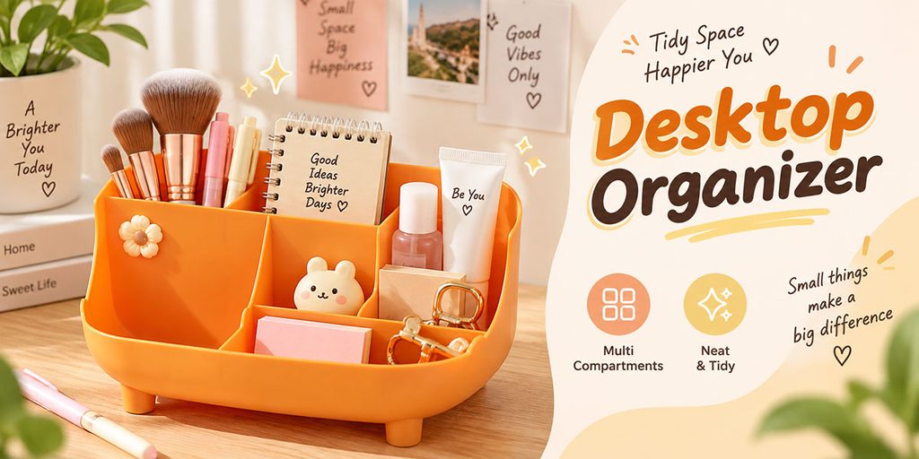
The product on the second poster is a desktop multifunctional storage box.
Different from the elegant visual style of jewelry storage boxes, we use a younger and more lively orange system for this product. The product itself has an obvious orange appearance, so we did not deliberately change the color of the product. Instead, we used the warm light in the environment, the wooden desktop, and yellow and orange auxiliary elements to make the product naturally integrate into the scene.
Products are displayed on the left side of the screen, and different items such as makeup brushes, notepads, skin care products, keys, and stationery are placed in each section.
The core purpose of this design is to allow users to intuitively see that the product can not only be used as a cosmetic storage box, but also as a desktop stationery storage, key storage and daily sundry organization tool. Compared with only displaying empty products, it is easier for consumers to understand the product capacity and usage after loading actual supplies.
A more relaxed text layout is used on the right side of the screen.
“Desktop Organizer” uses a combination of large fonts in orange and dark brown, and adds handwritten decorative text, such as “Tidy Space, Happier You” and “Small things make a big difference.”
We deliberately use this type of copywriting that focuses on lifestyle, rather than completely parameterized selling points, because desktop storage itself is a daily necessities with a low decision-making threshold. Consumers often buy it not for a certain complex function, but because they want their desktop to look tidier and more comfortable.
Therefore, we use a relaxed, bright, and approachable visual language to make the product closer to young women, students, and desk storage users.
3. Transparent clothing storage box: highlighting capacity, tidiness and space management
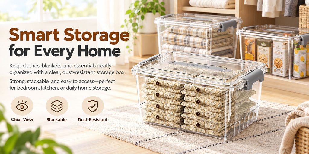
The third poster shows a transparent clothing storage box.
The core of this type of product is not the sense of decoration, but the capacity, transparent visibility, stacking ability and dust-proof effect. Therefore, we did not use too many fancy elements, but placed the scene in a real home cloakroom and bedroom environment.
The main product is placed in the right foreground and packed with neatly folded knitted clothing. At the rear, stacked storage boxes and transparent boxes containing food and daily necessities are added to enhance the multi-scenario attributes of the product through actual use.
When consumers see this image, they can immediately think of clothing, blankets, bedroom supplies and even food storage without us having to write a ton of additional explanation.
The title “Smart Storage for Every Home” directly establishes the home storage positioning.
Below the title, we use two short paragraphs of copy to explain that the product can help organize clothing, blankets, and household items while highlighting its transparent, stackable, and dust-proof features.
The three icons at the bottom correspond to Clear View, Stackable and Dust-Resistant respectively.
We put these three selling points at the end of the visual reading path because users will look at the product first, then the title, and finally quickly confirm the function. This kind of information sequence is more in line with the browsing logic of e-commerce banners, and also avoids the problem of “a lot of words but not prominent products” in posters.
4. Halloween lanterns: Use light to create a festive atmosphere
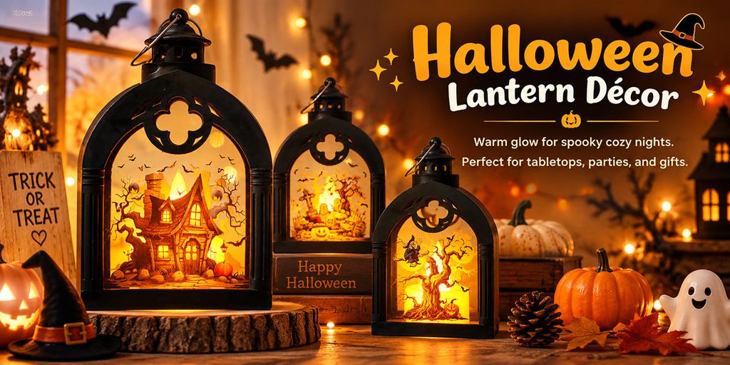
Starting from the fourth shot, we completely switched the visual system to a Halloween theme.
The first Halloween product was a decorative lantern.
For holiday products, consumers are not only buying the product itself, but also buying a scene and atmosphere. Therefore, instead of displaying it with a normal white background, we directly set up a Halloween night scene.
The picture uses black, orange and warm yellow as the main colors, and adds pumpkin lanterns, ghost ornaments, bats, fallen leaves, candles and light strings.
The three lanterns are arranged in different sizes, allowing consumers to clearly see the product shape, while forming a visual rhythm from large to small.
We focused on enhancing the warm yellow luminous effect inside the lantern, making “what it looks like after lighting up” the main visual.
The title uses “Halloween Lantern Décor” and uses an orange-yellow font to be consistent with the light source inside the lantern. Only a simple scene description is retained below without adding too many parameters, because this kind of product relies more on visual appeal rather than complex functional descriptions.
Consumers need to be attracted by the atmosphere first, and then be interested in clicking and purchasing.
5. Halloween witch headband: let the product become the protagonist of the style
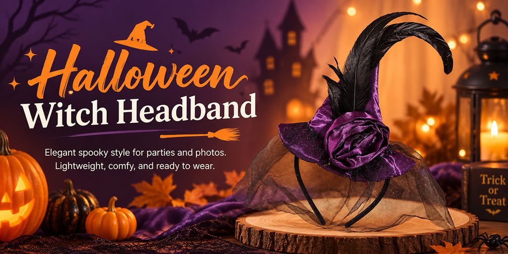
The fifth poster shows a witch-themed headband.
This type of product belongs to party, cosplay and festival wear accessories, so we focus on “styling” rather than functional parameters.
The product is placed on the right side of the picture and elevated through a wooden display stand, making the hairband the absolute subject of the picture. Purple velvet, black feathers and mesh itself have strong Halloween visual attributes, so the background uses a combination of purple and warm orange to form a clear contrast between warm and cold.
The title “Halloween Witch Headband” on the left occupies a large visual area and is decorated with hats, brooms and starlight.
We did not add complicated icons, but used short sentences such as “Elegant spooky style for parties and photos” and “Lightweight, comfy, and ready to wear” to emphasize the party, photo taking and wearing scenes.
For this type of clothing accessories, consumers pay more attention to “whether it has an atmosphere when worn”, “whether it is suitable for taking pictures” and “whether the shape is obvious”. Therefore, we chose to convey product positioning through scenes and font styles instead of stacking ordinary parameters.
6. Spider Bracelet: Enhance details and wearing effect
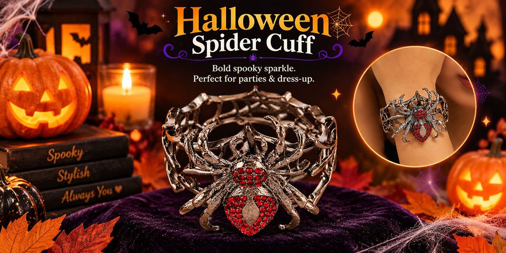
The final poster shows a Halloween spider bracelet.
The biggest visual selling point of this product is the spider structure and red gem decoration, so we made the product appear in the center of the picture in a close-up manner.
A deep purple velvet base complements the metal while allowing the red gemstones to stand out. Add jack-o’-lanterns, candles, bats, spider webs, and fall leaves around to make the product naturally fit into the Halloween theme.
Different from the previous headband, this poster not only displays the product itself, but also adds a circular wearing effect window.
This is a very important design detail.
If jewelry products only display still life, it will be difficult for consumers to judge the proportions and visual effects after wearing them. After adding the wrist wearing diagram, users can quickly understand the size, coverage and actual shape of the bracelet.
The title “Halloween Spider Cuff” is placed at the top of the frame and layered through orange, white and purple. The main text only retains “Bold spooky sparkle” and party wear-related copy to keep the message concise.