Project overview
The client of this project is a peripheral retail brand for animation enthusiasts and collectors. It mainly sells figures, comics, audio-visual products and different animation IP-related products. As products and series continue to increase, it is difficult for the original page to take into account the content level, product classification, and visual rhythm. Users are prone to information congestion when browsing. Therefore, the customer came to us and hoped to refer to the visual logic of mature animation malls to redesign a set of e-commerce pages with more immersion and conversion capabilities. The project is based on the Salesforce Commerce Cloud platform. We focused on the design of homepage visuals, promotional displays, product classifications, IP series navigation, and user browsing paths to balance the visual impact of animation culture with a clear shopping experience, helping users find products of interest faster and improving overall purchasing efficiency.
| Services | Industry | Platform |
| Website design and decoration | Home department store | shopify |
| Project requirements | target market | design style |
| Establish a professional and unified brand official website image | Global | Trendy sense | Animation sense | Immersive sense |
| project budget | Delivery content | Delivery time |
| ¥6800 | Website construction and full-site page design | 18 working days |
https://www.crunchyroll.com/store
Project Challenges
The core challenge of this project is to avoid cluttering the page while maintaining strong enough visual appeal and shopping efficiency when a large number of animation IPs, product categories and promotional information coexist. We need to solve problems such as unclear information level on the homepage, lack of clear distinction between different series, too many product entries leading to scattered browsing paths, and difficulty in balancing brand atmosphere and conversion goals. In the early stage of the project, we first sorted out the customer’s existing product structure, core animation IP, key promotion categories and target users’ purchasing habits, and analyzed the page layout and visual performance of similar animation malls. On this basis, we re-planned the content sequence, classification logic, main visual rhythm and product display method of the homepage to establish a clear and unified visual and content framework for subsequent designs.
Clear and uncluttered product discovery path
After the main visual on the first screen completes the task of attracting the user’s attention, the page needs to naturally transition from “event promotion mode” to “product browsing mode”. Many e-commerce websites often lose their sense of structure at this stage because they add too many sections with the same weight at the same time, making it difficult for users to judge which content deserves priority attention.
To avoid this, we designed the entire product discovery process into clear discovery tiers.
The first level: promotional products
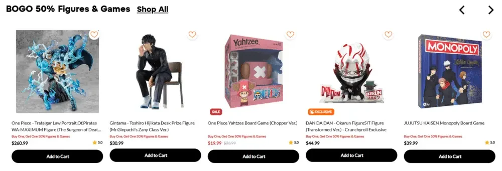
We place discount-oriented product combinations at the front of the page. When user interest is still high, we can first attract price-sensitive visitors and push them to make purchase decisions faster.
Design focus
By highlighting discounted products, limited-time offers or key promotions, users can quickly see attractive price information before entering in-depth browsing, thereby increasing conversion opportunities.
Second level: Browse by category
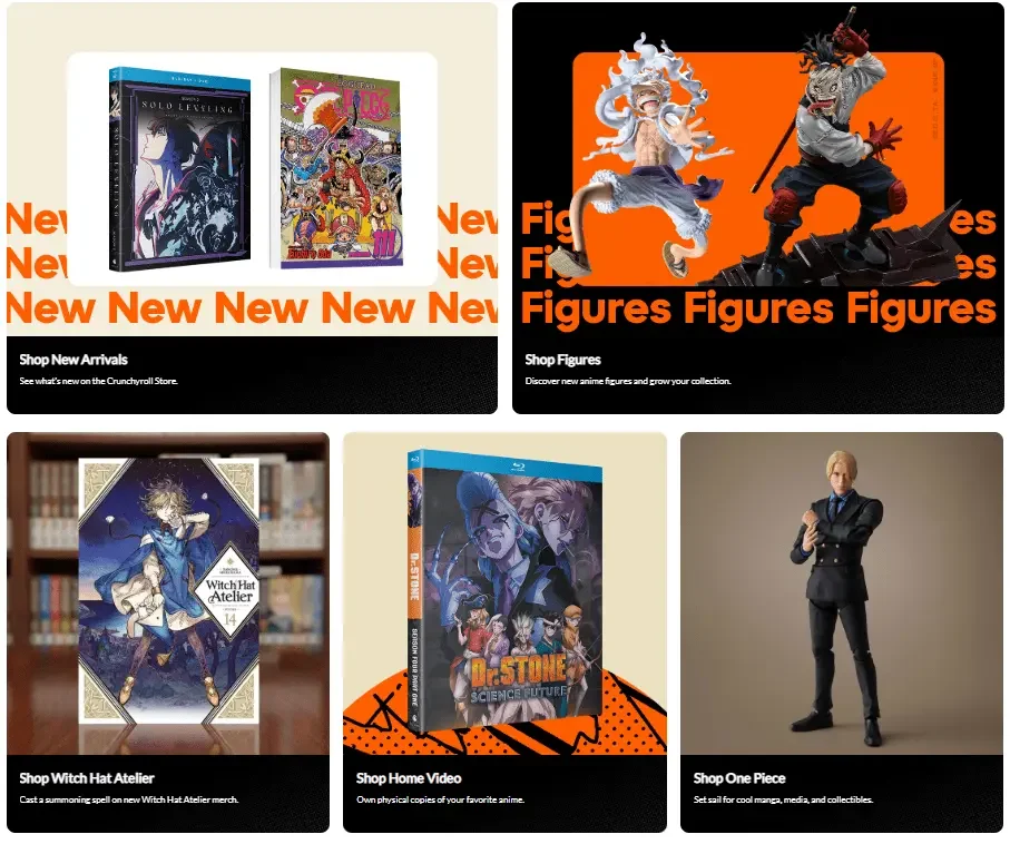
We use larger visual modules to showcase key product categories such as comics, figures, and home video products.
These sections are more like different product areas in a physical store, allowing users to quickly enter the corresponding categories according to their purchasing needs.
Design focus
Compared with simply stacking products, we emphasize clear category divisions to give the page a clearer browsing direction and reduce the information pressure caused by the simultaneous appearance of a large number of products.
Third level: Explore by anime series
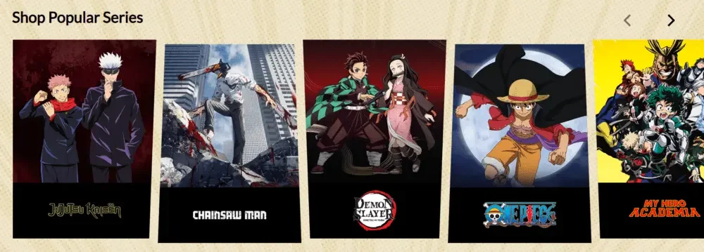
The shopping habits of anime users are different from those of ordinary retail consumers. Many fans often identify with a certain work or IP before deciding what specific product to buy.
Therefore, we added an entrance centered on anime series, so that different works can have a clear browsing path like independent brands.
Design focus
Establish entrances through popular animation IPs, work series and character themes, allowing users to directly enter related product collections from their favorite works, enhancing the interest-driven browsing experience.
Level 4: Trust and Member Value
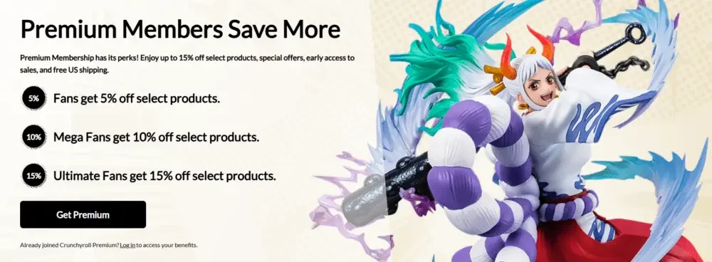
After completing the visual attraction and product exploration, we gradually transition the page content to trust building and member value display.
Such a rhythm can make the entire homepage experience more complete, rather than just focusing on promotions and merchandise sales from beginning to end.
Design focus
Through member rights, service guarantees, brand advantages and other trust information, it provides users with further confirmation before purchasing, reduces decision-making concerns, and strengthens the long-term brand value.
Establish a logical browsing rhythm
Through the hierarchical structure of “promotional products – product categories – animation series – trust value”, the page can naturally guide users from interest to exploration, and then from exploration to purchase decision.
This design method not only reduces page clutter, but also gives different content a clear priority, making the entire shopping path smoother and rhythmic.