Project overview
The client of this project is a cross-border ecommerce seller specializing in children’s educational toys and fun interactive products. It mainly sells products to overseas consumers through the Temu platform. This time, the client wanted to focus on promoting a children’s story projection flashlight, but the original material was not complete enough in terms of selling point level, usage scenarios, and product gameplay expression, making it difficult to quickly reflect the product’s differentiated advantages, so it approached us for a complete set of product visual design. The customer hopes that we can plan a set of primary and secondary product images suitable for Temu’s browsing habits around core selling points such as “bedtime stories, fun projections, children’s interaction, 64 patterns, and simple operations”. We combine real children’s bedroom scenes, cartoon projection effects, product displays and size operation instructions to establish a complete visual system from product recognition to scene experience, functional selling points and parameter information, so that consumers can more intuitively understand product gameplay and value.
| Услуги | Industry | Платформа |
| temumain product image design | Home department store | temu |
| Project requirements | target market | design style |
| Improve click-through rate | Глобальная | Childlike and lively · Warm and dreamy · Interactive scenes |
| project budget | Delivery content | Delivery time |
| ¥500 | 6 temumain product images | 5 working days |
Project Challenges
The core challenge of this project is how to let consumers understand the gameplay of this children’s story projection flashlight at first glance in Temu’s fast-browsing shopping environment, while avoiding cluttering the screen with a large number of cartoon patterns, functional selling points and parameter information. In the early stage of design, we first sorted out the product materials, slide content, size parameters and operation methods provided by the customers, and analyzed the consumption scenarios and visual characteristics of the children’s toy category, extracting core selling points such as “story projection, bedtime companionship, 64 patterns, fun cognition, and simple operation”. We then re-planned the information level of the six primary and secondary product images, distinguishing different tasks such as product display, children’s usage scenarios, projection gameplay, content quantity and size operations, etc. Through unified colors, fonts and composition language, the entire set of visuals maintains a childlike atmosphere while clearly and efficiently conveying product value.
The first one: Quickly explain what the product is
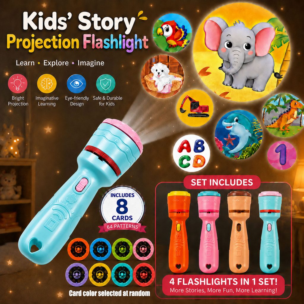
The first one takes on the most important task in the entire set of Temu product pictures – letting consumers understand the product at first glance.
Therefore, we placed the Blue Story projection flashlight in a large proportion at the bottom left of the screen, and used an oblique composition to make the product extend from the bottom left to the top right. Compared with ordinary vertical placement, this angle is more dynamic and naturally guides consumers to move their eyes from the product to the projected pattern on the upper right.
We focus on displaying projection effects such as elephants, parrots, puppies, dinosaurs, dolphins, letters and numbers in the upper right area of the screen. Even without reading the detailed description, consumers can quickly understand: this is not an ordinary lighting flashlight, but a children’s story toy that can project different cartoon patterns.
The title directly uses “Kids’ Story Projection Flashlight” to clarify the four core attributes of children, story, projection, and flashlight. “Learn · Explore · Imagine” is further added below, extending the product from simple toys to cognitive, exploration and imaginative scenarios.
In the selling point area, we use four circular icons of different colors to express brightness, imaginative learning, child-friendly visual experience and durable attributes respectively. Compared to large blocks of text, icons help Temu users scan information quickly.
The bottom of the screen focuses on strengthening “8 Cards / 64 Patterns”. This is important information for consumers to judge the richness of the product, so we not only use numbers to emphasize it, but also directly display multiple color slides, turning the “64 patterns” from abstract numbers into real content that can be seen.
A four-color product combination is added in the lower right corner to allow consumers to quickly understand the content and color differences of the set.
Therefore, the first picture is not simply to “put all the selling points in”, but to complete four layers of information transmission including product definition, gameplay display, content quantity and package in one picture.
Picture 2: Creating a real bedtime story scene
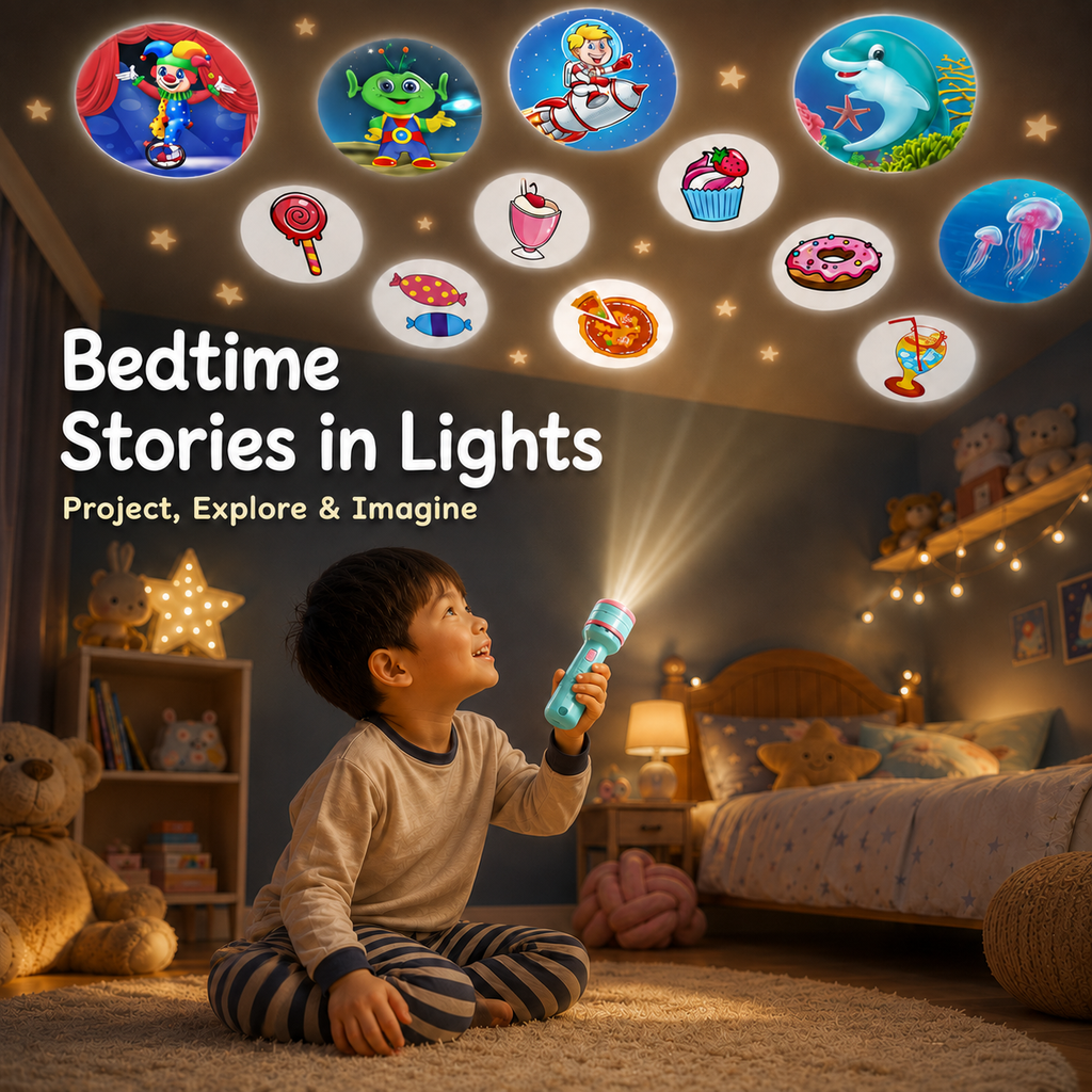
When consumers already know what the product is, the second picture no longer repeats the parameters, but answers another more important question:
“In what situations would a child use it?”
We chose the children’s bedroom as the core scene, letting the children sit on the soft carpet and hold a projection flashlight to project patterns on the ceiling. Warm yellow bedside lamps, plush toys, beds, and star lighting together create a warm bedtime atmosphere.
The biggest design focus of this piece is not the product, but the “experience”.
We kept the flashlight real and visible, but appropriately reduced the visual proportion of the product in the entire screen, leaving more space for the child’s expressions, projected beams, and patterns on the ceiling.
The action of children looking up at the projection allows consumers to directly understand how to use the product. At the same time, different themed patterns such as circus, aliens, astronauts, dolphins, jellyfish and desserts are distributed on the ceiling, turning the originally static product display into an imaginative children’s world.
On the left side, “Bedtime Stories in Lights” is used as the core copy to further transform the “projection” into the emotional value of “bedtime stories”.
This kind of scene-based expression is especially important for children’s toys. What parents buy is not just a plastic flashlight, but a bedtime companionship, a way of parent-child interaction, and a process for children to explore stories and patterns.
Therefore, the role of the second picture is to allow consumers to move from “understanding the product” to “imagining using the product.”
The third picture: Highlight the core gameplay of changing patterns
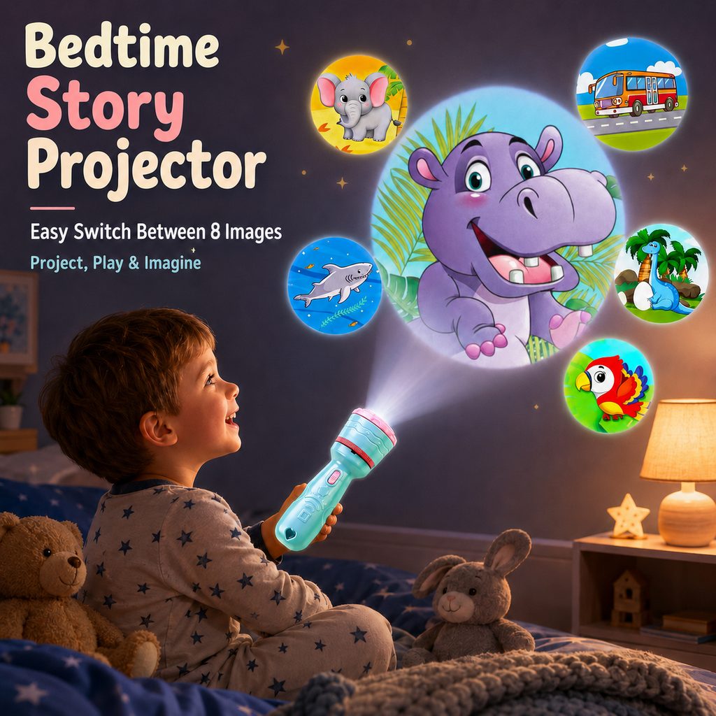
The third picture continues to use the children’s bedroom, but we re-adjusted the composition and visual emphasis to avoid a high degree of repetition in the entire set of pictures.
We had the child sit on the edge of the bed holding a blue projection flashlight with a visible beam of light connected to a giant hippopotamus projection on the wall.
The hippopotamus becomes the largest visual focus of the picture, and is surrounded by smaller projected patterns such as elephants, buses, sharks, dinosaurs and parrots.
This size relationship is very important.
If all graphics were the same size, consumers would just see a cluttered set of cartoon elements. Through the structure of “one main projection + multiple auxiliary projections”, we allow consumers to first understand the projection effect, and then further discover that the product has multiple patterns.
Use “Bedtime Story Projector” in the upper left corner to establish product positioning, and highlight “Easy Switch Between 8 Images” below to further inform consumers that they can switch to different content by operating the product.
This one actually serves as a “gameplay explanation”.
The first one tells consumers that “there are many patterns”, the second one tells consumers that “it can be played in the bedroom”, and the third one further tells consumers that “these patterns can be switched”.
This way each image has its own informational mission, rather than simply repeating the product’s selling points.
Picture 4: Strengthen the sense of warm companionship and child-friendliness
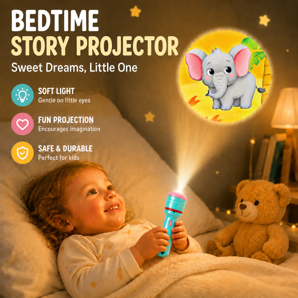
The fourth picture further reduces complex information and focuses on the interaction between children and products.
The picture uses a large area of warm yellow light. The child is lying on the bed holding a projection flashlight with both hands, and a bright elephant pattern appears on the wall. A nearby stuffed bear, bedside lamp and soft bedding further enhance the bedtime environment.
Compared with the second and third pictures, this one is more emotional marketing.
We use “BEDTIME STORY PROJECTOR” and “Sweet Dreams, Little One” as a title combination to make the product more directly related to bedtime companionship.
Only three core information modules remain on the left: Soft Light, Fun Projection, Safe & Durable.
We did not continue to add a large number of parameters because at this stage consumers have already understood how the product works and what they need is a clearer reason to buy.
In terms of visual design, we use three circular icons of blue, green, pink and yellow to echo the blue and pink color of the product itself. Different colors help users quickly distinguish information without destroying the warmth of the bedroom scene.
At the same time, the projection beam naturally extends from the flashlight to the elephant pattern on the wall, forming a complete visual link between “product-beam-projection result”.
Consumers don’t need to read instructions to understand how a product works.
This method of using screens to explain functions is more suitable for fast-browsing e-commerce platforms like Temu than simply adding text.
The fifth picture: concentrated display of 64 patterns
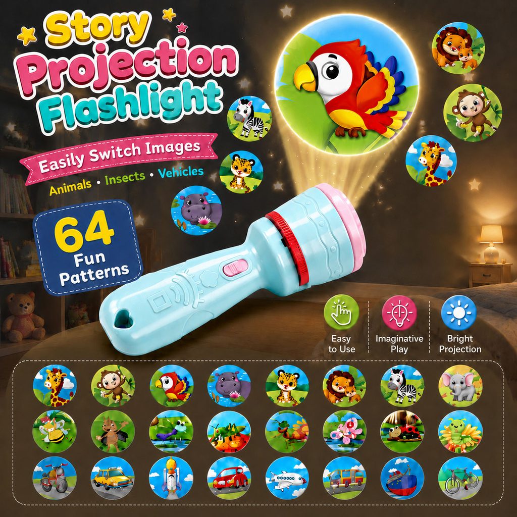
For story projection toys, the number of slides directly affects consumers’ judgment of product richness and playability, so the fifth one is specifically designed around “content quantity”.
This one once again makes the product the visual subject.
We placed the blue projection flashlight in the center of the screen in a horizontally tilted manner, showing the appearance, pink switch, red rotating structure and top projection components through a larger product scale.
A brightly colored parrot is used as the main projection effect above, and a yellow beam of light is used to connect the product with the pattern.
Small cartoon projections such as zebras, hippos, leopards, lions, monkeys and giraffes are then distributed around, allowing consumers to quickly feel the richness of the content.
On the left side of the screen, focus on “64 Fun Patterns”.
Here we deliberately make the number “64” a strong visual element, because numbers are easier for consumers to capture in a quick glance than descriptive copy.
Below, different projection contents such as animals, insects, and vehicles are arranged in a neat matrix.
This part is not only “displaying quantity”, but also showing “content classification”.
Consumers can quickly see motorcycles, cars, planes, buses, bicycles, as well as different animals and insects, thereby understanding that this product does not have a single story theme, but has multiple cognitive categories of interest to children.
Therefore, the fifth picture solves a very practical problem for consumers:
“Will the child run out of new content after playing it a few times?”
Through the centralized display of 64 patterns and different themes, we make the playability of the product more intuitive.
Picture 6: Use size and operating instructions to reduce purchasing concerns
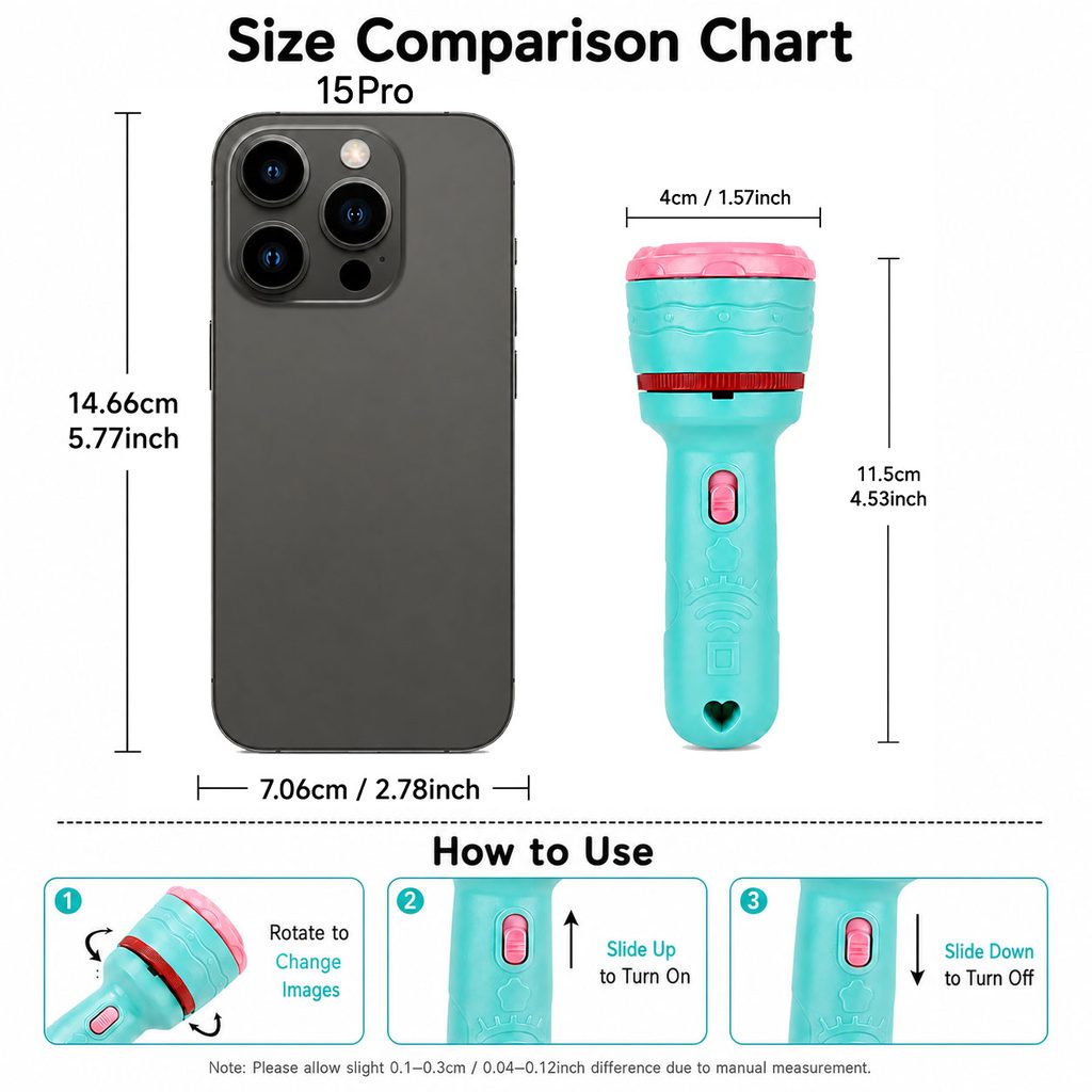
The first five pictures are mainly responsible for attracting and convincing consumers, while the sixth picture returns to more rational product information.
We use a large white background to reduce all scene elements and allow consumers to focus on size and operation.
A mobile phone is added as a size reference on the left, and a story projection flashlight is placed on the right to establish an intuitive perception of volume through side-by-side comparison.
The product is marked with a height of about 11.5cm and a width of 4cm. At the same time, reference through mobile phones helps consumers understand that the product is a small-sized toy that children can easily hold.
Simply marking “11.5cm” is actually difficult for consumers to form an accurate concept, and the familiar mobile phones in life can quickly establish a proportional reference.
The lower part of the screen uses three steps to explain the operation method.
The first step shows the rotating top structure switching picture; the second step shows pushing the switch upward to turn on the product; the third step shows pushing the switch downward to turn off the product.
We use partial product close-ups and arrows instead of adding complicated text instructions to make the operation method as clear as possible.
The visual style of this one is obviously simpler than the previous five, but that’s exactly what we intended.
E-commerce images do not need to have exactly the same scene complexity. Scene diagrams are responsible for establishing emotions, functional diagrams are responsible for explaining selling points, and parametric diagrams should be fast, accurate, and clear.
Only by allowing different images to perform their respective duties can the entire set of Temu product visuals form a complete information link.