Project overview
The client sells bags and lifestyle peripheral products with Sanrio, Hello Kitty, Cinnamoroll and other cute IP elements as the core, and hopes to further enhance the overall visual performance of the Shopee store. Since the products in the store cover multiple categories such as travel bags, storage bags, card books, pencil cases and desktop decorations, the original materials still have room for improvement in terms of unified style, expression of product selling points and creation of scene atmosphere. Therefore, the customer came to us and hoped to design a set of store posters with a unified brand sense for different products. We carry out visual planning around “cuteness, healing, girlishness, and daily companionship”. While keeping the main body of the product clear, we enhance the attractiveness of the products through soft color matching, life-like scenes and cartoon elements, helping the store establish a clearer and more unified visual image on the Shopee platform.
| Услуги | Industry | Платформа |
| shopee store design | Shoes and bags | shopee |
| Project requirements | target market | design style |
| Improve click-through rate | Глобальная | Cute girl|Healing and refreshing|Sweet handbook |
| project budget | Delivery content | Delivery time |
| ¥450 | 6 posters | 4 working days |
Project Challenges
The challenge of this project is how to highlight the characteristics of each product while maintaining the overall visual unity of the Shopee store when there are many types of products and rich character elements. Bags, pencil cases, card albums and desktop decorations have obvious differences in size, color and usage scenarios. Without unified planning, it is easy to cause cluttered pages and duplicate selling points. In the early stage of design, we first sorted out the product type, core functions, role IP, main colors and target consumer groups, and analyzed the life scenes and information key points suitable for different products to be presented, and then unified the fonts, color matching, decorative elements and layout logic. Finally, through differentiated composition and unified visual language, each poster not only has an independent selling point, but also can jointly form a complete and identifiable store image.
1. The first poster: Use “desktop cuteness” to establish the first visual impression
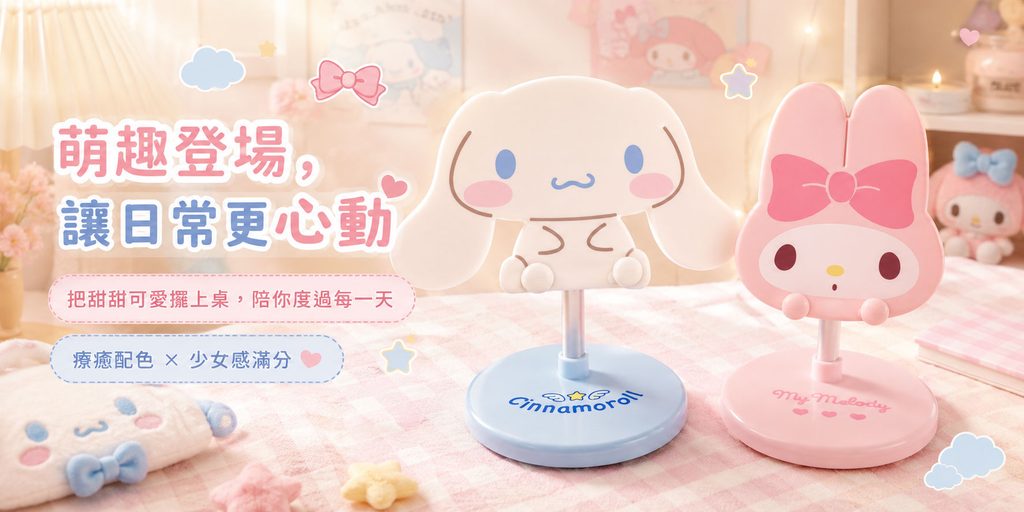
The first poster showcases Cinnamoroll and My Melody style table centerpiece products.
In this picture, we first placed the two core products on the right side of the picture, and used the colors of one blue and one pink to form a very natural visual combination. The light blue of Cinnamoroll and the pink of My Melody are a very typical girly combination, so we did not use strong background colors, but chose cream pink, light beige and natural warm light as the basis of the scene.
This treatment allows the product to remain prominent while preventing the background from stealing the subject.
We added elements such as plaid tablecloths, cartoon pillows, dolls, small stars, and bows to the scene. These details are not simple decorations, but constantly strengthen the visual association of “girls’ room”, “cute desktop” and “healing daily life”.
In terms of text, we use “Cuteness comes on the scene, making daily life more exciting” as the main title.
This title does not directly emphasize the function, but first emphasizes the emotional value, because the core reasons for purchasing such tableware are often “like”, “cute” and “want to put it on the table”.
Below, add auxiliary copy such as “Put sweetness and cuteness on the table to accompany you every day” to transform the product from a simple item into a “daily companion”.
Visually, we use pink and blue alternating typography to make the title color echo the two products, and use white strokes to improve the readability of the text on a soft background.
Therefore, this poster mainly plays the role of “emotional attraction” in the store.
2. The second poster: Use dark blue to create a more collectible product atmosphere
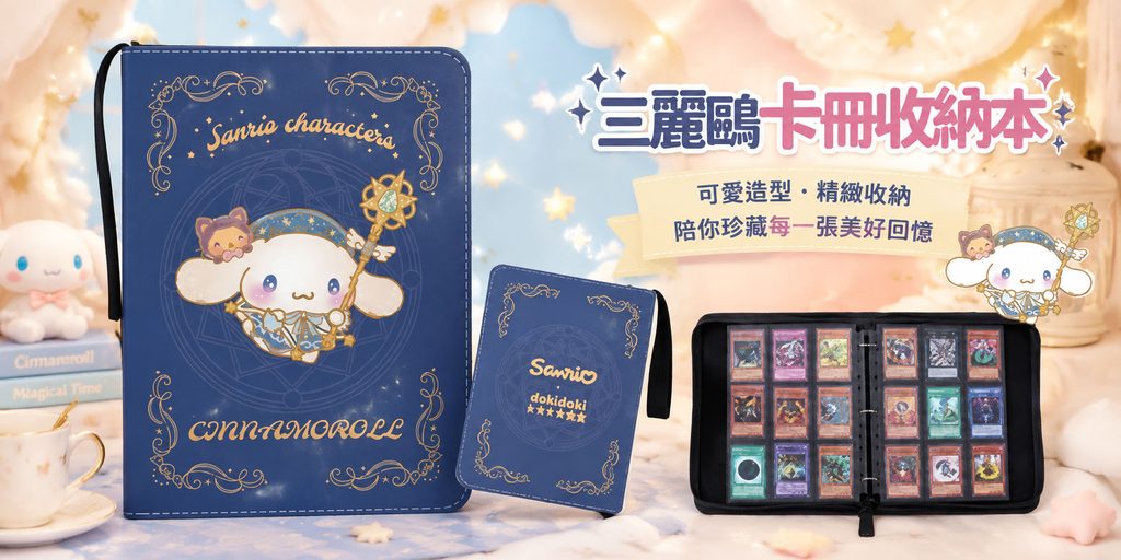
The second poster shows Sanrio card storage products.
Compared with the light and sweet girly style of the first picture, this product itself uses a large area of dark blue with gold decoration, so we did not continue to use the pure pink route, but adjusted the overall atmosphere to a “dream collection feeling”.
Place the largest main body of the card book on the left side of the screen and make it the strongest visual focus. In the middle, smaller card books form a hierarchy of sizes, and on the right side, the open internal structure is shown.
Such a picture completes three information expressions at the same time:
Appearance, specifications and actual storage effect.
Consumers can quickly understand how to use the product without entering the product detail page.
In the background, we use blue sky, clouds, stars, soft light and cream furniture to make the dark blue products look less heavy and at the same time enhance the feeling of “magical world” and “dream collection”.
In the title design, we use “Sanrio Card Book Storage Book” to directly tell consumers what the product is. Compared with the emotional title of the first picture, this picture adopts a clearer category expression, because storage products require more rapid delivery functions.
Next, add text such as “Cute styling and exquisite storage” and “Treasure every beautiful memory with you”.
We deliberately put “storage” and “treasure” together to let consumers feel that it is not only used to organize cards, but also to save their favorite characters, collections and memories.
Such expressions can further enhance the emotional value of the product beyond its functionality.
3. The third poster: showing the feeling of using the travel bag through real life scenes
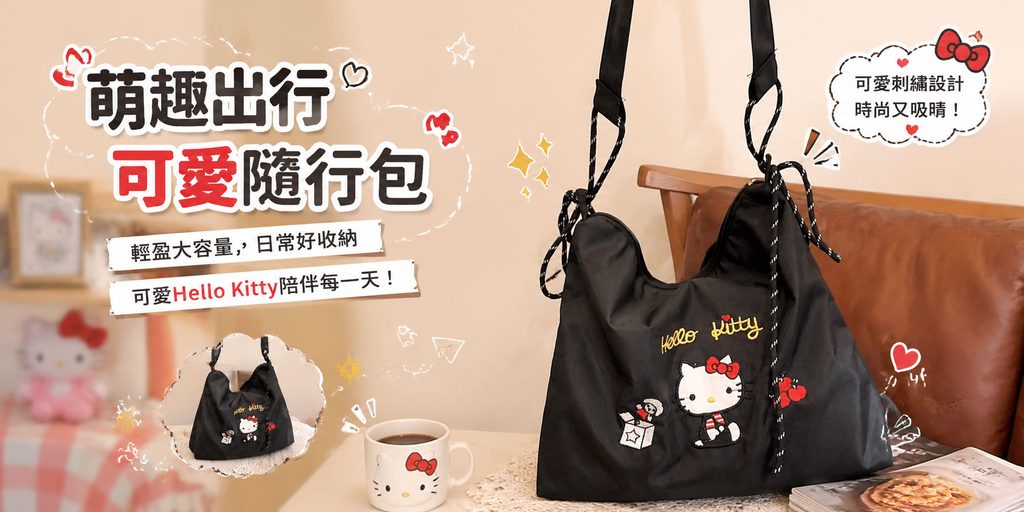
The third image shows the black Hello Kitty carry-on bag.
Since the product itself is dark in color, it can easily appear heavy if placed directly on a solid background. Therefore, we chose a warm beige home scene and added wooden chairs, coffee cups, magazines and other elements.
These life-like props can make black bags naturally blend into the environment, while creating a relaxed and daily use atmosphere.
In terms of composition, we let the bag occupy most of the area on the right side, and fully display the shoulder strap, bag mouth and embroidery pattern, so that consumers can quickly judge the size and appearance of the product.
The copywriting is concentrated on the left side, and the information hierarchy is established through obvious headlines.
“Cute travel, cute travel bag” not only contains product attributes, but also conveys usage scenarios.
After consumers see the words “travel” and “accompanying”, they will naturally think of commuting, shopping, traveling or daily outings.
“Light and large capacity, easy to store every day” below further complements the functional value, while “Cute Hello Kitty accompanies every day” once again strengthens the emotional value brought by the IP.
We also added hand-drawn lines, bows, hearts and small illustrations to reduce the visual hardness caused by large black products.
The point of this picture is to let consumers see that “black bags can also be very cute.”
4. The fourth poster: Use blue bags to create a relaxed and fresh travel atmosphere
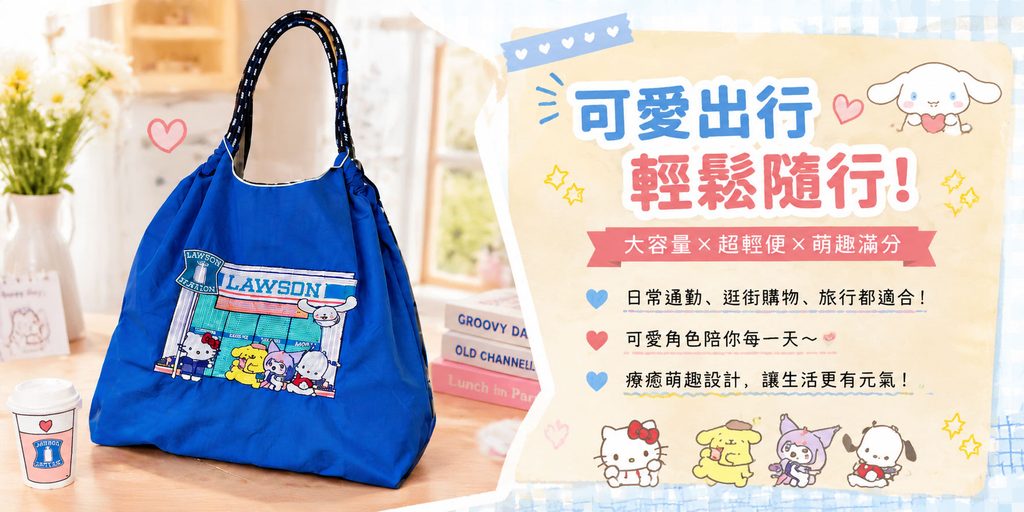
The fourth poster shows a blue large-capacity bag.
Compared with the previous black product, this blue bag itself has a stronger visual presence, so we placed the product on the left side of the picture, allowing the highly saturated blue color to directly attract consumers’ attention.
The background uses sunny windows, wooden tables, green plants and soft natural light to create a very fresh and comfortable living state.
The right side uses a light yellow handbook-style information area.
This type of layout design has two benefits.
First, it can clearly distinguish the product area and the information area.
Second, it is consistent with the overall style of the cute wallet.
The main title “Cute travel, easy to go with!” uses a combination of blue and pink to echo the text color, products and cartoon characters.
A red label is used in the middle to emphasize “large capacity × ultra-lightweight × full of cuteness”, directly concentrating the three most critical selling points into one message.
Below we use three brief instructions, corresponding to:
Use scenarios such as daily commuting, shopping, and traveling;
the emotional value of character companionship;
The overall design brings a living atmosphere.
This structure is very suitable for Shopee pages because users will not read long text carefully when browsing on mobile devices, so we need to make the information quickly understood through short sentences and obvious hierarchy.
The addition of multiple Sanrio character illustrations at the bottom also further strengthens the IP atmosphere of the entire screen.
5. The fifth poster: Use multi-color display to enhance the sense of choice of stationery bags
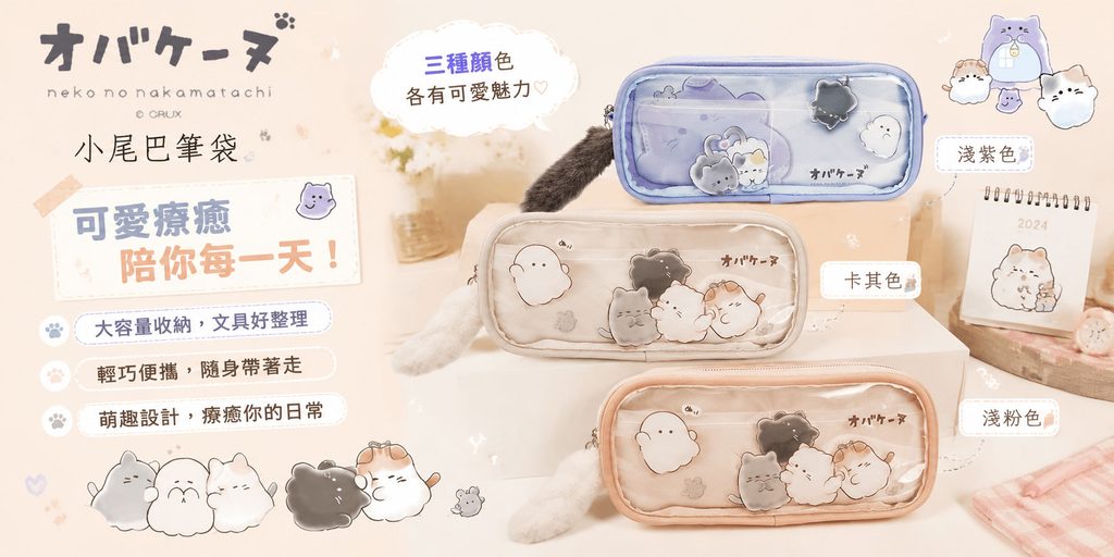
The fifth picture shows a cat-themed pencil case.
Different from the previous bag products, the core selling point of this product is not only the cute design, but also a variety of color options.
So instead of showing just one product, we put in three versions at the same time, including light purple, khaki and light pink.
In terms of composition, we arranged the three products vertically, allowing consumers to quickly understand the attributes of the series through color differences.
Add color name tags on the right side: “Light Purple”, “Khaki” and “Light Pink” to prevent consumers from making their own judgments.
The left side is mainly responsible for the description of the brand, product name and core selling points.
“Large storage capacity, easy to organize stationery”, “Lightweight and portable, take it with you” and “Cute design, healing your daily life” respectively correspond to the practicality, portability and emotional value of the product.
We added calendars, desktop stationery, soft plush elements, and light cream space in the background to make the pencil case look like it actually exists in a student or young woman’s desktop environment.
The overall color is kept low in saturation, allowing the three products to naturally become the visual center.
This picture focuses on “how to display multiple colors at the same time without appearing cluttered.”
By uniforming sizes, uniform angles and vertical arrangement, we allow the three SKUs to have independent display space while maintaining a sense of series.
6. The sixth poster: Create a complete sense of store selection through multiple products
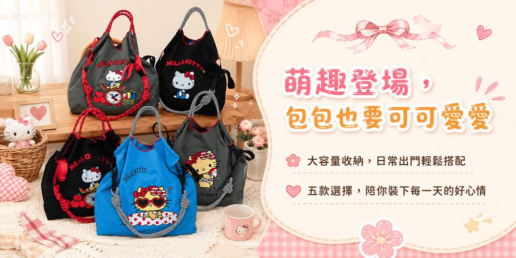
The sixth image shows a variety of Hello Kitty style bags.
This picture is different from the previous single product poster. It plays more of a “series display” and “enriched selection” role.
Therefore, we focus on displaying five bags on the left, creating visual richness through different colors, different embroidery patterns and different shapes.
In order to avoid multiple products appearing cluttered when placed together, we use a unified home environment as the background and create a complete life scene through elements such as desktops, flowers, lamps, and plaid cloth.
Although there are a large number of products, they are all concentrated in the same visual area, so consumers can quickly perceive that “this series has multiple options.”
On the right side, a large cream-white information card is used, and girly elements such as pink bows, flowers, and hearts are added.
The title “Cuteness is here, and the bags must be cute,” continues the emotional language of the entire store.
It does not emphasize specific parameters, but strengthens product tone and brand temperament.
The following two pieces of information emphasize “large capacity storage” and “five choices” respectively, directly expressing the information that consumers need to know most.
For Shopee stores, this type of series of posters is very important.
Because it not only displays a single product, but also allows consumers to discover more SKUs, thereby increasing the likelihood of continuing to browse other products in the store.