Project overview
Focusing on the Temu children’s clothing store positioning, we used a soft and childlike visual language, combined with model outfits, illustration elements and life-like scenes to create a set of unified yet varied store posters to enhance product appeal and the overall store atmosphere.
| Услуги | Industry | Платформа |
| temu store design | clothing apparel | temu |
| Project requirements | target market | design style |
| Improve click-through rate | Глобальная | Childlike, dreamy |
| project budget | Delivery content | Delivery time |
| ¥600 | 7 temu posters | 6 working days |
Project Challenges
The core challenge of this project is how to maintain a unified store vision among multiple children’s clothing posters while avoiding the duplication of each picture. The children’s clothing category itself has high requirements for a sense of atmosphere. If there are too many decorative elements, it will easily weaken the main body of the product; if it is too simple, it will be difficult to reflect the childlike interest and store characteristics. Therefore, on the one hand, we unified the watercolor background, hand-painted elements, soft colors and round fonts in the design to ensure that the entire set of posters has a consistent style; on the other hand, through different model matching, scene changes, clothing display methods and layout adjustments, each poster has an independent theme, thus taking into account the overall sense of the store and the appeal of a single picture.
The first picture: Use soft watercolor to create the first impression of the children’s clothing store
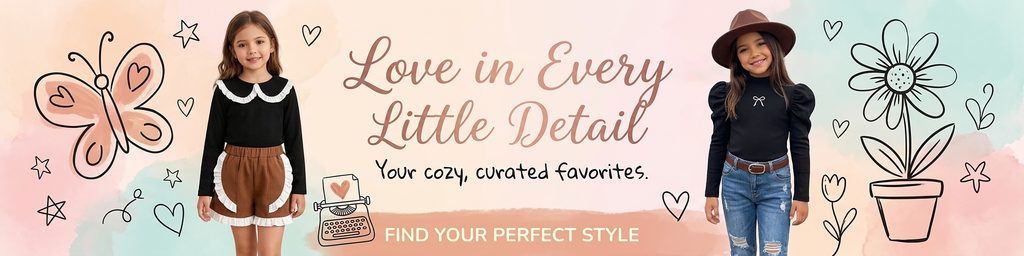
The first poster plays a very important role in establishing the brand atmosphere.
We arranged two girl models on the left and right of the screen, leaving a large area for copywriting in the middle. Such a symmetrical structure allows consumers to notice the characters and theme information at the same time at first glance, and keeps the entire horizontal screen stable.
The background does not use a real street scene, but uses a watercolor effect of light pink, cream orange, light blue and light green. The reason why we designed it this way is because children’s clothing itself is soft, relaxed and friendly. If complex real-life scenes are used, it can easily steal the attention of the product. The watercolor background provides enough visual variation without distracting from the main body of the garment.
Black hand-drawn line drawings such as butterflies, flower pots, flowers, hearts, and stars are added to the left and right sides to give the picture a visual experience similar to that of a children’s picture album.
In terms of product matching, we show girls’ styles that are more retro and sweet and more casual and street-oriented. The girl on the left wears a black top with brown shorts and white ruffles, while the girl on the right wears a black puff-sleeved top with jeans and a hat. Although the two looks are different in style, they are both in the same soft visual system.
The “Love in Every Little Detail” in the center further strengthens the core of what we want to convey – children’s clothing is not just clothes, but a lifestyle formed around growth, daily life and details.
Therefore, the task of this poster is not to emphasize a single product parameter, but to help the store quickly establish a warm, delicate, and childlike first impression.
The second picture: Enhance the vitality of boys’ clothing through city and park scenes
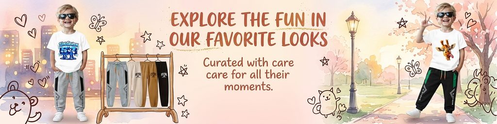
The second poster has a clear shift towards casual clothing for boys.
In order to distinguish the first picture from the girlish, soft and dreamy vision, we added elements such as urban buildings, parks, trees, street lights and clothing display racks to give the picture a more obvious atmosphere of outdoor activities.
The boy on the left is wearing a white printed T-shirt, gray sweatpants, and sunglasses; the boy on the right is also wearing a white graphic T-shirt, but with black and green sweatpants and a hat. Between the characters on both sides, we added a hanger to hang a variety of children’s trousers.
This arrangement serves two purposes.
First of all, consumers can not only see how the models dress, but also directly see more colors and styles, which enhances the richness of the store’s products.
Secondly, hangers can naturally combine “character scene posters” and “product display posters”, making the entire picture more in line with the sales attributes of e-commerce stores.
The background still uses the language of watercolor, but instead of continuing to use purely abstract color blocks, we depict cities and parks. This can make the child’s wearing status more realistic and make it easier for parents to think of specific usage scenarios such as after school, walking, and weekend outings.
The title “EXPLORE THE FUN IN OUR FAVORITE LOOKS” uses a bolder and livelier font, which is also consistent with the vitality of boys’ sweatpants and graphic T-shirts.
With this image, we began to expand the entire Temu store vision from simply “cute” to “everyday, vibrant and wearable.”
The third picture: Use the left and right models and the central display to create a complete girl’s outfit series
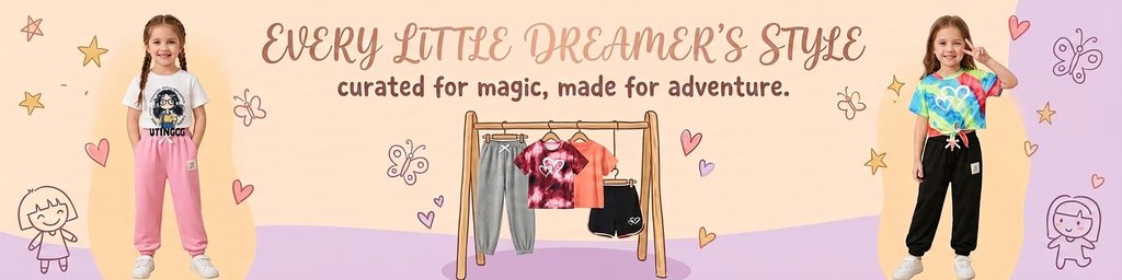
The third poster goes back to girls’ clothing, but we don’t replicate the structure of the first one.
This time we use a more clear three-stage layout of “left figure – middle display – right figure”.
The girl on the left is wearing a white printed T-shirt and pink sports trousers, while the girl on the right is wearing a colorful tie-dye top and black sports trousers, forming an obvious contrast in color and style on both sides.
The central hanger displays gray sweatpants, tie-dye T-shirts, orange T-shirts and black shorts simultaneously, allowing consumers to quickly understand that this collection does not have just one look, but includes multiple pieces that can be combined.
The background uses large-area curved color blocks of cream orange and light purple, and adds hearts, butterflies, stars and children’s character illustrations.
Compared with the first picture, this picture reduces the complex watercolor edges and adds flatter color blocks, making the product display clearer.
“EVERY LITTLE DREAMER’S STYLE” serves as the main title, linking clothing with girls’ growth, imagination and individual expression.
We hope to tell consumers through this poster: children’s clothing is not a smaller version of adult fashion, but should allow children to have more vivid and free colors and matching methods.
So whether it’s a pink pantsuit, a tie-dye T-shirt or sporty shorts, we put them all into the same relaxed, dreamy girl world.
Photo 4: Magnifying the features of girls’ printed products through flowers and butterflies
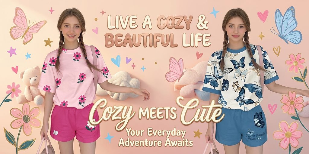
The fourth poster is the most visually sweet in the entire series.
We chose two older girl models and showed a pink floral T-shirt with rose-red shorts, and a blue-and-white butterfly pattern T-shirt with blue shorts.
The biggest design focus here is to have the background elements directly echo the clothing print.
The clothing on the left uses flower patterns, so we add pink flowers, plush dolls and soft cloud shapes to the background; the clothing on the right uses a lot of butterflies, so we add blue butterflies, pink butterflies and related decorations to the background.
Doing so creates very clear visual associations.
Even if consumers have not looked at the clothing carefully, they will first feel the keywords such as “flowers”, “butterflies”, “girls”, “spring and summer” and “relaxation” through the entire poster.
The title “LIVE A COZY & BEAUTIFUL LIFE” is placed in the top center, with large fonts reflecting the lifestyle theme, while “Cozy Meets Cute” below further reinforces the balance between comfort and cuteness.
We did not add too much price, discount or parameter information, because the main task of such pictures is to highlight the product pattern and overall style, rather than undertake complex information transmission.
For a Temu store, a poster like this would be perfect as a visual entrance to a girls’ print collection, spring/summer new arrivals or a casual children’s collection.
Picture 5: Use white space to enhance the sense of series and high-end
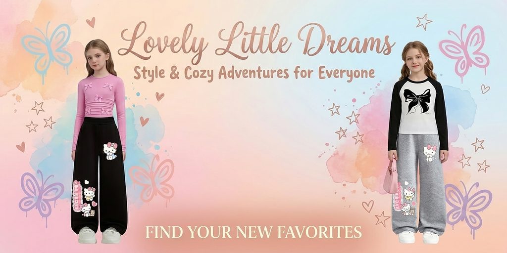
The fifth poster is significantly more restrained than the previous ones.
A model is placed on the left and right sides of the screen, leaving a large area of blank space in the center, with only copywriting placed at the top and bottom.
This type of layout can effectively alleviate the visual fatigue caused by multiple consecutive high-information posters.
The model on the left wears a pink long-sleeved top paired with black wide-leg pants, while the model on the right wears a black and white patchwork top paired with gray loose pants. Both outfits are centered on trousers, so we reduced the complex physical objects in the background, allowing consumers to focus on the fit, leg length and overall proportion.
The background uses light pink, light blue, cream and light purple watercolors, and includes line drawings of butterflies and stars.
The models are distributed left and right, leaving space in the middle, which also creates an obvious sense of visual breathing.
“Lovely Little Dreams” at the top and “FIND YOUR NEW FAVORITES” at the bottom echo each other. In this way, we guide consumers’ attention from the title to the characters, and then to the action copy below.
This image embodies something we attach great importance to throughout the project: children’s clothing design can be cute, but every poster shouldn’t be filled with decorations.
Appropriate white space can actually enhance the sense of value of the product and allow the entire set of store pages to have a rhythm change when browsing continuously.
Picture 6: Enhance the sense of social interaction and youthful atmosphere through character movements
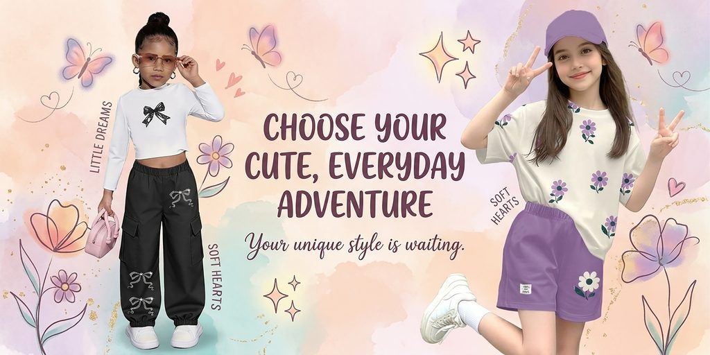
The sixth poster further strengthens girls’ daily wear and personality expression.
The girl on the left wears a black and white bow cropped long-sleeved top, black cargo pants and a pink handbag, while the girl on the right wears a floral T-shirt, purple shorts and a purple baseball cap.
Different from the relatively static standing postures in the previous photos, the model on the right makes a “V” gesture with her hands and lifts one leg, giving the picture obvious movement.
We added this gesture to let consumers feel the relaxed state of the clothes when they are actually worn on their children, rather than just a mere clothing catalog photo.
The entire background continues to use the watercolor language of pink, purple, cream and light green, while adding flowers, butterflies, hearts, glitter symbols and a small amount of gold texture.
Use “CHOOSE YOUR CUTE, EVERYDAY ADVENTURE” as the main copy in the middle.
The key words here are not “fashion”, but “everyday” and “adventure”. Because in children’s clothing purchasing decisions, in addition to appearance, parents usually also care about whether their children can wear it naturally in daily life, outings, playing and socializing.
Therefore, we used more relaxed movements and compositions to weaken the sense of traditional commercial advertising and make the poster more like children’s lifestyle content.
Picture 7: The three-square structure enhances the sense of single product wear and social content
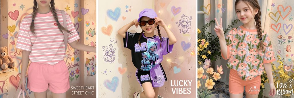
The seventh poster is different from other horizontal posters in that we use a combination of three vertical scenes.
The girl on the left wears a pink and white striped T-shirt with pink shorts, the girl in the middle wears a black and purple colorblock print suit, and the girl on the right wears a floral print T-shirt with orange shorts.
The three looks have distinctly different visual personalities, so rather than forcing them into one setting, we created a small scene for each outfit.
The left side highlights the sweet street feel, the middle highlights the trend and fun, and the right side emphasizes the floral and natural atmosphere.
Short copywriting such as “SWEETHEART STREET CHIC”, “LUCKY VIBES” and “LOVE & BLOOM” correspond to three styles respectively.
This design approach is perfect for the collection recommendation area in Temu stores, because consumers can quickly scan through different outfits and find their favorite direction as quickly as browsing social media content.
At the same time, vertical segmentation also increases the number of products that can be carried per unit screen.
Instead of adding complicated price tags, we let people, products and keywords be the main messages, making the picture more branded content rather than traditional promotional advertising.