Project overview
The client is FunnyFuzzy, a pet lifestyle brand targeting the global market. It mainly sells pet beds, clothing, toys and related daily necessities. It is positioned at the mid-to-high end and its core consumer group is pet owners who regard their pets as family members. With the rapid growth of brand business, the original website was gradually unable to meet development needs in terms of brand expression, product classification, user browsing experience and conversion paths. Therefore, we came to us and hoped to re-optimize the overall e-commerce visual and page experience.
The project was carried out based on the Shopify platform. The client hoped to improve the visual performance of the homepage, product discovery efficiency, trust and mobile shopping experience while retaining the warmth and friendly tone of the brand, and establish a more unified and sustainably expanded website design system. We carry out overall planning around brand story, category navigation, product display, trust module and conversion path, so that the website not only assumes the product sales function, but also delivers the brand value more completely.
| Услуги | Industry | Платформа |
| Website design and decoration | pet supplies | Shopify |
| Project requirements | target market | design style |
| Improve brand influence and user experience | Глобальная | Warm and healing, lively and fashionable, lifestyle sense |
| project budget | Delivery content | Delivery time |
| ¥18600 | Website construction and full-site page design | 24 working days |
Project Challenges
The core challenge of the project was to retain the warm and friendly visual tonality of the pet brand while solving the problems of the original website’s unclear information level, numerous product categories, easy-to-clutter pages, and insufficient trust building among new users. We also need to take into account the mobile browsing experience of global users so that users can understand the brand, find products and complete purchases more quickly. Before starting the project, we first sorted out the existing Shopify website structure, core product categories and user browsing paths, and analyzed the page performance, visual style and conversion logic of similar pet e-commerce brands. On this basis, we re-planned the homepage information level, product display sequence, trust module and CTA path to establish a unified direction for subsequent visual design and entire site optimization.
Home Page Design: Core Conversion Engine
Hero Above the Fold: Quickly Build Emotional Connections
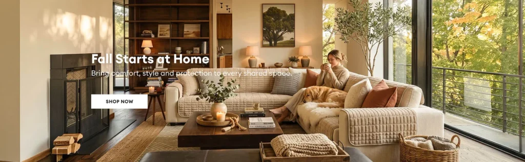
The design goal of the first screen of the homepage is to let users feel the warm atmosphere and lifestyle attributes of the brand for the first time.
Design focus
- Use large-sized, high-quality pictures of pet life scenes
- The title copy should be concise but have enough visual impact
- Set a clear, primary CTA such as “Buy Now”
- Maintain reasonable white space to avoid visual information overload on the page
This part serves as the emotional entrance for users after entering the website, laying the foundation for the browsing experience and brand atmosphere of the entire website.
Category Navigation: Replace Complexity with Clarity
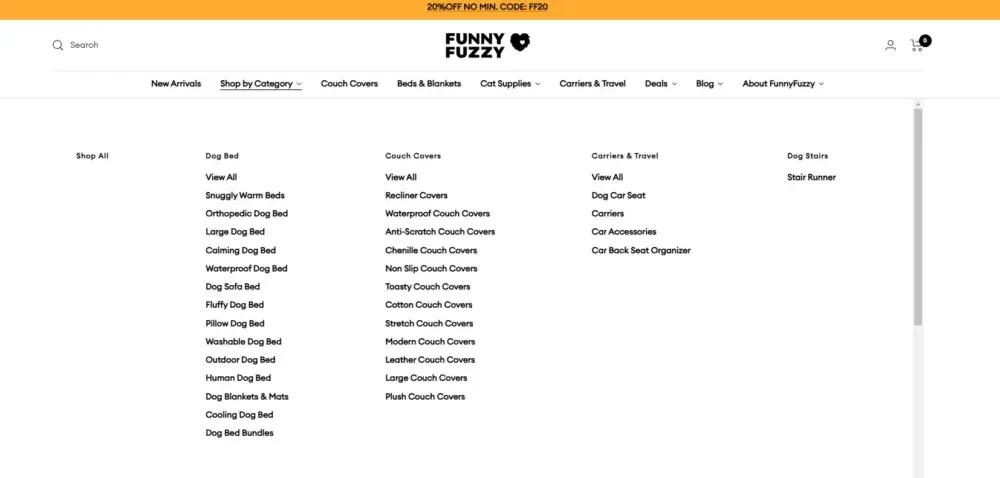
Rather than presenting users with too many choices at once, we adopt a more concise and intuitive classification grid layout.
Classification design includes
- Clearly distinguish different product categories, such as pet beds, pet clothing, pet toys, etc.
- The category cards maintain a unified design and add soft shadows and rounded corners.
- Use visual guidance to help users naturally enter different product categories for browsing.
This design approach reduces users’ cognitive load while encouraging them to continue exploring the site content.
Product recommendation module: improve user interaction and browsing depth
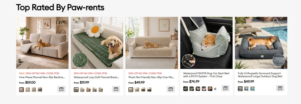
We have designed clearly structured product display modules for different sales needs, such as:
Core product modules
- Hot products
- New product launch
- Featured Series
Each product module contains a unified and clear visual structure.
Product card design
- Simple product cards and clear information hierarchy
- Users can quickly view prices, ratings and core selling points
- Uniform spacing and alignment
The design goal is to enable users to quickly scan and compare products while maintaining visual consistency throughout the page.
trust building module
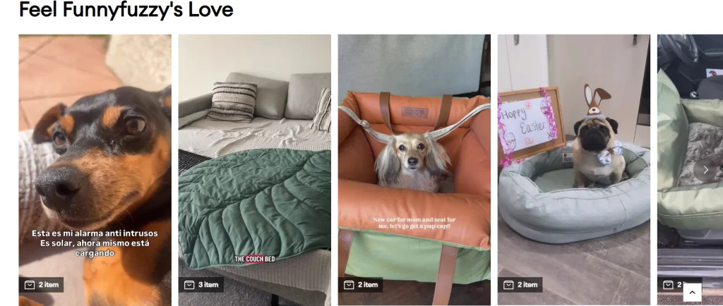
For users who visit the website for the first time, trust will directly affect purchase conversion, so we have added a variety of trust elements to the homepage.
Trust elements include
- Customer Reviews and Product Ratings
- User-generated content (UGC) images
- Trust marks for delivery, returns and quality assurance, etc.
These contents are reasonably distributed in different locations on the homepage, continuously strengthening the brand’s credibility without interrupting the user’s browsing rhythm.
Beyond the homepage: other core page designs
Product product detail page (PDP)
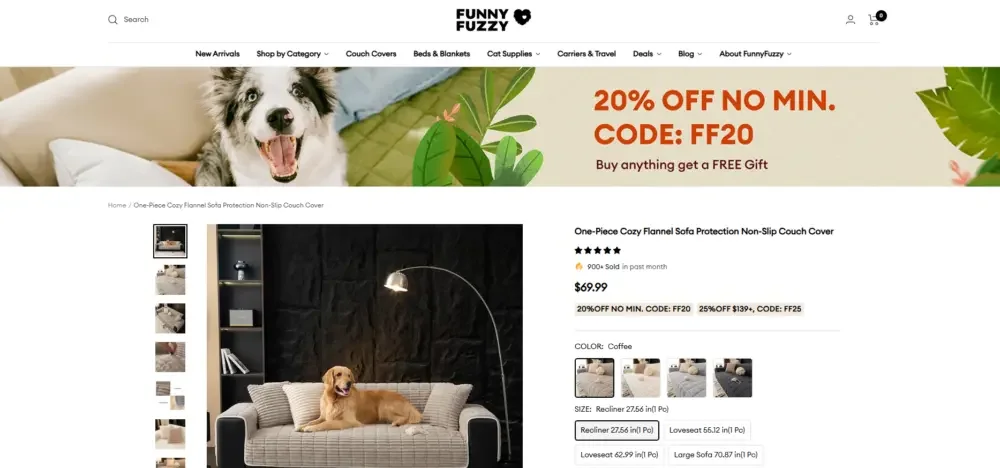
The core goal of the product detail page is to help users understand the product more quickly and complete purchasing decisions.
Page design focus
- Clearly display product images from different angles
- Establish a clear information hierarchy based on functions, benefits, specifications, etc.
- Highlight the “Add to Cart” button
- Use Lifestyle Scenario Maps to Strengthen the Emotional Value of Your Products
Our focus is on increasing the clarity and persuasiveness of information, rather than overwhelming users with too much complex information.
Product collection page
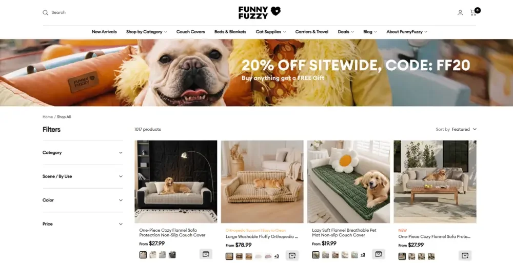
Product collection pages need to take into account both browsing efficiency and overall visual performance.
Optimization direction
- Use a clean and unified product grid layout
- Maintain consistent spacing between product cards
- Provides filtering and sorting functions to facilitate users to quickly find products
- Improve users’ browsing intention through stable visual rhythm
Through these optimizations, users can quickly find products that meet their needs at lower operating costs.
Мобильный опыт
Considering that a large amount of traffic comes from mobile devices, we prioritized the mobile experience during the design process.
Mobile optimization focus
- Optimize image size and visual experience when loading
- Navigation and CTA buttons in more thumb-friendly locations
- Simplify the page structure and establish a clear vertical browsing path
The mobile terminal as a whole continues the visual language of the desktop terminal, while improving operating efficiency and readability for small screen usage scenarios.
Our approach: Design-focused thinking
Clarity, Trust, Transformation
Every design decision in a website is centered around three core principles.
clear
Once users enter the website, they should be able to quickly understand what products and services the brand offers.
доверять
The entire website needs to continue to convey a professional and reliable brand image through visuals, content and page structure.
Convert
The path from product browsing to final purchase should be as smooth as possible, reducing unnecessary operational friction.
visual consistency system
In order to form a unified brand experience throughout the website, we established a consistent visual design language.
Unified design includes
- Unified font hierarchy
- A controlled color system that matches the brand positioning
- Standardized page spacing
- Consistent component structure and presentation
This consistency enhances brand recognition while increasing users’ sense of familiarity and trust in the website.
Emotional storytelling through design
Rather than relying solely on text descriptions, we place more emphasis on conveying brand stories and emotions through visual content.
visual storytelling
- Interactive lifestyle images using real pets
- Use warm colors and soft visual contrast
- Use a balanced, breathing page layout
- Maintain the right balance between approachability and sophistication
This design method can strengthen the emotional connection between users and the brand, allowing the website to not only undertake the sales function, but also deliver more complete brand value.