


Introduction: Designing a Store That Sells Feelings, Not Just Products
From a designer’s perspective, this Shopify gift store is built around a single guiding principle: emotional commerce drives faster decisions than functional browsing. Instead of presenting products as isolated items, we designed the entire experience as a continuous narrative of gifting moments, surprise, personalization, and instant gratification. Every section is intentionally structured to reduce cognitive load, shorten decision pathways, and increase emotional engagement.
We focused on creating a layered user journey where visitors first feel inspired, then guided, and finally confident enough to purchase. The store does not rely on complex navigation or overwhelming product catalogs. Instead, it uses storytelling modules, occasion-based grouping, visual-heavy product cards, and conversion-focused product pages to gradually move users from curiosity to checkout.
The sequence of the design follows a psychological flow: emotional hook → contextual discovery → structured browsing → product excitement → purchase confirmation. Each stage is carefully optimized to ensure that users never feel lost, but always feel gently guided forward.
| Срок доставки | Категория | Тип веб-сайта |
| 16 дней | gift | shopify |
| Участники проекта (дизайнеры) | Расходы | Эффект |
| Линь Чжан | $1900 | Sales📈244% |
Hero Section: Building Emotional Impact in Seconds
Visual First Impression Strategy
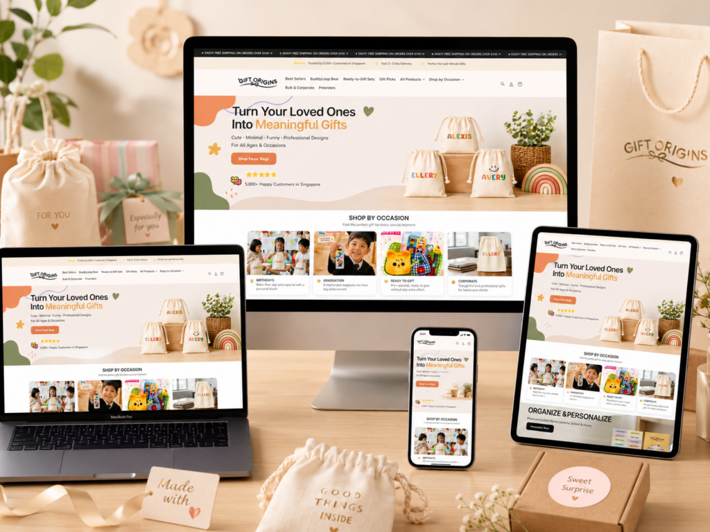
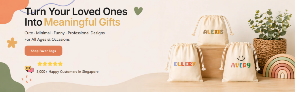
We designed the hero section—“Turn Your Loved Ones Into Meaningful Gifts”—as the emotional anchor of the entire website. The goal is to immediately establish emotional clarity. Users should understand within three seconds that this store is about transforming relationships into tangible, personalized gifts.
The typography hierarchy plays a critical role here. The phrase “Turn Your Loved Ones Into” is kept neutral and grounded, while “Meaningful Gifts” is visually emphasized using a warm accent color. This contrast ensures that emotional intent is highlighted without overwhelming the user.
Product as Lifestyle Storytelling
On the right side of the layout, we intentionally placed real product imagery showing personalized gift bags. This is not decorative—it is persuasive storytelling. Users don’t need to imagine the outcome; they see it instantly. We designed this visual balance so that emotional messaging on the left is immediately validated by real-world product results on the right.
Conversion-Oriented CTA Placement
The call-to-action button is placed within natural reading flow rather than isolated at the top or bottom. This ensures users encounter it after emotional understanding has already been established. Supporting elements like ratings and delivery assurances reinforce trust at the exact moment users are deciding whether to proceed.
Shop by Occasion: Designing Around Real-Life Intent
Structuring Products by Emotional Context
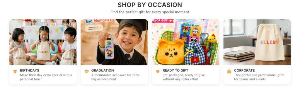
Instead of organizing products by category alone, we designed the “Shop by Occasion” section to align with how people actually think when buying gifts. Users rarely think, “I want a product.” They think, “I need a birthday gift” or “I need something for graduation.”
By mapping products to real-life events like Birthdays, Graduation, Ready to Gift, and Corporate needs, we reduce friction in decision-making. This structure eliminates unnecessary browsing steps and improves conversion efficiency.
Visual Anchoring for Faster Decisions
Each occasion card is designed as a visual storytelling unit. We use expressive photography that immediately communicates emotional context. For example, birthday scenes show children interacting with gifts, while corporate visuals emphasize clean, professional packaging.
This allows users to understand product relevance without reading text. The images act as instant decision shortcuts.
Minimal Copy, Maximum Clarity
We intentionally limited text under each category to a single descriptive sentence. This ensures that the section remains scannable and does not slow down browsing behavior. The goal is to support fast emotional recognition rather than detailed reading.
Organize & Personalize: Functional Design Meets Emotional Trust
Clarity Through Strong Typography Hierarchy
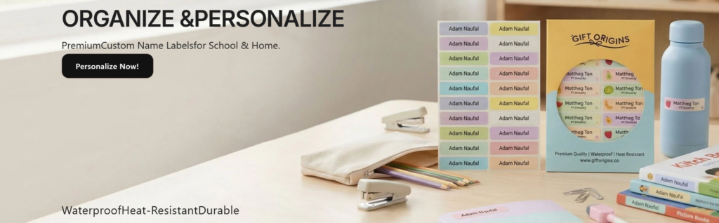
The “Organize & Personalize” section was designed to communicate utility first. The uppercase heading establishes authority and clarity, signaling that this product solves a real-world problem: labeling and organization.
We used a clean left-aligned layout to guide users through information in a predictable reading flow. This improves comprehension and reduces hesitation.
Right-Side Visual Proof System
The right side shows real-life usage scenarios—label sheets, school supplies, and household items. This is intentional visual proof. Instead of telling users the product works, we show it in action.
We designed this section to build trust through authenticity. The visuals are not stylized fantasy renders; they are grounded, real-world applications.
Benefit-Driven Micro Copy
Keywords like “waterproof,” “heat-resistant,” and “durable” are placed as quick-scanning benefits. This allows users to instantly evaluate product quality without reading long paragraphs. It supports fast decision-making behavior typical of mobile-first users.
Best-Selling Products: Social Proof as a Conversion Engine
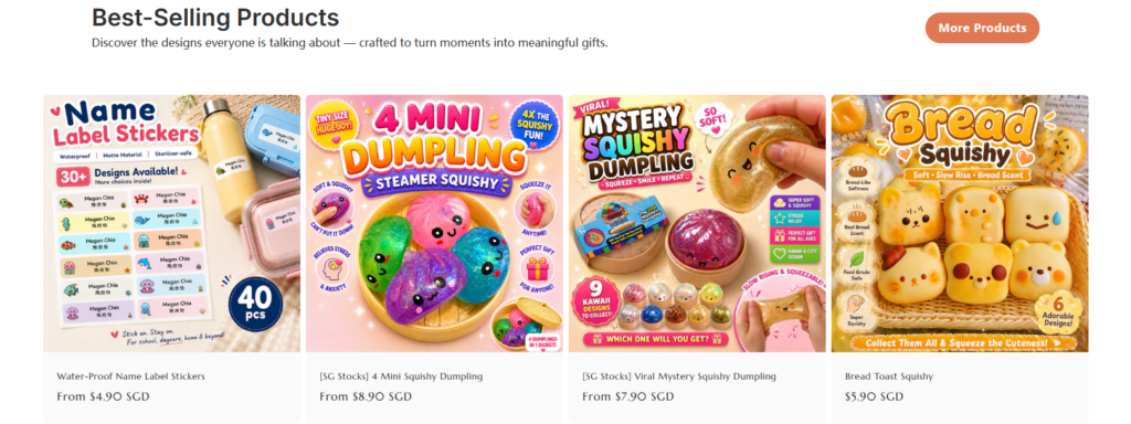
Leveraging Popularity Psychology
The “Best-Selling Products” section is designed to reduce decision anxiety. When users see that an item is labeled as “best-selling,” it signals validation from other buyers. This significantly increases purchase confidence.
We used this psychological principle intentionally to guide first-time visitors toward proven products.
Grid-Based Scannable Layout
Each product card is structured as a mini storefront. Large, colorful images dominate the visual hierarchy because gifting products rely heavily on emotional appeal. Users are not just buying functionality—they are buying excitement.
Pricing and product names are placed consistently below images to support quick scanning and comparison.
Controlled Visual Diversity
We allowed each product thumbnail to maintain its own unique promotional style. This introduces energy and variety into the grid while still maintaining structural consistency. The result is a balanced browsing experience that feels dynamic but not chaotic.
Unbox a Pocket-Sized Surprise: Designing Anticipation
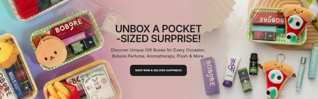
Emotional Trigger Through Typography
The “UNBOX A POCKET-SIZED SURPRISE” section is designed around curiosity. The uppercase headline immediately creates emotional tension and anticipation. Users are prompted to imagine what the surprise might contain before they even see the product details.
Flat-Lay Composition for Discovery Feeling
We used a scattered product arrangement on the right side to mimic the experience of unboxing. Items are visually distributed rather than structured, reinforcing the idea of discovery and surprise.
This composition strategy helps users emotionally simulate the product experience, which increases engagement.
Soft Gradient Background for Emotional Warmth
The background uses soft pastel gradients to create a friendly, gift-oriented atmosphere. This reduces visual harshness and makes the section feel playful and accessible.
Ready to Gift Sets: Reducing Decision Fatigue
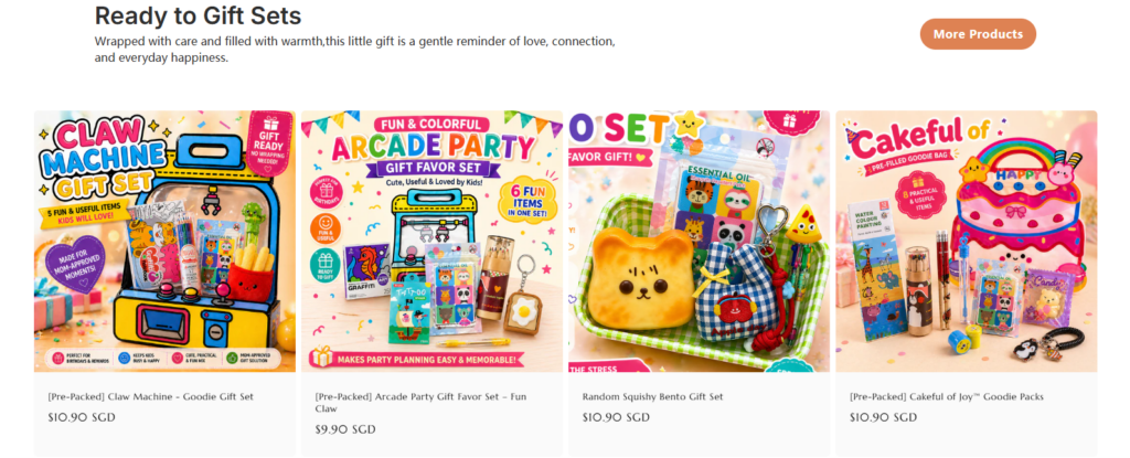
Pre-Bundled Value Proposition
This section is built around a key behavioral insight: users prefer ready-made solutions when under time pressure. By presenting fully assembled gift sets, we remove the need for users to combine or customize products themselves.
Bold Visual Identity for Each Set
Each product card uses highly expressive packaging visuals. The design ensures that users can instantly understand the theme of each set—whether arcade, cute food, or surprise bundles.
Структурированный поток информации
We kept pricing and titles minimal to maintain clarity. The focus remains on emotional impact rather than technical details. This ensures faster browsing and higher engagement.
Pre-Packed Goodie Bags Collection Page: Scaling Discovery
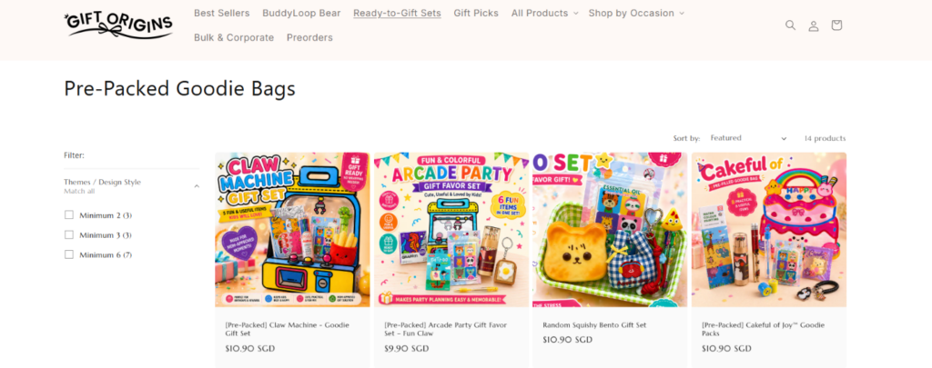
Clean Grid System for High Product Volume
This collection page is designed to handle large inventory without overwhelming users. A consistent grid system ensures visual order even when many products are displayed simultaneously.
Filter System for Controlled Exploration
The filter panel is intentionally minimal. It allows users to narrow down choices without interrupting browsing flow. This is critical for maintaining engagement in large catalog environments.
Persistent Conversion Elements
Elements like WhatsApp support and trust signals are placed strategically to ensure users always have a path to assistance or reassurance during browsing.
Product Detail Page: Converting Intent Into Purchase
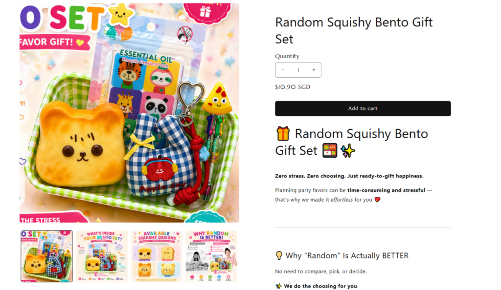
Split-Screen Decision Architecture
The product page uses a left-right structure: immersive imagery on the left and decision-making tools on the right. This mirrors how users naturally process information—first emotionally, then rationally.
Reducing Uncertainty Through Explanation
Sections like “Why Random Is Actually Better” are designed to eliminate doubt. Instead of forcing choice, we frame randomness as a benefit, reducing decision fatigue and increasing trust.
Scannable Product Breakdown
The “What’s Inside” section uses bullet points and icons to allow fast comprehension. Users can quickly evaluate value without reading long paragraphs, which improves conversion speed.
Emotional Reinforcement Blocks
Sections like “Perfect For Busy Parents” connect the product to real-life scenarios. This ensures that users not only understand the product but also imagine themselves using it.
Заключение
This Shopify gift store is not just a product listing platform—it is a carefully structured emotional journey. Every section is designed to guide users from curiosity to confidence through visual storytelling, psychological triggers, and conversion-focused structure. By combining occasion-based navigation, strong product imagery, simplified decision flows, and emotionally driven messaging, the entire experience transforms browsing into an intuitive gifting journey.
In the end, this design demonstrates how modern eCommerce succeeds not by showing more products, but by reducing friction, amplifying emotion, and guiding users through meaningful decision pathways.


Спроектируем и создадим для вас WordPress-сайт или корпоративный сайт с полной системой электронной коммерции.
Ценовой диапазон: от $200.00 до $2,500.00Нестандартные требования или специальные предложения
Первоначальная цена составляла: $2.00.$1.00Текущая цена: $1.00. Дизайн главного изображения для домашнего физиотерапевтического устройства Amazon: пояснения.
Введение: Создание достоверного изображения для домашних терапевтических приборов на Amazon При разработке главного изображения для домашнего терапевтического прибора на Amazon мы в первую очередь...

Дизайн основного изображения для конвертации помады на Amazon.
Введение: Разработка главного образа помады, которая продается на Amazon Когда мы разрабатываем главный образ для помады Amazon, наша ответственность выходит далеко за рамки...

Как хакеры крадут электронные письма администраторов WordPress (и как им это предотвратить)
Начнем с неприятной истины: ваша электронная почта администратора WordPress, вероятно, гораздо более публична, чем вы думаете. А хакеры? Им это нравится. Для них ваш...

Что делает основное изображение жидкой тональной основы Amazon конвертируемым?
Введение. Разработка дизайна основного изображения для жидкой тональной основы на Amazon — это не просто создание красивого внешнего вида продукта. На Amazon основное изображение и...

Разработка эффективного основного изображения Amazon для фильтрующих картриджей
Введение. Разработка основного изображения для Amazon — это не просто создание привлекательного внешнего вида товара. Речь идёт о ясности, доверии и мгновенном понимании, особенно для...

Повторные атаки на WordPress: реальная угроза или преувеличенный миф?
Давайте сначала кое-что проясним. Атаки повторного воспроизведения не выглядят страшно. Они не взламывают пароли. Они не внедряют вредоносный код с зелёным хакерским текстом, разлетающимся повсюду. Они действуют коварно...

Как скопировать страницы WordPress, ничего не сломав
Давайте посмотрим правде в глаза. Иногда вам не хочется создавать новую страницу. Вам нужна та же самая страница… но немного другая. Тот же макет. Те же блоки. Те же настройки. Потому что….

Сравнение пяти тем WordPress для сайтов о домашних животных
Введение. Выбор подходящей темы WordPress для сайтов, посвященных домашним животным, — это не просто решение, связанное с дизайном; оно напрямую влияет на удобство использования, масштабируемость и долгосрочный рост бизнеса. Уход за домашними животными и...

Сравнение пяти тем оформления для интернет-магазинов купальников
Введение. Выбор правильной тематики для независимого магазина купальников или нижнего белья — это не просто визуальное решение, оно напрямую влияет на коэффициент конверсии, масштабируемость и долгосрочную перспективу...

Как отключить комментарии в WordPress (не сойдя с ума)
Давайте поговорим о комментариях в WordPress. В теории комментарии — это здорово. Они стимулируют дискуссии. Они создают сообщество. Они делают ваш сайт “живым”. А на практике? Зачастую они притягивают...

Создание масштабируемого веб-сайта на WordPress для научно-ориентированного бренда: проект AminoUSA
Введение. В современном цифровом пространстве веб-сайт — это больше, чем просто место для размещения информации о товарах. Для научно-ориентированных брендов, работающих в регулируемых или научно-исследовательских отраслях, это….

Создание масштабируемого магазина Shopify для глобального бренда ножей: проект CoolKatana
Введение. В трансграничной электронной коммерции веб-сайт Shopify — это больше, чем просто витрина магазина. Для брендов, работающих в нишевых, ориентированных на культуру категориях, веб-сайт должен делать гораздо больше, чем...

Разработка высокоэффективного магазина Shopify для карточек Pokémon.
Введение. В мире электронной коммерции коллекционных товаров, особенно на рынке коллекционных карточных игр Pokémon, веб-сайт должен делать больше, чем просто перечислять товары...

Высокоэффективный дизайн Shopify для индивидуального бренда стационарной торговой точки.
Введение. В условиях современной конкурентной среды электронной коммерции, особенно в сегменте персонализированных подарков и коллекционных товаров, веб-сайт на платформе Shopify должен делать гораздо больше, чем просто отображать товары. Он...

Как связаться со службой поддержки Shopify: простое и понятное руководство
Управление магазином Shopify должно приносить удовольствие, а не путаницу. Когда возникают вопросы или проблемы замедляют вашу работу, Shopify предлагает несколько вариантов поддержки в зависимости от ситуации...

Как деактивировать магазин Shopify: понятное и практичное руководство
Деактивация магазина Shopify — несложная процедура, но она влечет за собой последствия, которые многие продавцы упускают из виду. В этом руководстве процесс описан простым и понятным языком...

Пример разработки веб-сайта на платформе Shopify для премиального цветочного бренда.
Введение. В условиях современной конкурентной среды электронной коммерции веб-сайт на платформе Shopify должен делать гораздо больше, чем просто отображать товары. Он должен мгновенно передавать ценность бренда, направлять пользователей...

Пример проекта дизайна на Shopify: магазин ретро-игр
Введение. В условиях высокой конкуренции в сфере электронной коммерции визуальная ясность и эмоциональная связь часто определяют, станет ли посетитель клиентом. Это особенно актуально в...