


لا توجد منتجات في سلة التسوق.

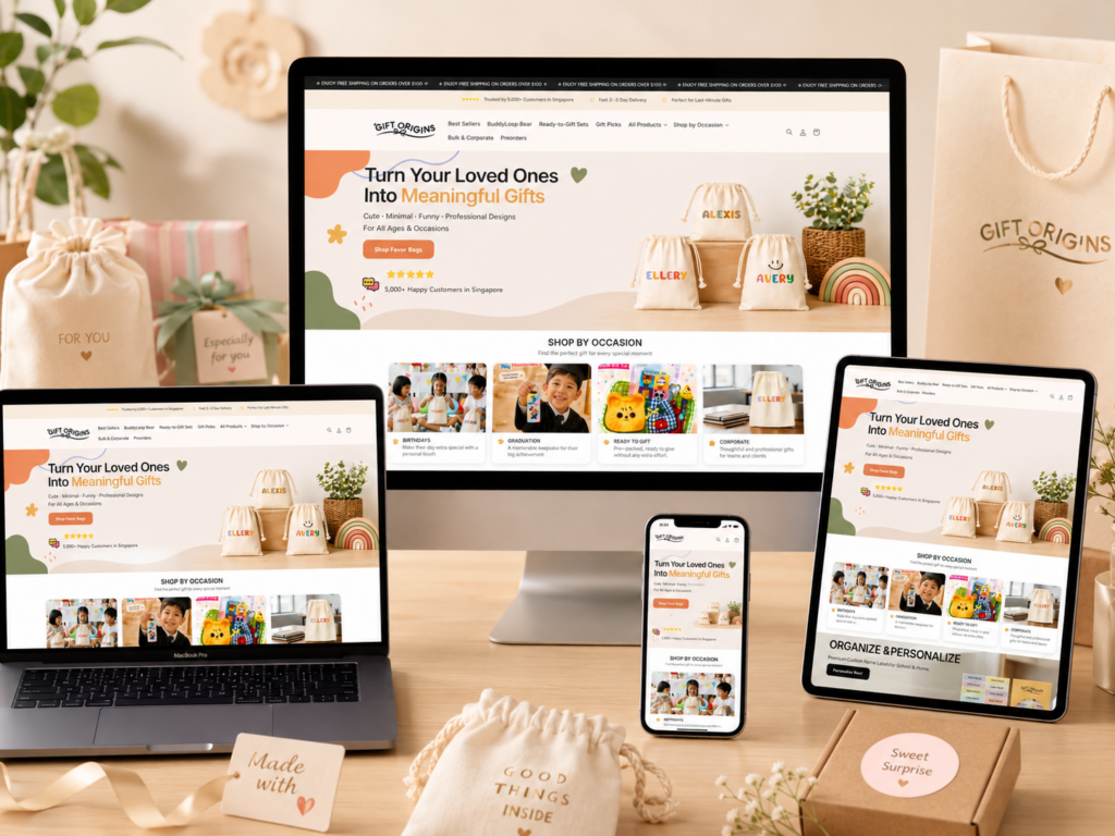
From a designer’s perspective, this Shopify gift store is built around a single guiding principle: emotional commerce drives faster decisions than functional browsing. Instead of presenting products as isolated items, we designed the entire experience as a continuous narrative of gifting moments, surprise, personalization, and instant gratification. Every section is intentionally structured to reduce cognitive load, shorten decision pathways, and increase emotional engagement.
We focused on creating a layered user journey where visitors first feel inspired, then guided, and finally confident enough to purchase. The store does not rely on complex navigation or overwhelming product catalogs. Instead, it uses storytelling modules, occasion-based grouping, visual-heavy product cards, and conversion-focused product pages to gradually move users from curiosity to checkout.
The sequence of the design follows a psychological flow: emotional hook → contextual discovery → structured browsing → product excitement → purchase confirmation. Each stage is carefully optimized to ensure that users never feel lost, but always feel gently guided forward.
| التسليم في الوقت المحدد | فئة | نوع الموقع الإلكتروني |
| 16days | gift | shopify |
| المصممون المشاركون | يكلف | تأثير |
| لين تشانغ | $1900 | مبيعات📈244% |
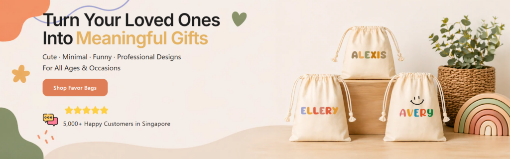
We designed the hero section—“Turn Your Loved Ones Into Meaningful Gifts”—as the emotional anchor of the entire website. The goal is to immediately establish emotional clarity. Users should understand within three seconds that this store is about transforming relationships into tangible, personalized gifts.
The typography hierarchy plays a critical role here. The phrase “Turn Your Loved Ones Into” is kept neutral and grounded, while “Meaningful Gifts” is visually emphasized using a warm accent color. This contrast ensures that emotional intent is highlighted without overwhelming the user.
On the right side of the layout, we intentionally placed real product imagery showing personalized gift bags. This is not decorative—it is persuasive storytelling. Users don’t need to imagine the outcome; they see it instantly. We designed this visual balance so that emotional messaging on the left is immediately validated by real-world product results on the right.
The call-to-action button is placed within natural reading flow rather than isolated at the top or bottom. This ensures users encounter it after emotional understanding has already been established. Supporting elements like ratings and delivery assurances reinforce trust at the exact moment users are deciding whether to proceed.
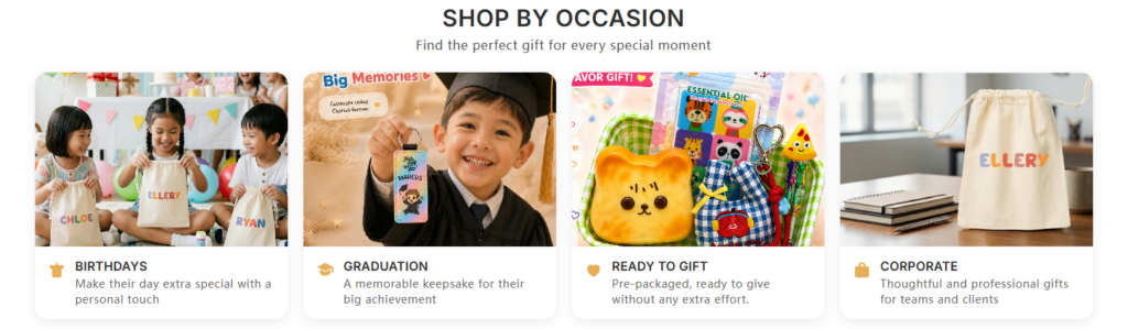
Instead of organizing products by category alone, we designed the “Shop by Occasion” section to align with how people actually think when buying gifts. Users rarely think, “I want a product.” They think, “I need a birthday gift” or “I need something for graduation.”
By mapping products to real-life events like Birthdays, Graduation, Ready to Gift, and Corporate needs, we reduce friction in decision-making. This structure eliminates unnecessary browsing steps and improves conversion efficiency.
Each occasion card is designed as a visual storytelling unit. We use expressive photography that immediately communicates emotional context. For example, birthday scenes show children interacting with gifts, while corporate visuals emphasize clean, professional packaging.
This allows users to understand product relevance without reading text. The images act as instant decision shortcuts.
We intentionally limited text under each category to a single descriptive sentence. This ensures that the section remains scannable and does not slow down browsing behavior. The goal is to support fast emotional recognition rather than detailed reading.
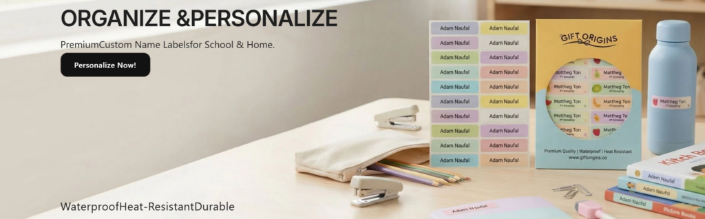
The “Organize & Personalize” section was designed to communicate utility first. The uppercase heading establishes authority and clarity, signaling that this product solves a real-world problem: labeling and organization.
We used a clean left-aligned layout to guide users through information in a predictable reading flow. This improves comprehension and reduces hesitation.
The right side shows real-life usage scenarios—label sheets, school supplies, and household items. This is intentional visual proof. Instead of telling users the product works, we show it in action.
We designed this section to build trust through authenticity. The visuals are not stylized fantasy renders; they are grounded, real-world applications.
Keywords like “waterproof,” “heat-resistant,” and “durable” are placed as quick-scanning benefits. This allows users to instantly evaluate product quality without reading long paragraphs. It supports fast decision-making behavior typical of mobile-first users.
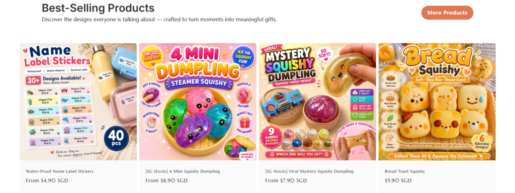
The “Best-Selling Products” section is designed to reduce decision anxiety. When users see that an item is labeled as “best-selling,” it signals validation from other buyers. This significantly increases purchase confidence.
We used this psychological principle intentionally to guide first-time visitors toward proven products.
Each product card is structured as a mini storefront. Large, colorful images dominate the visual hierarchy because gifting products rely heavily on emotional appeal. Users are not just buying functionality—they are buying excitement.
Pricing and product names are placed consistently below images to support quick scanning and comparison.
We allowed each product thumbnail to maintain its own unique promotional style. This introduces energy and variety into the grid while still maintaining structural consistency. The result is a balanced browsing experience that feels dynamic but not chaotic.
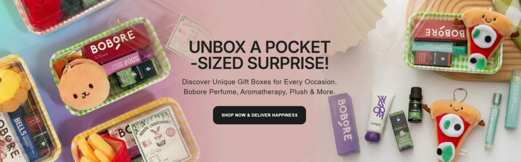
The “UNBOX A POCKET-SIZED SURPRISE” section is designed around curiosity. The uppercase headline immediately creates emotional tension and anticipation. Users are prompted to imagine what the surprise might contain before they even see the product details.
We used a scattered product arrangement on the right side to mimic the experience of unboxing. Items are visually distributed rather than structured, reinforcing the idea of discovery and surprise.
This composition strategy helps users emotionally simulate the product experience, which increases engagement.
The background uses soft pastel gradients to create a friendly, gift-oriented atmosphere. This reduces visual harshness and makes the section feel playful and accessible.
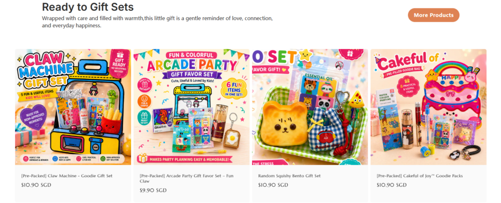
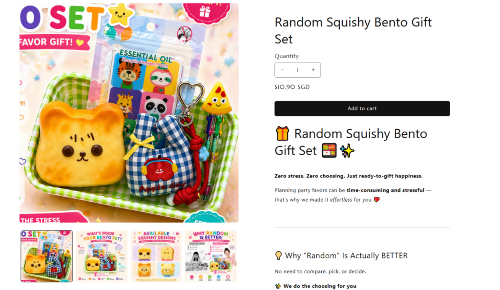
This section is built around a key behavioral insight: users prefer ready-made solutions when under time pressure. By presenting fully assembled gift sets, we remove the need for users to combine or customize products themselves.
Each product card uses highly expressive packaging visuals. The design ensures that users can instantly understand the theme of each set—whether arcade, cute food, or surprise bundles.
We kept pricing and titles minimal to maintain clarity. The focus remains on emotional impact rather than technical details. This ensures faster browsing and higher engagement.
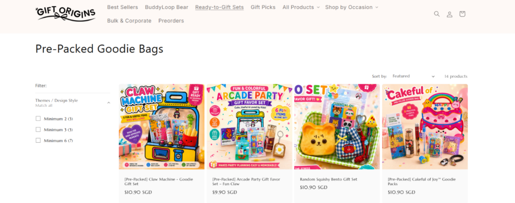
This collection page is designed to handle large inventory without overwhelming users. A consistent grid system ensures visual order even when many products are displayed simultaneously.
The filter panel is intentionally minimal. It allows users to narrow down choices without interrupting browsing flow. This is critical for maintaining engagement in large catalog environments.
Elements like WhatsApp support and trust signals are placed strategically to ensure users always have a path to assistance or reassurance during browsing.
The product page uses a left-right structure: immersive imagery on the left and decision-making tools on the right. This mirrors how users naturally process information—first emotionally, then rationally.
Sections like “Why Random Is Actually Better” are designed to eliminate doubt. Instead of forcing choice, we frame randomness as a benefit, reducing decision fatigue and increasing trust.
The “What’s Inside” section uses bullet points and icons to allow fast comprehension. Users can quickly evaluate value without reading long paragraphs, which improves conversion speed.
Sections like “Perfect For Busy Parents” connect the product to real-life scenarios. This ensures that users not only understand the product but also imagine themselves using it.
This Shopify gift store is not just a product listing platform—it is a carefully structured emotional journey. Every section is designed to guide users from curiosity to confidence through visual storytelling, psychological triggers, and conversion-focused structure. By combining occasion-based navigation, strong product imagery, simplified decision flows, and emotionally driven messaging, the entire experience transforms browsing into an intuitive gifting journey.
In the end, this design demonstrates how modern eCommerce succeeds not by showing more products, but by reducing friction, amplifying emotion, and guiding users through meaningful decision pathways.


