


В корзине нет товаров.

In the competitive arena of global footwear, the digital storefront serves as the primary gateway between a brand’s philosophy and its global audience. For a brand like Xero Shoes, which champions the revolutionary concept of natural movement and “barefoot” living, the website must do more than simply list products. It must communicate an entire lifestyle, a scientific health benefit, and a tactile sensation through a digital medium. This article explores the intricate design journey we undertook to elevate the Xero Shoes Shopify experience, focusing exclusively on the power of visual communication, user interface (UI) artistry, and the strategic design thinking that drives conversion without relying on technical code.
| Срок доставки | Категория | Платформа приложений |
| 19 дней | shoe | shopify |
| Участники проекта (дизайнеры) | Расходы | Эффект |
| Линь Чжан | $1800 | Sales📈320% |
Every successful design begins with a deep understanding of the brand’s soul. Xero Shoes is built on the belief that “Life is better feet first.” Our creative challenge was to translate this visceral, physical experience into a visual design system that resonates with both elite athletes and health-conscious casual walkers. We moved away from the cluttered layouts often seen in traditional footwear e-commerce and embraced a philosophy of “Minimalist Vitality.”
The first step in our design methodology was defining a cohesive visual language. We selected a palette of earthy, organic tones—deep greens, slate greys, and warm terracottas—complemented by high-energy accent colors like vibrant orange. This combination reflects the brand’s connection to nature while injecting a sense of athletic performance. Our team focused on “Dynamic Whitespace,” a technique where the negative space isn’t just empty; it’s a structural element that guides the user’s eye toward the most critical information: the product’s unique features and the brand’s core benefits.
Design is a deliberate discipline, not a series of accidents. To ensure the Xero Shoes website stood out among Shopify’s vast ecosystem, we followed a rigorous, design-first process that prioritized user empathy and aesthetic harmony.
We began with an extensive aesthetic audit. We didn’t just look at what competitors were doing; we looked at what they were missing. Many footwear sites feel heavy and industrial. For Xero Shoes, the design needed to feel light and flexible, mirroring the product itself. We analyzed how light interacted with footwear materials in photography and how different font weights affected the perceived “heaviness” of the page. This stage was about finding the perfect balance between professional sports performance and approachable wellness.
In the design phase, we meticulously mapped out the visual hierarchy. Using eye-tracking principles like the F-Pattern and the Z-Pattern, we positioned key visual elements to ensure maximum impact. We placed the most critical value propositions—such as the “Wide Toe Box” and “Flexible Sole”—in high-visibility zones. This allows users to grasp the unique selling points (USPs) of the brand within seconds of landing on the page, even before they begin to read the detailed copy.
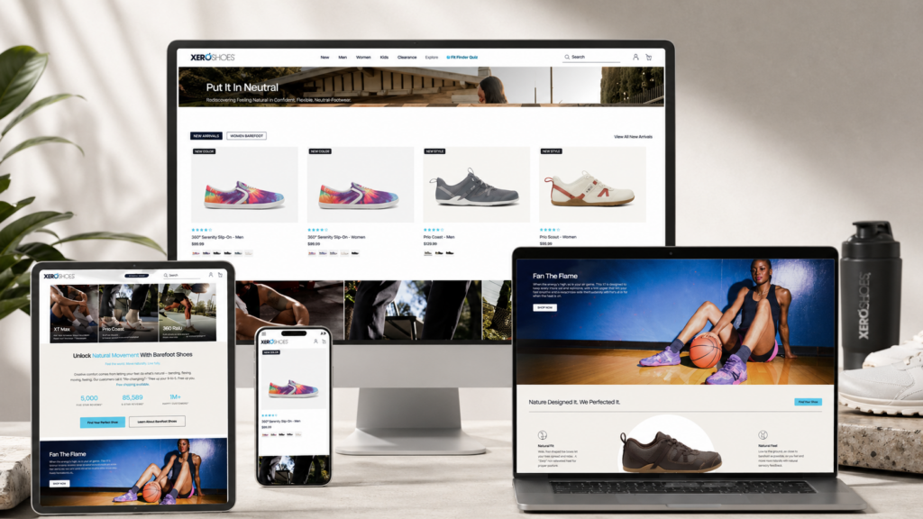
The Home Page of a Shopify store is its most valuable real estate. It is the digital equivalent of a flagship store in Manhattan. For Xero Shoes, we designed a Home Page that functions as a narrative journey.
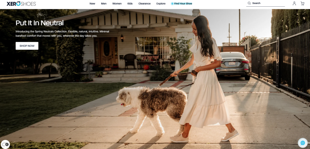
The hero section is designed to stop the scroll. We utilized high-fidelity lifestyle imagery that shows the product in its natural habitat—the trail, the gym, and the street. By choosing images that depict active movement, we tap into the user’s aspirations. The typography in the hero section was designed to be bold yet elegant, using a custom font scale that ensures the message remains powerful across all device dimensions.The call-to-action (CTA) buttons were given a subtle shadow and a distinct color to provide “visual affordance,” signaling to the user exactly where to click to start their journey.
A website’s success is often decided in the details of its inner pages. We extended the same design rigor to the Collection and Product Detail Pages (PDP).
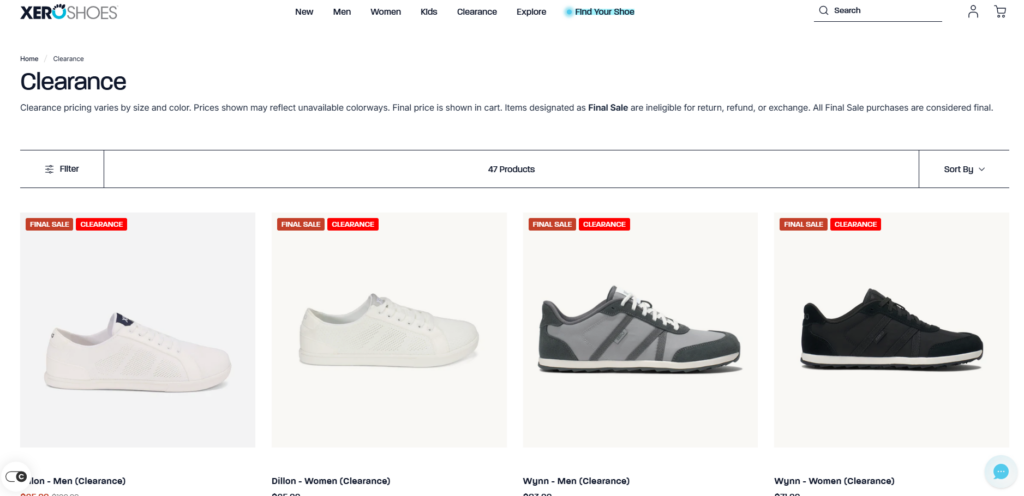
For the Collection pages, we prioritized “visual scanning.” We designed a grid system that highlights the unique silhouettes of the shoes. By ensuring that the background of each product shot is consistent and neutral, we allow the product’s colors to pop. We also designed interactive hover states—where a user can see a side-view or a sole-view simply by moving their cursor—reducing the cognitive load required to find the right pair of shoes.
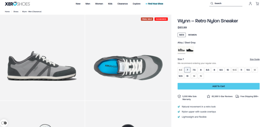
Since the user cannot physically try on the shoes, the design must provide a “virtual touch.” We achieved this through extreme close-up photography and a layout that emphasizes texture. We designed custom iconography to represent the “Xero DNA”—the features that make the shoes unique. These icons were designed with a clean, thin-line style to maintain the minimalist feel of the brand. Every element on the PDP, from the size selector to the “Add to Cart” button, was designed with “clickability” in mind, using spacing and color to remove any friction from the buying process.”Design is the silent ambassador of your brand. It speaks when you are not there, and it convinces when words are not enough.”
Redesigning a high-traffic Shopify site like Xero Shoes presents unique creative challenges. One of the primary obstacles was the volume of educational content. The “barefoot” concept requires explanation, but too much text can kill a design’s momentum.
How do you explain the complex mechanics of the human foot without making a website look like a textbook? This was the central design puzzle. If we used too much text, we risked boring the user. If we used too little, they might not understand why they should buy these shoes over traditional sneakers.
Our solution was to transform the data into “visual bites.” We designed a series of modular infographics that break down the foot’s anatomy and the shoe’s construction. We used a “progressive disclosure” design technique—showing the most important information first and allowing curious users to click for more. This keeps the layout clean and fast-paced while still providing the necessary depth for those who want to learn.We also utilized video backgrounds to show the sole’s flexibility, proving the product’s value through motion rather than just words.
By focusing purely on design and UI, we provide our clients with several distinct advantages. First, a design-first approach ensures that the brand remains the hero. We don’t get bogged down in the technical “how”; we focus on the “what” and the “why.” This leads to a more creative, less restricted visual outcome.
We design for emotion. We know that shoppers make decisions based on how a brand makes them feel. For Xero Shoes, we designed a journey that feels empowering, healthy, and liberating. This emotional resonance is what turns a one-time buyer into a brand advocate. Every curve of a button and every choice of line-height is aimed at creating a sense of “premium comfort.”
The final design of the Xero Shoes Shopify store is a testament to the power of visual storytelling. By stripping away the unnecessary and focusing on the core brand values, we created a digital experience that is as functional as the shoes themselves. The site now stands as a benchmark for the footwear industry, proving that with the right design strategy, a Shopify store can compete with any high-end custom-built platform in the world.
На сайте АИРСАНГ, we understand that your website is the most important asset your business owns. Our mission is to transform that asset into a masterpiece of design and user experience. As a specialist design firm, we provide the creative vision and the strategic UI expertise that modern Shopify brands need to thrive in a global market. We don’t just design pages; we design connections. We don’t just build layouts; we build legacies. Our partnership with brands like Xero Shoes showcases our ability to translate complex brand philosophies into beautiful, high-converting digital realities. By choosing АИРСАНГ, you are choosing a partner who values aesthetics as much as you value your business. Let us help you tell your story through the power of world-class design.


