Project overview
The client is a Pokémon card collection e-commerce company targeting the global market. It mainly sells Simplified Chinese Pokémon TCG cards, entire card packs, rare single cards, and related collection peripherals. As the number of products and overseas users continues to grow, the original display method has been unable to take into account product classification, brand trust and shopping efficiency. Therefore, customers came to AIRSANG and hoped to redesign a brand website visual and page structure that is more professional and suitable for collectible e-commerce. The project was designed based on the Shopify platform, focusing on homepage visuals, product categories, pre-sale areas, product lists, mobile experience and conversion paths. While retaining the distinctive visual appeal of Pokémon, it also improved product browsing efficiency, brand credibility and subsequent expansion capabilities through a concise, clear and modular design.
| Serviços | Industry | Plataforma |
| Website design and decoration | Home department store | shopify |
| Project requirements | target market | design style |
| Create a website that takes into account both brand presentation and sales conversion | Mundial | Trend Collection|Colorful Vitality|Simple E-commerce |
| project budget | Delivery content | Delivery time |
| ¥8300 | Website construction and full-site page design | 14 working days |
Project Challenges
The core challenge of this project was how to strike a balance between the rich, bright product visuals of Pokémon cards and a professional and credible cross-border ecommerce experience. Customer product types include full boxes of cards, rare single cards, pre-sale products and collection peripherals. There are a large number of products and high frequency of updates. If the classification and page hierarchy are not clear enough, it is easy to cause confusion in browsing. At the same time, overseas buyers are also more sensitive to product authenticity, price, inventory and purchase security. Before the project started, we focused on sorting out the target users, product structure, core categories and purchase paths, and analyzed the page logic, visual expression and mobile experience of similar collectible card websites. On this basis, we determined the Shopify homepage structure, classification system, pre-sale area, product display rules and overall visual direction, and established unified standards for subsequent designs.
Our Shopify design approach
- Make the homepage a visual entrance
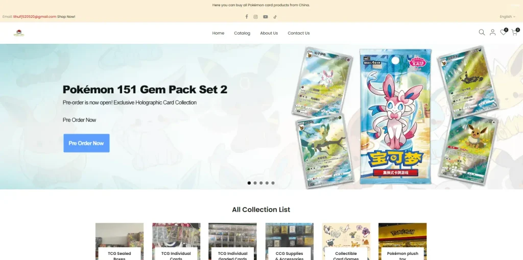
The homepage is the core entrance to the entire Shopify store. We did not treat it as a static landing page, but designed it as a guided browsing experience.
Key design considerations include:
- Use eye-catching above-the-fold areas to highlight new and pre-sale items
- Set clear action buttons such as “Book Now”
- Emphasize the visual expression of product packaging and card illustrations
The above-the-fold Banner allows users to quickly understand what the store sells and who it targets, while focusing attention on the currently promoted products.
- Build a clear product classification display
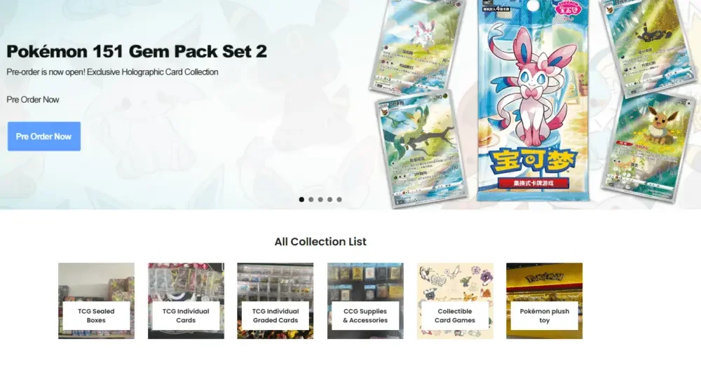
One of the biggest design challenges of this project is the wide range of product types, including:
- Sealed cartridges and refill packs
- single rated card
- Card storage and related accessories
- Plush toys and collectible peripherals
In order to solve the browsing problems caused by the wide variety of products, we have adopted a page structure that prioritizes classification.
All category display areas
This section divides different products in the store into multiple clickable categories in a clear and intuitive visual way. Each category card uses:
- Simple product images
- Clear category names
- Uniform spacing and alignment
Users can quickly find the product categories they are interested in without reading a lot of description text, improving overall browsing efficiency.
- Display pre-sale products independently as a focus
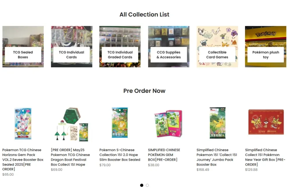
In the Pokémon TCG collectible market, pre-sale items are often a significant source of sales. Therefore, instead of mixing pre-sale products into the general merchandise list, we have designed a separate pre-sale area.
Design strategies employed here include:
- Unified product card layout
- Clear and eye-catching “pre-sale” sign
- Display prices intuitively while avoiding too cluttered information on the page
This design can not only create a sense of urgency brought about by new product launches, but also maintain information transparency. These two points are very important for building the purchasing trust of collectors.
- Design product grid for collecting players
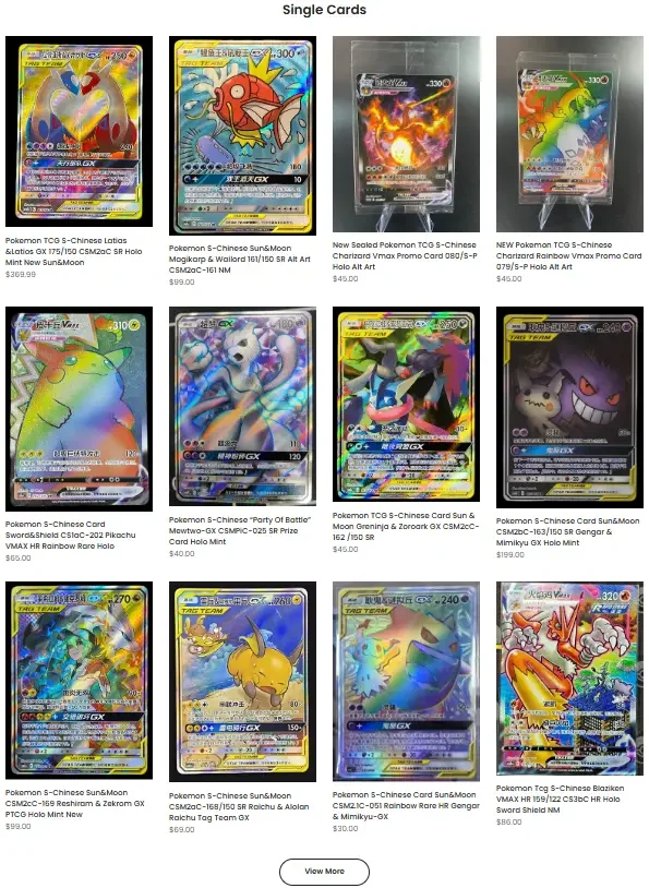
The shopping habits of collectors are different from those of ordinary consumers. Many users will compare information such as card illustrations, rarity, and quality before clicking on a product.
In order to adapt to this browsing habit, we emphasize the following in the product grid design:
- Larger, clearer product images
- Unified product card ratio
- Reduce unnecessary visual noise around prices and titles
In this way, the image of the card itself becomes the visual focus of the page, which is especially important for the collectibles market that highly relies on the visual appeal of the product.
Single card area: Design for high-value products
Individual cards usually have higher perceived value, so users place more emphasis on authenticity and reliability when purchasing.
Build trust through visual design
We do not use a lot of text to pile up product information, but mainly enhance the sense of professionalism through the following methods:
- simple white background
- High-definition sharp card pictures
- Maintain comfortable and balanced white space between products
This design language is similar to the visual style of professional card rating platforms and collectible auction websites, which can subtly enhance the authenticity, professionalism and quality of products.
Mobile-first design considerations
For collectible products, a considerable number of users browse the website through mobile phones, especially visitors from social media channels.
Therefore, we focus on the following considerations in mobile design:
- Clear and clickable interactive areas
- Simpler navigation menu
- Product grid layout suitable for vertical scrolling
We did not simply shrink the desktop page to the mobile screen, but reorganized the content priority on the mobile side to ensure that users can still browse products quickly and complete key operations smoothly on a smaller screen.