









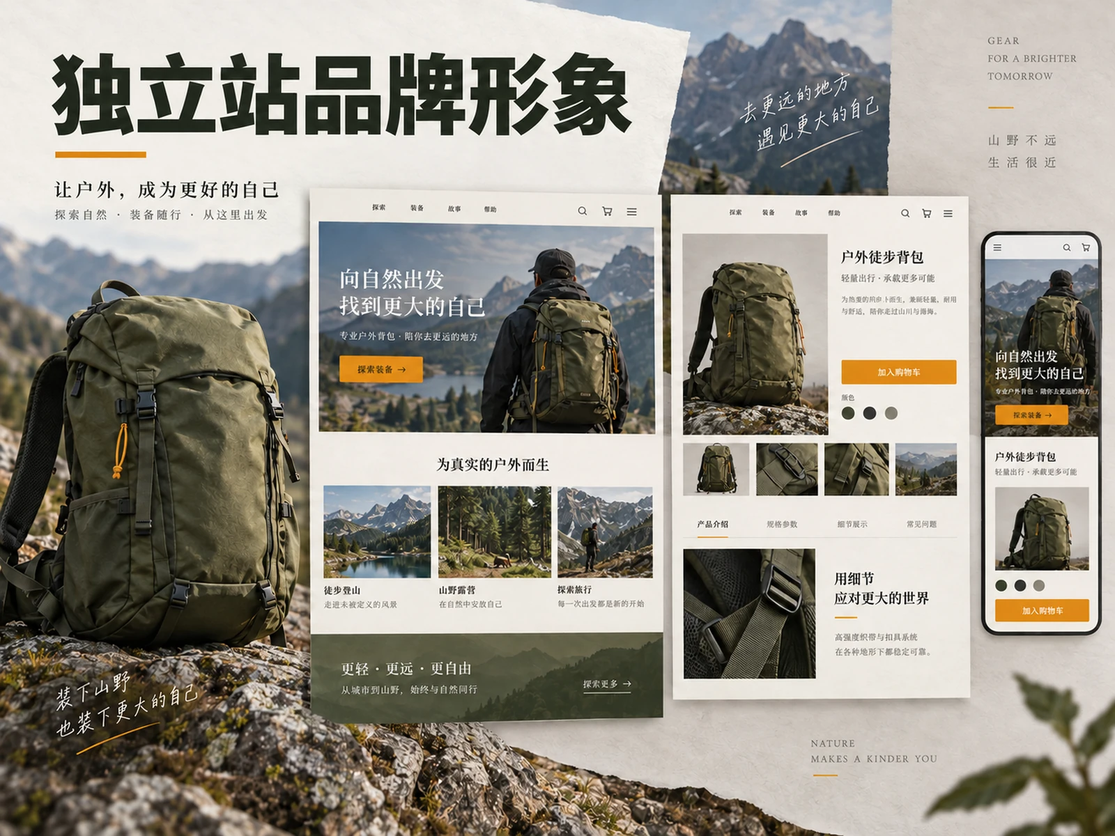
After opening a brand website, users may only spend a short time judging: what is sold here, whether it is suitable for me, and whether I can continue reading with confidence. Brand website brand image is therefore not just about enlarging the logo or changing the buttons into brand colors, but about transforming the brand’s promise into a set of page expressions that can help users complete their tasks. The homepage should quickly explain the positioning, the product page should confirm the promise, and the mobile terminal should maintain the same judgment path.
This article is intended for teams that are preparing to build or revamp a brand website, and provides a set of design methods from positioning, first screen, product information to responsive inspection. All page structure examples are teaching suggestions and do not represent the actual conversion results of a certain customer.
Answer three questions first, then discuss visual style
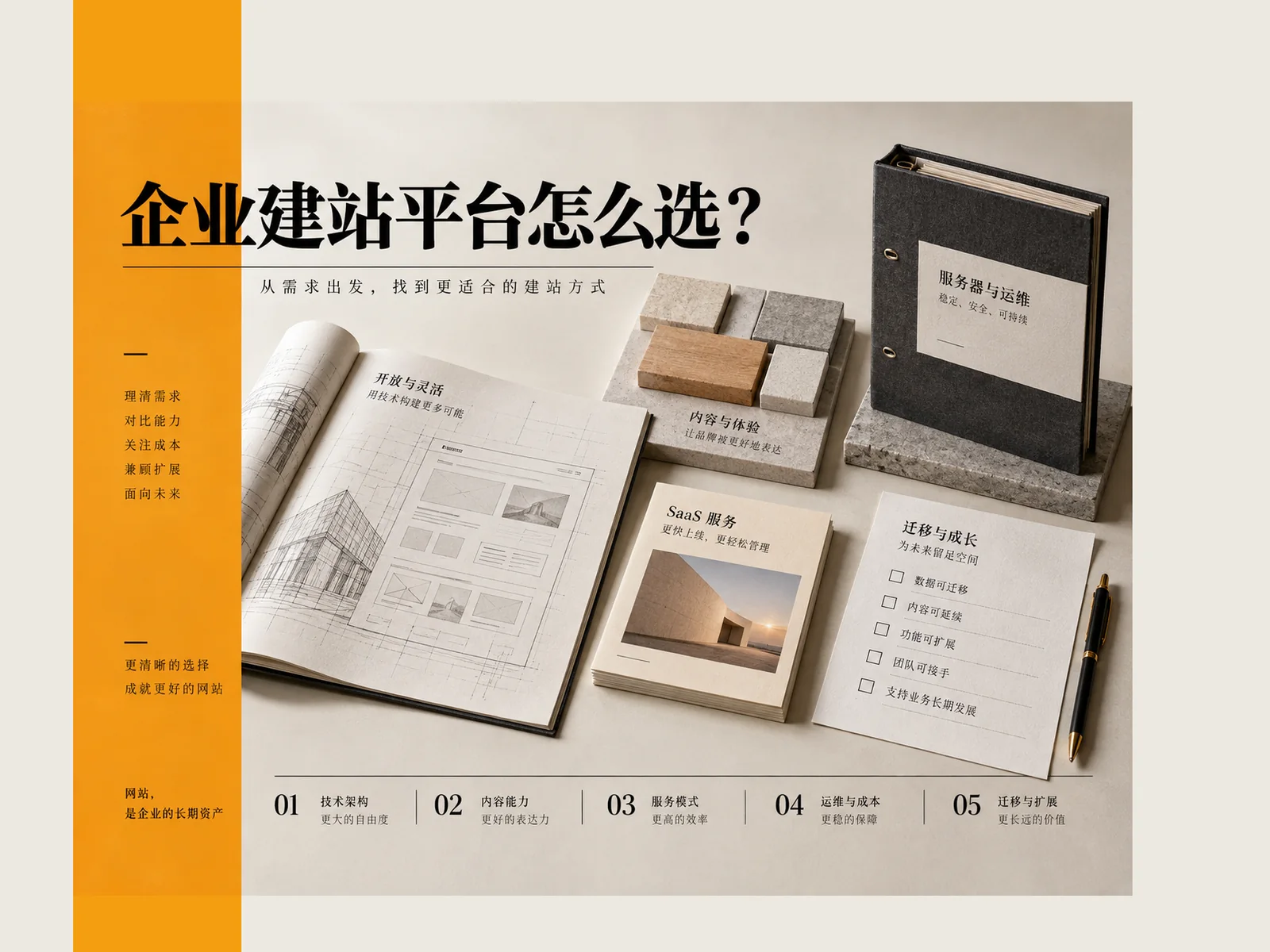
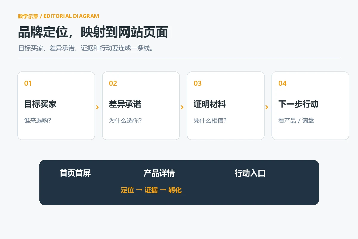
Brands often use “high-end” and “international” as design requirements, but these words are not enough to guide page selection. Before starting the project, write down a sentence: What problem do we solve for which type of buyer, and why do we deserve their trust? Then add the target market, main products, and the most common concerns before purchasing. This short positioning card should be given to design, copywriting, product, and operations teams simultaneously to avoid each page saying something different.
For example, a home furnishing brand targeting overseas retail consumers may prioritize product use scenarios, materials, and delivery ranges on its homepage; an accessories supplier targeting wholesale procurement should explain categories, specifications, minimum order communication methods, and service scope earlier. Both can use refined visuals, but the order of information above the fold should not be copied. The brand image first serves the reader’s decision-making, not the decorative style decided by the designer alone.
Brand elements can be divided into four levels: Positioning Answer “Who am I?” identify Let colors, fonts, and images create a recognizable rhythm across pages. evidence Display product and service information related to commitments, action Tell users where to go next. Webflow sorting out brand elements It also emphasizes the relationship between positioning, tone, vision and experience; here it is implemented into the page tasks of the brand website.
Home page above the fold: let users understand, rather than letting the pictures speak for you
The title clearly states the object and value
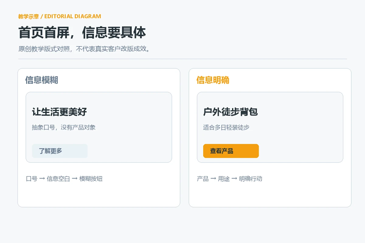
The first screen of the homepage should form a clear order between the title, auxiliary description, main visual and main buttons. The title clearly explains the product or service and its applicable objects, the auxiliary description fills in the differences or conditions, the main visual shows the real product or a clearly marked conceptual scene, and the button explains what you can get after clicking it. Only writing about “redefining the future” and “discovering a better life”, readers often have to look down for basic information.
You can do a five-second self-test on the first screen: Can you still determine the product category if you cover the logo? Can you tell who it is suitable for by just looking at the title and picture? Just by looking at the main button, can you predict whether the next step will be to browse products, get a quote, or contact a consultant? If the answer is no, modify the information expression first, and then consider enlarging the text, adding animation, or changing the background. Webflow’s homepage optimization article Also consider hierarchy, white space, and clear main actions as key points in homepage design.
Navigation should reflect the user’s search order
Brand stories are valuable, but most first-time visitors are more concerned about products, usage scenarios, price ranges, or cooperation methods. The navigation should use names that readers can understand, and prioritize the main categories, solutions, about us and contact portals; there is no need to change “products” into creative words that are difficult to guess in order to appear unique. Websites in different languages must also check whether the category name, currency and service area are consistent to avoid the first screen promising global services, but the actual settlement or consultation path only supports a single market.
If the brand targets multiple countries at the same time, it can be combined during the planning stage Shopify Multilingual Store Guide Check language and market entry. Multilingualism is not about translating the homepage copy: size units, delivery range, customer support time zone and pre-purchase concerns may all affect the page structure and image selection.
Product Page: Deliver on the homepage promise with consistent evidence
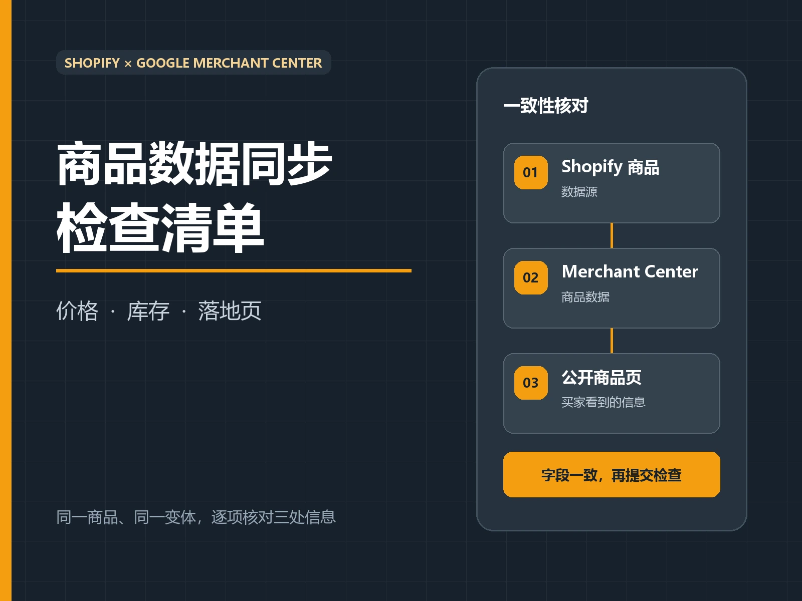
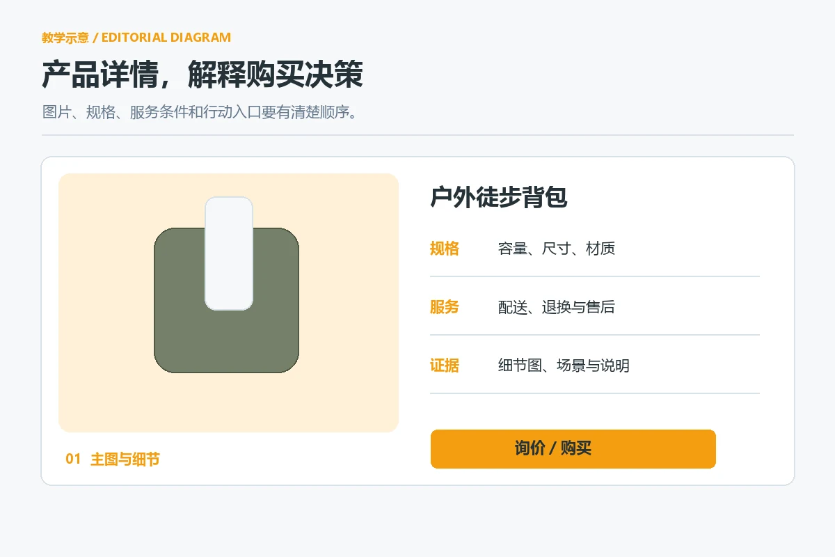
The quality, professionalism or ease of use emphasized on the homepage must be found on the product page. The main product image needs to allow buyers to clearly identify the product, and the supporting image explains the proportion, material, usage or packaging; the text explains the specifications, applicable conditions, delivery scope and frequently asked questions. Copying only one set of beautiful photos to all products, or squeezing all selling points into pictures will make it difficult for users to compare and will not be conducive to subsequent updates.
It is recommended to establish a fixed sequence of information for the same series: product name and core uses, key differences, specifications and variants, real usage scenarios, delivery and after-sales, and action entry. What is fixed is the judgment framework, not making every page look exactly the same. If the product purchase decision relies on safety data, material certification, or compatibility information, these contents should appear where buyers are looking for them, with scope of application; unverified certifications or performance numbers should not be placed on the page.
Visual consistency also includes image processing methods. Lighting, background, cropping, models or usage environments can vary depending on the category, but the same series should maintain similar information density and quality. Shopify’s Chinese description of brand consistency Think of touchpoints like fonts, color schemes, and images as the same identity system. When it comes to the product page, the design team must be able to answer: When users go from the advertisement to the product details, will they feel that they have entered another company?
Turn brand language into reusable design rules
Colors, fonts, and components all do their job
It’s not advisable to choose colors based solely on “which one you like.” First distinguish the background, main text, emphasis and status colors, and then specify their respective usage scenarios: the main text is responsible for long-term reading, the emphasis color points to the main action, and the status color expresses success, errors and reminders. Using the same strong color for buttons and text will make it difficult for users to judge priorities; using one tone for all pages will weaken recognition.
Fonts also need hierarchy: the main title first tells users what problem this page solves, the subtitle helps scan, the main text carries details, and the button copy clearly defines the action. The mix of Chinese and English, numbers, specification units and long product names should be tested in real content. You cannot just look at a design draft with only a short title. For the readability of text and background, please refer to W3C WCAG 2.2 Contrast Requirements : Normal text usually uses 4.5:1 as the AA minimum target; this is a usability baseline and does not equal “the brand must be black and white.”
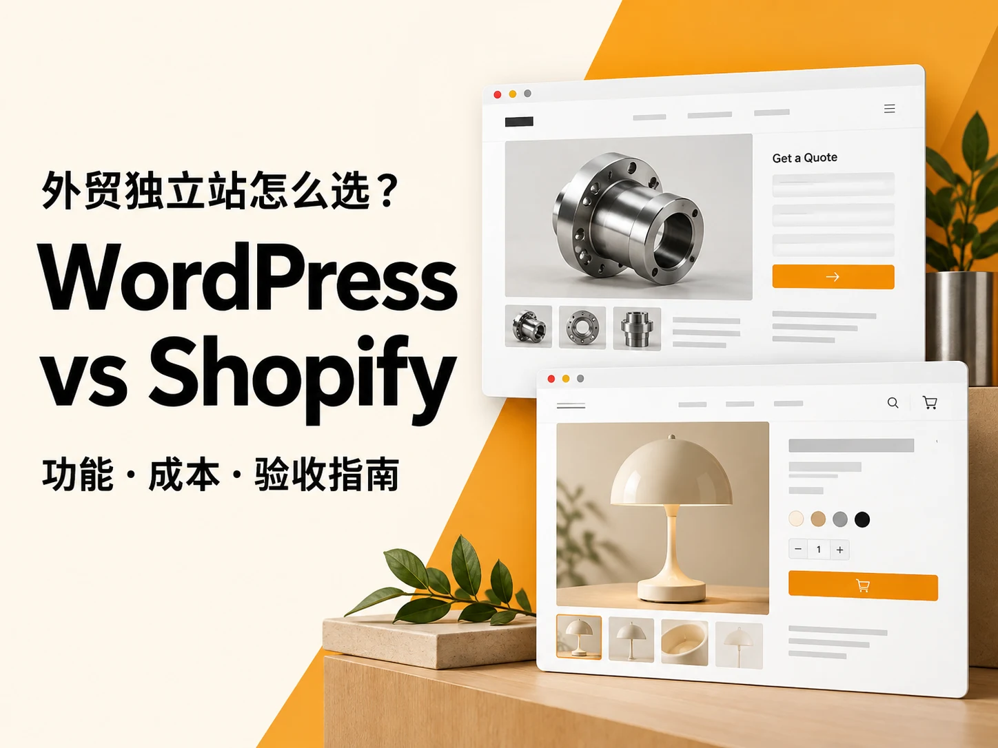
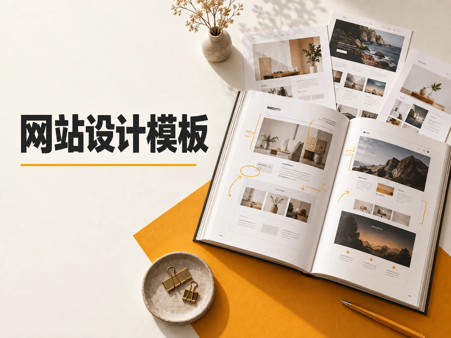
Organizing the buttons, product cards, labels, information prompts, and form fields that appear repeatedly on the page into components can reduce the gradual deviation of each page after going online. Webflow’s brand design system article The value of codifying visual decisions into reusable rules is also discussed. For a small team, there is no need to build a large design system first; just start with one page of color and font rules, several common components, and image cropping specifications. When selecting a ready-made theme, you can combine How to choose a website design template Check whether the component can actually carry the brand content.
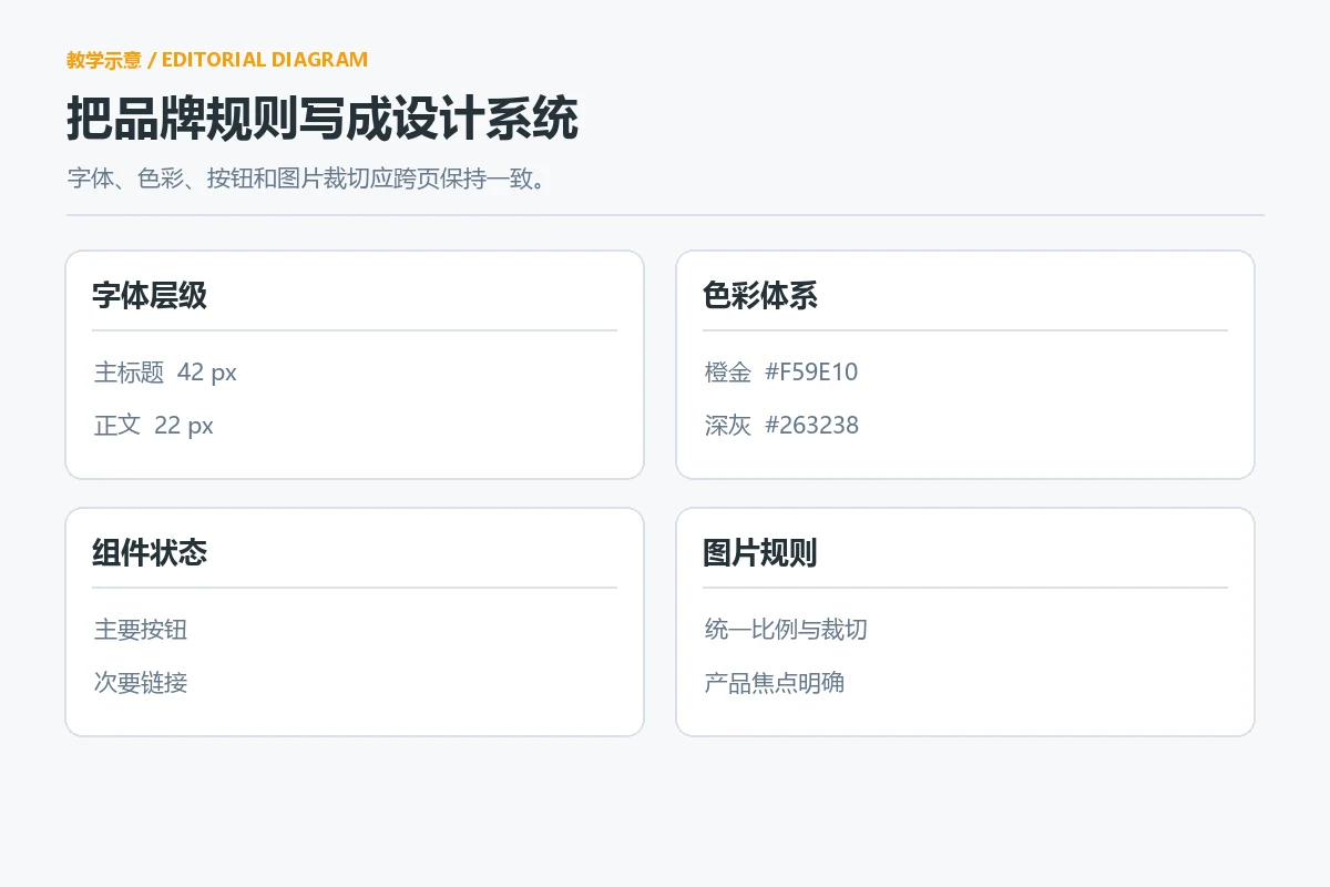
How do four types of pages express the same brand?
Uniformity does not mean repeating the same banner on every page. The pages have different tasks, and the visual emphasis should also change. The following table is a teaching comparison for planning, which can be checked item by item during the site map stage.
| Page | What does the user want to confirm? | should be given priority | Common deviations |
|---|---|---|---|
| Home page | What does the brand sell and who is it suitable for? | Clear positioning, representative products, next step entrance | Just emotional blockbusters, no judgmental information |
| Category page | How to narrow down your choices | Understandable sorting, filtering and product differentiation | Category names are creative but difficult to understand |
| product page | Is it applicable, credible, worthy of purchase or inquiry? | Product details, specifications, service conditions and action portal | All selling points are made into pictures, and the text lacks substantive information. |
| About/Contact Page | Is the team real and how to get in touch? | Real team and service scope, clear contact information | Vacant declarations or difficult-to-use forms |
Let each page fulfill its primary task first, and then connect them together using the same font size, button language, graphics, and tone of voice. If the site is still in the budget stage, you can cooperate with International business website website development cost budget One article, including necessary pages, material preparation and subsequent maintenance; if the design rules are not maintained, they will be scattered by temporary activity pages soon after they go online.
The mobile version is not a reduced version of the desktop version
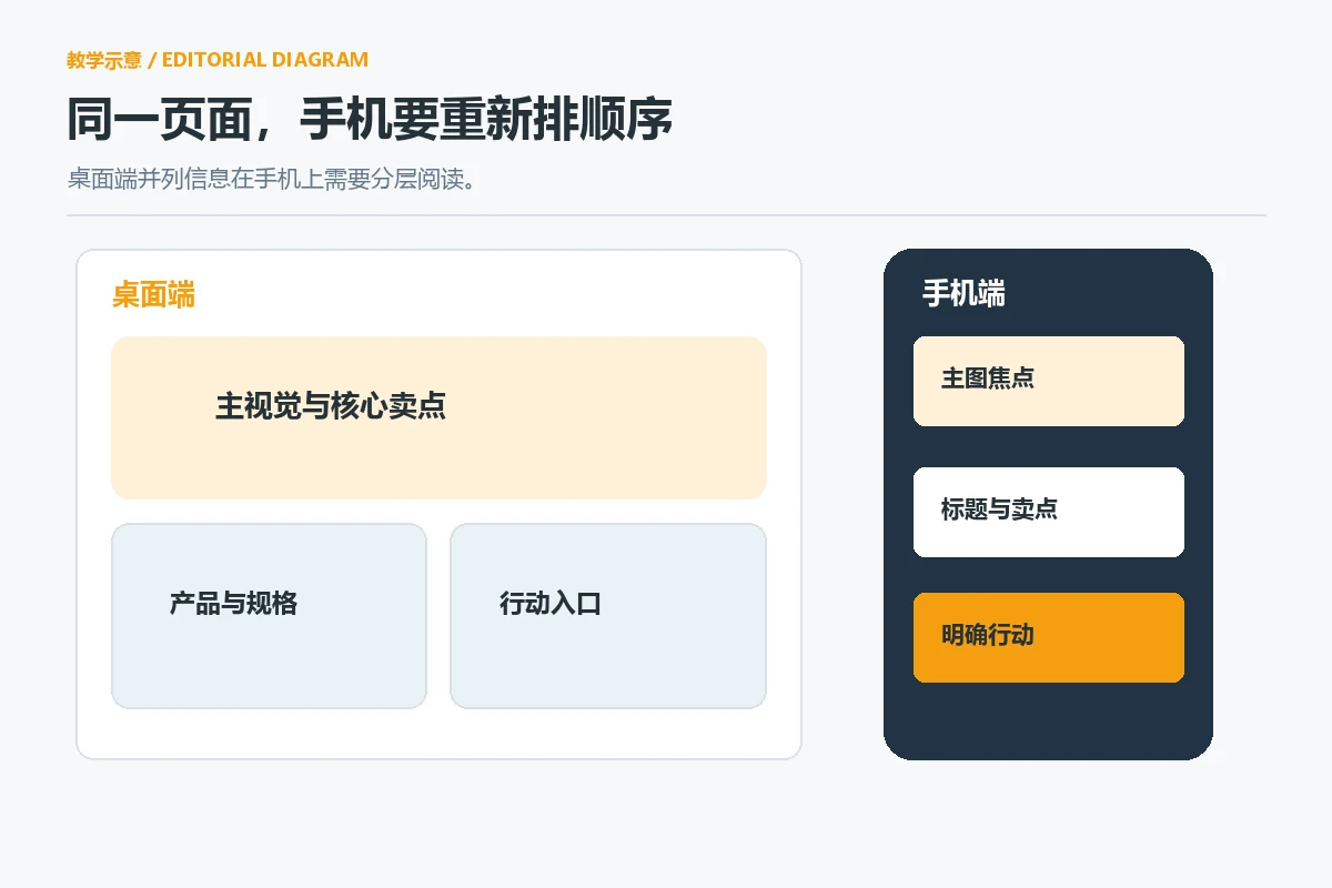
Mobile phone screen space is limited, and brand elements must be chosen. The title, product image and description that can appear side by side on the desktop need to be rearranged on the mobile phone; give priority to retaining the product name, key reasons, price or customer inquiry entry, and then put the auxiliary narrative at the back. If a main visual relies on the edge of the screen to convey the selling point, only the decoration may be left after the mobile phone is cropped. Therefore, the focus of the mobile image and the position of text overlay must be reviewed separately.
Mobile navigation also needs to be tested with actual tasks: can the user find the target category in a few steps? Are product specifications and shipping instructions easy to expand? Will the keyboard block the buttons when filling out a customer inquiry? The experience of the same brand is consistent, which does not mean that each device has the exact same layout, but that the important information, commitments and action paths remain consistent. WCAG Reflow Requirements We are reminded to check whether simultaneous horizontal and vertical scrolling is required when zooming in on a narrow screen; there are exceptions for complex tables, etc., and ordinary text should not be difficult to read due to this.
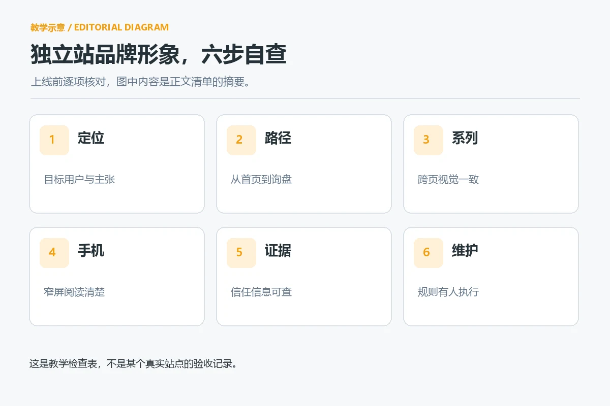
Use six steps to conduct a self-examination of your brand image before going online
- Cover the logo to see the positioning. Can the homepage title, products and key visual independently describe the business? If not, change the information level first.
- Follow a true path. From the home page to categories, products, contact or settlement, record the issues that users need to judge at every step.
- Compare pages in the same series. Check whether the title format, product image, specification position, and button copy follow the same set of rules.
- Read again on your phone. Check whether the important information is still at the front, whether the main product image is cropped and whether the key points of the product are retained, and whether the form is easy to operate.
- Examine the evidence. Customer reviews, certifications, material descriptions and service commitments must be traceable; “first” and “guarantee” that have no factual basis should be deleted.
- Maintainer of records rules. Designate update responsibilities for fonts, colors, page components, and image specifications to avoid reinventing a visual set every time.
This checklist is not a uniform template. Depending on the brand’s customer unit price, purchase cycle, B2B or B2C model, the priority of page evidence will also change. You can first conduct a small-scale audit on the pages with the highest traffic volume or business value, record the areas that users do not understand, and then decide whether a full-site revision is needed. Don’t write “looks more advanced” as conversion rate has improved when there is no real analytical data.
Conclusion: brand website brand image should run through every step of user judgment
A good brand website brand image is the result of the joint action of positioning, page structure, visual identity and credible information. First determine what tasks the target buyers want to complete, then let the home page explain the value, the product page give evidence, the mobile page retain key actions, and finally use fonts, colors, pictures and component rules to maintain consistency. To judge whether a revision is needed, you might as well choose a main product and go from the homepage all the way to customer inquiry or purchase: any link that requires guessing and repeated return to understand is the starting point for the next round of design work.