Project overview
The product diagram of energy storage power supply needs to organize the power, interface, charging method and transportation structure into information that is easy for consumers to understand. This case uses 7 Ozon Russian primary and secondary product images of the FORIEC 3600W power supply as the object to show how to establish product identification through black gold industrial vision, and then split the complex parameters into continuous purchase instructions. For brands and sellers who are preparing to produce pictures of similar products, the reference value of this set of works is that each picture has an independent responsibility, and the whole set of pictures can answer a complete question – whether this device is suitable for your use needs.
| Services | Industry | Platform |
| Ozon product primary and secondary product images design | Digital 3C | Ozon |
| Project requirements | target market | design style |
| Clearly present power, interfaces and usage scenarios to establish complete product awareness | Russian consumer market | Black gold industry, strong contrast, functional infographic |
| project budget | Delivery content | Delivery time |
| not disclosed | 7 product display pictures | not disclosed |
design challenge
This set of works needs to process three types of information at the same time: first, core information such as power, capacity and battery cells; second, instructions for use such as interfaces, charging and power supply scenarios; third, pre-purchase judgments such as size, weight and transportation methods. The difficulty of the design is to allow these contents to have their own places, to avoid the parameters filling the first picture, and to avoid the picture having only appearance without explanation. Therefore, the picture group is expanded in the order of “first understand the product, then understand the use, and finally check the conditions.”
Design strategy: let seven pictures form a clear purchasing path
01 Establish recognition first, then explain functions hierarchically
Figure 1 uses the brand, category and 3600W main title to establish a first impression; Figure 2 maps power supply information to common equipment; Figures 3 to 6 respectively explain connection, energy replenishment, battery cells and transportation; Figure 7 focuses on checking specifications. By splitting information responsibilities, the first image does not need to carry the entire set of product descriptions, and subsequent images have a clear reading order.
02 Use a unified black gold vision to carry different information tasks
The gray-black body, yellow side panels and warm yellow light form a consistent industrial vision. Big numbers bear focus, white captions add meaning, and wireframe icons help distinguish categories of information. Scenes, close-ups of interfaces and character movements change the rhythm of the composition, allowing the series to remain recognizable while reducing repetitive product placement.
03 Match technical information to specific questions before purchasing
The power supply scene answers “where can it be used”, the interface diagram answers “how to connect”, the charging diagram answers “how to replenish energy”, and the drag and size diagram answers “how to move it and whether it can be put down”. This organization is designed to help the user complete the check, rather than just remember a set of numbers. For the approximately 50.2kg device, the work retains weight information and explains the method of movement using wheels and pull rods.
Dismantling of the work: Each picture has a clear information task
Figure 1|Main vision: establishing product identification and core information hierarchy
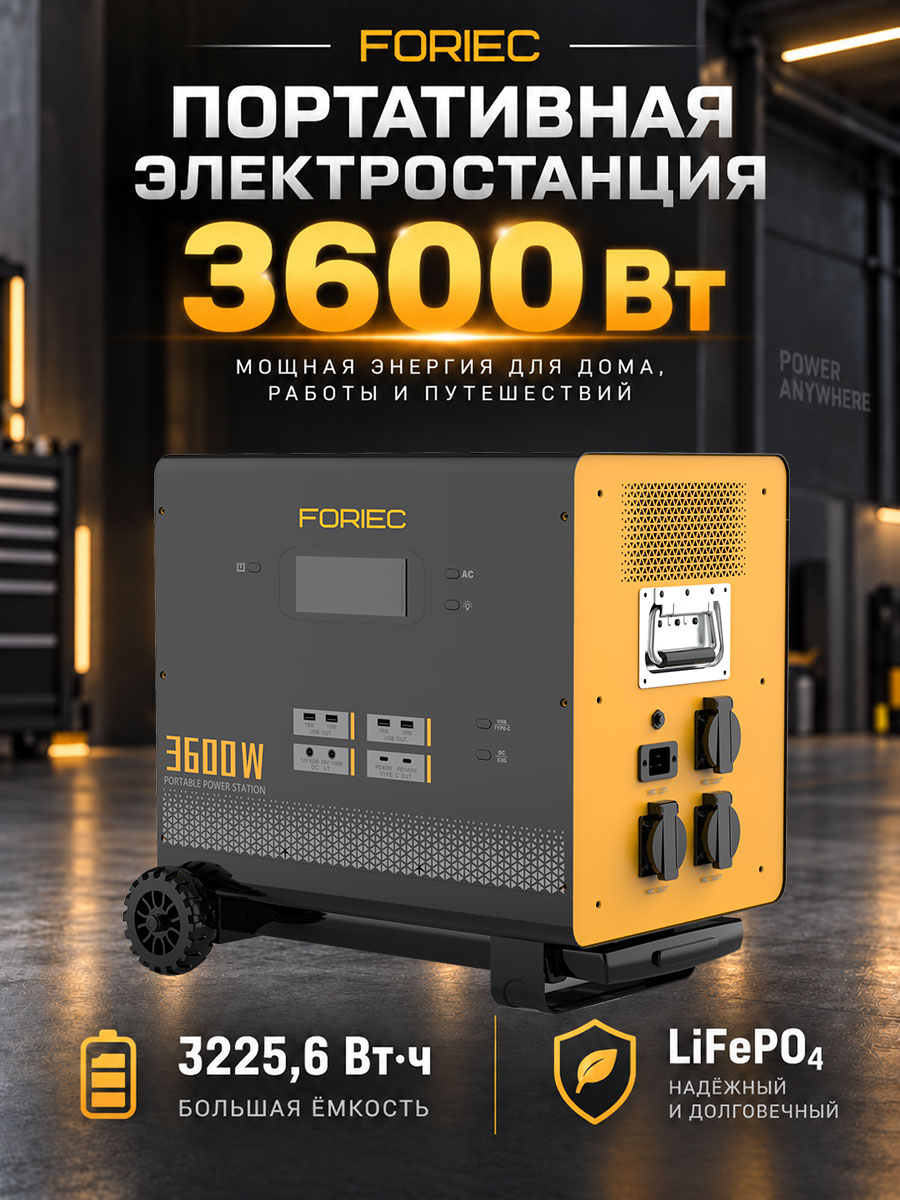
The first picture echoes the side panels of the product with industrial space, warm yellow lights and ground reflections, and the gray and black body occupies the lower half of the picture. The brand, Russian product name and large font “3600 Вт” form a reading hierarchy from top to bottom, allowing consumers to first identify product categories and core information.
The 3225.6Wh capacity and LiFePO₄ cell information in the picture are separated by icons at the bottom, placing them on an auxiliary reading layer instead of continuing to squeeze into the top. The first picture therefore assumes the responsibility of “recognizing the product, grasping the key points”, and leaving space for subsequent explanations.
Figure 2|Power supply scenario: Match the power figures to the equipment usage
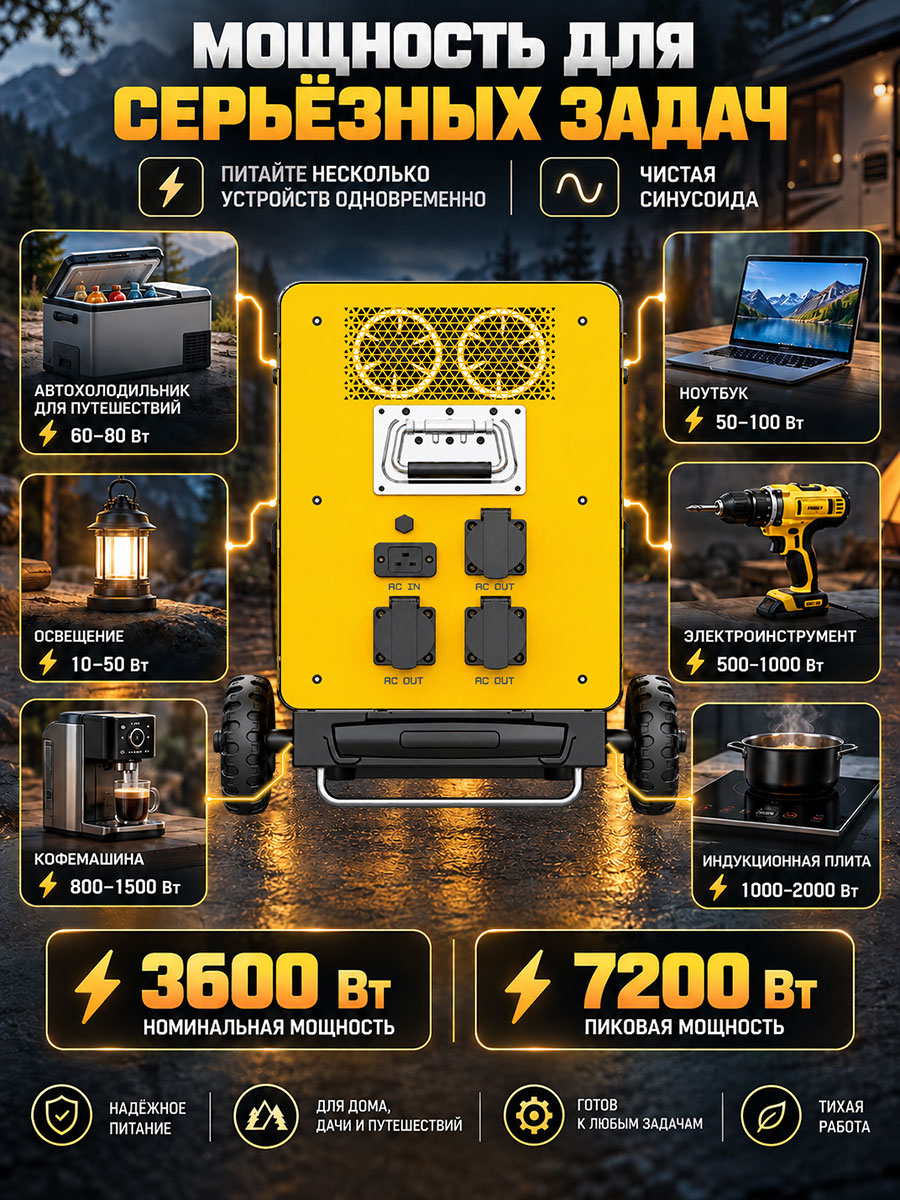
The second picture places the power supply in the center of the screen, with cards around it organizing refrigerators, lighting, coffee machines, laptops, power tools, induction cookers and other equipment, and marking their respective power ranges. Consumers can first find familiar devices and then view related information.
The 3600W rated power and 7200W peak power in the figure are presented separately at the bottom to keep the two types of numbers distinct. The point of this diagram is to establish a usage reference, not to convey that all devices can operate simultaneously. The combination of scene cards and central products gives abstract parameters a concrete reading entrance.
Figure 3|Interface description: Support connection verification using partial amplification
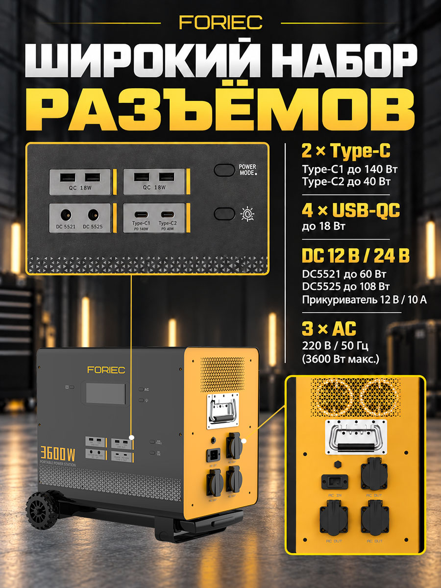
The third picture uses a partial panel and guide lines to correspond to the actual interface locations, grouping Type-C, USB, DC and AC interfaces. Numbers, units and port structures appear in the same reading area, so users don’t have to repeatedly search for connection locations in photos of the entire machine.
The design task of this page is to support the judgment of “how to connect my device”. The enlarged picture is responsible for seeing the details clearly, the guide lines are responsible for establishing positional relationships, and the group titles are responsible for distinguishing categories; the main body of the product is still retained so that local information does not separate from the whole machine.
Figure 4|Charging method: use double-column layout to distinguish energy replenishment paths
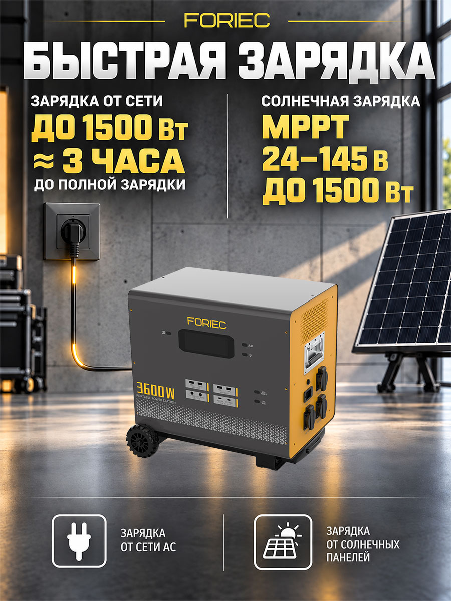
The fourth picture places wall sockets and solar panels on the left and right sides respectively, with the power supply located in the center below, using environmental elements to directly indicate the two energy sources. The upper two columns organize the mains power 1500W, about 3 hours, and solar MPPT, 24–145V and 1500W information in the figure respectively.
The divider line and the icon at the bottom once again distinguish the two types of paths, allowing charging time, voltage and power to have corresponding methods. The focus of the design is to answer “where to recharge energy and what information should be checked” to avoid confusing different charging conditions into an isolated selling point.
Figure 5|Cell theme: retain key numbers and limited information
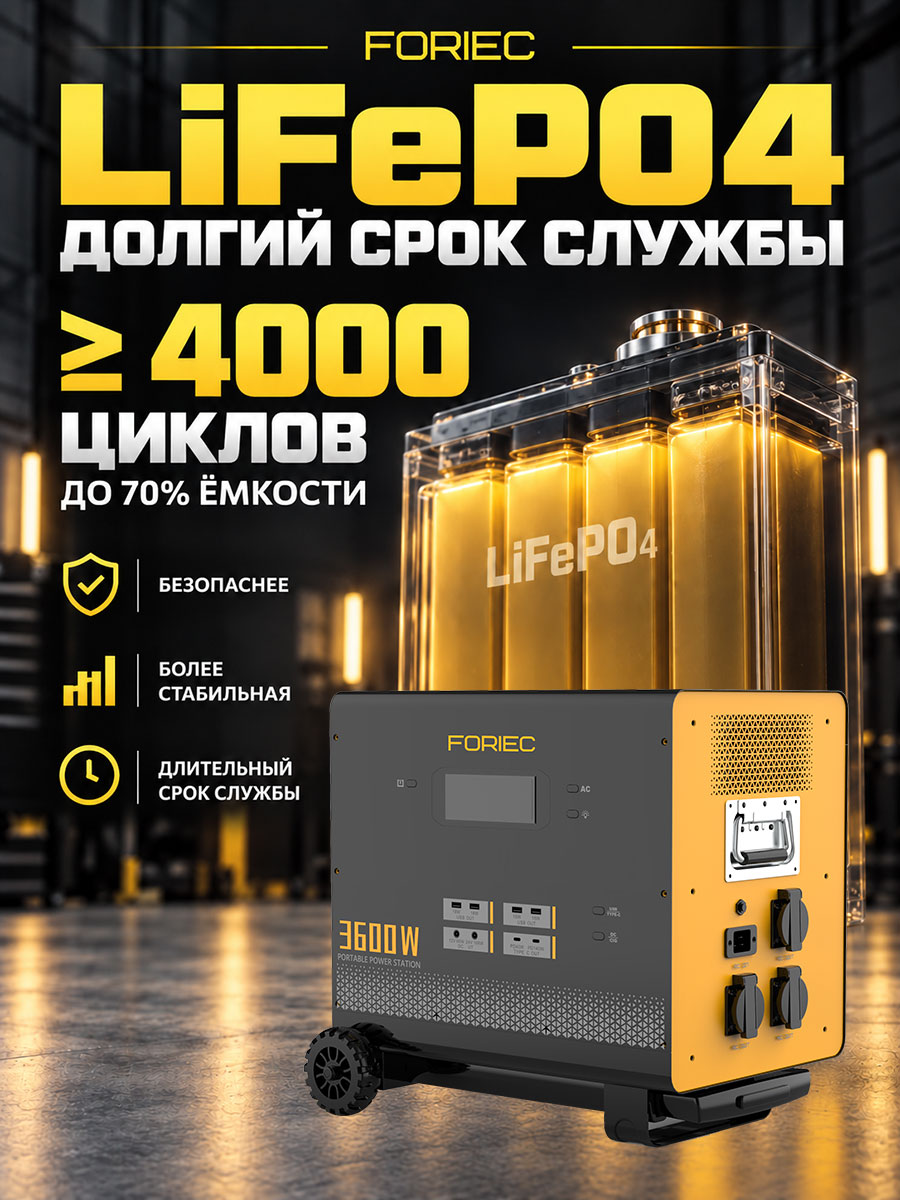
The fifth picture enlarges LiFePO₄ as the theme title, and the yellow light-emitting battery indicates that it is located behind the whole machine, forming a hierarchy from the internal theme to the external products. The number of cycles marked “≥4000” on the left remains eye-catching, while retaining the limited information of “to 70% capacity”.
Shield, bar chart and clock icons continue the visual language of the set, organizing themes of safety, stability and longevity within the material. Large numbers attract attention, limited text complements the boundaries, and icons indicate reading categories; battery cell symbols play an explanatory role here.
Figure 6|Moving structure: using character movements to explain the dragging method
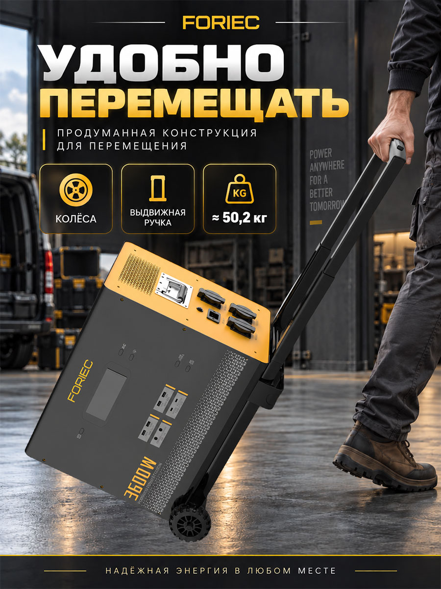
The sixth picture directly shows how this large power supply moves through the continuous movements of the character holding the telescopic lever, tilting the fuselage and the wheels on the bottom. The characters are only partially displayed, which not only provides reference for use, but also retains the visual status of the main body of the product.
The top card shows the wheels, tie rods and the weight of about 50.2kg in the picture. The simultaneous appearance of weight and mobile structure completes the expression: the focus of the towable design is the way it is transported, not the lightness of the body. The yellow border and ground light continue to maintain the sense of series.
Figure 7|Dimensions: Complete information check before purchase
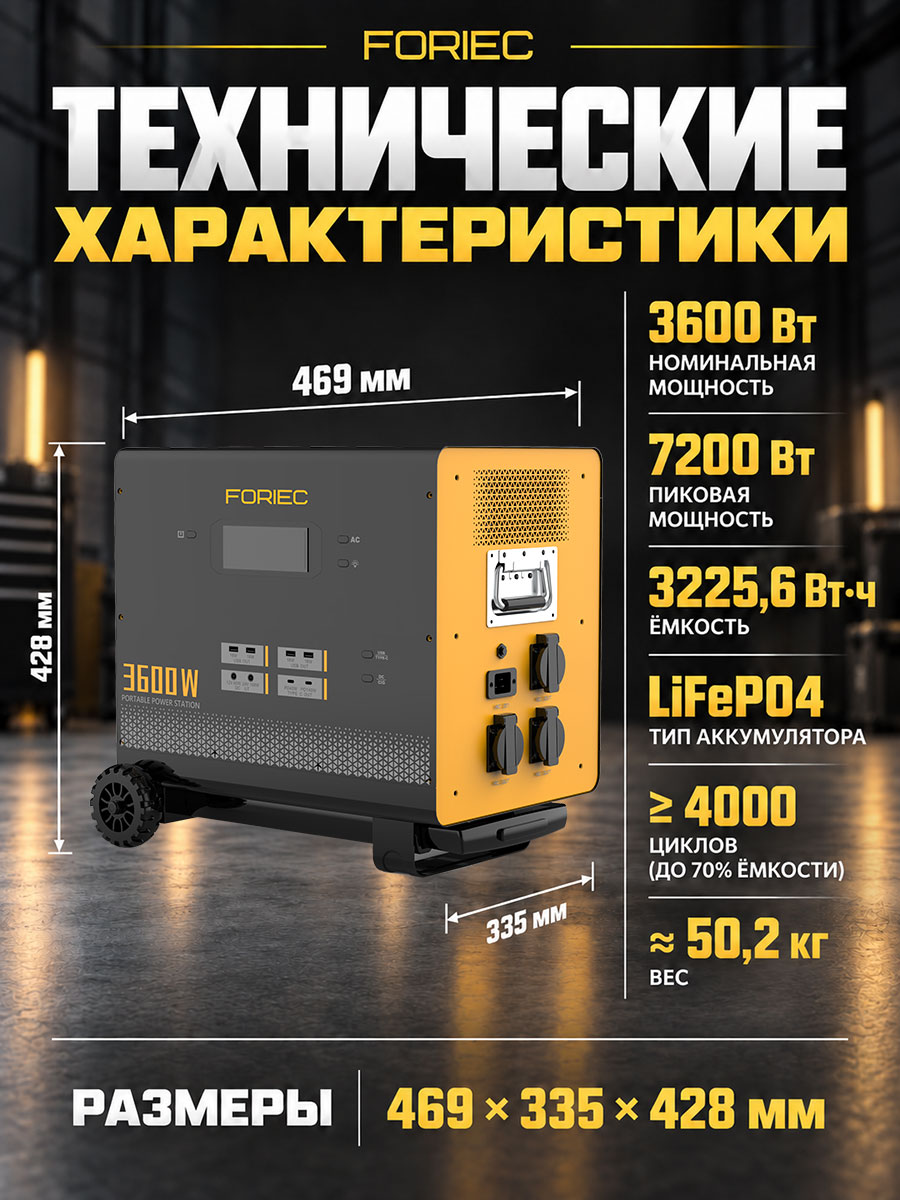
The last picture adopts the left picture and right text layout. The size arrows are close to the product outline, corresponding to 469mm, 335mm and 428mm respectively. The right side is concentrated on power, capacity, battery cells, cycle times and weight, and the bottom summarizes the dimensions.
After users understand the purpose, interface and energy replenishment, they can return to this page to check the space and handling conditions. The large numbers and white categories indicate different levels, and the dimensions correspond to the millimeter values to the actual directions, completing the specification of the entire set of drawings.
Delivery summary and design value
Delivery presentation is more holistic
7 900×1200 Russian product pictures cover product identification, power supply scenarios, interfaces, charging, battery cells, movement methods and specifications. The black and gold colors, icons and text hierarchy run throughout the series, allowing the responsibilities of each image to be distinguished while maintaining consistent brand expression.
Complex information is easier to find by question
Putting parameters, usage and structure on corresponding pages will help users find relevant instructions when needed. For brands, this also provides an idea for planning pictures of similar products: first list the pre-purchase questions, and then allocate picture content.
Verify more completely before purchasing
Scenario, port, weight, and size work together to support fit determination. The value here lies in the explanation method and delivery content; changes in click-through rates, sales, and conversion rates require additional test data and cannot be inferred from the picture group alone.
The product parameters in this article are used to explain the information presentation method of the provided pictures. Please refer to the product information for specific performance and usage conditions.
Plan a clearer set of product images for your Ozon products
If your Ozon product also has problems with too many parameters, difficult to explain functions, or a lack of unified style in the picture group, you can submit product links or existing pictures to AIRSANG, explain the target platform and the required range of primary and secondary product images, and communicate the information organization and design direction suitable for the product.
Consultation email: [email protected] · Telephone: 177-5952-2770