소개
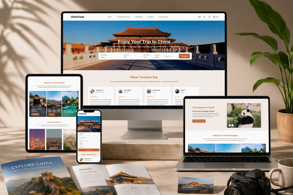
In the travel industry, a website is more than just a digital storefront—it is the first destination a customer experiences. A well-designed travel website must inspire, build trust, and guide users seamlessly from exploration to booking. For this Ueeshop project (https://t181.shop5.ueeshop.com/), our goal was to design a visually immersive and conversion-driven travel website that captures the excitement of discovery while delivering a smooth and intuitive user experience.
Rather than focusing on technical complexity, we approached the project from a design-first perspective. Every layout, visual, and interaction was crafted to reflect the emotional nature of travel—curiosity, inspiration, and confidence—while also driving measurable business outcomes.
This case study explores how we designed a travel-focused Ueeshop website, how each design decision supports user behavior, and how a strategic design approach can turn browsing into bookings.
| 배송 시간 | 범주 | 애플리케이션 플랫폼 |
| 24일 | travel | Ueeshop |
| 참여 디자이너 | 비용 | 효과 |
| 린 장 | $2600 | Pageviews📈277% |
Understanding the Project Goals
Before any design work began, we defined clear objectives to align the website with the client’s business vision.
핵심 목표
- Build a clean, modern, and globally appealing visual identity
- Improve user trust through structured and transparent design
- Highlight product value through visual storytelling
- Create a seamless browsing and purchasing experience
- Ensure strong conversion performance across desktop and mobile
Target Audience
The website targets international customers, primarily from Western markets. This meant the design needed to reflect:
- Minimalism and clarity
- High visual consistency
- Strong brand storytelling
- Easy navigation and fast decision-making
홈페이지 디자인 전략
The homepage acts as a gateway to exploration. It must immediately capture attention and encourage users to dive deeper.
Hero Section: Inspire at First Glance
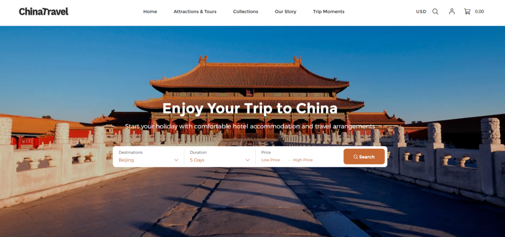
We designed a full-width hero banner featuring immersive travel imagery—landscapes, destinations, and cultural moments. The goal is to create an emotional connection within seconds.
Key elements include:
- High-impact destination visuals
- Short, inspiring headlines
- Clear call-to-action (e.g., “Explore Destinations” or “Plan Your Trip”)
This approach invites users to start their journey instantly.rload.ad.
Destination Highlight Sections
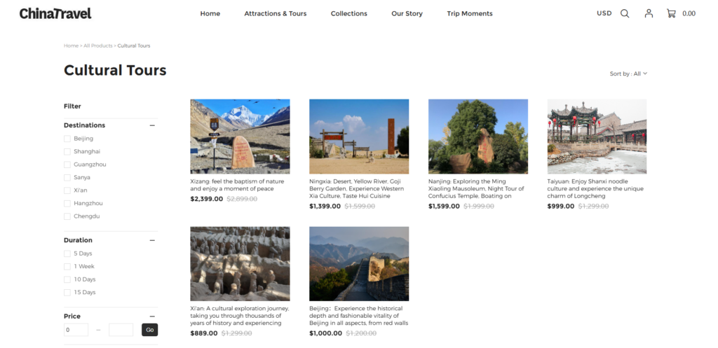
Instead of generic product listings, we structured sections around travel experiences and destinations.
Design Approach
- Grid layouts showcasing different destinations
- Balanced use of imagery and minimal text
- Clear categorization (e.g., cities, nature, cultural tours)
- Consistent spacing for a clean look
Each section answers key user questions:
- Where can I go?
- What can I experience?
- Why should I choose this option?
Trust and Credibility Elements
Travel decisions involve higher commitment, so trust is critical.
We integrated:
- Traveler reviews and testimonials
- Service guarantees and support highlights
- Clear booking and cancellation policies
- Visual trust indicators (icons and badges)
These elements reduce uncertainty and increase booking confidence.n easier.
Beyond the Homepage: Supporting Travel Pages
While the homepage inspires, internal pages convert interest into action.
Travel Package / Service Pages
We designed these pages to present travel offerings clearly and persuasively.
Structure Includes:
- High-quality destination galleries
- Key highlights and itineraries above the fold
- Transparent pricing and inclusions
- Prominent booking or inquiry buttons
- Supporting visuals (maps, icons, feature highlights)
Instead of long descriptions, we used visual storytelling to communicate the experience. communicate value.echnical descriptions, we used visual storytelling to communicate value.
Destination Category Pages
These pages help users explore travel options efficiently.
We optimized them by:
- Keeping layouts clean and easy to scan
- Grouping destinations logically
- Using consistent visual cards
- Avoiding clutter to maintain focus
This allows users to quickly compare and choose destinations.find what they are looking for.
About and Brand Story Pages
In travel, emotional connection is essential.
We designed these pages to:
- Share the brand’s travel philosophy
- Highlight expertise and reliability
- Maintain visual consistency
- Build a sense of trust and inspiration
우리의 디자인 프로세스
A structured approach ensures both creativity and effectiveness.
Step 1: Research and Travel Market Insights
We analyzed:
- Travel industry trends
- Competitor travel websites
- User behavior in trip planning
This helped define the visual and structural direction.
Step 2: Wireframing the User Journey
We mapped the full user journey:
- Discovery → Exploration → Decision → Booking
This ensured every page supports a logical flow.
Step 3: Visual Design for Inspiration
우리는 다음 사항에 집중했습니다:
- Large, immersive imagery
- Clean layouts with ample whitespace
- Consistent typography
- Harmonized color schemes
The goal was to balance inspiration with clarity.
Step 4: Conversion Optimization
We refined the design to:
- Reduce friction in navigation
- Highlight key actions
- Simplify decision-making
Our focus: guide users naturally toward booking.ve friction and guide action.
Key Advantages of Our Approach
1. Experience-Driven Design
We design for emotion and experience, not just structure. This is especially important in travel, where inspiration drives action.
2. Global User Alignment
We follow Western design standards:
- Minimalist layouts
- 강력한 시각적 계층 구조
- Clear communication
3. Consistency Across Pages
Consistency ensures users feel confident throughout their journey.
4. Mobile-First Travel Experience
Travel users often browse on mobile devices. We optimized for:
- Easy scrolling
- Touch-friendly interactions
- Fast content consumption
우리가 직면했던 어려움
Challenge 1: Balancing Inspiration and Information
Travel websites must inspire without overwhelming users with details.
Challenge 2: Building Trust Quickly
Users need to feel confident in booking decisions within seconds.
Challenge 3: Structuring Complex Travel Content
Travel offerings can be complex, requiring clear organization.
당사의 솔루션
Solution 1: Clear Content Hierarchy
We prioritized essential information and structured it logically.
Solution 2: Visual Storytelling
We used imagery and layout to communicate experiences instead of relying on text-heavy content.
Solution 3: Simplified Design Language
We removed unnecessary elements to keep focus on destinations and actions.
Final Results
The final travel website achieved:
- A visually engaging and immersive experience
- Improved navigation and user flow
- Stronger presentation of travel offerings
- Increased trust and credibility
- Enhanced booking potential
Users can now easily explore destinations, understand offerings, and take action.
결론
This Ueeshop travel website project demonstrates how design can transform a browsing experience into a booking journey. By combining inspiration, clarity, and strategic layout, we created a platform that not only attracts users but also converts them effectively.
In the travel industry, great design is not optional—it is essential.
에서 AIRSANG, we specialize in creating high-converting, design-driven websites tailored for global markets. Whether for travel brands or other industries, our focus remains the same: turning user interest into real business growth through thoughtful design.