






Project overview
KikaGoods is a trendy toy and collectibles brand targeting the global market. It mainly sells designer toys, blind boxes, collectible figures, character peripherals and other products. As the number and series of products continue to increase, the original website is gradually unable to meet business growth needs in terms of brand visual expression, product category browsing, and promotional information presentation. Therefore, the customer approached AIRSANG and hoped to upgrade its Shopify brand website in a systematic design. The project focuses on optimizing the homepage visuals, product display, series classification, promotion modules and mobile browsing experience. While retaining the brand’s youthful, interesting and collectible atmosphere, it improves the website’s information level and shopping efficiency, and establishes a set of sustainably expanded visual and page structures to provide a stable foundation for subsequent new product releases, limited series and global market operations.
| 서비스 | Industry | 플랫폼 |
| Website design and decoration | Home department store | shopify |
| Project requirements | target market | design style |
| Improve product display effect and sales conversion rate | 글로벌 | Fun and lively | Soft colors | Collection atmosphere |
| project budget | Delivery content | Delivery time |
| ¥8300 | Website construction and full-site page design | 17 working days |
Project Challenges
In the early stages of the project, the core challenge we faced was how to keep the website clear, orderly and with distinctive brand recognition under a business model with a large number of SKUs and frequent new releases. KikaGoods products cover blind boxes, designer toys and collectible figures. Different series have great differences in characters, colors and visual languages. At the same time, they also need to take into account the browsing habits and mobile shopping experience of global users. To this end, we focused on sorting out product classification, series logic, promotional content and user browsing paths in the early stage, and analyzed the homepage information level, product card specifications and mobile terminal display methods, and established unified fonts, colors, image proportions and module spacing rules to lay a stable foundation for subsequent Shopify page design and long-term new product expansion.
Page design strategy
Home Page: Building the First Impression
First screen visual impact
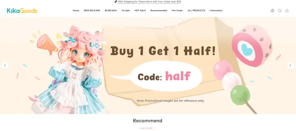
The homepage needs to convey three core messages as soon as the user enters the website:
What products does the brand mainly sell?
What kind of emotional and visual atmosphere does the brand hope to create?
Why it’s worth it for users to keep scrolling
Therefore, we designed a large, highly recognizable and colorful main visual area on the first screen, combined with:
Clear promotional messages
Soft, lively and friendly color scheme
Product images that highlight product materials, textures and details
We did not pile too much content on the first screen, but made the main visual a visual entrance that attracts users to continue exploring the website.
Modular content storytelling
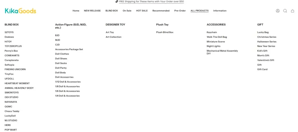
Rather than randomly arranging products on the homepage, we adopted a modular content narrative structure, including:
추천 상품
New product launch
Buy more, save more provinces
Hot products
Discount product series
Featured recommendation modules
Each module maintains uniform spacing, font specifications, and picture proportions, so that even if the page carries a large number of products and content, it can still remain clear and orderly, and facilitate users to quickly browse and obtain key information.
Product display design
Designed for collectibles, not general merchandise
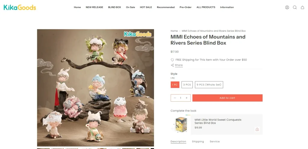
Designer toys have a different display logic than regular retail merchandise. Rather than simply emphasizing price and functionality, we pay more attention to the visual performance, character details and overall emotional atmosphere of the product itself, so that users can feel the collection value and brand personality when browsing.
Product card design
Each product card is designed around the following key points:
Clearly display character modeling and product details
Maintain consistent image proportions and visual dimensions
Highlight prices and promotions without cluttering the page
Use concise small labels to display status such as “new product”, “hot sale” or “discount”
The unified product card structure can help users browse a large number of products more quickly while reducing the reading pressure caused by information overload.
Visual grouping and product families
We do not only divide products according to traditional commodity classifications, but combine them with visual logic to group them, including:
character theme
color style
Limited series
Seasonal new products
This classification method makes the user’s browsing process more exploratory, rather than purely centered around purchasing behavior, and is more in line with the consumption habits of trendy toys and collectibles users.
Promotion and marketing activity module design
Make promotions friendlier rather than overemphasizing discounts
Many Shopify stores are accustomed to using large amounts of eye-catching discount information to stimulate purchases, but this approach can easily weaken the sense of value of the brand itself. For KikaGoods, we adopted a softer, design-driven promotional expression.
Marketing activity module
For example, the following promotional content:
Free shipping on orders placed
coupon code
Buy one get one free event
Lucky bag and blind box activities
Instead of using overly strong, eye-catching promotional banners, we presented it through illustrative elements and a friendlier copywriting approach.
This method can not only retain the original relaxed and interesting visual charm of the brand, but also effectively promote user conversion.
Visual hierarchy of promotional messages
In the promotion area, we mainly establish the information hierarchy in the following ways:
Clear font size and weight contrast
soft background colors
Use character illustrations instead of plain generic icons
This allows promotional information to be quickly noticed by users without interrupting the overall shopping experience or destroying the visual unity of the page.
Navigation and browsing experience
Designed for large product catalogs
KikaGoods has a large number of SKUs that are constantly updated, so one of the biggest challenges is how to allow users to easily explore different products while avoiding the browsing pressure caused by complex categories.
Menu and category logic
We help websites reorganize their navigation structure around:
product type
Product series
Limited new products
Special offer
The core goal is to reduce the number of clicks required for users to find target products, so that different types of users can quickly enter the product area of interest.
Page structure suitable for scrolling
Rather than asking users to frequently jump to different category pages, we designed a content structure that is more suitable for long page scrolling and encourages users to continuously discover new products through continuous product modules.
This design method is especially suitable for mobile users, because users can complete browsing by naturally swiping down without having to click and return frequently.
Mobile-first page design
Designed for real shopping
A considerable part of the traffic on the website comes from mobile users, so when we design each page module, we fully consider the operating habits of mobile users.
Mobile design principles
We focused on applying the following design principles:
Clear and clickable operating area
Use a top-down arrangement structure to improve the reading experience
Control the loading load of images and visual elements
Use short, clear text
Maintain uniform and comfortable module spacing
We try to avoid overly complex layout structures that could overcrowd content or disrupt browsing rhythm on smaller screens.
Visual unity and brand language
Establish a recognizable design system
For fast-growing brands, it is easy to have inconsistent page styles in the long-term operation process. To avoid this, we have established a clear and sustainable set of visual design rules for our website, including:
Uniform font usage specifications
통합 색상 논리
Repeatable and reusable page layout patterns
Stable and consistent module spacing
Through this design system, even if new products, promotions and content modules are continuously added in the future, the overall visual style can be maintained consistent without the need to redesign the page every time.