Project overview
The client of this project, ToRetro, is a retro gaming equipment brand targeting the global market. It mainly sells retro handheld consoles and related game console products. Its target users include nostalgic gamers, collectors and consumers who buy handheld consoles for the first time. As product categories and marketing activities continue to increase, the original website can no longer meet business growth needs in terms of brand vision, product browsing efficiency, and promotional information presentation. Therefore, the customer approached AIRSANG and hoped to reorganize the entire site design based on the Shopify platform. The project focuses on the homepage visual design, product classification and card layout, promotion module, mobile experience and brand visual unification. It retains the retro game atmosphere while integrating modern e-commerce design language to create a Shopify brand website with a sense of nostalgia, professionalism and conversion capabilities.
| 서비스 | Industry | 플랫폼 |
| Website design and decoration | Digital 3C | shopify |
| Project requirements | target market | design style |
| Improve the overall visual quality and brand recognition of the website | 글로벌 | Retro technology, neon trend, young and dynamic |
| project budget | Delivery content | Delivery time |
| ¥8500 | Website construction and full-site page design | 18 working days |
Project Challenges
The core challenge of this project is to keep the nostalgic atmosphere of retro games while preventing the page from looking old and cluttered, and to solve problems such as a large number of products, frequent promotional information, and poor mobile browsing experience. ToRetro has a variety of handheld products and different versions. Users usually browse and compare repeatedly before purchasing. Therefore, the website needs to take into account product discovery efficiency, visual appeal and promotion conversion. Before starting the project, we first conducted a visual review of the original website, researched similar retro games and consumer electronics brands, and analyzed the page structure, product cards, promotion layout and mobile experience of competing products. At the same time, we combined customer communication to sort out target user behavior, product classification and marketing needs, and determine a unified direction for the subsequent Shopify homepage structure, visual hierarchy and modular design.
Our Shopify design process
Step One|Visual Review and Competitive Product Analysis
At the beginning of the project, we first conducted a complete visual review of the client’s existing website, and also analyzed retro game and consumer electronics brand websites of the same type. Through this process, we discovered some obvious problems:
- Too much use of dark layout affects page readability
- The spacing between product cards is not uniform
- Visual competition between promotional banner and core content
Based on these questions, we established a core design principle:
Each page section must have clear value in terms of visual presentation and marketing strategy.
Step 2|Homepage structure and visual hierarchy
The homepage is the core foundation of the entire website experience, so we focused on reorganizing the page structure and content hierarchy.
First screen Banner design
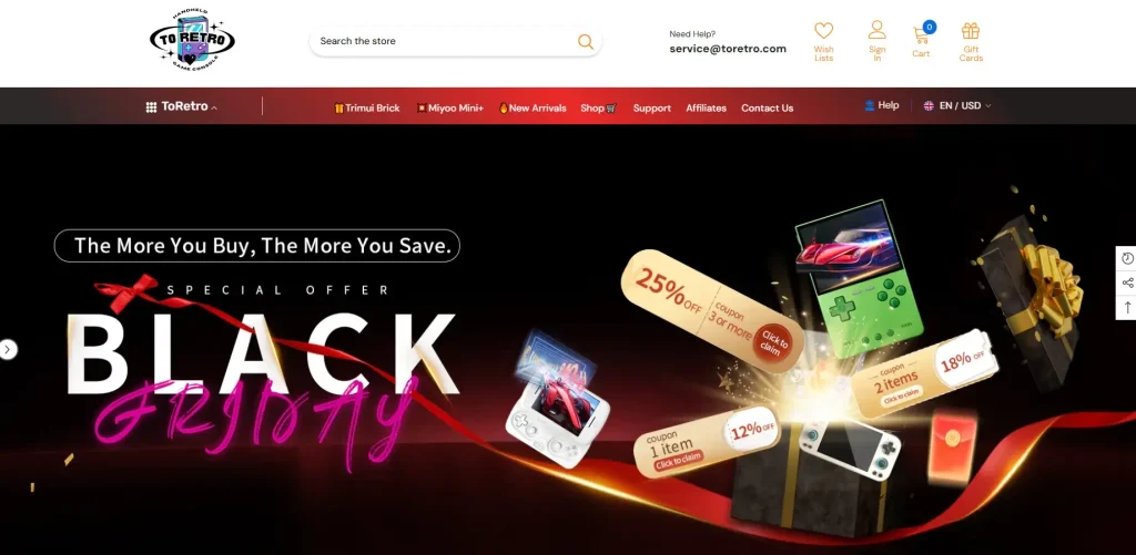
The above-the-fold banner is not only used to display promotional activities, but also plays a role in establishing the first impression of the brand and creating an overall emotional atmosphere.
The main design directions include:
- Use high-contrast visuals and incorporate neon-style accents
- Clearly present promotions such as Black Friday and limited-time offers
- Enhance the sense of space and dynamics of the picture through the arrangement of product images at different levels
This section can quickly convey the atmosphere of the event after users enter the website, while ensuring that the core information is clear and easy to browse.
Trust information module
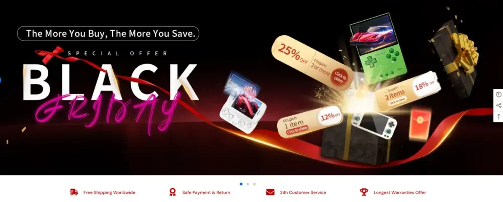
Below the first-screen banner, we have added a set of trust information based on icons, including:
- free shipping
- Safe payment
- customer support
- Product warranty or satisfaction guarantee
Although this content is not visually eye-catching, for users who visit the website for the first time, it can effectively reduce purchasing concerns and enhance brand trust.
Step 3|Improving product discovery efficiency through design
Layout with product series as the core
Rather than stacking a large number of products directly on the homepage, we reorganized the content around curated product lines, such as:
- Featured Retro Handheld Consoles
- New product recommendations
- A range of different consoles for both novice and experienced gamers
Each product collection module uses consistent card styles, spacing, and hover effects to establish a neater, more coherent visual rhythm.
Product card optimization
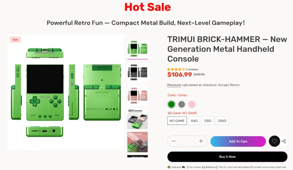
Without changing Shopify’s original product system, we focused on optimizing the visual display of products, including:
- Unify and optimize the alignment of product images
- Clarify the price hierarchy between sales price and original price
- Use more intuitive color style selection tips
Such a design can help users quickly compare different products without the need to frequently open multiple pages or tabs.
Designed for marketing activities and promotional scenarios
Flexible to adapt to seasonal events
An important requirement for ToRetro was the ability to frequently conduct different types of marketing campaigns, including Black Friday, limited stock promotions, and various themed sales events.
Therefore, we designed a set of marketing modules that are flexible and updateable, allowing brands to quickly replace visual content without changing the overall page structure.
예를 들어:
- Full Width Promotional Banner
- Prominent “Hot Sale” hot-selling product section
- Use animation or illustrations to separate elements to enhance event atmosphere and sense of urgency.
Through modular design, even if the website frequently updates marketing activities, it can continue to maintain visual freshness while maintaining the consistency of the overall style and page structure.