Project overview
The client of this project is a cross-border ecommerce seller specializing in hardware tools and electrical tools. It plans to focus on promoting terminal crimping pliers products on the Temu platform. Due to the similar appearance of similar products and concentrated competition, it is difficult for the original materials to quickly highlight the product functions and professional advantages. Therefore, the customer came to us and hoped to re-plan a set of primary and secondary product images with more recognizable and sales logic. We organized the content around the product’s crimping range, ratchet labor-saving structure, crimping effect, specifications and dimensions, durable components and operating procedures, and established a unified visual system in black, gray and orange industrial styles, so that consumers can quickly understand the product’s purpose, core parameters and usage advantages, while improving the professionalism and information transmission efficiency of the product page.
| 서비스 | Industry | 플랫폼 |
| temumain product image design | 하드웨어 도구 | temu |
| Project requirements | target market | design style |
| Improve click-through rate | 글로벌 | Industrial Tough|Technology Machinery|Professional Functions |
| project budget | Delivery content | Delivery time |
| ¥500 | 6 temumain product images | 5 working days |
Project Challenges
The core challenge of this project is how to allow consumers to quickly understand the functional differences of crimping pliers in a competitive environment where Temu hardware tool categories are highly homogeneous, while avoiding the complexity of the picture caused by parameter stacking. In the early stage of design, we first sorted out basic information such as product model, crimping range, wire diameter, size, weight and applicable terminals, and analyzed key components such as ratchet structure, release device, anti-slip handle and crimping jaws. Subsequently, we re-divided the information tasks of the six pictures according to the order of consumers’ purchasing decisions, planned product display, structural selling points, crimping effects, specifications, durable details and operating steps, and unified fonts, colors, icons and information levels to establish clear visual standards for the subsequent design of the entire set of primary and secondary product images.
The first picture: Use the product body to establish the first visual memory
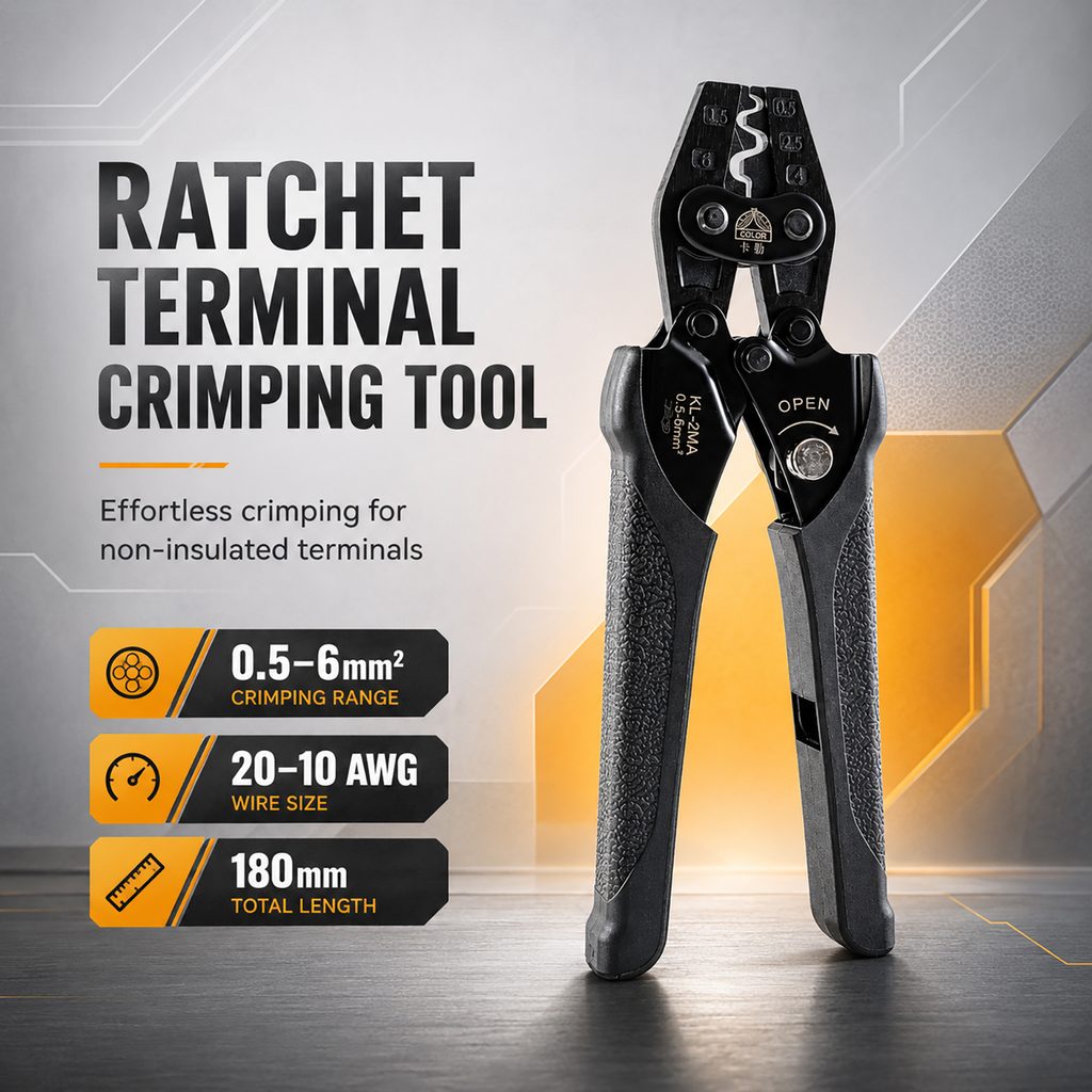
The first one takes on the most important task in the entire set of pictures – letting consumers quickly understand the product.
We placed the crimping pliers on the right side of the screen in a nearly vertical manner, and significantly enlarged the scale of the product so that the jaws, mechanical structure, handle texture, and model information on the product can be fully displayed. Rather than spreading a large amount of information evenly across the screen, we proactively focus the visual focus on the product itself, allowing consumers to know at first glance that this is a professional terminal crimping tool after entering the product page.
Use a large font title “RATCHET TERMINAL CRIMPING TOOL” on the left to directly describe the product type. The title uses a bold sans-serif font, and the higher font weight establishes the sense of power that hardware tools should have. The “Effortless crimping for non-insulated terminals” below further explains the use of the product, allowing users to understand that this tool is mainly used for crimping non-insulated terminals without reading complicated instructions.
At the bottom, we have separated three key parameters into black and orange information cards: 0.5–6mm² crimp range, 20–10 AWG wire diameter range, and 180mm overall length. When consumers browse the first picture, they can complete the two actions of “understanding the product” and “confirming the basic specifications” at the same time.
For the background, we did not use complex real maintenance scenes, but used light gray industrial space with orange geometric structures. In this way, the professional feel of tool products can be retained without letting environmental elements steal the attention of the main product.
Second picture: Prominent ratchet structure and labor-saving operation
After consumers get to know the product, the next step will naturally be to focus on: Why is this crimping plier better to use?
Therefore, in the second picture, we did not continue to repeat the basic parameters of the first picture, but turned the focus to the ratchet structure.
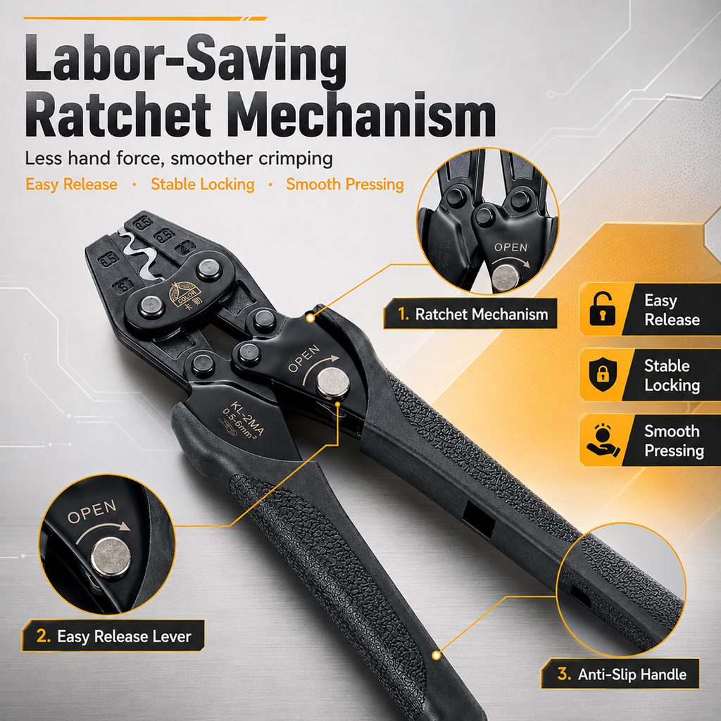
We use “Labor-Saving Ratchet Mechanism” as the core title and “Less hand force, smoother crimping” to directly explain the actual value that the ratchet structure brings to users. Compared with just writing “Ratchet Mechanism”, this expression is easier for ordinary consumers to understand, because what users really care about is not the name of the mechanical structure, but whether it can reduce hand force and make the crimping process smoother.
In the picture, we enlarge the crimping tool diagonally so that the product extends naturally from the upper left to the lower right. This composition not only displays the complete tool, but also breaks the repetitive feeling of the first vertical display.
We further added three partial magnification areas to emphasize the ratchet mechanism, release structure and anti-slip handle respectively. Through the orange stroked circular magnifying frame and guide lines, consumers’ attention is accurately brought to the corresponding structure.
The information module on the right extracts three benefit points: Easy Release, Stable Locking, and Smooth Pressing. We configure independent icons for each selling point so that consumers can quickly understand the product advantages through graphics and short words even if they quickly scroll the page.
The core purpose of this piece is not to tell consumers “what the product has”, but to explain “why these structures are valuable.”
The third picture: directly shows the crimping effect
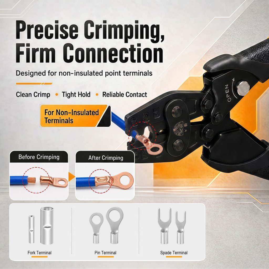
For crimping pliers, one of the important factors that really determines the purchase is whether the final pressed terminals are firm and neat.
Therefore, in the third picture, we go directly to the usage effect display.
The title “Precise Crimping, Firm Connection” clearly expresses the two core values of precise crimping and firm connection. The subtitle further explains that the product is designed for non-insulated terminals, making the product positioning clearer.
On the right side of the picture, a large-scale crimping plier is used to directly show the relationship between the blue wire, the copper terminal and the pliers. In this way, when consumers see the picture, they don’t need to rely on imagination to understand how the product actually works.
We designed the Before Crimping and After Crimping comparison modules in the lower left area. Before crimping, the wire and terminal are in a separated state; after crimping, the terminal has formed a complete connection with the wire. Through this result-oriented display method, we transform the abstract “crimping ability” into visual results that consumers can directly observe.
At the same time, we added three short selling points: Clean Crimp, Tight Hold, and Reliable Contact to further summarize the effect after crimping as a clean, strong and reliable connection.
The bottom shows a variety of applicable terminal forms. The different forms of terminal icons tell consumers that this tool does not only correspond to a single terminal. Compared with simply listing the compatibility range with text, product graphics can significantly reduce the cost of user understanding.
This one actually plays the role of “functional proof” and is also a very important transformational content in the entire set of pictures.
The fourth picture: Focus on solving specifications and size issues
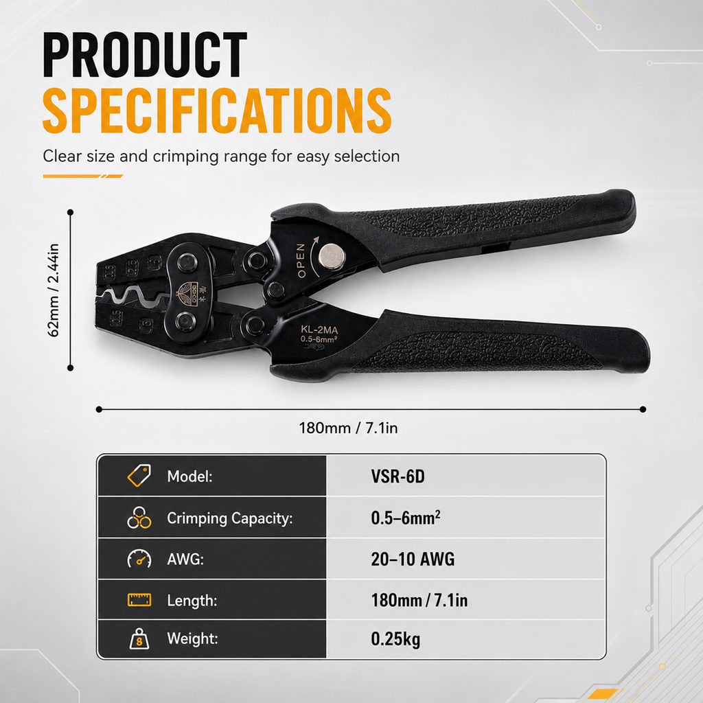
The first three pictures have completed product recognition, structural selling points and usage effect display. In the fourth picture, we took the initiative to reduce the degree of sceneization and put all the focus on product specifications.
We use a clean background that is close to white and display the crimping tool in its entirety horizontally. The horizontal composition is ideal for conveying the length of the product, while also allowing consumers to observe the overall proportions between jaws, hinges and handles.
We directly mark the product length of 180mm / 7.1in and the width of 62mm / 2.44in through the size line, allowing consumers to establish a true size concept without reading the detailed text.
The information table below summarizes parameters such as model number, crimping capacity, AWG range, length and weight. Rather than scattering these numbers into different pictures, we concentrated the detailed specifications in one area, which can help consumers who are already interested in purchasing quickly complete the final information confirmation.
This one is obviously more restrained visually than the previous three. We reduce the orange background area, retaining only the orange title and a few decorative lines, letting the parameters themselves become the protagonist.
This change of pace is also very important. If all six pictures use the same information density and scene presentation, consumers will easily suffer from visual fatigue. By alternating “selling point pictures – function pictures – parameter pictures”, we make the whole set of pictures more hierarchical to browse.
Picture 5: Use structural details to enhance durability
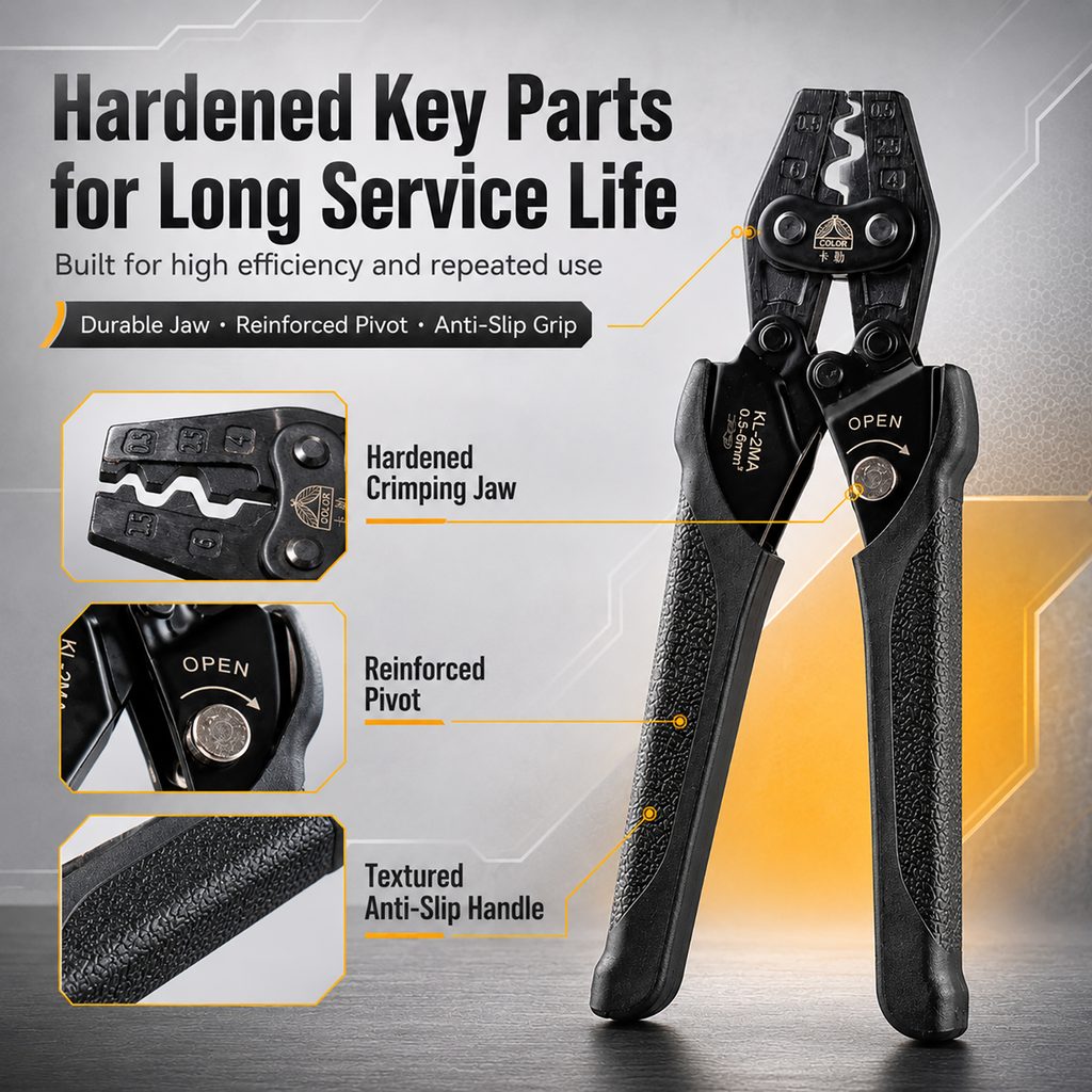
In addition to functionality, consumers usually also pay attention to durability of tool products.
Therefore, in the fifth picture, we set the theme as “Hardened Key Parts for Long Service Life” to dismantle the important structure of the product so that consumers can see where the durable design of the product comes from.
The complete product remains on the right side, ensuring that users can always connect local details to the entire tool. On the left side, there are three partial close-up areas, showing Hardened Crimping Jaw, Reinforced Pivot and Textured Anti-Slip Handle respectively.
The jaws are the core area directly involved in crimping, so we zoomed in to show its structure; the rotating shaft bears the mechanical force when the tool is repeatedly opened and closed, so it stands out alone; the handle directly affects the holding stability and operating experience, so we use close-up texture close-ups to enhance the anti-slip feel.
We didn’t simply write “Durable” or “High Quality” because it’s difficult to form a credible visual basis for such general terms. We chose to let the pictures directly show the jaws, shafts and handles, and then use short labels to describe the corresponding structures.
This design method of “showing the evidence first, then summarizing the selling points” is more suitable for tool products.
The background continues the visual system of silver gray and industrial orange, and uses thin lines and geometric structures to connect local details. This not only maintains the visual consistency of the entire set, but also gives the picture a professional feel similar to industrial product illustrations.
Picture 6: Use four steps to lower the threshold of use
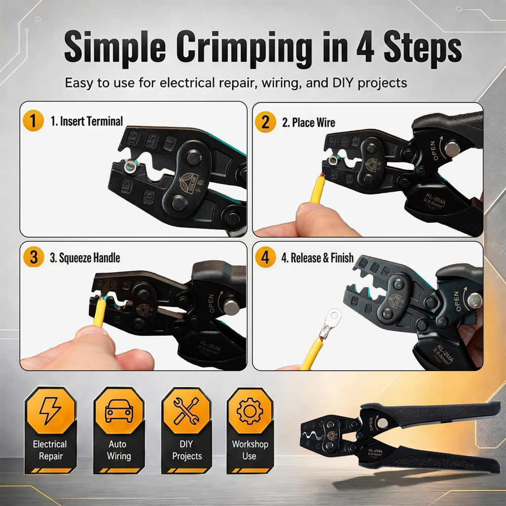
In the last picture, we focus on the actual operation process.
For those familiar with electrician tools, the operation of a crimping tool may be very simple, but Temu is aimed at a wider range of consumers, including DIY users, car wiring repair users and home tool consumers.
Therefore, we cannot assume that every consumer knows how to use the product.
We break the operation process into four steps: insert the terminal, put in the wire, hold the handle, release and complete the crimp. Each step is illustrated using partial images of real products and establishing a clear reading sequence with prominent numbers 1, 2, 3, and 4.
The advantage of this four-square grid structure is that consumers hardly need to read long instructions and can only understand the complete operation process by following the order of pictures.
The four usage directions of Electrical Repair, Auto Wiring, DIY Projects and Workshop Use are further added at the bottom of the screen. Through icons such as lightning, cars, tools and gears, we expand the product from a simple “crimper” to more specific application scenarios.
The complete product is placed again in the lower right corner, which is not only used to balance the picture, but also to strengthen product memory.
This one is very suitable to be placed at the end of the whole set of pictures, because it completes the complete cognitive process for consumers from “what is this”, “what are the advantages”, “what can be pressed”, “what are the parameters” to “specifically how to use it”.