Project overview
In the Shoplazza website design of Firstep Metal Technology, we focused on two display needs of metal manufacturing companies: first, let customers understand which engineering scenarios the products serve, and then put the products and specifications in an easy-to-find location. AIRSANG uses actual factory scenes, blue and white colors, and a clear title hierarchy to connect the homepage, construction project categories, and fence product details; the company introduction adds brand background at the back of the homepage to connect product browsing with corporate awareness.
| 서비스 | Industry | 플랫폼 |
| Shoplazza website visual and page design | Machinery manufacturing | 쇼플라자 |
| Project requirements | target market | design style |
| Connect manufacturing brand introduction, application classification and product specification selection | Philippine market, mainly English content | Industrial blue and white, real factory scene, clear graphic and text hierarchy |
| Project quotation | Delivery content | Delivery time |
| ¥5,300 | Visual layout of home page, engineering product categories and fence product details | 9 days |
design challenge
Products such as fences, scaffolding, and trucks span different application scenarios. If the products are only arranged continuously, visitors need to judge the relationship between each type of product and the project. We organize application scenarios, product catalogs, and single product selections separately: we first use factory images to explain the manufacturing context, and then present products in categories and cards. After entering the details, we focus on checking pictures, prices, and specifications. Visually retain the color blue as an identification cue, while using a white background and module spacing to differentiate between different information groups.
Design strategy: from manufacturing scenarios to specific products
01 First establish the manufacturing context and then expand the product catalog
We used the actual factory scene as the first screen of the homepage, and put the brand’s manufacturing and supply themes into translucent text cards; then divided the browsing entrance by scenes such as construction projects, transportation facilities, industrial warehousing, and residential and commercial buildings. First explain the direction of use, and then display the products, so that different project needs have corresponding starting points.
02 Use two types of English fonts to distinguish emphasis and reading
We use Archivo Black with thick fonts for key titles such as English themes and new products on the first screen, and Arvo with serif characteristics for the main text and some classified text; Chinese descriptions are presented by the system backup font. Blue is responsible for columns, links and price reminders. Dark text is placed on a white background or light-colored card. The priority is distinguished by font size, font weight and white space.
03 Let the actual interaction revolve around product selection and specifications
On the category page, filtering is placed on the left side of the product and sorting is placed above the product area; fence details place specification options, quantity and purchase entry in the same information column. We arrange the interactive feedback at the location where the selection occurs, and let the specification selected state and adjacent fields jointly explain the current selection.
Home page, first screen: Use real factory scenes to explain brand positioning
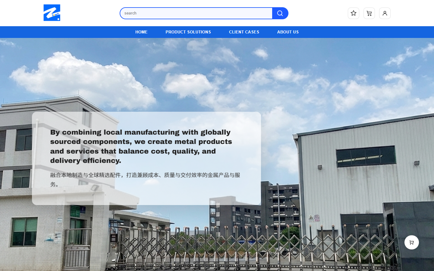
We combined the factory buildings, fences and blue sky to form a complete background, allowing visitors to see the actual environment of metal manufacturing at a first glance. The translucent rounded card on the left carries the English theme and Chinese supplements, reducing the interference of complex backgrounds on the text; the white area at the top is placed with entrances such as logos, searches, and accounts, and the blue navigation belt is divided into separate columns.
The English theme uses Archivo Black’s thick font to establish focus, while the Chinese description uses a lighter font weight, leaving paragraph space between primary and secondary. We did not dye the entire background into the brand color, but focused the blue on the search border and navigation, retaining the details and texture of the factory photo itself.
Application classification: Match products with usage scenarios
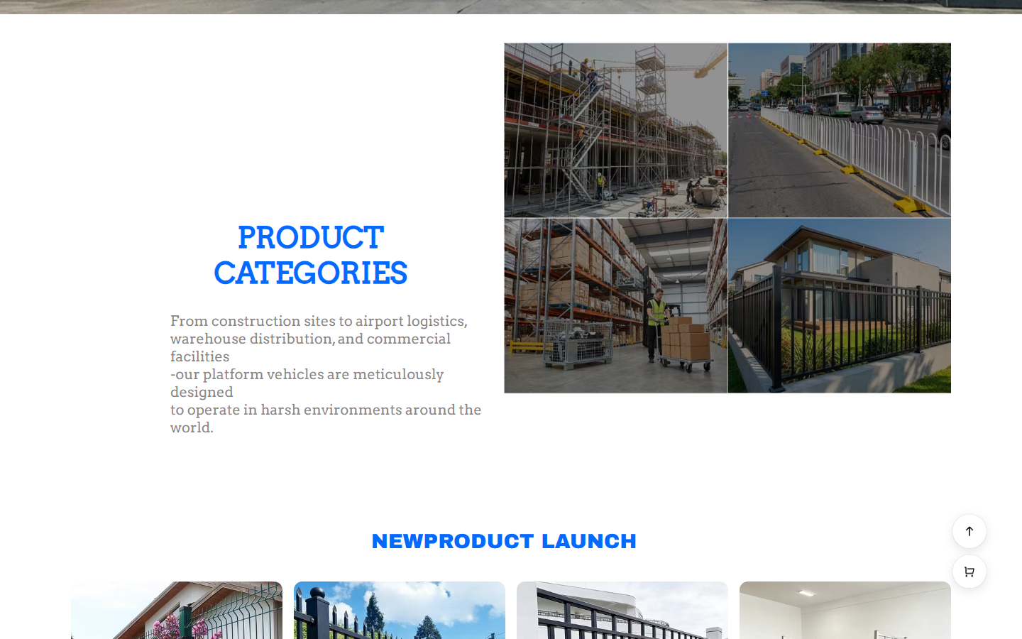
We organize “PRODUCT CATEGORIES” with text on the left and pictures on the right: the left side explains the application scope, and the right side uses four sets of scene diagrams corresponding to construction, transportation, warehousing and residential and commercial. The pictures help identify the usage environment, and the text supplements the meaning of the classification. It is easier to understand the scope of the content than a separate list of product names.
This group of categories uses blue titles and serifed English text. The scale of the titles is significantly larger than the explanatory text. Leave a blank space between the left and right partitions, and keep the pictures on the right in regular arrangement. After applying the classification, enter the new product area, so that scene recognition and single product browsing are divided into two reading stages.
New product area: Unify the pictures and price positions in the card
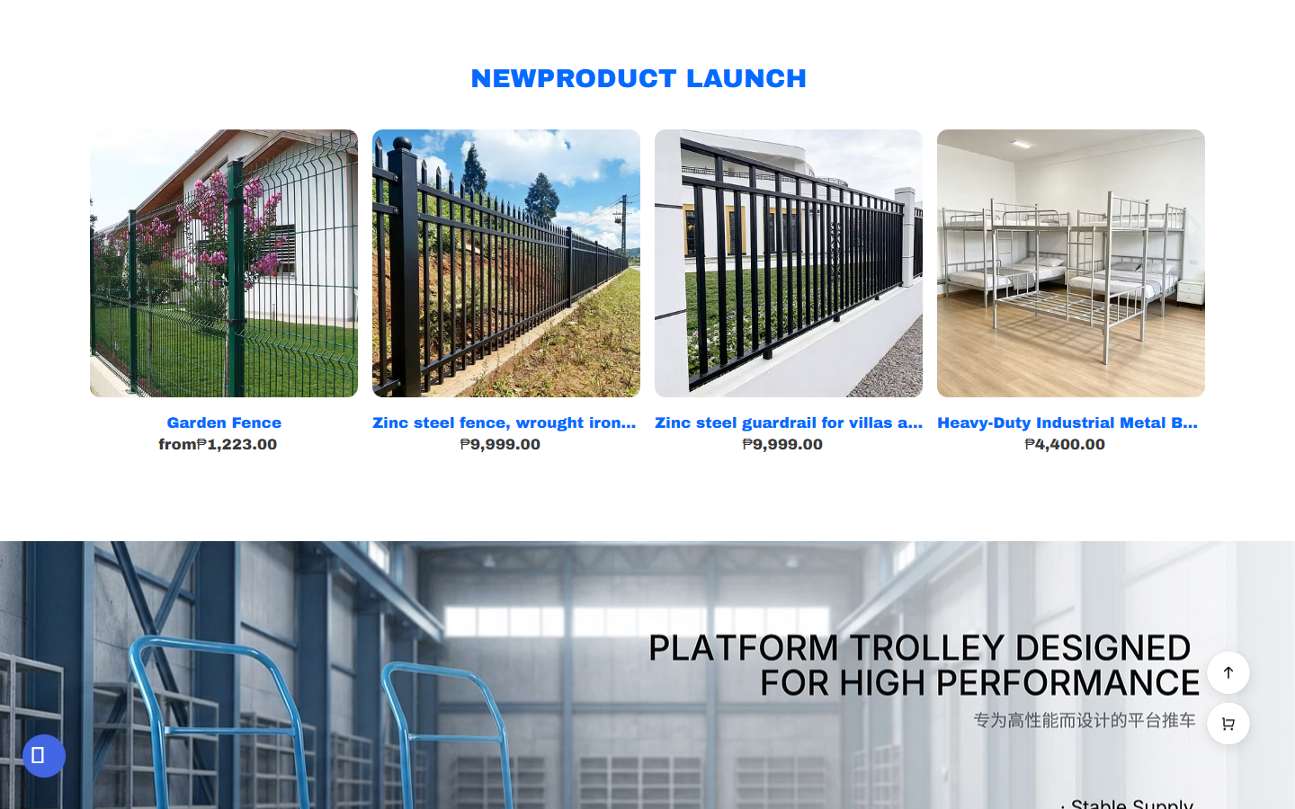
We organized the new products into four columns of product cards, with the fence and metal bed frame arranged along the same image scale, with the name and price in Philippine pesos underneath. Product images retain their respective environments and materials, and unified containers and information locations help users continue browsing between different categories.
“NEWPRODUCT LAUNCH” uses a blue bold title to distance itself from the product area below. The spacing between cards and the white space above and below leave space for long product names, and the truck scene banner is connected below to change the reading rhythm with images. A unified display structure connects different products, while scene banners complement the context of use of these products.
Engineering category page: Use banner positioning, then enter filtering and products
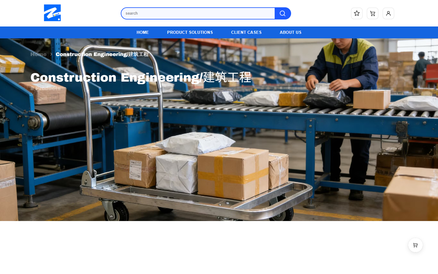
Entering the construction engineering category page, we use transportation and warehousing scenes to form a wide title area. Breadcrumbs and “Construction Engineering/Construction Engineering” are superimposed on the picture, and the current location is first explained. Arrange filters and products only at the bottom to avoid titles, conditions and products being crowded into the same information belt.
The title is in white Archivo Black, and uses a larger font size to maintain recognition in the background; the product area returns to blue text on a white background, so that the image banner and the catalog content form a clear boundary. The white space after the banner also reserves the transition for switching roles on the page: from recognizing categories to viewing products item by item.
Category Product Grid: Put comparison tools next to catalogs
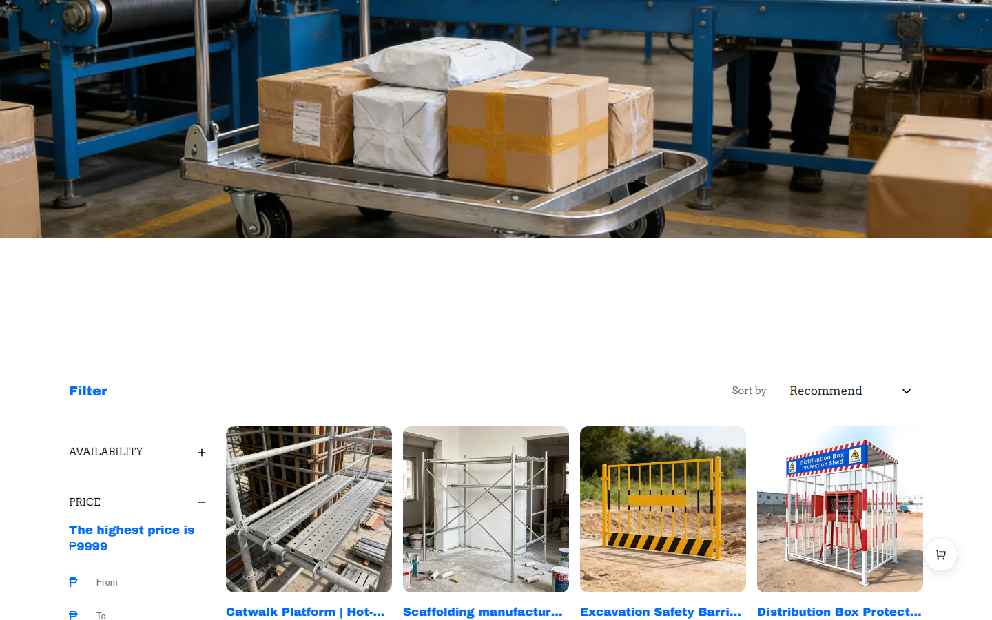
We put the supply, price and supplier filtering groups on the left side, arrange the sorting entrance at the top right of the product area, and display scaffolding, protective fences and engineering supporting products in a regular grid on the right side. The filtering processing range, the sorting processing sequence, and the product pictures and names have their own fixed positions.
Blue is used to filter titles, links, and prices, and thin lines and white backgrounds maintain lightweight separation. The product name is long, so there is a hierarchy between pictures and text, so that the entire grid does not become a wall of text with the same density; visitors can first look at the product outline, and then continue to read the specific name and price.
Fence details: juxtapose item identification and selection area
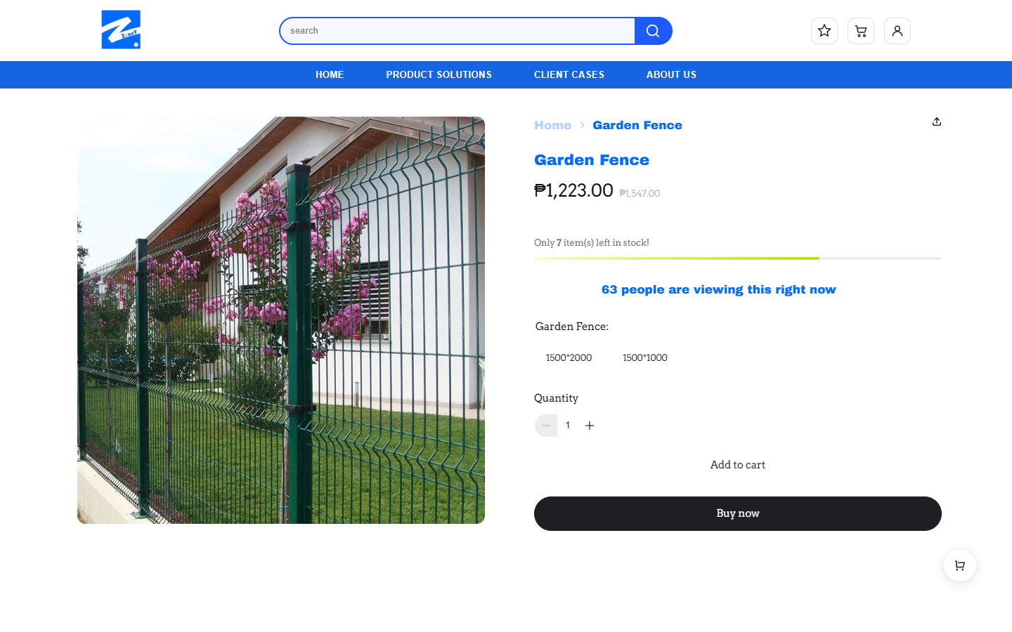
The details of Garden Fence are shown in the picture on the left and the text on the right. The large picture on the left shows the green fence and garden environment, and the name, price, specification, quantity and purchase entrance are concentrated on the right, so that the picture directly corresponds to the specific product information. The blue and white navigation is still used at the top of the page, and it will not switch to another visual language after entering the details.
We reserve a large area for the image, and the information column on the right uses field spacing to distinguish price, specifications, and quantity. The difference between the dark solid purchase button and the light-colored auxiliary operations allows the viewer to read along the order of “see the product – check the information – select specifications”.
Specification switching: Provide clear feedback on the selected size
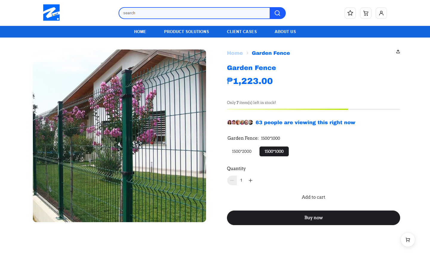
In this picture, we switch the fence specification to “1500*1000”, the corresponding options are distinguished by dark selection, and the current selection is displayed next to the specification title. Another “1500*2000” remains in the same area, and users can directly compare the two options.
We put the specification feedback in the product information column instead of interrupting reading with additional pop-ups. After clicking, the selected border, dark background color and current specification text jointly provide feedback; the quantity and purchase entrance continue to be located below, and specification selection remains adjacent to the next step.
Company introduction module: Supplement corporate background in the back section of the home page
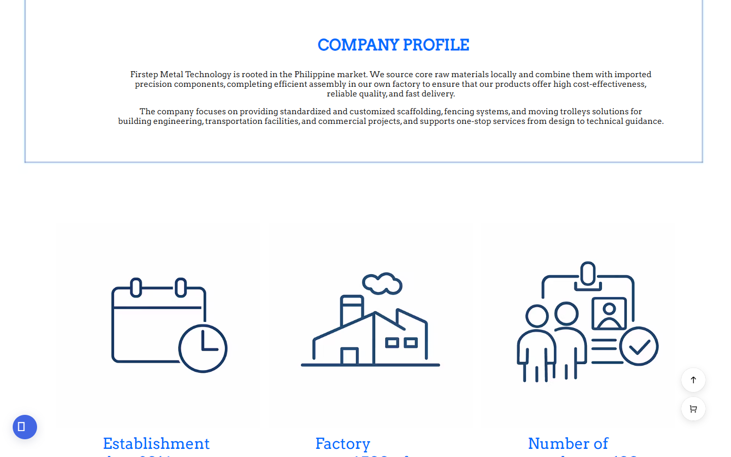
We put the company introduction at the back of the home page, and used a centered blue title and two paragraphs of English description to explain the direction of the Philippine market, local manufacturing, and standardized and customized products. Below, corporate information is organized with linear icons such as dates, factories, and personnel to differentiate the brand background from the product catalog.
This module retains wider horizontal reading space and top-to-bottom spacing. The title uses blue to establish recognition, and the text returns to dark text; the icon uses a unified line style, forming another information expression with the previous factory photo. We put the brand background after product browsing to let visitors know the product first, and then add corporate information.
Mobile homepage: reallocate image and text space in narrow screens
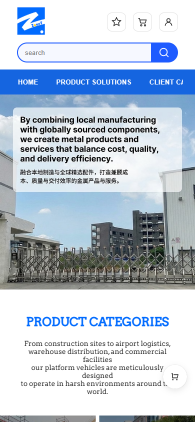
On the mobile phone, icons such as the logo and account are placed at the top, the search box occupies a separate line, and the horizontal navigation strip is retained below. The main visual continues to use factory photos, the text card shrinks with the viewport, the English theme and Chinese description are expanded for vertical reading, and then the product classification is added.
By shortening the length of each line of text, we can still retain the brand theme and factory background on the first screen. The blue navigation and search style continue the desktop vision; the top navigation remains horizontally arranged, and the main visual and category content below are expanded vertically, allowing the brand theme and product content to continue in the same reading direction.
Mobile phone product page: Look at the fence first, then enter the specifications.
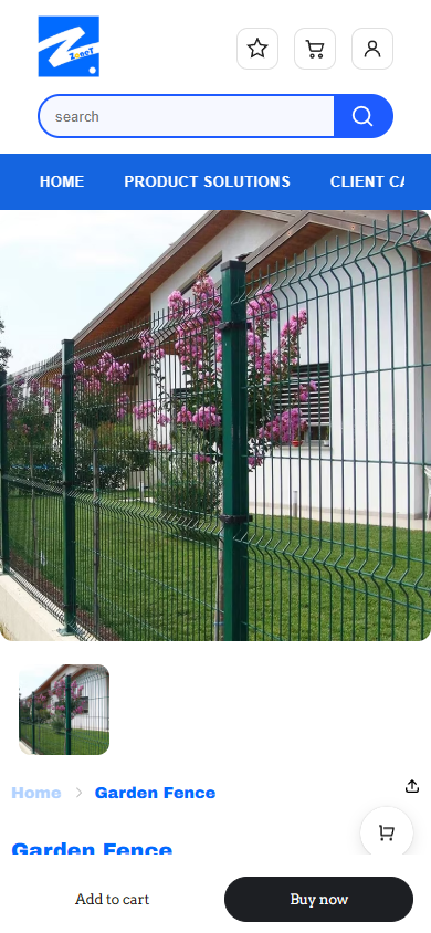
In the mobile product detail page, the fence image first occupies the main width, thumbnails, breadcrumbs and product names appear later, and prices and other information continue to expand downwards. The left and right columns of the desktop are switched to up and down reading, so that product pictures do not have to compete with specification information for the same line space.
We retain the space between the image and the product title, and the blue title takes over the information identification method on the desktop. The image first explains the product and environment, and then the subsequent text takes over for verification; as the page expands downwards, specifications and quantities continue to be taken over. After the product information, the image and fields respectively obtain the full available width.
Design summary: Keep the manufacturing background and product selection path connected
In Firstep’s website expression, we use factory photos to establish the manufacturing context, use application classification and product grid to organize products, and then put fence specifications on the product detail page for centralized selection. Blue and white, emphasized titles and serifed text run through different pages, giving each layer of brand identity and product information.
The interaction revolves around actual browsing tasks: users can enter the product catalog through real category links and switch fence specifications in the details; scrolling the page gradually connects application scenarios, products and company introductions. The entire set of pages revolves around “understanding the manufacturing background, finding application directions, viewing specific products, and selecting specifications” to maintain a clear sequence of corporate expression and product browsing.
Plan a clear Shoplazza website for your brand
You can provide us with your existing website address, product catalog, brand materials and required page range, and together we can sort out the page structure, visuals and functions that suit your business.