Project overview
This case shows 8 Ozon Russian works from the orange-themed electronics and home appliances series. They connect different products with a common visual system, and then change the display focus around the structure, use and specifications of each product. The focus of the explanation is: adapting different presentation methods to culinary, event and video products. For brands and sellers who need to plan a series of product images, this arrangement provides a specific reference between unified identification and single product differences.
| 서비스 | Industry | 플랫폼 |
| Ozon series product main product image design | Digital 3C | 오존 |
| Project requirements | target market | design style |
| Adapt different presentation methods to culinary, event and video products | Russia | Cool technology, high contrast between orange and black, information e-commerce |
| project budget | Delivery content | Delivery time |
| ¥500 | 8 case display pictures | 8 working days |
design challenge
The eight pictures involve air fryers, headsets, lamps, bracelets, juicers, stabilizers and heaters. They share the orange visual, but the purchasing questions are different. The explanations should explain the key points of the information separately, and do not string the parameters of each model into a set of single product specifications.
Design strategy: Let the entire group of works form a clear information relationship
01 First distinguish the product objects, and then determine the focus of each picture
The work involves “small-capacity cooking → head-mounted display → large-capacity cooking → car lights → bracelets → juicers → stabilizers → heaters.” Each picture organizes the content around the corresponding product, and does not combine the capacity, power or functions of different products into one model. What the series have in common is the visual identity, while the information tasks are determined individually by product characteristics.
02 Use a consistent visual language to connect different reading tasks
Warm orange light penetrates the background, and the dark body forms an outline. Food ingredients, game themes, sports figures, and device interfaces change according to categories, and rounded-corner labels maintain series identification. The unified style serves the entire group identification, and composition changes serve different contents; the main title, auxiliary labels and product proportions in the picture jointly determine the reading order.
03 Let different products retain their own purchase issues
Adapting different presentation methods to culinary, event and video products is the organizing focus of this body of work. Lists, parameters, parts and scenes are suitable for different products: first look at what each product needs to explain, and then select the corresponding screen, instead of applying the same parameter layout to all products.
Dismantling the work: explaining the screen arrangement and information responsibilities of each picture
Figure 1|Small-capacity cooking: Put the window and ingredients together
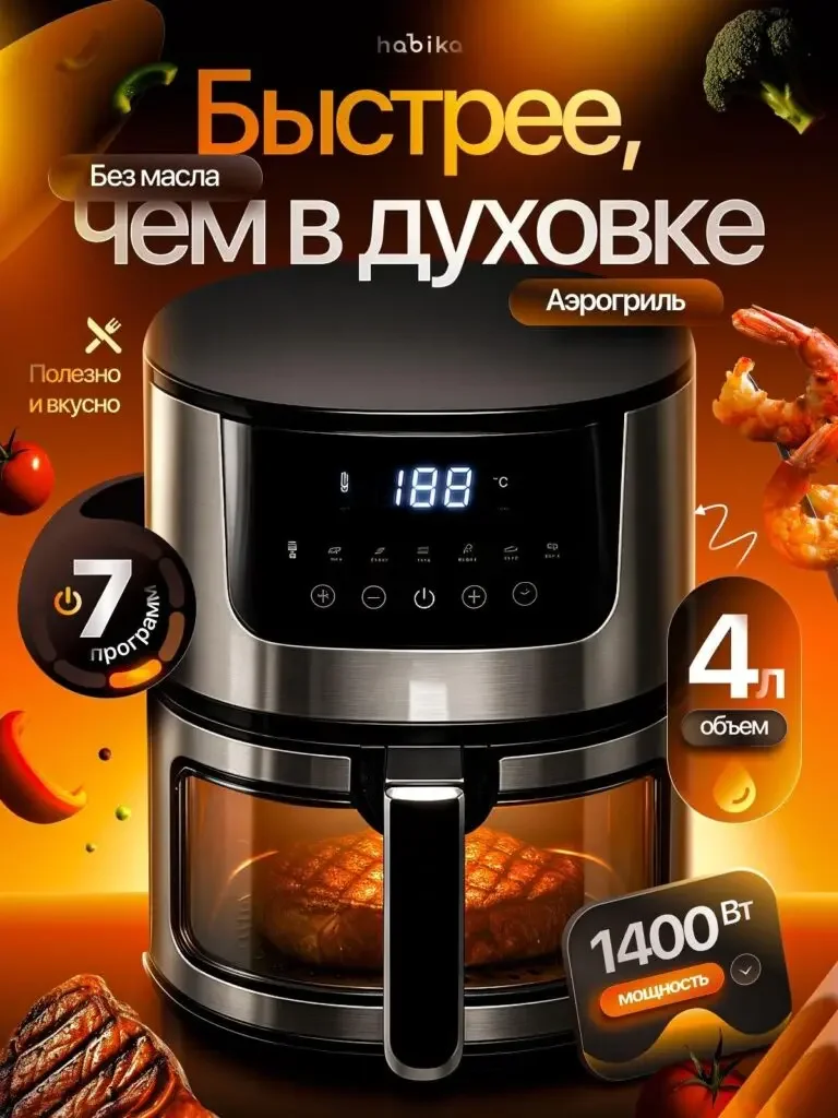
The air fryer is in the center, with a transparent window revealing the ingredients, and the program, capacity and power themes are placed around it.
The window and food explain the objects to be used, the parameter card provides a selection entrance, and the warm color atmosphere is consistent with the cooking theme.
Figure 2 | Head-mounted display theme: using spatial hierarchy to establish shape recognition
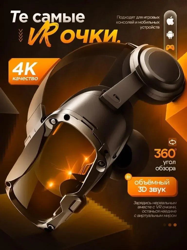
The headset is tilted and unfolded, the lenses and straps remain visible, and the 4K, perspective and sound themes are scattered in the blank area.
The structural outline is responsible for category identification, and the spatial light effect expresses the immersive theme. It is not written as an actual experience measurement.
Figure 3 | Large-capacity cooking: focusing on the body and capacity
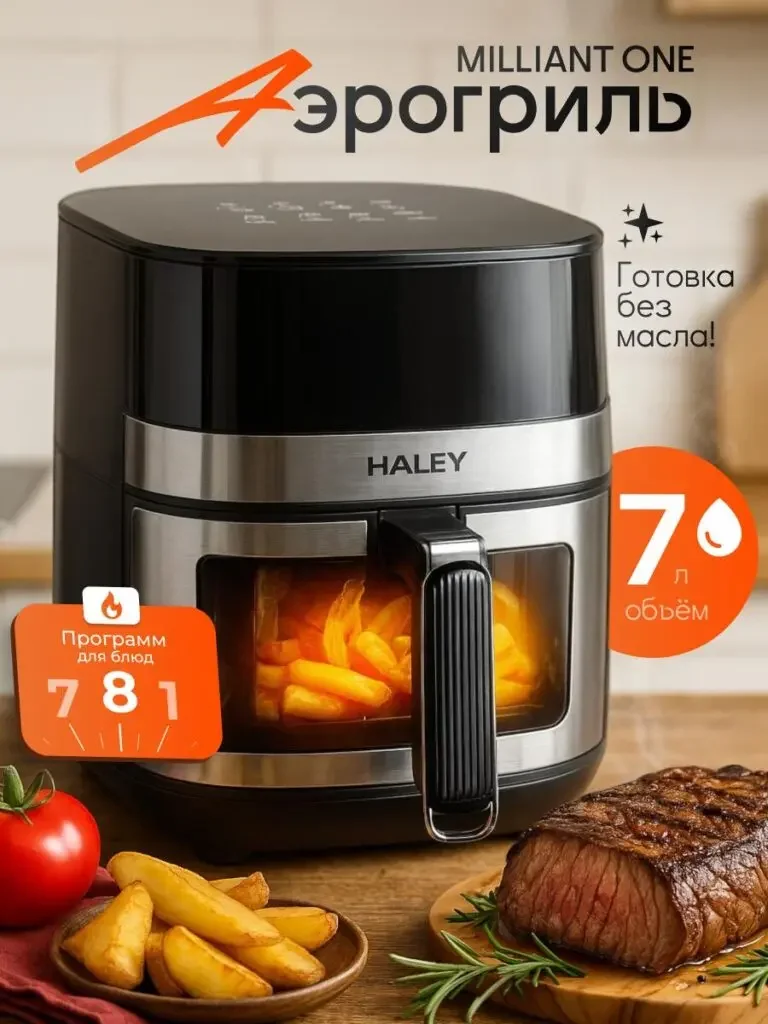
Another air fryer is placed on the countertop, with ingredients and visual windows providing reference, and 7L and program themes are located on both sides.
The configurations are described separately from the previous one. The capacity and power in the two pictures cannot be combined into the same model.
Figure 4|Automotive lamps: mark the base and set quantities independently
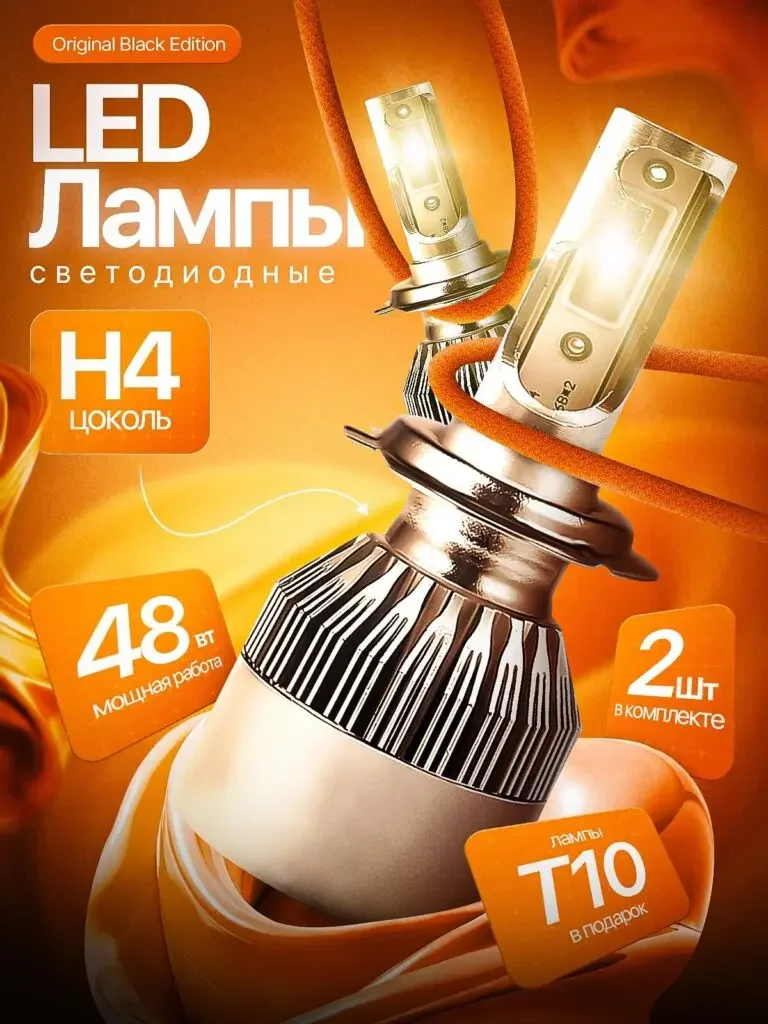
The LED lights are placed at a large angle, H4, power and two-piece themes are placed separately, and the heat dissipation structure is clearly visible.
Specific interfaces are the focus of this type of product, and the number and base correspond to the position of the product, rather than just expressing the brightness and atmosphere.
Figure 5|Sports bracelet: let the interface correspond to the activity environment
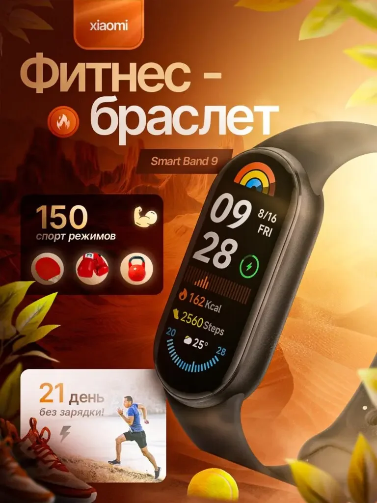
The bracelet screen and watch strap occupy the center, and 150 mode themes and small pictures of sports figures are arranged on both sides.
The interface is responsible for function identification, and the characters are responsible for usage reference. The activity data in the materials are not used as actual measured health conclusions.
Figure 6|Juicer: Use the feeding structure and juice container to illustrate the use
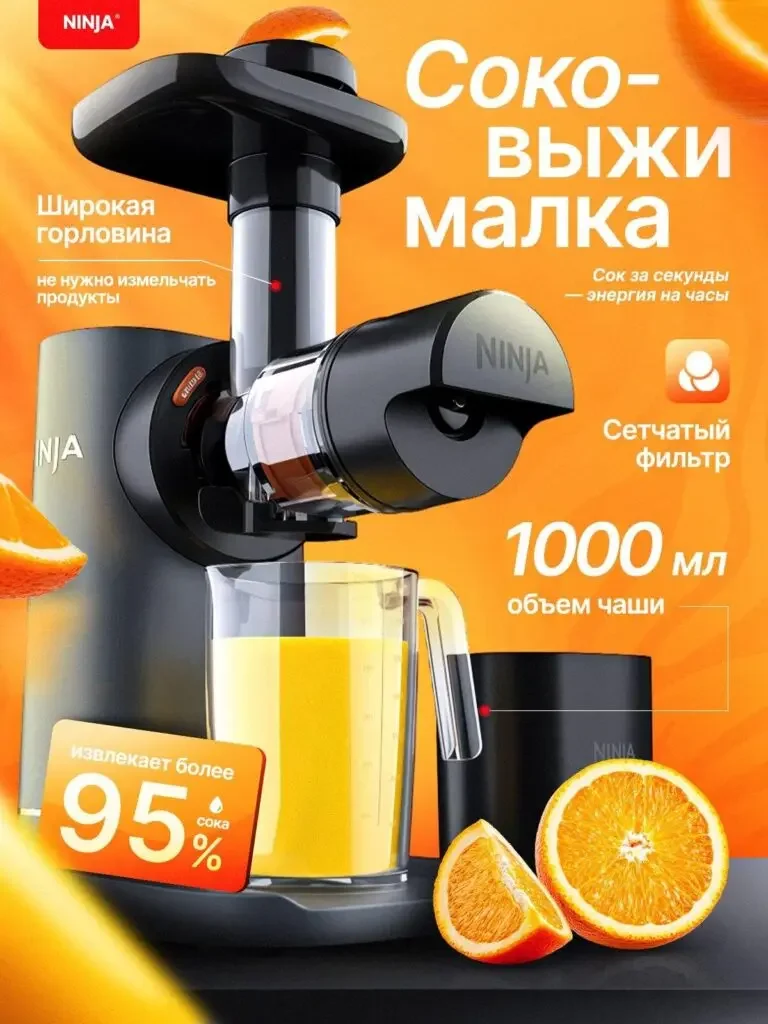
The long feeding area and the transparent juice collection part are kept clear, and themes such as 1000ml and fruit are placed next to it.
The transparent structure makes the work objects visible, and the containers and ingredients explain their purpose; the juice ratio in the picture is just a declaration of the ingredients.
Figure 7|Mobile phone stabilizer: use the shooting screen to connect the device structure
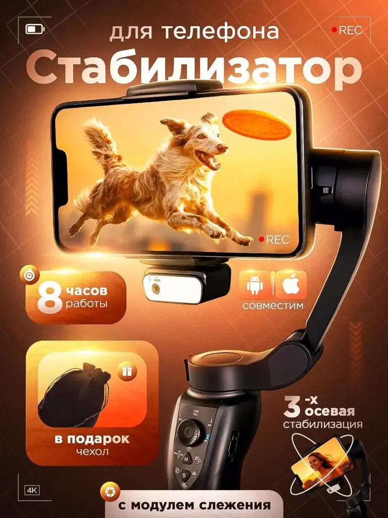
The mobile phone shows the animal in motion, with the stabilizer handle and stand occupying the lower part, and partial schematics to complement the subject.
The equipment and the picture are on the same page, indicating that it serves the shooting; static works do not directly prove the actual anti-shake performance.
Figure 8|Heater: Organize the theme of warmth with luminous areas
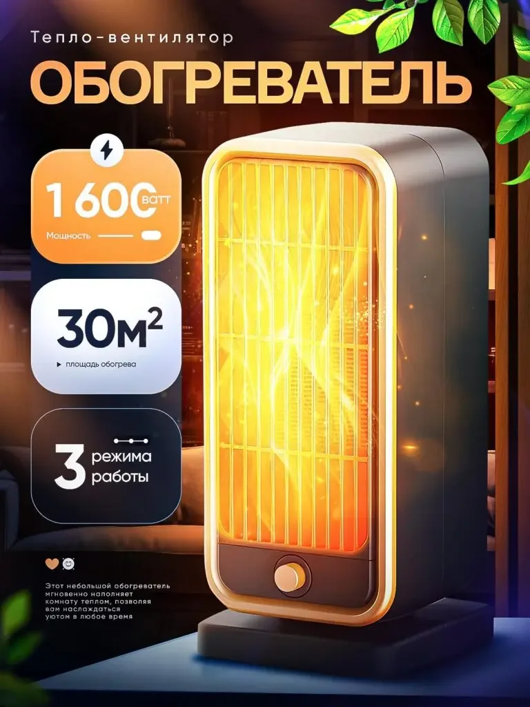
The front of the heater is illuminated, and large digital cards show the power, area and mode respectively, and the operating parts are retained at the bottom of the fuselage.
Warm colors support category expression, parameters are used to check conditions, and cooking equipment forms the same color but different content responsibilities.
Delivery summary and design value
The entire team delivers with a clear division of labor
The eight works in this case respectively cover “small-capacity cooking → head display → large-capacity cooking → car lights → bracelets → juicers → stabilizers → heaters.” The number of images depends on the actual content, and each image has its own theme while maintaining an overall identity through color, text hierarchy, or composition.
Procurement issues can be more easily mapped to specific information
Focusing on the orange-themed electronics and home appliances series, the works will “use different display methods to adapt to cooking, activities and imaging products” and implement them into different images. When brands plan similar designs, they can first list the content that consumers need to identify, understand and check, and then determine the tasks and order of primary and secondary product images.
Value is based on interpretive methods and authentic works
The whole machine, part, scene and information cards provide different reading entrances, helping to organize product descriptions more clearly. The value of this case is the visible design expression and information division of labor; changes in click-through rates, sales, and conversion rates require additional statistical or test data support.
The parameters, materials and functions in this article are used to explain the content of the accompanying pictures. The specific specifications, applicable conditions and accompanying items are subject to the product information of the corresponding model.
Plan clearer product images for your Ozon products
If you also need to plan primary and secondary product images for your Ozon orange-themed electronics and home appliances series, you can submit product links, existing pictures or product information to AIRSANG, explain the target market and required picture group range, and communicate the information organization and visual direction suitable for the product.
Consultation email: [email protected] · Telephone: 177-5952-2770