カートに商品がありません。.

 Japanese
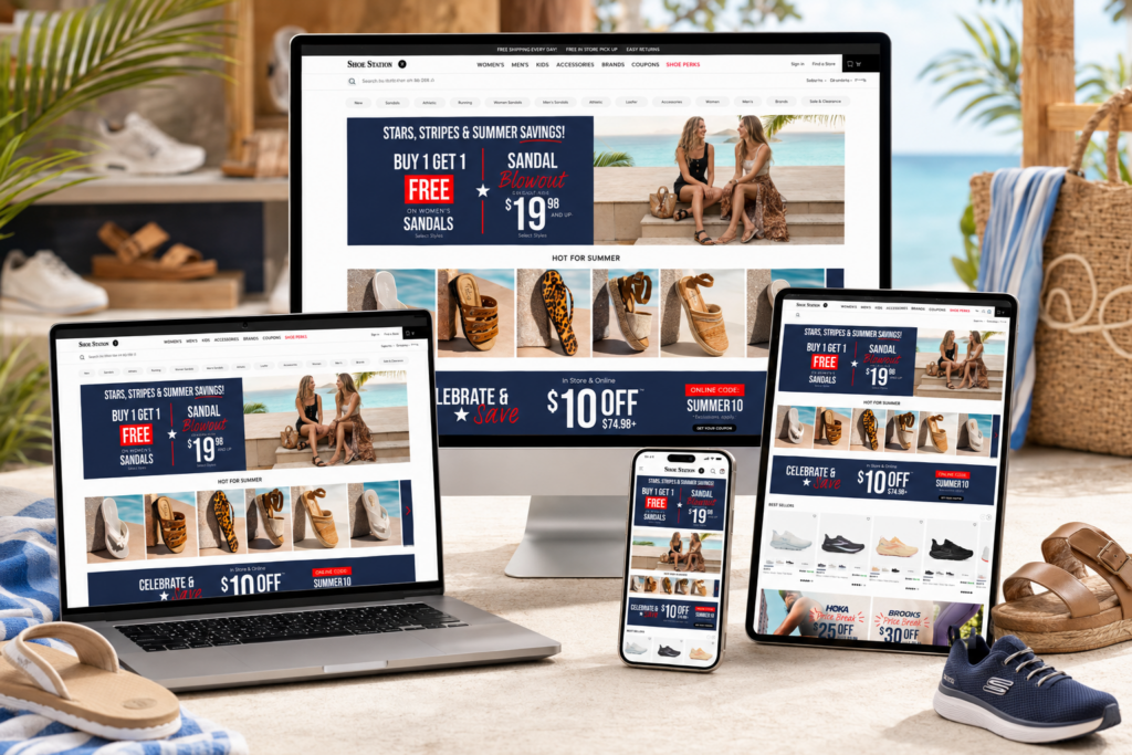
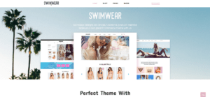
Shoe Station builds its website around a simple retail idea: customers should understand the offer, trust the store, compare products quickly, and move toward purchase without friction. The homepage uses clear navigation for Women’s, Men’s, Kids, Accessories, Brands, Coupons, and Shoe Perks, while the site also highlights seasonal promotions, brand shopping paths, trending searches, and service benefits. As designers, we see this website as a strong example of how a footwear retailer can combine promotional energy with practical eCommerce structure.
Instead of relying on one large banner and a basic product grid, the page organizes shopping intent into multiple layers. The first layer creates urgency through bold sale campaigns. The second layer inspires shoppers through lifestyle-driven summer categories. The third layer supports direct comparison through best sellers, fresh arrivals, themed product carousels, and brand shortcuts. The final layer builds confidence with perks, shipping messages, reviews, related products, and detailed product-page information.
This design works because it respects how real footwear shoppers behave. Some visitors come for a deal. Some come for a brand. Some want sandals for vacation, running shoes for performance, or casual shoes for everyday comfort. Shoe Station gives each type of shopper a clear entry point while keeping the page visually consistent, fast to scan, and conversion-focused.
| 配達時間 | カテゴリ | ウェブサイトの種類 |
| 21日間 | Shoe | Self-built website |
| 関与するデザイナー | 料金 | 効果 |
| リン・チャン | $2500 | Sales📈314% |
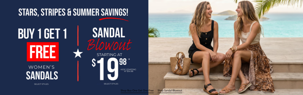
We designed the opening promotional banner to make the shopping message impossible to miss. The “Stars, Stripes & Summer Savings” theme gives the page a strong seasonal identity, while the split layout lets the promotion and lifestyle image work together. On the left side, the navy background, oversized white typography, and red accent color create a patriotic summer retail atmosphere. This color system feels bold and familiar for American shoppers, especially during a holiday sale period.
The “Buy 1 Get 1 Free” message takes visual priority because shoppers should understand the value proposition within seconds. We placed “FREE” inside a red block to create a high-contrast anchor point. That single word carries the emotional weight of the offer, so the design treats it like the main conversion trigger. The sandal blowout offer sits beside it with a large starting price, giving shoppers a second path if they are more interested in low-price discovery than bundled savings.
The right side uses a relaxed coastal lifestyle image to prevent the banner from feeling like a plain discount graphic. Two women wearing sandals in a bright seaside setting help customers imagine the product in a real summer moment. This matters because footwear shopping is not only about price; it is also about where the customer will wear the product and how the product fits into their lifestyle.
By combining strong promotional typography with human-centered imagery, the design creates both urgency and desire. The shopper sees the deal, understands the category, and feels the summer context immediately. That balance makes the first screen work harder than a standard hero banner.
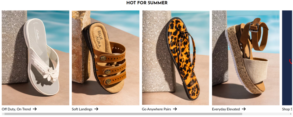
The “Hot for Summer” section shifts the mood from promotion to inspiration. Instead of displaying sandals in a plain product grid, the design presents each style in a poolside visual environment with sunlight, stone textures, and warm shadows. This creates a stronger seasonal connection and makes the products feel ready for vacation, outdoor weekends, and casual summer outfits.
We used a horizontal carousel because it supports quick discovery without overwhelming the page. Each card has its own personality: white casual sandals feel clean and easy, brown comfort sandals feel relaxed, animal-print styles feel bold, and wedge sandals feel more elevated. This variety helps the customer browse by mood, not only by product type.
The short labels under each image, such as “Off Duty, On Trend,” “Soft Landings,” “Go Anywhere Pairs,” and “Everyday Elevated,” make the section feel more editorial. These phrases do more than name products. They help shoppers understand the occasion and emotional use case behind each style.
This approach works well for footwear because customers often shop for a situation: a vacation shoe, a comfortable sandal, a statement piece, or something easy to wear every day. The arrows suggest continued browsing, while the clean spacing keeps the section easy to scan. As designers, we use this type of section to bridge the gap between brand storytelling and direct product discovery.
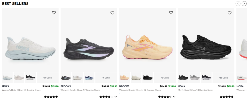
The “Best Sellers” section gives shoppers a strong confidence signal. When customers feel unsure, popular products can reduce decision anxiety. We designed the product cards with large white image areas because running shoes and comfort footwear need space to show shape, cushioning, material, and color. The clean background keeps attention on the product instead of the interface.
Each card follows a predictable structure: brand name, product title, color thumbnails, original price, sale price, rating, and wishlist icon. This hierarchy helps shoppers compare several options quickly. They can see which brands dominate the selection, which colors are available, and which products offer a discount without opening every product page.
The green sale price gives the discount a clear visual signal, while the crossed-out original price helps shoppers recognize the value instantly. Star ratings add social proof and make the section feel more reliable. The heart icon gives users a low-commitment way to save products for later, which supports browsing behavior for shoppers who are not ready to purchase immediately.
This section works because it respects comparison shopping. Footwear customers often compare brands like HOKA and Brooks based on comfort, style, color, price, and reviews. By placing these signals directly inside the product card, the design makes the browsing experience faster and more persuasive.
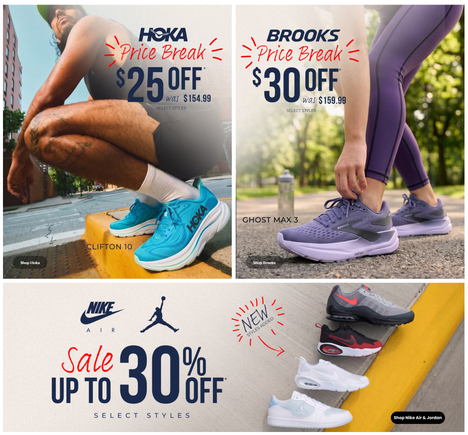
The next promotional area uses large campaign blocks for HOKA, Brooks, Nike Air, and Jordan. We designed this section to make brand deals feel active and specific instead of generic. Each block gives a major brand its own visual moment, which helps shoppers who already have brand preference move quickly toward relevant offers.
The lifestyle running imagery creates a sense of motion and performance. A HOKA shoe appears in an urban running scene, while the Brooks block shows a runner tying a shoe in a green outdoor environment. These images make the products feel connected to real activity, not just a discount table. For performance footwear, this context matters because shoppers want to imagine comfort, stability, and movement.
The oversized discount numbers carry the main message. “$25 Off,” “$30 Off,” and “Up to 30% Off” are large enough to read immediately. We used handwritten red elements like “Price Break,” “Sale,” and “New Styles Added” to add urgency and a human promotional feel. The dark blue typography keeps the design strong and trustworthy, while the red accents create energy.
Each block also includes a direct shop button. This is important because a promotional section should not only excite shoppers; it should give them a clear next step. The design turns brand awareness into action by connecting each offer to a specific shopping path.
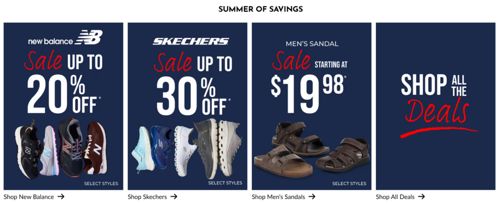
The “Summer of Savings” section simplifies deal browsing through four bold cards. Each card focuses on one destination: New Balance, Skechers, men’s sandals, or all deals. This structure helps customers avoid the confusion that often happens during large sales. Instead of forcing shoppers to interpret a long list of offers, the design turns promotions into clear visual categories.
The navy background connects the cards to the broader seasonal campaign. Large white numbers make the discounts easy to read, while red handwritten words add energy. This creates visual consistency with the hero banner and brand deal blocks, making the sale theme feel cohesive across the homepage.
Product cutouts at the bottom of each card quickly communicate what the shopper can expect. New Balance sneakers, Skechers shoes, and men’s sandals appear as visual cues, so customers can understand the category even before reading the full text. The “Shop” links with arrows provide a simple action path.
As designers, we like this type of section because it functions as both a promotion and a navigation tool. It does not simply say “sale.” It helps customers decide which sale is relevant to them.
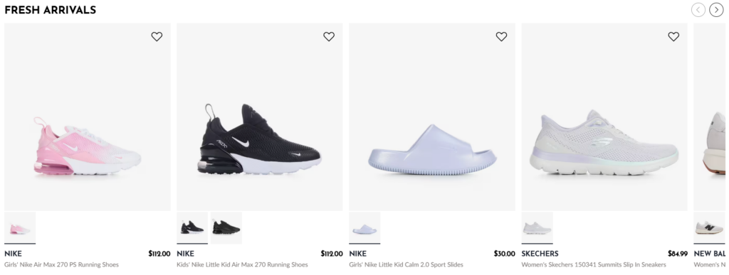
The “Fresh Arrivals” carousel introduces new products with a cleaner, quieter layout. After several energetic sale sections, this part gives the shopper a calmer product-first experience. The large white product areas make the shoes feel fresh and uncluttered, while the consistent card structure keeps browsing efficient.
New arrivals often need visual clarity more than heavy storytelling. Customers want to see what is new, compare prices, and decide whether a product fits their taste. The layout supports that behavior by showing the shoe clearly, then placing brand, product name, price, thumbnails, and wishlist controls in predictable positions.
The color thumbnails help shoppers understand available variations before clicking into a product page. This is especially useful for footwear because color can change the customer’s interest immediately. A shopper might not like one Nike colorway but may click after seeing another version.
The carousel format also keeps the homepage compact. Rather than stacking too many products vertically, the design allows horizontal browsing. This gives the section a strong retail rhythm: shoppers can scan, pause, save, or click without losing their place on the page.
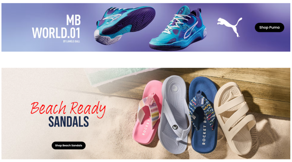
The next area combines two different shopping moods. The top Puma MB WORLD.01 banner uses a purple gradient, floating shoe angles, and a strong logo presence to create a modern performance feel. The shoes appear dynamic and energetic, which matches the basketball identity of the product. The black “Shop Puma” button gives the banner a clean conversion point.
Below it, the “Beach Ready Sandals” banner shifts into a relaxed summer story. Sand, wood texture, soft lighting, and colorful sandals create a vacation-ready mood. This contrast helps the homepage avoid monotony. The shopper moves from performance footwear to beach sandals, but the layout still feels controlled because both banners use clear messaging and direct call-to-action buttons.
Footwear shoppers do not all arrive with the same intent. Some want athletic shoes, while others want casual seasonal footwear. By placing these two banners together, the design expands the shopping possibilities without making the page feel scattered.
The “Beach Ready” message uses handwritten red typography for warmth and personality, while the bold “Sandals” text keeps the offer readable. The product arrangement lets customers see multiple sandal colors at once, which supports quick visual comparison. Overall, this section keeps the homepage lively and helps different shoppers find a path that feels relevant.
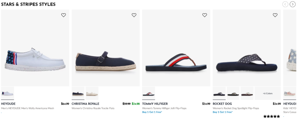
The “Stars & Stripes Styles” section takes the patriotic campaign theme and turns it into a shoppable product carousel. This creates continuity from the opening banner while giving customers actual products to browse. The red, white, and blue footwear options feel aligned with the seasonal campaign, but the clean product-card layout keeps the section practical.
Each product image sits on a light background, making the shoes and sandals easy to inspect. The designs include patriotic details, casual silhouettes, flip-flops, and easy summer styles. This variety helps the theme feel broad enough for different shoppers rather than limited to one product type.
We used the same product-card logic seen elsewhere on the site: brand names, product titles, prices, color thumbnails, promotions, ratings, and wishlist icons. This consistency matters because customers should not need to relearn the interface from section to section.
Some products show promotional messages like “Buy 1 Get 1 Free,” while others focus on price. This helps the carousel support both emotional seasonal browsing and practical deal evaluation. The arrows encourage continued exploration, and the clean grid structure prevents the patriotic theme from becoming visually overwhelming.
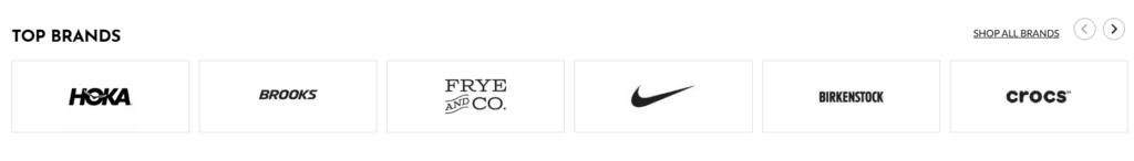
The “Top Brands” section gives shoppers a fast trust signal. In footwear retail, brand recognition plays a major role in confidence. Customers often arrive with names like HOKA, Brooks, Nike, Birkenstock, Crocs, Jordan, Skechers, or HEYDUDE already in mind. The website highlights brand discovery through a dedicated brand area and a “Shop All Brands” path.
We designed this section with a white background and thin bordered boxes because logos should feel clean, neutral, and easy to compare. Heavy imagery would distract from the purpose of the section. Here, the brand mark itself carries the value.
The horizontal layout supports quick scanning. Customers can identify a familiar logo in seconds and click into the brand they trust. The “Shop All Brands” link provides a broader path for users who want more options, while carousel arrows suggest additional names beyond the visible set.
This section also reinforces store credibility. When shoppers see reputable footwear brands displayed together, they understand that the store offers a wide and recognizable assortment. That trust supports conversion even before the customer reaches a product page.
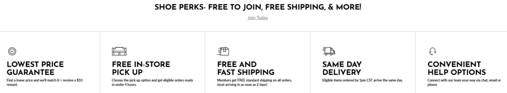
The “Shoe Perks” section focuses on trust, convenience, and membership value. Many retailers hide service benefits in footer links or policy pages, but this layout brings them into the shopping journey. The section highlights practical promises such as price guarantee, in-store pickup, fast shipping, same-day delivery, and help options. The homepage also references member-focused benefits like free shipping and in-store pickup.
We used a clean horizontal value strip because customers need to understand these benefits quickly. Each item includes a simple line icon, bold headline, and short explanation. This structure makes the information scannable and prevents the section from feeling like a block of policy text.
Service design matters because customers often hesitate for reasons beyond product style. They may worry about shipping speed, returns, pickup availability, price competitiveness, or customer support. By placing these benefits on the page, the design answers those concerns before they become barriers.
The centered “Shoe Perks” headline and “Join Today” link also encourage account creation without interrupting the shopping flow. This is a smart balance: the section promotes membership, but it still feels helpful rather than aggressive.
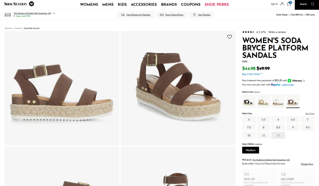
The product page for the women’s Soda Bryce Platform Sandals uses a large multi-angle image gallery, which is exactly what a footwear product needs. The page shows the sandals from multiple perspectives, including side, front, back, top, and sole views. The product listing presents the item name, brand, sale price, original price, pickup or delivery area, add-to-cart action, and product detail content.
As designers, we see the image gallery as the foundation of the page. Platform sandals require close visual inspection because shoppers want to understand strap placement, wedge height, buckle details, sole texture, and overall shape. A single product image would not provide enough confidence. The grid format gives the customer a near in-store inspection experience.
On the right side, the purchase panel keeps the decision-making information compact and action-focused. The product name sits at the top, followed by rating, price, color options, size selection, pickup or delivery information, and the Add to Cart button. This order matches the customer’s natural decision process: identify the product, confirm value, choose the right variation, understand fulfillment, and act.
Color swatches and size buttons reduce friction because shoppers can make key choices without scrolling. The fulfillment module helps them understand whether they can pick up the item or receive delivery. Payment messaging also supports confidence at the moment of purchase, especially for customers who want flexible payment options.
Below the main product area, related products keep the shopping journey alive. If the selected sandal is not the perfect match, the customer can compare similar Soda sandals and other nearby styles without starting over. This improves retention because it gives the shopper alternative paths inside the same product category.
The related product cards use the same design language as the homepage: product image, color thumbnails, brand, title, price, promotion, and wishlist control. This consistency makes the site feel easier to use. Customers can move from homepage carousels to product-page recommendations without adjusting to a new interface.
The review section adds social proof and practical detail. Ratings, written comments, fit feedback, and customer impressions help shoppers understand whether the sandal feels comfortable, true to size, narrow, wide, soft, stiff, or suitable for longer wear. For shoes, this feedback matters because fit and comfort cannot be fully communicated through product images alone.
The product page also includes review filters and sorting tools, which make the review area more useful. Customers can search within reviews, sort by relevance, and focus on the feedback that matters to them. This turns the review section into a decision-support tool rather than a passive testimonial area.
The bottom of the product page repeats trust-building service messages, email signup, help links, store links, Shoe Perks resources, and shopping categories. This footer structure matters because customers who scroll deep into a product page often need reassurance or a next step. They may want to check shipping, returns, contact options, coupons, gift cards, or store information.
By ending the page with service benefits and structured navigation, the design keeps the customer inside the shopping ecosystem. It supports both immediate conversion and continued exploration.
Shoe Station’s website works because it treats footwear shopping as a mix of inspiration, comparison, trust, and action. The homepage opens with strong seasonal promotions, then guides shoppers through summer categories, best sellers, brand-specific deals, new arrivals, themed collections, top brands, and service benefits. The product page continues that same logic with detailed images, clear purchase controls, related products, reviews, fit feedback, and trust-building support areas.
From a design perspective, the strongest point is not one single banner or one product card. The strength comes from the full shopping rhythm. Each section has a clear role: attract attention, create desire, organize choices, prove value, reduce hesitation, or push the shopper toward the next step. That is why the site feels commercial without feeling confusing, promotional without feeling messy, and detailed without becoming heavy.
For cross-border eCommerce brands, this structure offers a useful lesson: a high-converting footwear website needs more than attractive images. It needs a complete visual system that connects campaign design, product discovery, brand trust, service promises, and product-page confidence. This is exactly the kind of conversion-focused independent website design thinking that エアサン helps brands build.