


 Japanese
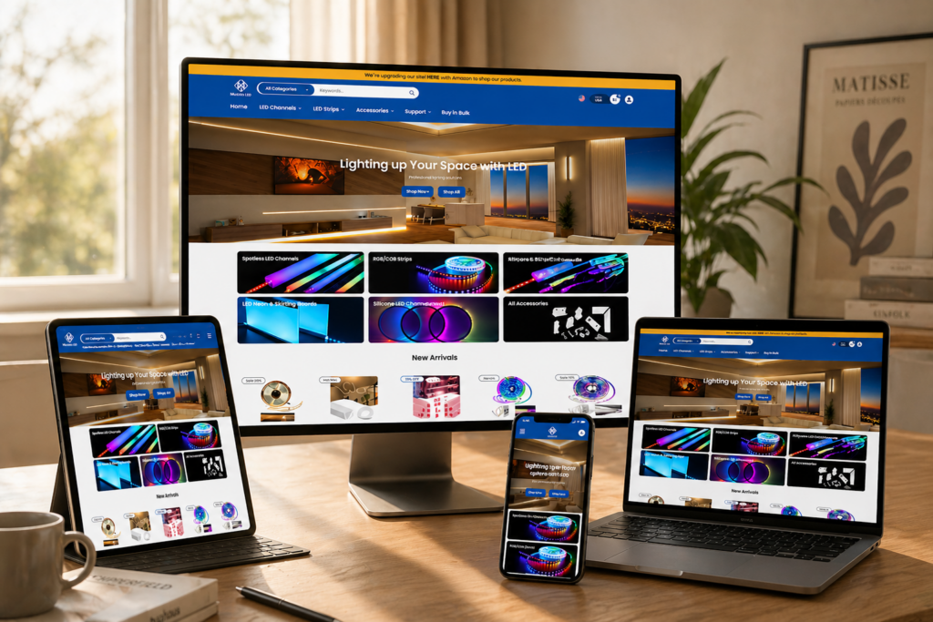
導入
In today’s competitive eCommerce landscape, design is no longer just about aesthetics—it’s about clarity, trust, and conversion. For a niche brand like Muzata LED, which specializes in modern lighting solutions, the website must communicate both technical credibility and lifestyle appeal within seconds.
This case study explores how we approached the design of the Shopify store at muzataled.com, focusing on building a visually compelling, conversion-driven experience. While the homepage plays a central role, we also extended design consistency across key pages to create a cohesive brand journey that guides users from discovery to purchase.
| 配達時間 | カテゴリ | アプリケーションプラットフォーム |
| 20日間 | LED Strip Light | shopify |
| 関与するデザイナー | 料金 | 効果 |
| ナンシー | $1900 | Sales📈269% |
Understanding the Brand and Project Goals
ブランドポジショニング
Muzata LED operates in a space that blends functionality with design inspiration. Their products are not just lighting fixtures—they are part of architectural expression, often used in staircases, railings, and modern interiors.
Key Objectives
- Create a clean, modern visual identity aligned with architectural aesthetics
- Simplify complex product offerings into easy-to-navigate structures
- Improve user trust through clarity and visual hierarchy
- Increase conversion rates through strategic layout and call-to-action placement
- Ensure a seamless mobile-first experience
Our Design Approach
A Design-First Strategy
Rather than focusing on technical implementation, our approach centered on translating business goals into visual systems. Every design decision was guided by three principles:
- Clarity: Make information easy to scan and understand
- Trust: Reinforce credibility through structure and visual cues
- Conversion: Guide users naturally toward purchase decisions
Visual Language Development
We built a consistent design language across the site, including:
- Neutral color palettes with high contrast for readability
- Clean typography to reflect professionalism
- Structured spacing systems for visual rhythm
- Product-focused imagery with contextual usage scenes
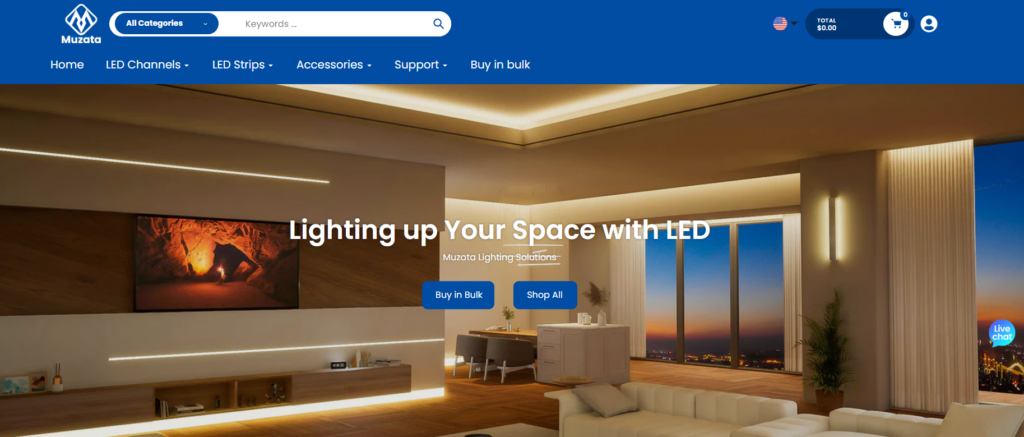
Homepage Design: First Impressions That Convert
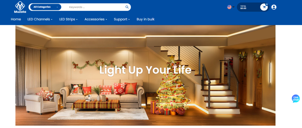
Hero Section: Immediate Value Communication
The hero section was designed to instantly answer three questions:
- そのブランドは何を提供しているのか?
- Why should users trust it?
- What action should they take next?
We used large-scale lifestyle imagery combined with concise messaging to create a strong first impression. The call-to-action was positioned prominently, encouraging users to explore product categories.
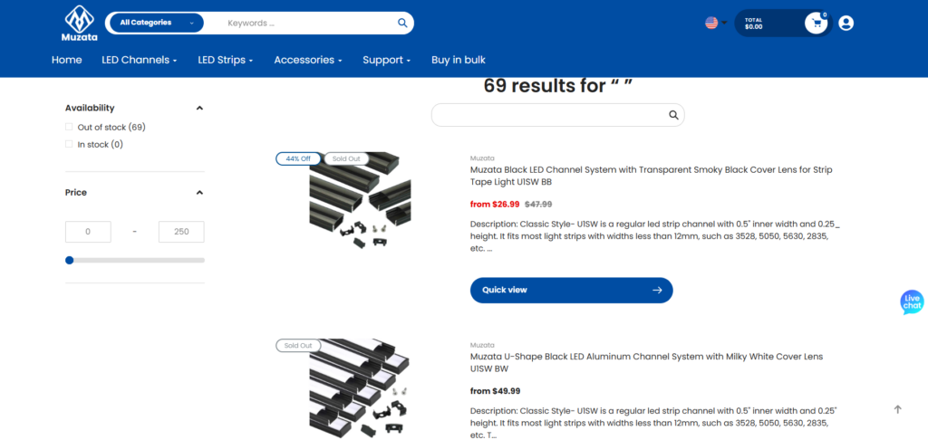
Category Navigation: Simplifying Complexity
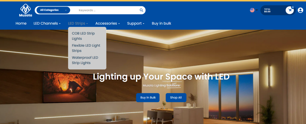
LED lighting products can quickly become overwhelming due to variations in installation, application, and specifications. To address this, we:
- Grouped products into intuitive categories
- Used visual icons and imagery to aid recognition
- Reduced cognitive load by limiting choices per section
This approach allows users to quickly find what they need without friction.
Social Proof and Trust Signals
To build credibility, we integrated:
- 顧客レビュー
- Installation examples
- Certifications and quality indicators
These elements were strategically placed to reinforce trust at key decision points.
Product Page Design: Driving Purchase Decisions
Clear Information Hierarchy
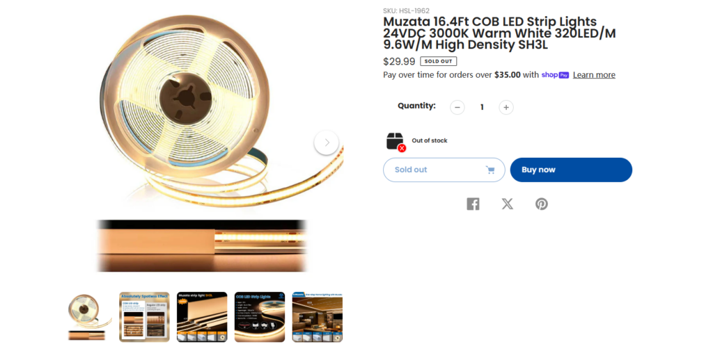
Product pages were designed to balance technical details with visual clarity. Instead of overwhelming users, we structured content into digestible sections:
- Key features highlighted at the top
- Visual demonstrations of product usage
- Expandable sections for detailed specifications
ビジュアルストーリーテリング
We emphasized real-world applications of the products:
- Installation scenarios
- Before-and-after comparisons
- Close-up material details
This helps users visualize how the product fits into their own space.
Conversion-Focused Elements
We optimized key elements for conversions:
- Prominent “Add to Cart” buttons
- 明確な価格設定とバリエーション選択
- Urgency and reassurance cues (e.g., shipping, guarantees)
Supporting Pages: Extending the Experience
コレクションページ
Collection pages were designed to act as both browsing hubs and conversion funnels. We:
- Used grid layouts with consistent spacing
- Highlighted best-selling and featured products
- Integrated filtering systems to refine choices
About Page
The About page focused on storytelling and brand credibility:
- Clear brand narrative
- Visual alignment with product design philosophy
- Reinforcement of expertise in LED solutions
Content and Inspiration Sections
To support SEO and user engagement, we incorporated content-driven sections:
- Installation guides
- Design inspiration
- Educational resources
These not only improve organic traffic but also position the brand as an authority.
直面した課題
Complexity of Product Information
LED products often involve technical specifications that can overwhelm users. The challenge was to present this information without sacrificing usability.
Balancing Technical and Lifestyle Appeal
We needed to strike a balance between:
- Technical accuracy for informed buyers
- Visual inspiration for design-oriented users
Mobile Optimization
A significant portion of traffic comes from mobile devices, requiring:
- Responsive layouts
- Simplified navigation
- Optimized image scaling
当社のソリューション
Modular Content Structure
We designed flexible content blocks that allow information to be presented in layers, ensuring both accessibility and depth.
Visual Prioritization
By emphasizing visuals over text where possible, we reduced cognitive load and improved engagement.
Consistent Design System
A unified design system ensured consistency across all pages, improving both usability and brand recognition.
結果と影響
ユーザーエクスペリエンスの向上
- Faster navigation through simplified structures
- Better understanding of product offerings
- Increased engagement with visual content
ブランドイメージの向上
- More professional and cohesive visual identity
- Increased trust through clear messaging and layout
Conversion Optimization
- Higher interaction with call-to-action elements
- Reduced drop-off rates on key pages
- More efficient purchase journeys
Our Methodology in Practice
Step 1: Research and Analysis
分析結果:
- Competitor websites
- ユーザーの行動パターン
- Industry design trends
Step 2: Wireframing and Structure
We created layout frameworks that prioritize:
- Information hierarchy
- ユーザーフロー
- Conversion نقاط
Step 3: Visual Design Execution
We translated structure into high-fidelity designs, focusing on:
- タイポグラフィ
- Color systems
- Image selection
Step 4: Iteration and Refinement
Designs were continuously refined based on:
- Usability feedback
- Performance insights
- Brand alignment
Why Design Matters in Shopify Stores
A well-designed Shopify store does more than look good—it directly impacts business outcomes. In this project, design served as the bridge between product complexity and user simplicity.
Key takeaways include:
- Clear structure improves usability
- Strong visuals enhance engagement
- Consistency builds trust
- Strategic layouts drive conversions
結論
Designing the Muzata LED Shopify store required a careful balance of clarity, functionality, and visual appeal. By focusing on user experience and conversion-driven design principles, we transformed a complex product offering into an intuitive and engaging shopping journey.
This project reflects our belief that great design is not just about aesthetics—it’s about solving problems, guiding users, and driving measurable results. At エアサン, we specialize in creating high-performing Shopify experiences that align design with business growth, helping brands stand out in competitive markets.


WordPressのウェブサイトや、完全なeコマースシステムを備えたコーポレートサイトをデザイン・構築します。.
価格帯$200.00~$2,500.00custom-requirements-or-special-quotations
元価格は$2.00。.$1.00現在の価格は$1.00。. Amazonホーム理学療法機器のメイン画像デザイン解説
はじめにAmazonで家庭用治療器の信頼できるイメージを構築する Amazonで家庭用治療器のメインイメージをデザインする際、私たちが最も重視するのは...

Amazon リップスティックコンバージョンのメイン画像デザイン
はじめにアマゾンで売れる口紅のメイン画像をデザインする アマゾンの口紅のメイン画像をデザインするとき、私たちの責任は...

ハッカーがWordPress管理者のメールアドレスを盗む方法(そしてそれを阻止する方法)
WordPressの管理者メールアドレスは、あなたが思っている以上に公開されているのです。ハッカーはそれが大好きです。彼らにとって、あなたの...

Amazonのリキッドファンデーションのメイン画像がコンバージョンにつながる理由
はじめに Amazonリキッドファンデーションのメイン画像デザインは、単に商品を美しく見せるだけではありません。Amazonでは、メイン画像と….

フィルターカートリッジの効果的なAmazonメインイメージのデザイン
はじめに Amazonのメイン画像をデザインする上で、商品を魅力的に見せることは決して重要ではありません。明確さ、信頼性、そして瞬時に理解できることが何よりも重要です。特に….

WordPress へのリプレイ攻撃: 本当の脅威か、それとも誇張された神話か?
まず最初に明確にしておきましょう。リプレイ攻撃は見た目には怖くありません。パスワードを破壊したり、緑色のハッカーテキストが飛び交うような悪質なコードを挿入したりもしません。彼らは狡猾なのです…。.

WordPressページを何も壊さずに複製する方法
正直に言って、新しいページを作りたくない時もあるでしょう。同じページを少しだけ変えたいだけなのに。レイアウトもブロックも設定も全部同じ。なぜなら….

ペット向けWordPressテーマ5選を比較
はじめに ペット関連のWordPressテーマを適切に選ぶことは、単なるデザイン上の決定ではありません。使いやすさ、拡張性、そして長期的なビジネスの成長に直接影響します。ペットケアとペット...

5つの水着eコマーステーマを比較
はじめに 水着やランジェリーの独立ストアに適切なテーマを選択することは、見た目だけの問題ではなく、コンバージョン率、拡張性、長期的な効果に直接影響します...

WordPressでコメント機能をオフにする方法(気が狂わずに)
WordPressのコメントについてお話しましょう。理論上は、コメントは素晴らしいものです。議論を促し、コミュニティを築き、ウェブサイトに「活気」を与えてくれます。しかし実際にはどうでしょうか?コメントはしばしば人を惹きつけ….

科学主導のブランドのためのスケーラブルなWordPressウェブサイトの構築:AminoUSAプロジェクト
はじめに 今日のデジタル環境において、ウェブサイトは単なる製品リストを掲載する場所ではありません。規制の厳しい業界や研究重視の業界で事業を展開する科学主導のブランドにとって、ウェブサイトは….

グローバルブレードブランドのためのスケーラブルなShopifyストアの構築:CoolKatanaプロジェクト
はじめに 越境電子商取引において、Shopify の Web サイトは単なる店舗ではありません。ニッチで文化主導のカテゴリーで活動するブランドにとって、Web サイトは単なる店舗以上のものを実現する必要があります...

ポケモンカード向け高コンバージョンShopifyストアの設計
はじめに 収集可能な電子商取引の世界、特にポケモン トレーディング カード ゲーム (TCG) 市場では、Web サイトは単に製品をリストするだけでは不十分です。...

カスタムレンガブランドのための高コンバージョンShopifyデザイン
はじめに 今日の競争の激しいeコマース市場、特にパーソナライズされたギフトやコレクターズアイテムの分野では、Shopifyのウェブサイトは商品を展示する以上の機能を提供する必要があります。それは….

Shopifyサポートへの問い合わせ方法:シンプルでストレスフリーなガイド
Shopifyストアの運営は、混乱するのではなく、ワクワクするものであるべきです。疑問が生じたり、問題が発生して作業が滞ったりした場合でも、Shopifyは状況に応じて複数のサポートパスをご用意しています。.

Shopifyストアを非アクティブ化する方法:分かりやすく実践的なガイド
Shopifyストアの無効化はそれほど複雑ではありませんが、多くのマーチャントが見落としている影響があります。このガイドでは、そのプロセスを分かりやすく解説します。.

高級花卉ブランド向けShopifyウェブサイトデザイン事例
はじめに 今日の競争の激しいeコマース市場において、Shopifyのウェブサイトは商品を表示する以上の機能を提供する必要があります。ブランド価値を瞬時に伝え、ユーザーを誘導する必要があります….

Shopifyデザインケーススタディ:レトロゲームストア
はじめに 競争の激しいeコマース環境では、視覚的な明瞭さと感情的な繋がりが、訪問者が顧客になるかどうかを左右することがよくあります。これは特に….