حيل التصميم التي ساهمت في نجاح متجر Shopify هذا بشكل كبير

حيل التصميم التي ساهمت في نجاح متجر Shopify هذا بشكل كبير

مقدمة

In today’s competitive eCommerce landscape, design is no longer just about aesthetics—it’s about clarity, trust, and conversion. For a niche brand like Muzata LED, which specializes in modern lighting solutions, the website must communicate both technical credibility and lifestyle appeal within seconds.

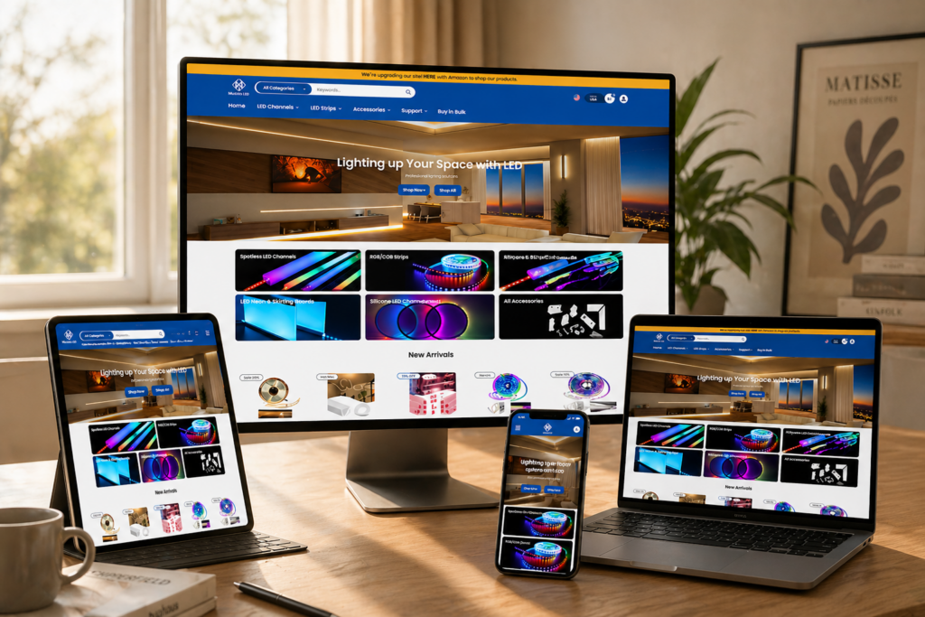
تستكشف دراسة الحالة هذه كيف تعاملنا مع تصميم Shopify store at muzataled.com, focusing on building a visually compelling, conversion-driven experience. While the homepage plays a central role, we also extended design consistency across key pages to create a cohesive brand journey that guides users from discovery to purchase.

التسليم في الوقت المحددفئةمنصة التطبيقات
20 يومًاLED Strip Lightshopify
المصممون المشاركونيكلفتأثير
نانسي$1900Sales📈269%

فهم أهداف العلامة التجارية والمشروع

Brand Positioning

Muzata LED operates in a space that blends functionality with design inspiration. Their products are not just lighting fixtures—they are part of architectural expression, often used in staircases, railings, and modern interiors.

Key Objectives

  • Create a clean, modern visual identity aligned with architectural aesthetics
  • Simplify complex product offerings into easy-to-navigate structures
  • Improve user trust through clarity and visual hierarchy
  • Increase conversion rates through strategic layout and call-to-action placement
  • Ensure a seamless mobile-first experience

نهجنا في التصميم

A Design-First Strategy

Rather than focusing on technical implementation, our approach centered on translating business goals into visual systems. Every design decision was guided by three principles:

  • Clarity: Make information easy to scan and understand
  • Trust: Reinforce credibility through structure and visual cues
  • Conversion: Guide users naturally toward purchase decisions

Visual Language Development

We built a consistent design language across the site, including:

  • Neutral color palettes with high contrast for readability
  • Clean typography to reflect professionalism
  • Structured spacing systems for visual rhythm
  • Product-focused imagery with contextual usage scenes

Homepage Design: First Impressions That Convert

Hero Section: Immediate Value Communication

The Design Tricks That Skyrocketed This Shopify Store-Homepage Design: First Impressions That Convert-Hero Section: Immediate Value Communication

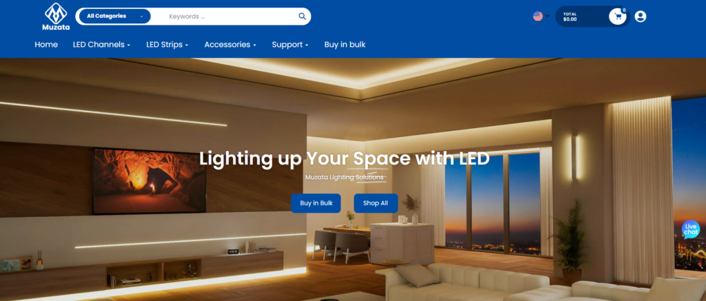
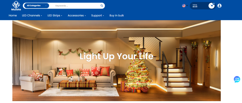
The hero section was designed to instantly answer three questions:

  1. ما الذي تقدمه هذه العلامة التجارية؟
  2. لماذا ينبغي للمستخدمين أن يثقوا به؟
  3. What action should they take next?

We used large-scale lifestyle imagery combined with concise messaging to create a strong first impression. The call-to-action was positioned prominently, encouraging users to explore product categories.

Category Navigation: Simplifying Complexity

The Design Tricks That Skyrocketed This Shopify Store-Homepage Design: First Impressions That Convert-Category Navigation: Simplifying Complexity

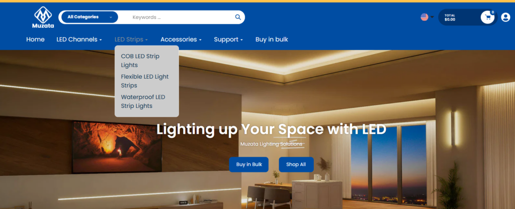
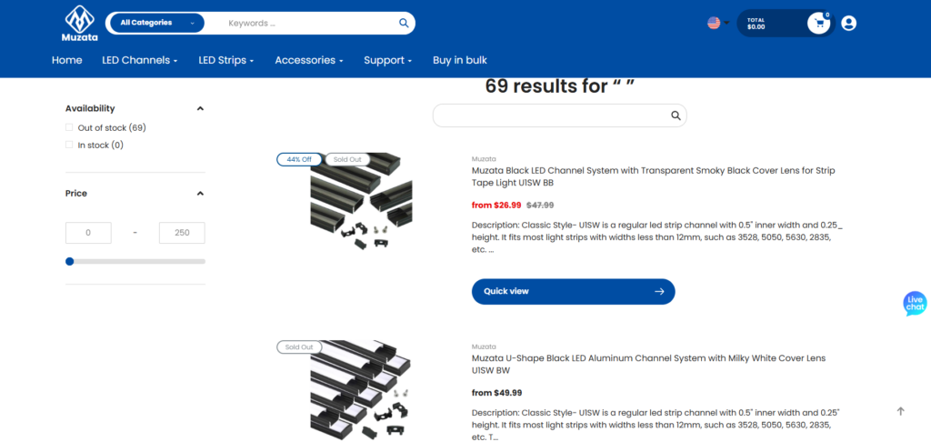
LED lighting products can quickly become overwhelming due to variations in installation, application, and specifications. To address this, we:

  • Grouped products into intuitive categories
  • Used visual icons and imagery to aid recognition
  • Reduced cognitive load by limiting choices per section

This approach allows users to quickly find what they need without friction.

Social Proof and Trust Signals

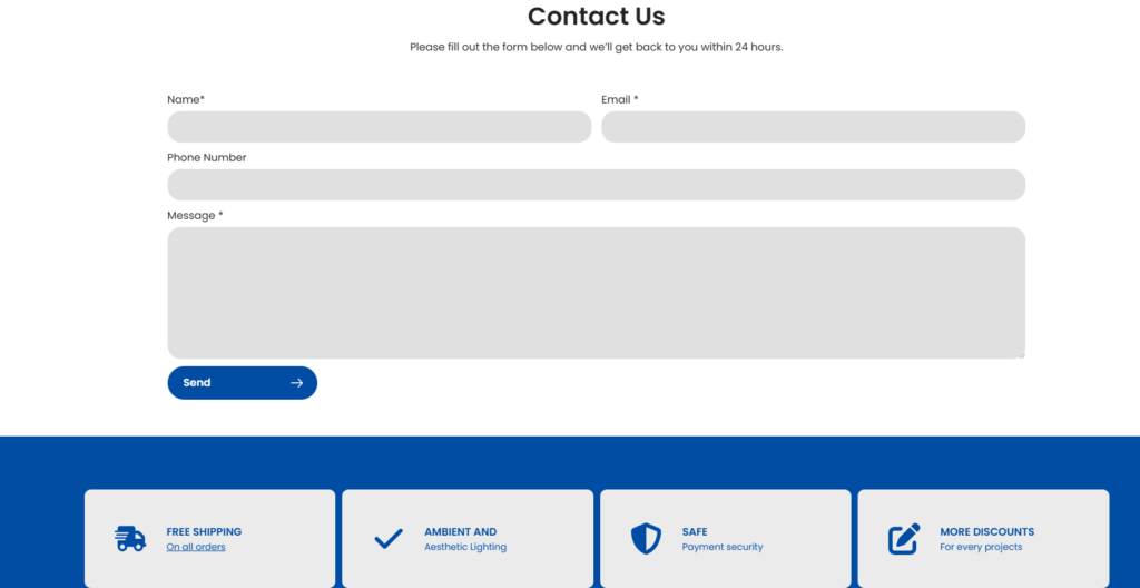
To build credibility, we integrated:

  • Customer reviews
  • Installation examples
  • Certifications and quality indicators

These elements were strategically placed to reinforce trust at key decision points.

Product Page Design: Driving Purchase Decisions

تسلسل هرمي واضح للمعلومات

The Design Tricks That Skyrocketed This Shopify Store-Product Page Design: Driving Purchase Decisions-Clear Information Hierarchy

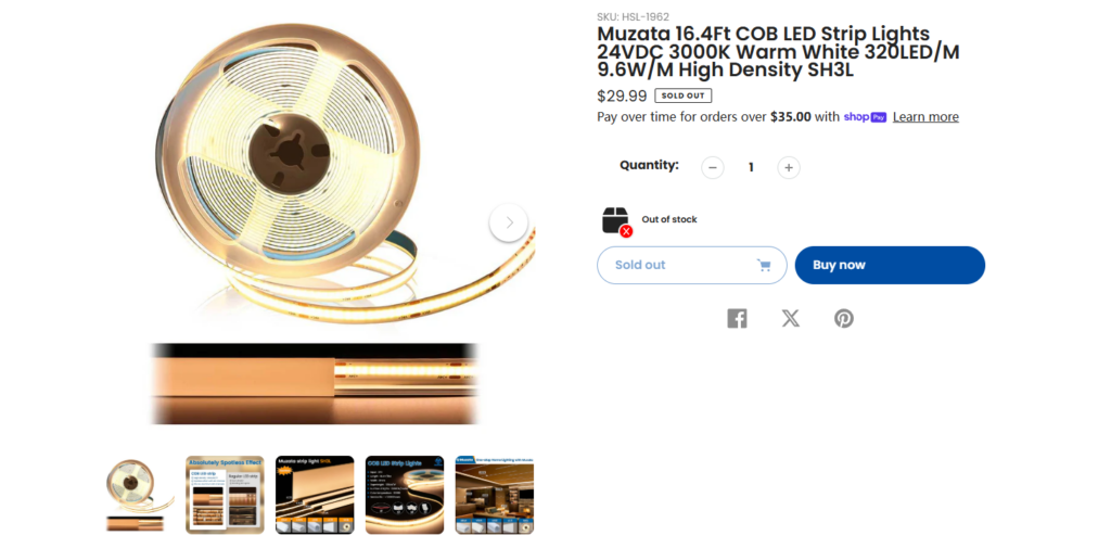
Product pages were designed to balance technical details with visual clarity. Instead of overwhelming users, we structured content into digestible sections:

  • Key features highlighted at the top
  • Visual demonstrations of product usage
  • Expandable sections for detailed specifications

Visual Storytelling

We emphasized real-world applications of the products:

  • Installation scenarios
  • Before-and-after comparisons
  • Close-up material details

This helps users visualize how the product fits into their own space.

Conversion-Focused Elements

We optimized key elements for conversions:

  • Prominent “Add to Cart” buttons
  • Clear pricing and variant selection
  • Urgency and reassurance cues (e.g., shipping, guarantees)

Supporting Pages: Extending the Experience

Collection Pages

The Design Tricks That Skyrocketed This Shopify Store-Supporting Pages: Extending the Experience-Collection Pages

Collection pages were designed to act as both browsing hubs and conversion funnels. We:

  • Used grid layouts with consistent spacing
  • Highlighted best-selling and featured products
  • Integrated filtering systems to refine choices

About Page

The Design Tricks That Skyrocketed This Shopify Store-Supporting Pages: Extending the Experience-About Page

The About page focused on storytelling and brand credibility:

  • Clear brand narrative
  • Visual alignment with product design philosophy
  • Reinforcement of expertise in LED solutions

Content and Inspiration Sections

The Design Tricks That Skyrocketed This Shopify Store-Supporting Pages: Extending the Experience-Content and Inspiration Sections

To support SEO and user engagement, we incorporated content-driven sections:

  • Installation guides
  • Design inspiration
  • Educational resources

These not only improve organic traffic but also position the brand as an authority.

التحديات التي واجهناها

Complexity of Product Information

LED products often involve technical specifications that can overwhelm users. The challenge was to present this information without sacrificing usability.

Balancing Technical and Lifestyle Appeal

We needed to strike a balance between:

  • Technical accuracy for informed buyers
  • Visual inspiration for design-oriented users

Mobile Optimization

A significant portion of traffic comes from mobile devices, requiring:

  • تصميمات متجاوبة
  • Simplified navigation
  • تحسين تحجيم الصور

حلولنا

Modular Content Structure

We designed flexible content blocks that allow information to be presented in layers, ensuring both accessibility and depth.

Visual Prioritization

By emphasizing visuals over text where possible, we reduced cognitive load and improved engagement.

Consistent Design System

A unified design system ensured consistency across all pages, improving both usability and brand recognition.

النتائج والتأثير

تجربة مستخدم محسّنة

  • Faster navigation through simplified structures
  • Better understanding of product offerings
  • Increased engagement with visual content

صورة أقوى للعلامة التجارية

  • More professional and cohesive visual identity
  • Increased trust through clear messaging and layout

Conversion Optimization

  • Higher interaction with call-to-action elements
  • Reduced drop-off rates on key pages
  • More efficient purchase journeys

Our Methodology in Practice

Step 1: Research and Analysis

قمنا بتحليل ما يلي:

  • مواقع المنافسين
  • أنماط سلوك المستخدم
  • Industry design trends

Step 2: Wireframing and Structure

We created layout frameworks that prioritize:

  • Information hierarchy
  • تدفق المستخدم
  • Conversion نقاط

الخطوة الثالثة: تنفيذ التصميم المرئي

We translated structure into high-fidelity designs, focusing on:

  • الطباعة
  • Color systems
  • Image selection

الخطوة الرابعة: التكرار والتحسين

Designs were continuously refined based on:

  • Usability feedback
  • Performance insights
  • Brand alignment

لماذا يُعدّ التصميم مهمًا في متاجر Shopify

A well-designed Shopify store does more than look good—it directly impacts business outcomes. In this project, design served as the bridge between product complexity and user simplicity.

Key takeaways include:

  • Clear structure improves usability
  • Strong visuals enhance engagement
  • Consistency builds trust
  • Strategic layouts drive conversions

خاتمة

تصميم Muzata LED Shopify store required a careful balance of clarity, functionality, and visual appeal. By focusing on user experience and conversion-driven design principles, we transformed a complex product offering into an intuitive and engaging shopping journey.

This project reflects our belief that great design is not just about aesthetics—it’s about solving problems, guiding users, and driving measurable results. At أيرسانج, we specialize in creating high-performing Shopify experiences that align design with business growth, helping brands stand out in competitive markets.

يتم التوصيل في جميع أنحاء العالم

أيرسانج يقدم خدمات تصميم مواقع إلكترونية فعّالة من حيث التكلفة، وهوية بصرية للعلامة التجارية، وحلول التجارة الإلكترونية. من Shopify وWordPress إلى صور المنتجات Amazon،, نحن نساعد العلامات التجارية العالمية على بناء أعمالها التجارية عبر الإنترنت، والارتقاء بها، وتنميتها.

صمم وأنشئ موقعاً إلكترونياً أو موقعاً إلكترونياً للشركة باستخدام نظام تجارة إلكترونية كامل من أجلك.
المتطلبات المخصصة أو عروض الأسعار الخاصة

المتطلبات المخصصة أو عروض الأسعار الخاصة

السعر الأصلي كان: $2.00.السعر الحالي هو: $1.00.
إنشاء متجر Shopify قابل للتوسع لعلامة تجارية عالمية للشفرات: مشروع CoolKatana
مقدمة: في التجارة الإلكترونية عبر الحدود، يُعد موقع Shopify الإلكتروني أكثر من مجرد واجهة متجر. بالنسبة للعلامات التجارية العاملة في فئات متخصصة وثقافية، يجب أن يقدم الموقع الإلكتروني أكثر بكثير من ذلك...

هل أنت مستعد لتحويل عملك التجاري؟

احجز اتصالاً لمعرفة المزيد حول كيف يمكن لوكالتنا للتسويق الرقمي أن ترتقي بأعمالك إلى المستوى التالي.