


 Japanese
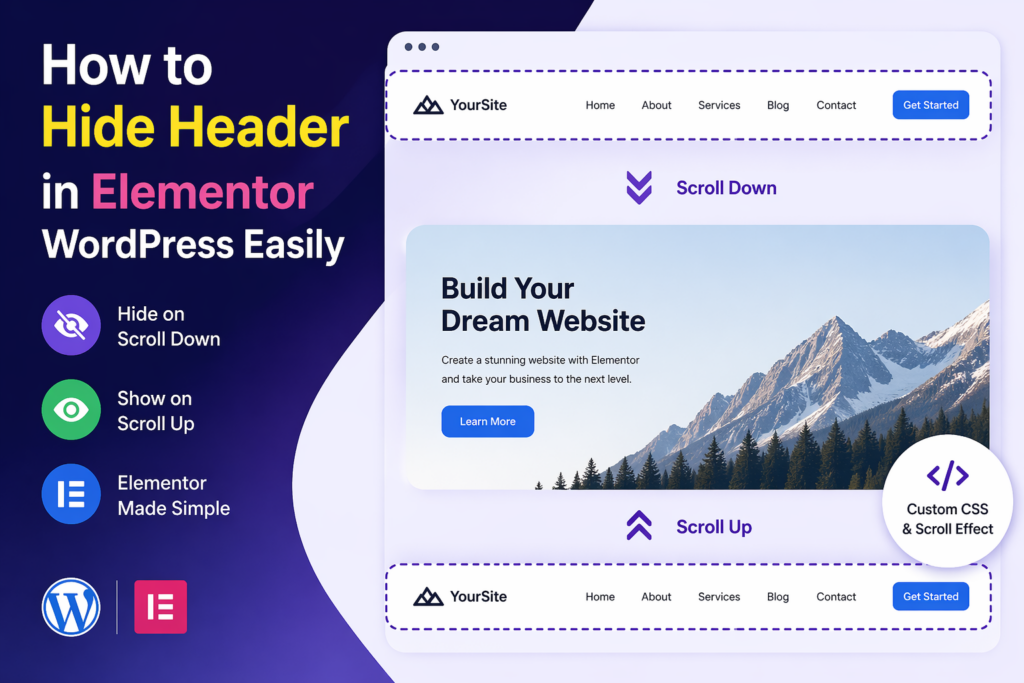
導入
When building a modern website, user experience is everything. Visitors expect clean layouts, fast loading times, and intuitive navigation. One small but powerful design trick that can dramatically improve usability is hiding the header when users scroll down—and revealing it again when they scroll up.
If you’re using Elementor on a ワードプレス website, you already have a flexible design system. But by default, Elementor doesn’t provide a simple toggle for scroll-based header behavior. That’s why many designers look for ways to implement this feature manually.
In this guide, we’ll explain how to hide header in Elementor WordPress, why it matters, and the different ways you can implement it—even if you’re not a developer.
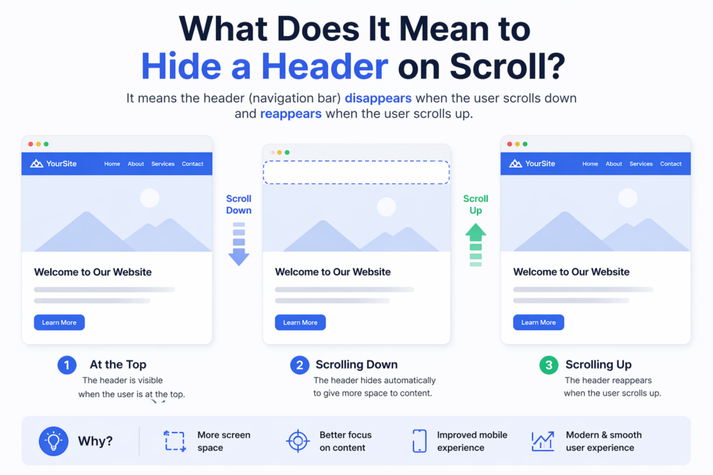
What Does It Mean to Hide a Header on Scroll?
Before diving into the steps, it’s important to understand the concept.
A “hide on scroll” header is a navigation bar that:
- Disappears when the user scrolls down
- Reappears when the user scrolls up
This behavior helps reduce visual clutter and gives more space to content, especially on smaller screens.
Why Hide the Header in Elementor?
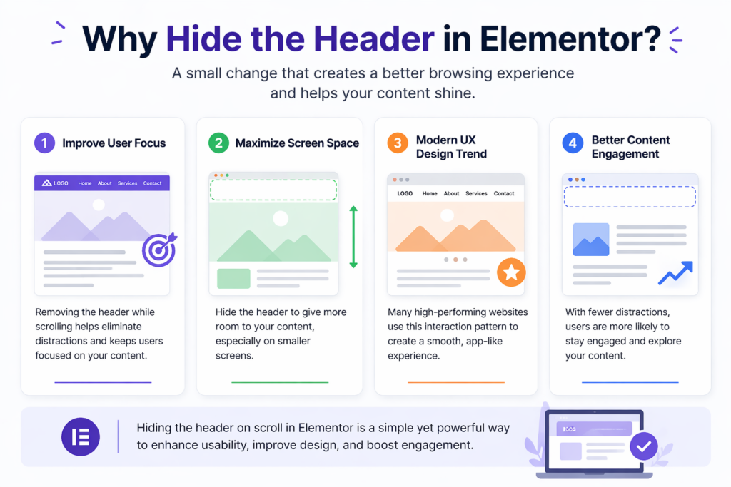
1. Improve User Focus
When users scroll through content, the header can become a distraction. Hiding it allows the content to take center stage.
2. Maximize Screen Space
This is especially useful on mobile devices, where screen space is limited.
3. Modern UX Design Trend
Many high-performing websites adopt this interaction pattern to create a smooth, app-like experience.
4. Better Content Engagement
By removing unnecessary elements during scrolling, users are more likely to stay engaged with your content.
Understanding Elementor Header Structure
In Elementor, headers are typically created using:
- Elementor Pro Theme Builder
- A header template assigned across pages
The header section is usually:
- Set as sticky
- Positioned at the top
- Visible at all times by default
To hide it dynamically, we need to add custom behavior using CSS and JavaScript.
Method 1: Using Custom CSS and JavaScript
This is the most common and flexible approach.
Step 1: Make the Header Sticky
In Elementor:
- Edit your header template
- Select the main section
- Go to Advanced → Motion Effects
- Set Sticky: Top
This ensures the header stays fixed before we add scroll behavior.
Step 2: Add a Custom CSS Class
Assign a class to your header section, for example:
header-hide
This class will be used to control visibility.
Step 3: Add CSS for Transition Effects
Add the following CSS to your site (via Customizer or Elementor Custom CSS):
.header-hide {
    transition: transform 0.3s ease-in-out;
}.header-hide.hide {
    transform: translateY(-100%);
}
What this does:
- Adds smooth animation
- Moves the header out of view when hidden
Step 4: Add JavaScript for Scroll Detection
Now we need logic to detect scroll direction.
Add this script to your site (via footer script or plugin):
let lastScrollTop = 0;
const header = document.querySelector('.header-hide');window.addEventListener('scroll', function () {
    let scrollTop = window.pageYOffset || document.documentElement.scrollTop;    if (scrollTop > lastScrollTop) {
        // scrolling down
        header.classList.add('hide');
    } else {
        // scrolling up
        header.classList.remove('hide');
    }    lastScrollTop = scrollTop;
});
仕組み
- The script tracks scroll direction
- When scrolling down → adds
.hide - When scrolling up → removes
.hide - CSS handles the animation
Method 2: Using Elementor Pro with Custom Code
If you are using Elementor Pro, you can:
- Add JavaScript via Custom Code feature
- Apply CSS directly in the header template
This method avoids external plugins and keeps everything centralized.
Method 3: Using Plugins
If you prefer a no-code approach, some plugins can help.
例:
- Sticky Header Effects plugins
- Header animation plugins
However, keep in mind:
- Plugins may add extra weight
- Custom control is limited compared to manual coding
Best Practices for Hiding Headers
1. Keep Animation Smooth
Avoid abrupt movements. Use transitions between 0.3s–0.5s.
2. Ensure Accessibility
Make sure users can still easily access navigation when scrolling up.
3. Test on Mobile Devices
Mobile behavior should feel natural and responsive.
4. Avoid Conflicts
If you’re using other sticky or scroll scripts, test for conflicts.
Common Issues and Fixes
Header Not Hiding
- Check if the correct class is applied
- Ensure JavaScript is loaded properly
Animation Feels Laggy
- Optimize CSS transitions
- Avoid heavy scripts running simultaneously
Header Flickering
- Add a small scroll threshold to prevent constant toggling
Example improvement:
if (Math.abs(scrollTop - lastScrollTop) > 10) {
    // trigger only when meaningful scroll happens
}
Advanced Enhancements
Once you’ve implemented the basic version, you can improve it further.
1. Add Shadow on Scroll
.header-hide.scrolled {
    box-shadow: 0 2px 10px rgba(0,0,0,0.1);
}
2. Change Header Style Dynamically
You can modify:
- Background color
- Logo size
- Menu spacing
Based on scroll position.
When You Should Not Hide the Header
While this feature is useful, it’s not always appropriate.
Avoid it when:
- Your site relies heavily on navigation
- Users need constant access to menus
- Your audience prefers traditional layouts
実際の使用事例
This technique is commonly used in:
- SaaS landing pages
- Portfolio websites
- Eコマースストア
- Blogs with long-form content
It helps create a more immersive browsing experience.
Performance Considerations
- Keep JavaScript lightweight
- Avoid unnecessary DOM queries
- Test performance with tools
Efficient code ensures smooth scrolling and better user experience.
結論
Learning how to hide header in Elementor ワードプレス is a simple yet powerful way to improve your website’s usability and design. By combining Elementor’s sticky header feature with custom CSS and JavaScript, you can create a smooth, modern scrolling experience that keeps users focused on your content.
Whether you choose a manual coding approach or a plugin-based solution, the key is to ensure smooth behavior, responsiveness, and usability across devices. With the right implementation, this small interaction can make a big difference in how your website feels and performs.
よくある質問
You can hide the header on scroll by making it sticky in Elementor, then adding custom CSS and JavaScript to detect scroll direction and toggle visibility.
Yes, you can use third-party plugins that offer sticky header effects and scroll-based animations, but they may have limited customization compared to custom code.
This usually happens if the header is not set to sticky, the CSS class is missing, or the JavaScript is not properly loaded on the page.
Yes, it can improve user experience by reducing distractions, increasing screen space, and creating a cleaner, more modern browsing experience.
If implemented correctly, it can enhance mobile usability by freeing up space, but you should test carefully to ensure navigation remains easy to access.
A sticky header stays visible at the top at all times, while a hide-on-scroll header disappears when scrolling down and reappears when scrolling up.


WordPressのウェブサイトや、完全なeコマースシステムを備えたコーポレートサイトをデザイン・構築します。.
価格帯$200.00~$2,500.00カスタム要件または特別見積もり
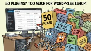
元価格は$2.00。.$1.00現在の価格は$1.00。. WordPress の電子商取引ストアに 50 個のプラグインは多すぎますか?
WordPressのeコマースサイトに50個のプラグインがあるからといって、それが自動的に問題になるわけではありません。実際、数だけでパフォーマンスが決まることはほとんどありません。.

Amazonホーム理学療法機器のメイン画像デザイン解説
はじめにAmazonで家庭用治療器の信頼できるイメージを構築する Amazonで家庭用治療器のメインイメージをデザインする際、私たちが最も重視するのは...
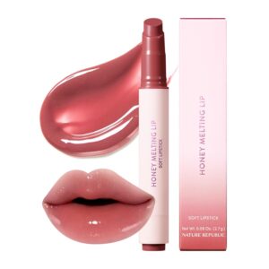
Amazon リップスティックコンバージョンのメイン画像デザイン
はじめにアマゾンで売れる口紅のメイン画像をデザインする アマゾンの口紅のメイン画像をデザインするとき、私たちの責任は...

ハッカーがWordPress管理者のメールアドレスを盗む方法(そしてそれを阻止する方法)
WordPressの管理者メールアドレスは、あなたが思っている以上に公開されているのです。ハッカーはそれが大好きです。彼らにとって、あなたの...
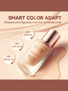
Amazonのリキッドファンデーションのメイン画像がコンバージョンにつながる理由
はじめに Amazonリキッドファンデーションのメイン画像デザインは、単に商品を美しく見せるだけではありません。Amazonでは、メイン画像と….

フィルターカートリッジの効果的なAmazonメインイメージのデザイン
はじめに Amazonのメイン画像をデザインする上で、商品を魅力的に見せることは決して重要ではありません。明確さ、信頼性、そして瞬時に理解できることが何よりも重要です。特に….
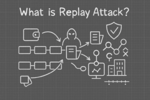
WordPress へのリプレイ攻撃: 本当の脅威か、それとも誇張された神話か?
まず最初に明確にしておきましょう。リプレイ攻撃は見た目には怖くありません。パスワードを破壊したり、緑色のハッカーテキストが飛び交うような悪質なコードを挿入したりもしません。彼らは狡猾なのです…。.
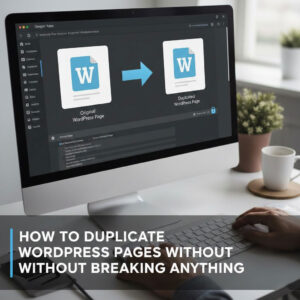
WordPressページを何も壊さずに複製する方法
正直に言って、新しいページを作りたくない時もあるでしょう。同じページを少しだけ変えたいだけなのに。レイアウトもブロックも設定も全部同じ。なぜなら….

ペット向けWordPressテーマ5選を比較
はじめに ペット関連のWordPressテーマを適切に選ぶことは、単なるデザイン上の決定ではありません。使いやすさ、拡張性、そして長期的なビジネスの成長に直接影響します。ペットケアとペット...

5つの水着eコマーステーマを比較
はじめに 水着やランジェリーの独立ストアに適切なテーマを選択することは、見た目だけの問題ではなく、コンバージョン率、拡張性、長期的な効果に直接影響します...
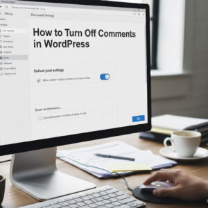
WordPressでコメント機能をオフにする方法(気が狂わずに)
WordPressのコメントについてお話しましょう。理論上は、コメントは素晴らしいものです。議論を促し、コミュニティを築き、ウェブサイトに「活気」を与えてくれます。しかし実際にはどうでしょうか?コメントはしばしば人を惹きつけ….

WordPress 500エラー:ウェブサイトがパニックに陥ったとき
WordPressサイトはほんの少し前までは問題ありませんでした。ページを更新した途端、突然…ドカーン💥…500 内部サーバーエラーが発生してしまいました。説明も謝罪もありませんでした。ただ冷たく、混乱を招くメッセージが表示され、その内容は….

科学主導のブランドのためのスケーラブルなWordPressウェブサイトの構築:AminoUSAプロジェクト
はじめに 今日のデジタル環境において、ウェブサイトは単なる製品リストを掲載する場所ではありません。規制の厳しい業界や研究重視の業界で事業を展開する科学主導のブランドにとって、ウェブサイトは….

グローバルブレードブランドのためのスケーラブルなShopifyストアの構築:CoolKatanaプロジェクト
はじめに 越境電子商取引において、Shopify の Web サイトは単なる店舗ではありません。ニッチで文化主導のカテゴリーで活動するブランドにとって、Web サイトは単なる店舗以上のものを実現する必要があります...

ポケモンカード向け高コンバージョンShopifyストアの設計
はじめに 収集可能な電子商取引の世界、特にポケモン トレーディング カード ゲーム (TCG) 市場では、Web サイトは単に製品をリストするだけでは不十分です。...
カスタムレンガブランドのための高コンバージョンShopifyデザイン
はじめに 今日の競争の激しいeコマース市場、特にパーソナライズされたギフトやコレクターズアイテムの分野では、Shopifyのウェブサイトは商品を展示する以上の機能を提供する必要があります。それは….
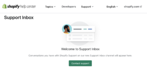
Shopifyサポートへの問い合わせ方法:シンプルでストレスフリーなガイド
Shopifyストアの運営は、混乱するのではなく、ワクワクするものであるべきです。疑問が生じたり、問題が発生して作業が滞ったりした場合でも、Shopifyは状況に応じて複数のサポートパスをご用意しています。.
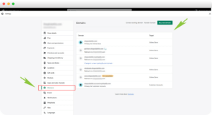
Shopifyストアを非アクティブ化する方法:分かりやすく実践的なガイド
Shopifyストアの無効化はそれほど複雑ではありませんが、多くのマーチャントが見落としている影響があります。このガイドでは、そのプロセスを分かりやすく解説します。.