


 Japanese
導入
In the travel industry, a website does more than present information—it shapes the entire perception of a destination and determines whether a visitor becomes a traveler. When users explore train travel options across China, they expect a platform that feels trustworthy, intuitive, and visually immersive. A well-designed travel website must balance storytelling, usability, and clear booking pathways.
The China Trains section of the China Highlights website serves as a crucial gateway for travelers planning rail journeys across China. The goal of this project was to design a page that simplifies complex travel information while creating a compelling visual experience that encourages users to explore routes, understand the benefits of train travel, and confidently move toward booking.
This case study explains how the page was strategically designed from a Shopify user-experience and visual-structure perspective, focusing on layout clarity, travel inspiration, and conversion-driven navigation.
| 配達時間 | カテゴリ | アプリケーションプラットフォーム |
| 21日間 | Travel | shopify |
| 関与するデザイナー | 料金 | 効果 |
| リン・チャン | $1000 | Store traffic📈217% |
Understanding the Project Goals
Before beginning any design work, it was important to understand the objectives behind the China Trains page.
主な目的
- Present China’s high-speed rail system in a clear and accessible format
- Inspire travelers to consider train journeys as part of their itinerary
- Simplify route exploration and travel planning
- Build trust through visual credibility and structured information
- Guide users toward tour planning and booking actions
Target Audience
The page primarily targets:
- First-time travelers to China
- International tourists planning multi-city trips
- Travelers interested in scenic train routes
- Users researching transportation between major destinations
These audiences often arrive with limited knowledge about China’s rail system, so the design needed to act as both an educational resource and a booking entry point.
Our Shopify Design Philosophy
Designing travel websites requires a unique balance between visual inspiration and functional clarity. Users want to imagine their future trip while also finding practical information quickly.
Our design approach focused on three core principles:
1. Visual Storytelling
Travel websites must evoke emotion. Strong imagery and clean layouts help visitors imagine themselves in the experience.
2. Information Hierarchy
Travel planning often involves large amounts of information. Clear structure ensures users can absorb details without feeling overwhelmed.
3. Conversion-Focused Navigation
Every page should guide visitors toward meaningful actions such as exploring tours or requesting travel planning support.
These principles informed every design decision throughout the project.
The Design Process
Creating a successful travel page requires a structured design workflow that combines research, layout planning, and visual storytelling.
Discovery and Research
The first stage focused on understanding the existing travel brand and how visitors interact with travel planning pages.
Key insights included:
- Many visitors search for transportation guidance before booking tours
- Travelers often compare multiple destinations and routes
- Clear visuals help users understand travel distances and options faster
These insights shaped the structure of the page.
UX Planning and Layout Structure
The design needed to guide visitors through several stages of travel planning.
Stage 1: Inspire Curiosity
Introduce China’s rail network and highlight its advantages.
Stage 2: Provide Practical Guidance
Explain routes, travel times, and key destinations.
Stage 3: Encourage Exploration
Lead users toward tours and personalized trip planning.
To achieve this flow, the page was structured into several carefully designed sections.
Key Design Sections of the Page
Hero Section: Immediate Travel Inspiration
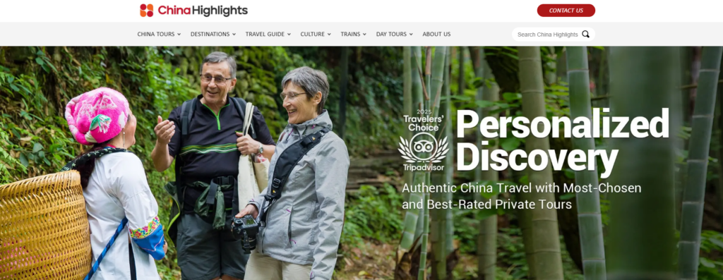
The hero section serves as the first emotional touchpoint for the visitor.
Design priorities included:
- A large lifestyle image showing real travel moments
- Clear messaging that highlights personalized travel experiences
- Strong visual hierarchy to immediately communicate value
The headline communicates exploration and discovery, reinforcing the idea that travel planning can be personalized and seamless.
Supporting design elements include:
- Minimal navigation distraction
- Strong contrast for readability
- Clear focal points guiding the eye from headline to content
This section creates the first emotional connection with the traveler.
Trust Signals and Authority
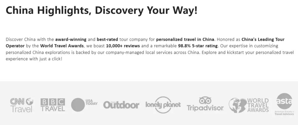
Travel decisions require a high level of trust. The page integrates several credibility elements early in the layout.
These include:
- Media mentions
- Travel awards
- Trusted travel platforms
- Industry recognition
From a design perspective, these elements are placed in a clean horizontal row, allowing visitors to quickly recognize authority without disrupting the visual flow.
Trust badges function as subtle reassurance that the brand is reputable and experienced.
Travel Information Highlights
One challenge of designing travel websites is presenting important updates and policies clearly.
For example, visa policies or travel announcements must be noticeable but not overwhelming.
The solution was a highlight information box that:
- Uses subtle borders and background contrast
- Keeps typography clean and readable
- Allows quick scanning
This ensures important travel updates remain visible without interrupting the browsing experience.
Tour Exploration Section
The Top China Tours section was designed to encourage discovery.
Each tour card contains:
- A strong destination image
- Tour duration
- Key cities included in the itinerary
- A clear “View More” action
From a design standpoint, the grid layout serves multiple purposes:
- Makes comparisons easy
- Creates visual rhythm
- Encourages browsing
The card design balances visual inspiration and practical information, helping travelers quickly identify tours that match their interests.
Social Proof and Traveler Reviews
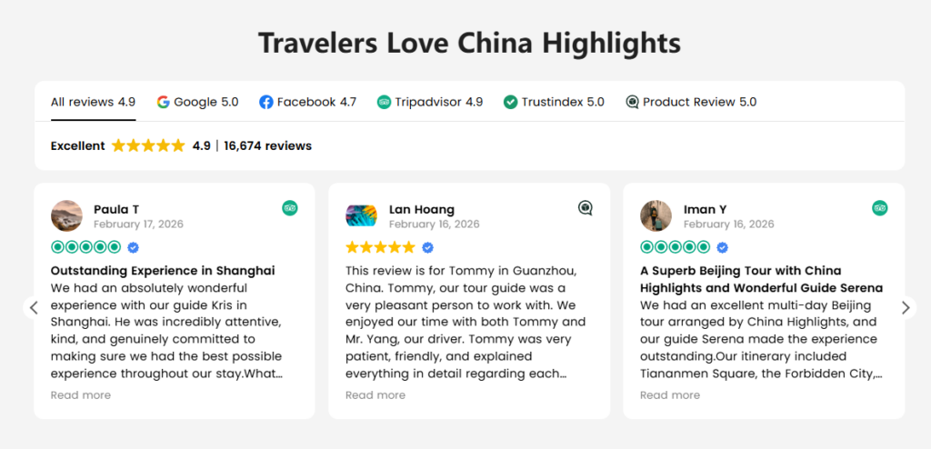
User-generated reviews are powerful persuasion tools.
The review section was designed to showcase real traveler experiences while maintaining visual cleanliness.
デザイン要素には次のものが含まれます。
- Star ratings for immediate credibility
- Reviewer avatars for authenticity
- Short testimonial excerpts for readability
The layout uses card-based design, allowing multiple testimonials to appear without overwhelming the page.
This section strengthens trust while reinforcing the brand’s reliability.
Destination Discovery Grid
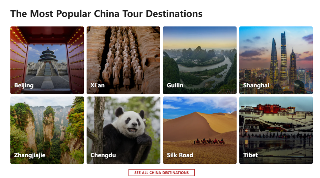
Travelers often begin planning by exploring destinations rather than tours.
The destination grid section was created to support this behavior.
Key design features include:
- High-impact destination photography
- Clear labels for each location
- Grid layouts that feel modern and scannable
Destinations such as Beijing, Shanghai, Guilin, and Tibet are displayed in a visually engaging format.
This section acts as a visual travel map, helping visitors imagine potential routes and travel experiences.
Educational Travel Content
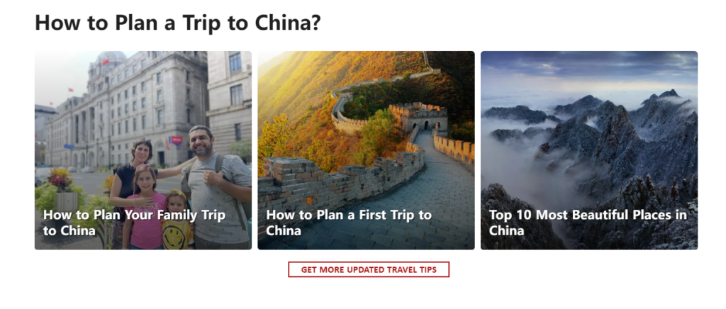
Many travelers need guidance before committing to a trip.
The design therefore includes a section dedicated to travel planning articles.
例:
- Planning a first trip to China
- Family travel advice
- Scenic destination guides
From a UX perspective, this section supports content-driven discovery, allowing visitors to continue exploring without leaving the ecosystem of the website.
Conversion Section: Encouraging Action
After guiding users through inspiration, information, and exploration, the design shifts toward conversion.
A clear call-to-action invites visitors to start planning a personalized trip.
Design considerations included:
- Strong contrast button colors
- Centered layout for emphasis
- Minimal surrounding distractions
This section acts as a decision point, encouraging travelers to take the next step.
Newsletter Engagement
Travel planning often takes weeks or months.
The newsletter section was designed to capture interest from users who may not be ready to book immediately.
Key design features:
- Scenic background imagery
- Clear benefit messaging
- Simple signup interaction
This ensures the brand can continue engaging with potential travelers over time.
設計上の課題と解決策
Challenge 1: Complex Travel Information
Train travel across China involves numerous routes and destinations.
解決:
Organize information into clearly defined sections that prioritize readability and visual scanning.
Challenge 2: Balancing Inspiration and Practicality
Travel websites must inspire users while still providing practical guidance.
解決:
Use a combination of:
- Lifestyle photography
- structured information cards
- educational content modules
Challenge 3: Encouraging Exploration Without Overwhelming Users
Too many options can confuse visitors.
解決:
Implement modular layouts and curated content blocks that guide users step-by-step.
The Final Design Outcome
The redesigned page delivers several key improvements:
Clear Visual Hierarchy
Visitors can quickly understand:
- what the page offers
- how to explore tours
- where to plan their trip
Strong Travel Storytelling
Immersive imagery helps visitors imagine real travel experiences across China.
Intuitive Navigation
Each section naturally leads to the next stage of the traveler’s journey.
Improved User Engagement
Visitors can:
- browse destinations
- explore tours
- read travel advice
- start planning trips
All within a single cohesive experience.
Why Strategic Shopify Design Matters
In modern travel eCommerce, a website must function as both a content hub and a booking platform.
A thoughtful Shopify design strategy ensures:
- seamless exploration
- clear travel information
- engaging storytelling
- strong conversion pathways
When these elements work together, the website becomes more than a booking tool—it becomes part of the travel experience itself.
結論
Designing the China Trains page required a careful balance between inspiration, usability, and trust-building. Through strategic layout planning, strong visual storytelling, and conversion-focused structure, the page now provides travelers with a clear and engaging way to explore rail journeys across China.
Projects like this highlight how thoughtful Shopify design can transform complex travel information into an intuitive digital experience that encourages exploration and builds confidence in travel planning.
For businesses seeking professional Shopify design that blends storytelling, usability, and conversion strategy, the team at エアサン specializes in crafting high-impact eCommerce experiences tailored to global audiences.


WordPressのウェブサイトや、完全なeコマースシステムを備えたコーポレートサイトをデザイン・構築します。.
価格帯$200.00~$2,500.00カスタム要件または特別見積もり
元価格は$2.00。.$1.00現在の価格は$1.00。. Amazonホーム理学療法機器のメイン画像デザイン解説
はじめにAmazonで家庭用治療器の信頼できるイメージを構築する Amazonで家庭用治療器のメインイメージをデザインする際、私たちが最も重視するのは...

Amazon リップスティックコンバージョンのメイン画像デザイン
はじめにアマゾンで売れる口紅のメイン画像をデザインする アマゾンの口紅のメイン画像をデザインするとき、私たちの責任は...

ハッカーがWordPress管理者のメールアドレスを盗む方法(そしてそれを阻止する方法)
WordPressの管理者メールアドレスは、あなたが思っている以上に公開されているのです。ハッカーはそれが大好きです。彼らにとって、あなたの...

Amazonのリキッドファンデーションのメイン画像がコンバージョンにつながる理由
はじめに Amazonリキッドファンデーションのメイン画像デザインは、単に商品を美しく見せるだけではありません。Amazonでは、メイン画像と….

フィルターカートリッジの効果的なAmazonメインイメージのデザイン
はじめに Amazonのメイン画像をデザインする上で、商品を魅力的に見せることは決して重要ではありません。明確さ、信頼性、そして瞬時に理解できることが何よりも重要です。特に….

WordPress へのリプレイ攻撃: 本当の脅威か、それとも誇張された神話か?
まず最初に明確にしておきましょう。リプレイ攻撃は見た目には怖くありません。パスワードを破壊したり、緑色のハッカーテキストが飛び交うような悪質なコードを挿入したりもしません。彼らは狡猾なのです…。.

WordPressページを何も壊さずに複製する方法
正直に言って、新しいページを作りたくない時もあるでしょう。同じページを少しだけ変えたいだけなのに。レイアウトもブロックも設定も全部同じ。なぜなら….

ペット向けWordPressテーマ5選を比較
はじめに ペット関連のWordPressテーマを適切に選ぶことは、単なるデザイン上の決定ではありません。使いやすさ、拡張性、そして長期的なビジネスの成長に直接影響します。ペットケアとペット...

5つの水着eコマーステーマを比較
はじめに 水着やランジェリーの独立ストアに適切なテーマを選択することは、見た目だけの問題ではなく、コンバージョン率、拡張性、長期的な効果に直接影響します...

WordPressでコメント機能をオフにする方法(気が狂わずに)
WordPressのコメントについてお話しましょう。理論上は、コメントは素晴らしいものです。議論を促し、コミュニティを築き、ウェブサイトに「活気」を与えてくれます。しかし実際にはどうでしょうか?コメントはしばしば人を惹きつけ….

科学主導のブランドのためのスケーラブルなWordPressウェブサイトの構築:AminoUSAプロジェクト
はじめに 今日のデジタル環境において、ウェブサイトは単なる製品リストを掲載する場所ではありません。規制の厳しい業界や研究重視の業界で事業を展開する科学主導のブランドにとって、ウェブサイトは….

グローバルブレードブランドのためのスケーラブルなShopifyストアの構築:CoolKatanaプロジェクト
はじめに 越境電子商取引において、Shopify の Web サイトは単なる店舗ではありません。ニッチで文化主導のカテゴリーで活動するブランドにとって、Web サイトは単なる店舗以上のものを実現する必要があります...

ポケモンカード向け高コンバージョンShopifyストアの設計
はじめに 収集可能な電子商取引の世界、特にポケモン トレーディング カード ゲーム (TCG) 市場では、Web サイトは単に製品をリストするだけでは不十分です。...

カスタムレンガブランドのための高コンバージョンShopifyデザイン
はじめに 今日の競争の激しいeコマース市場、特にパーソナライズされたギフトやコレクターズアイテムの分野では、Shopifyのウェブサイトは商品を展示する以上の機能を提供する必要があります。それは….

Shopifyサポートへの問い合わせ方法:シンプルでストレスフリーなガイド
Shopifyストアの運営は、混乱するのではなく、ワクワクするものであるべきです。疑問が生じたり、問題が発生して作業が滞ったりした場合でも、Shopifyは状況に応じて複数のサポートパスをご用意しています。.

Shopifyストアを非アクティブ化する方法:分かりやすく実践的なガイド
Shopifyストアの無効化はそれほど複雑ではありませんが、多くのマーチャントが見落としている影響があります。このガイドでは、そのプロセスを分かりやすく解説します。.

高級花卉ブランド向けShopifyウェブサイトデザイン事例
はじめに 今日の競争の激しいeコマース市場において、Shopifyのウェブサイトは商品を表示する以上の機能を提供する必要があります。ブランド価値を瞬時に伝え、ユーザーを誘導する必要があります….

Shopifyデザインケーススタディ:レトロゲームストア
はじめに 競争の激しいeコマース環境では、視覚的な明瞭さと感情的な繋がりが、訪問者が顧客になるかどうかを左右することがよくあります。これは特に….