









Project overview
The audio website needs to not only allow visitors to understand the product range, but also explain specifications and cooperation methods. This case uses the English front-end website of Phonix Audio as the object, and explains its visible design structure from five aspects: homepage, product catalog, representative product details, brand introduction, and contact page. The website uses black navigation, white content areas and electric blue accent colors to form a division of labor between the professional audio atmosphere and the readability of product information: the homepage establishes positioning, the catalog helps selection, explains the product in detail, the brand page supplements corporate information, and the contact page handles needs.
| Services | Industry | Plate-forme |
| WordPress website visual explanation | Digital 3C | WordPress |
| Project requirements | target market | design style |
| Clearly display audio products and corporate information, organize product browsing and consultation paths | English International Business Visitor | Black and white tone, electric blue emphasis, product and manufacturing theme |
| Project quotation | Delivery content | Delivery time |
| ¥7,800 | 5 main page explanations, desktop/mobile phone screenshots and browsing screen recordings | 16 days |
design challenge
Car audio, PA systems, line array equipment and accessories cater to different purchasing needs. If only a large brand image is used, it will be difficult for visitors to find specific products; if a large number of models and parameters are directly displayed, there is no entrance to understand the brand and purpose. Therefore, the website needs to organize three lines of information at the same time: where to find products, where to check technical information, and how to make demands when preparing for cooperation. The focus of the design explanation is to observe how different pages perform these tasks respectively.
overall design strategy
01 First show the product direction, and then enter the specific selection
The first screen of the homepage first displays the audio manufacturing theme and product entrance, and then uses selected products, category cards and series displays to guide browsing. Classification and model information are distributed at different levels. Visitors can choose the application direction first, and then enter the catalog and details without having to understand all the technical parameters on the first screen.
02 Use unified vision to distinguish brand atmosphere and technical reading
The black header, dark sound background and blue emphasis establish a technical atmosphere; the white area, rule cards and large white space carry the product name, specifications and introduction. Use blue or obvious black and white contrast for important buttons to distinguish the operation entrance from the main text instructions.
03 Let details, company information and contact pages connect with each other
The representative product detail page starts with product diagrams and key features, and is supplemented by technical data, application notes, quality topics, and Q&A. The brand introduction page focuses on corporate identity and service scope, while the contact page provides a request form and contact information. The design value here is to allow different questions to have corresponding page positions, rather than putting all content on the home page.
Website browsing record
The following video records the actual browsing process of the homepage, product catalog, representative details, brand introduction and contact page. You can combine the screenshots of the following modules to see the connection between the pages.
Home page above the fold: Establish first impression with clear positioning and product entrance
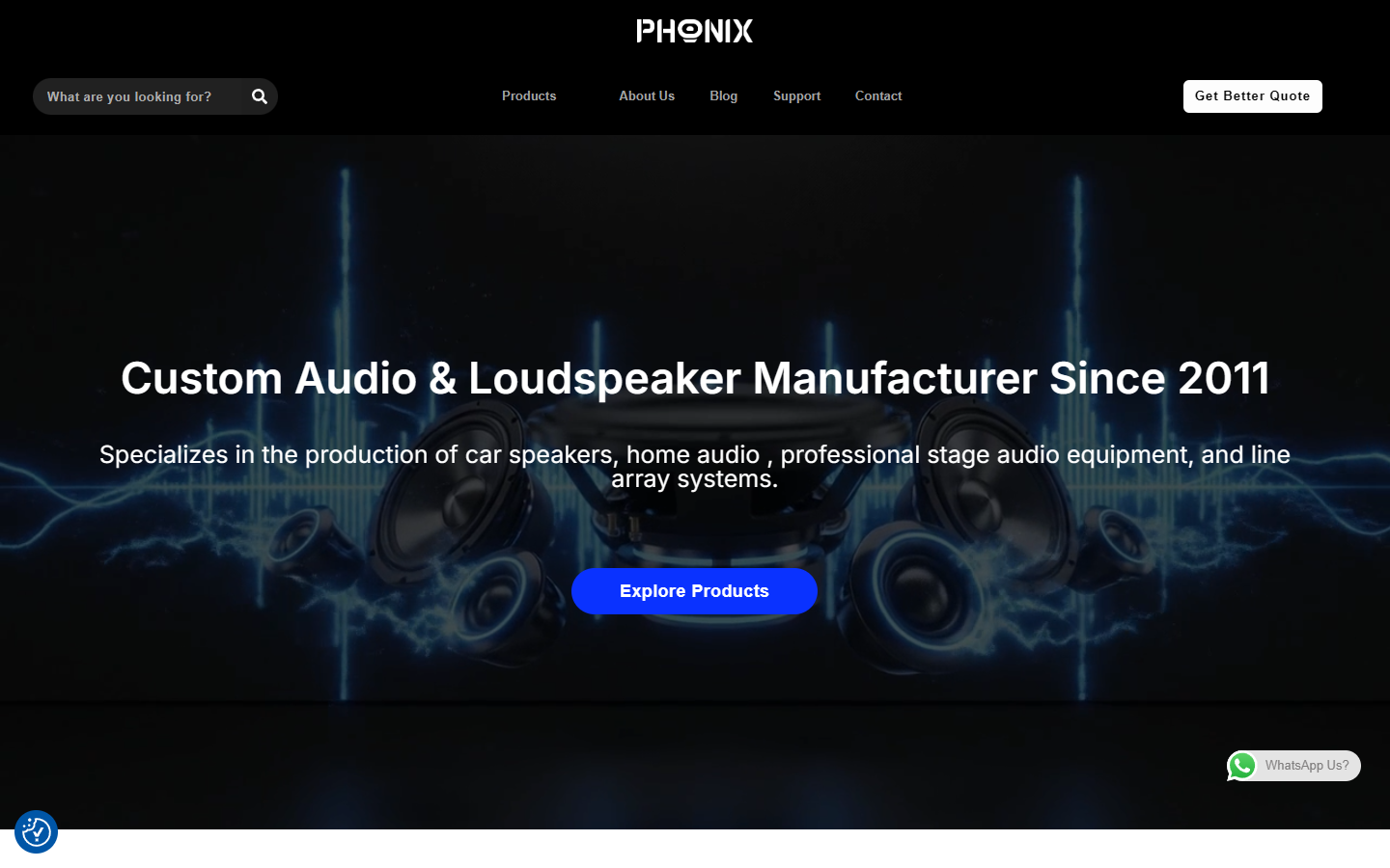
Place the brand logo in the top center of the page, arrange search, product, brand introduction, blog, contact and other entrances below, and keep quotation tips on the right. On the first screen, large fonts are used to create the topic title and product range description to establish the basic context, and the blue “Explore Products” button becomes the clear choice before browsing down.
This layout satisfies two types of visitors at the same time: first-time visitors first understand the business direction, and users who already have goals can directly use navigation or search to enter the product. The dark background contrasts with the white text, and the blue button distinguishes the action portal from the background.
Home page classification module: Convert the audio business scope into a browsable entrance
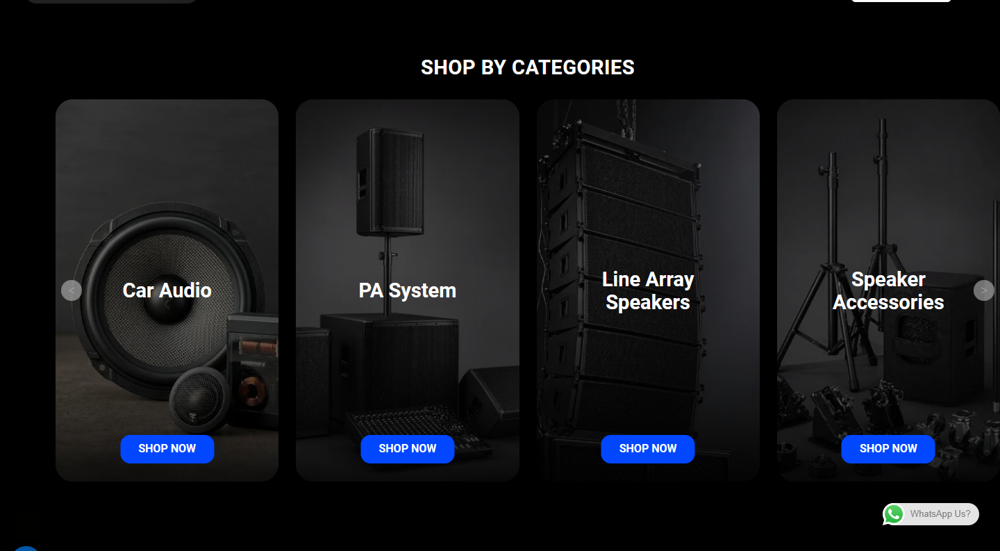
After the product display on the homepage, set up category cards to organize the content in visible categories such as car audio, PA systems, line arrays and accessories. The picture provides a product or application reference, the name helps identify the direction, and the browsing prompts in the card connect to subsequent pages.
The task of the classification module is not to repeat the first-screen positioning, but to answer “Where is the type I need?” Compared with text only, picture cards are easier to scan; the selected products and series area provides another way to browse based on specific products.
Product catalog page: Use regular grid to support model search
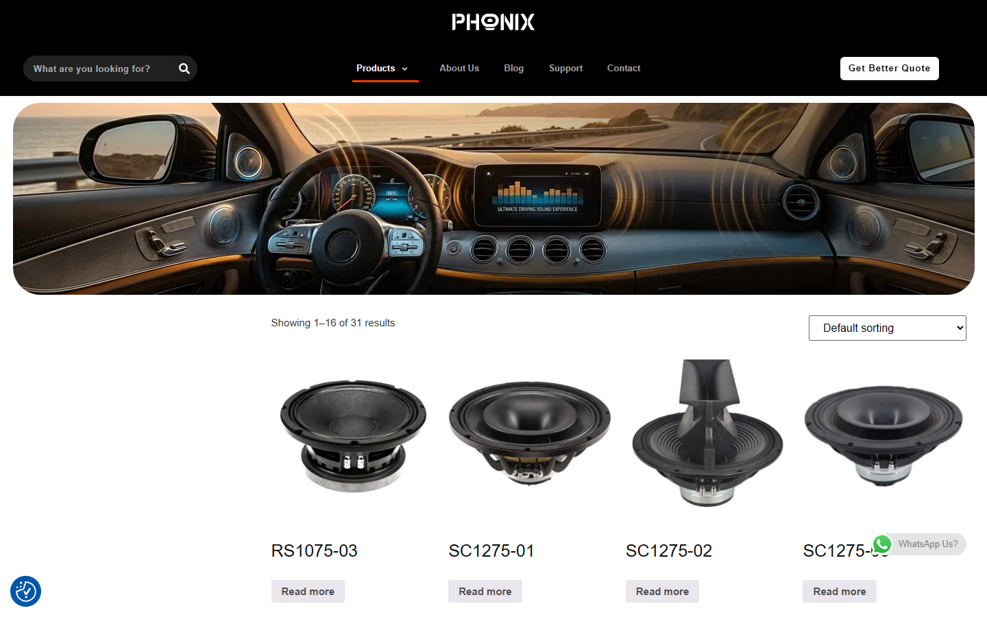
The product catalog uses a regular grid to present speaker images and models, with result prompts and sorting options set at the top, and pagination at the bottom to continue browsing. Compared with the theme display on the home page, this page has obviously condensed content and mainly serves product search.
Uniform image areas and name locations allow different models to have a comparable display basis. The division of labor from catalog to details is also clear: the list is responsible for discovering the product, and the details are responsible for explaining specifications and uses. This article looks at representative catalog pages and does not equate it to reviewing all models one by one.
Product details above the first screen: first look at the product, then understand the key features
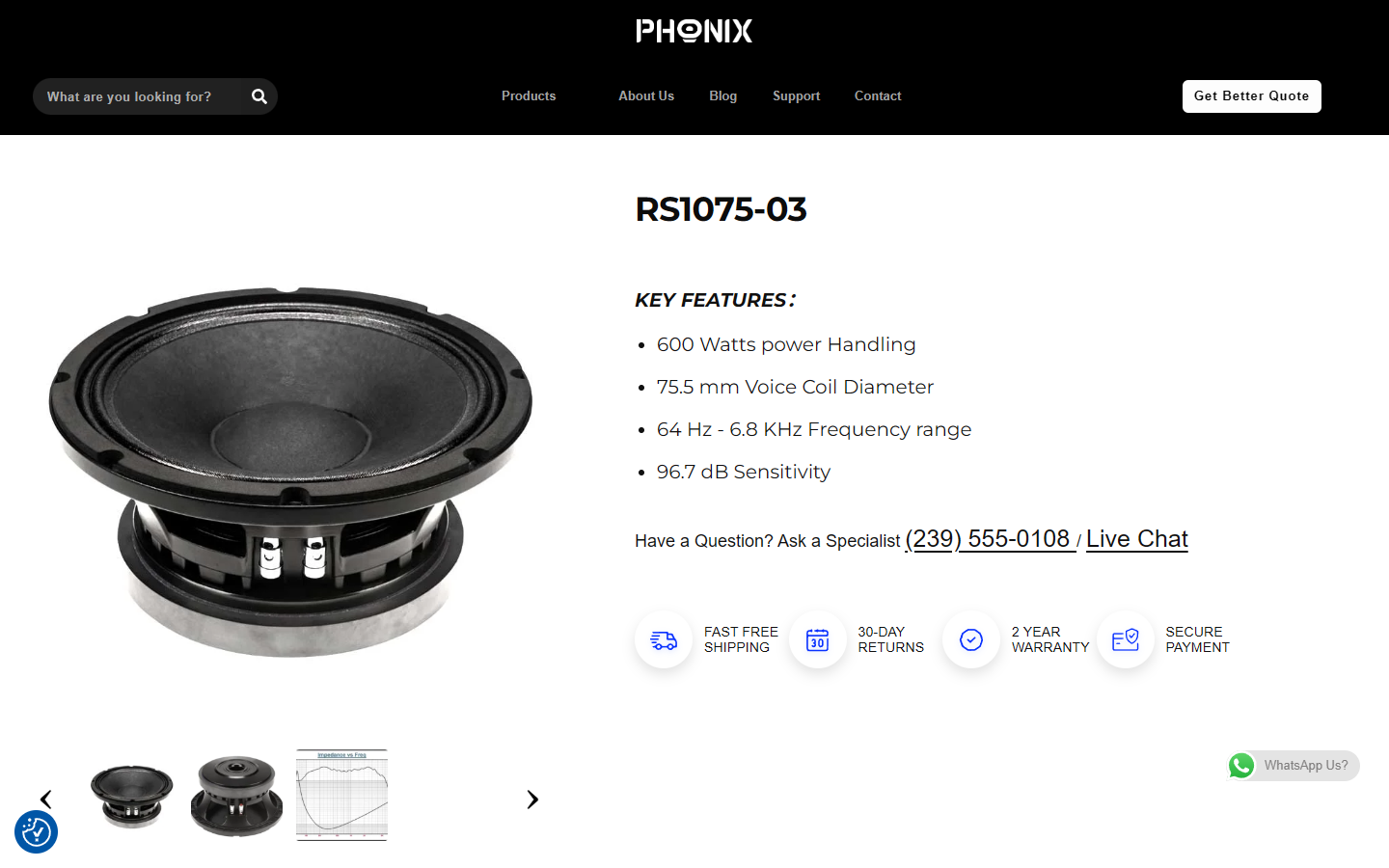
Taking the RS1075-03 page as an example, the product brochure and text description are juxtaposed on the first screen. The product name and key features are concentrated on the right side. Users can continue to read the core information after seeing the appearance clearly. The service prompts below supplement the page context.
The large product picture is responsible for identification, and the text area is responsible for explanation. The two should not be mixed in the same parameter poster. This structure helps technical products retain a clear visual body while leaving space for functional introductions and follow-up consultations.
Technical data module: separate detailed specifications from the first screen
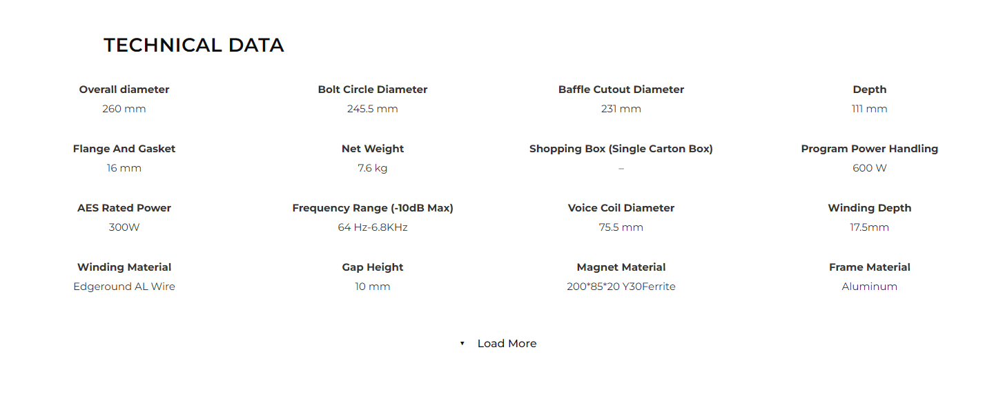
The technical data area is displayed in groups of labels and values, and information such as size, power, frequency, electromagnetic structure and materials are placed in separate areas. When users need to check a certain specification, they can directly look for the corresponding label instead of extracting numbers from a multi-paragraph introduction.
This module illustrates the layering of information on a technical website: key features for quick reading, detailed data for in-depth verification. The case pays attention to its layout organization; the specific specifications on the page need to be uniformly proofread by the website before they can be used as a basis for purchasing.
In-depth product descriptions: Supplement understanding with applications, quality topics, and Q&A
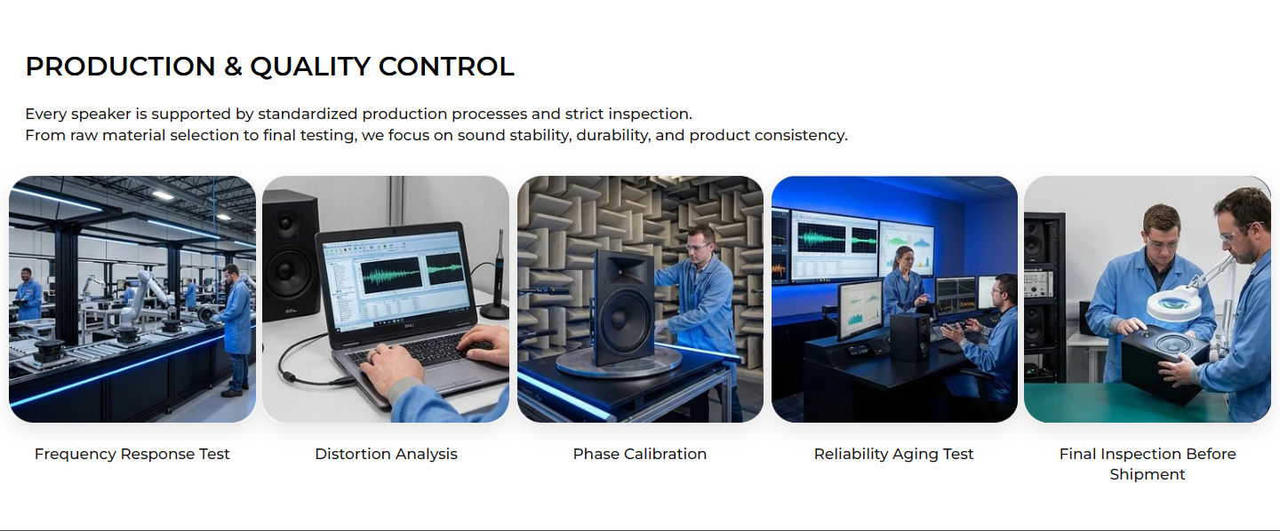
After the parameter area, the page continues to explain the product usage with scenarios and introductions, and then organizes different inspection items through production and quality theme cards. A clear division of labor between images, short titles, and supplementary instructions moves the paragraph from a numerical reading to a process description.
The advantage area and frequently asked questions below continue to respond to questions about product selection, samples, delivery and customization, forming a reading order from shallow to deep. The expanded status of the Q&A was viewed in the screen recording; no customer inquiry was submitted, nor was the test or service commitment stated on the website verified.
Brand introduction page: centralized description of corporate identity and cooperation scope
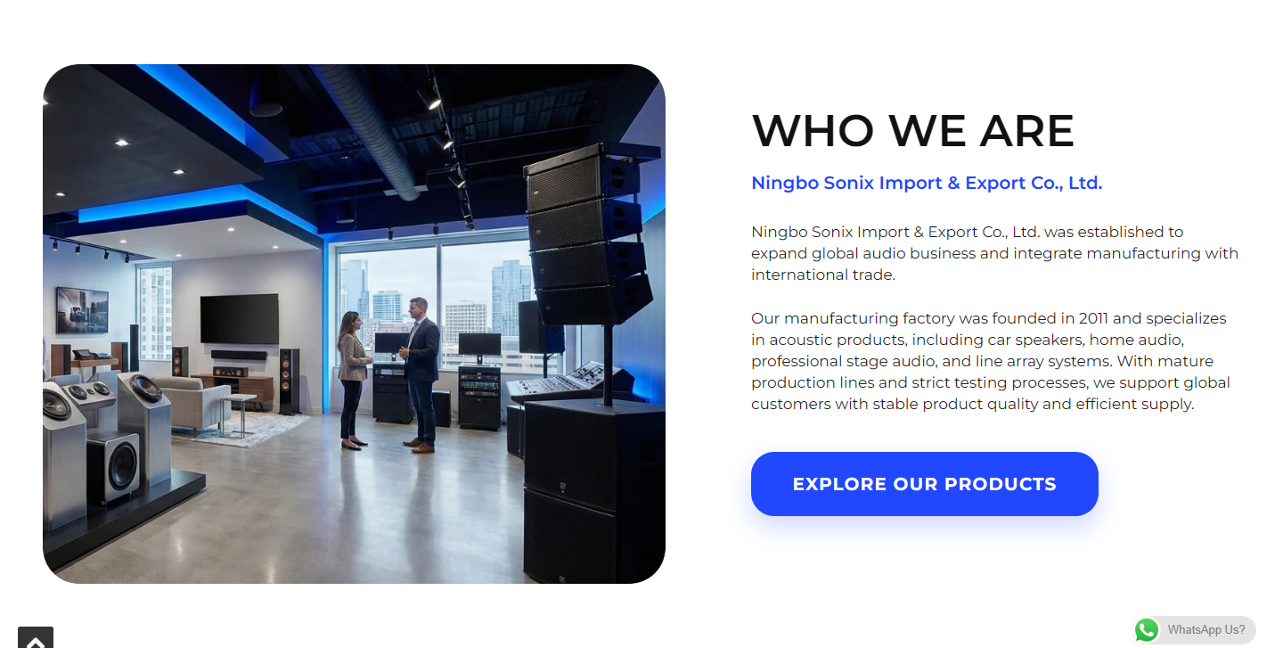
The brand introduction page first establishes a corporate theme, and then uses left and right columns to organize pictures and company introductions. Unlike product pages that discuss a single model, here they mainly explain the company’s identity, product direction, and the relationship between manufacturing and international business.
Separating these contents into separate pages will help visitors who are interested in cooperation continue to understand the supplier without having to go back to the product parameters to find the company background. The pictures are responsible for providing business reference, and the text is responsible for supplementing the relationship and scope; the cases are only explained on the page and do not replace the company’s qualification verification.
Enterprise capability overview: Use cards to make background information easier to scan
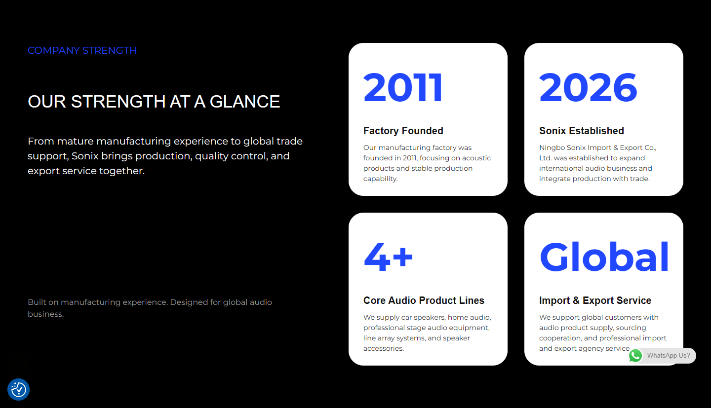
The capability overview breaks down corporate development, product lines and international business scope into scannable cards with large font information, category labels and short descriptions. Follow-up collaboration benefits, vision, and contact tips further connect to business communications.
The value of this page is to transform the company introduction from a single long paragraph to different levels of information. Year and ability cards can prompt reading points, but page statements still need to correspond to real information, and you cannot claim to have established verified trust by relying solely on digital cards.
Contact page: Convert browsing interests into clear expressions of need
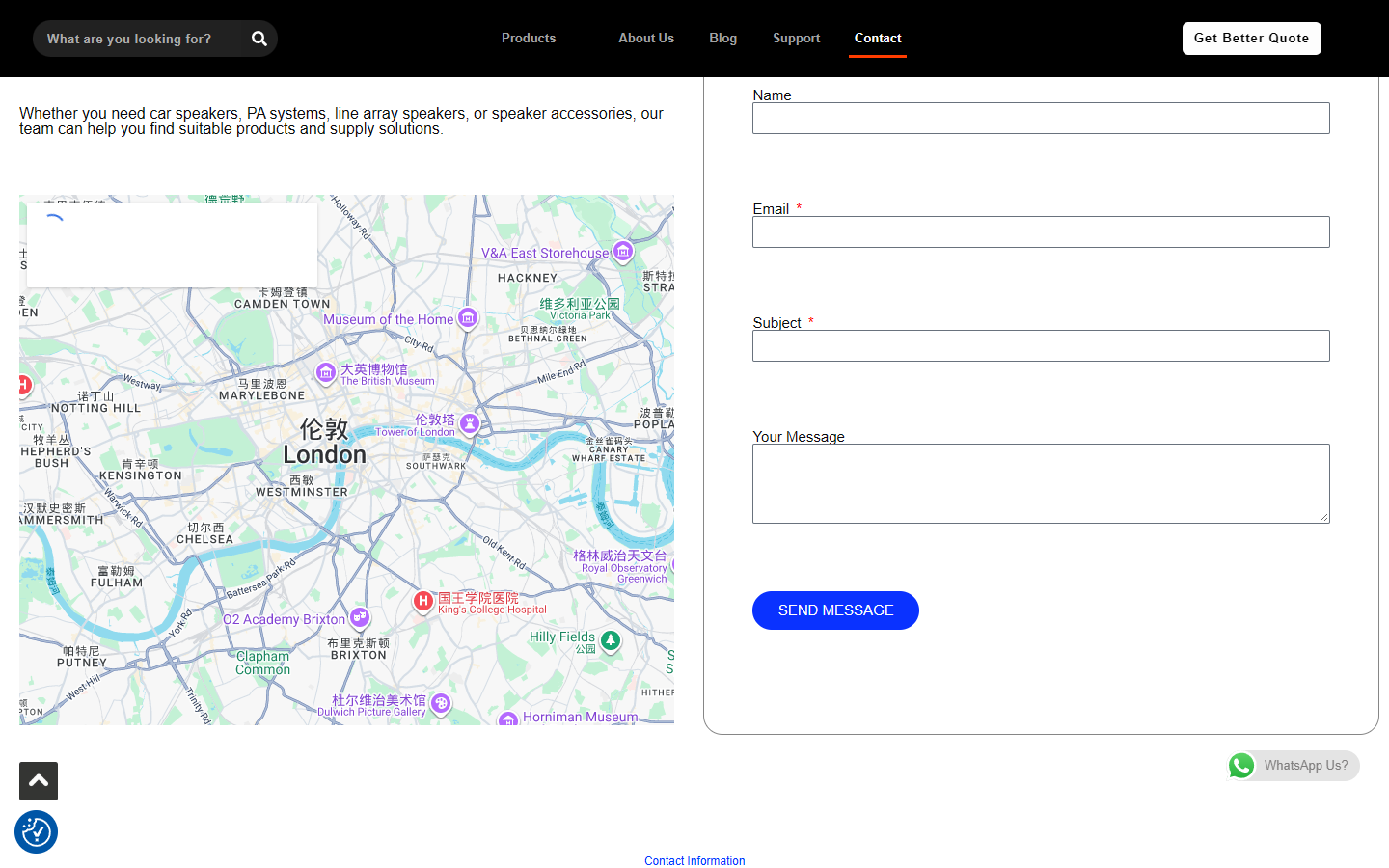
The contact page first explains the products and cooperation directions suitable for consultation, and then provides name, email, subject and message fields. Supplement the phone number, address and email at the bottom of the page so that visitors can choose the communication method according to their own needs.
This arrangement makes Contact not just a footer link, but a standalone page that explains what the consultation is about. The case collection looked at the form layout and existing entrances, and no real information was sent; whether it is successfully delivered still requires additional authorized functional testing.
Observation on the mobile phone: Check the reading order of the home page and details separately
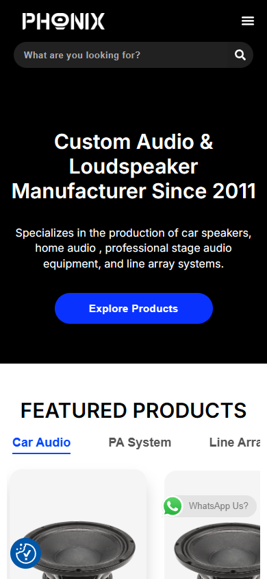
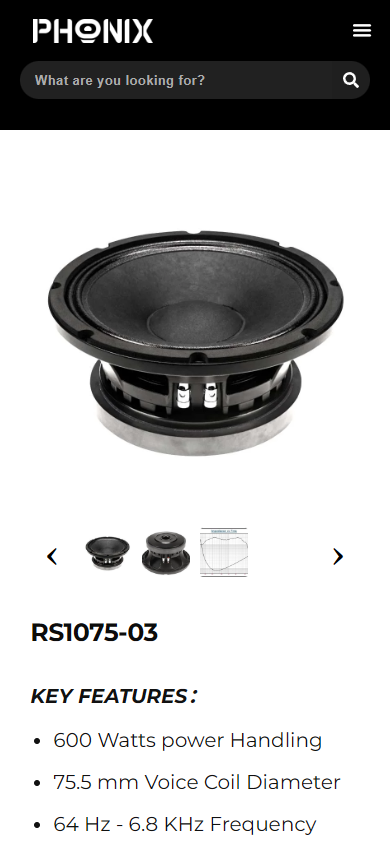
This time, the homepage and representative product pages are accessed with a 390-pixel wide viewport, and real mobile phone screenshots are retained. The sorting, number of lines of text, and proportion of images on the small screen of the desktop side-by-side structure need to be observed separately from the desktop page, rather than just reducing the size of the large image.
The horizontal overflow of the page was also recorded during collection. What is shown here is the actual access status. It cannot be concluded that all pages of the entire site have completed the mobile adaptation test based on the two screenshots.
Delivery summary and design value
Page responsibilities form a continuous path
The homepage displays positioning and product direction, the catalog is responsible for model discovery, and details add specifications and uses. The brand page concentrates corporate information, and the contact page handles needs. The division of responsibilities between these pages is the most valuable information organization method in this case.
The two information lines of product and enterprise are expanded separately.
Technology procurement requires looking at specific products and understanding suppliers. Product details and brand introduction are organized separately, allowing the two types of questions to have their own reading space; the existing navigation then connects them to the same website.
Design expression and real business data need to be synchronized
The website can organize product and cooperation information structurally, but the brand name, model parameters, placeholder content and link destinations should still be unified before publishing. Page performance is not a substitute for measured customer inquiry, transaction or performance data; these results are not provided in this case.
Plan a clear website display path for your products
If your product also has many series, complex parameters or difficult to explain cooperation methods, you can submit your existing website or design materials to AIRSANG, explain the business type, target market and required page range, and communicate the design needs of the website’s visual and information structure.
Consultation email: [email protected] · Telephone: 177-5952-2770