










Aucun produit dans le panier.

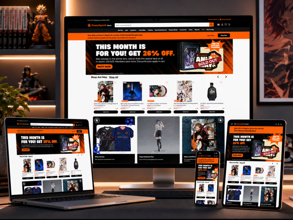
An anime eCommerce website cannot feel like a basic product catalog. Fans do not only buy figures, apparel, manga, collectibles, Blu-rays, home goods, or accessories because they need another item in their cart. They buy because a series, character, scene, or story already means something to them. That emotional connection should shape the full website design experience.
For the Crunchyroll Store project, our goal was to design a shopping experience that felt energetic, collectible, organized, and conversion-focused. The official store carries a wide range of licensed anime products, including figures, vinyl, home goods, collectibles, exclusive clothing, manga, books, accessories, and merchandise from major series. That gave us a clear design challenge: the website needed to support a large product catalog while still feeling exciting, visual, and easy to browse.
Instead of treating the homepage as a simple entry point, we designed it as a fan-driven shopping journey. The homepage had to introduce promotions, guide users into popular categories, highlight new releases, push featured collections, and make product discovery feel natural. From there, the category pages, product listing pages, and product detail pages needed to continue the same experience with clear filters, strong product cards, visual hierarchy, and purchase-focused layouts.
| Délai de livraison | Catégorie | Type de site Web |
| 19 jours | Anime Merchandise | Site web auto-construit |
| Concepteurs impliqués | Coût | Effet |
| Lin Zhang | $2100 | Sales📈274% |
This project focused on an anime merchandise eCommerce store. The store needed to support several major product groups, such as collectibles, clothing, home entertainment, manga and books, accessories, series-based shopping, exclusives, sale items, and memberships.
The main goal was to design a website that could turn fan attention into product exploration and product exploration into purchases. Anime fans often arrive with different shopping behaviors. Some users search for a specific series. Some want limited-edition items. Some browse by character, category, price, or release status. Others only want to see what is new, trending, or discounted.
Because of that, the design needed to support both direct shopping and casual discovery.
We used a bold, entertainment-led design direction. The layout needed to feel active but not messy. The colors, banners, spacing, product grids, and promotional sections had to work together as one shopping system. The site needed to feel exciting enough for anime fans but structured enough for serious eCommerce performance.
Anime fans are highly visual shoppers. They respond to character artwork, limited releases, exclusive collections, recognizable series names, and collectible presentation. A standard eCommerce layout can sell products, but it may not create the sense of excitement that anime merchandise needs.
We designed the page experience around four user motivations:
Many visitors want to build or complete a collection. Product cards, category groupings, and series pages needed to help users quickly understand what belongs together.
Anime apparel, accessories, and home goods often express personal taste. The design needed to make products feel lifestyle-oriented, not only transactional.
New fans may not know exactly what they want. The homepage and listing pages needed to guide them through featured items, best sellers, new releases, and promotional collections.
Limited offers, pre-orders, exclusives, and sale campaigns can drive faster decisions. The page design needed strong promotional zones without overwhelming the shopping experience.
Before designing the page structure, we reviewed the type of products the store needed to present. A large anime store includes many SKUs across different product formats. A figure, hoodie, manga volume, Blu-ray, plush, and home item all need different visual treatment, but they must still feel consistent inside the same store.
We mapped the catalog into simple shopping pathways:
This path helps users browse product types such as collectibles, clothing, manga, books, accessories, and home goods.
This path helps users find products connected to specific anime titles.
This path supports sale campaigns, free gift offers, limited deals, and seasonal campaigns.
This path supports new releases, in-stock items, and pre-order products.
This planning stage helped us design navigation, homepage sections, product cards, and filters around real shopping behavior.
The homepage needed to do more than look attractive. It had to introduce the brand world, highlight major campaigns, and guide visitors toward product categories.
We planned the homepage as a layered journey:
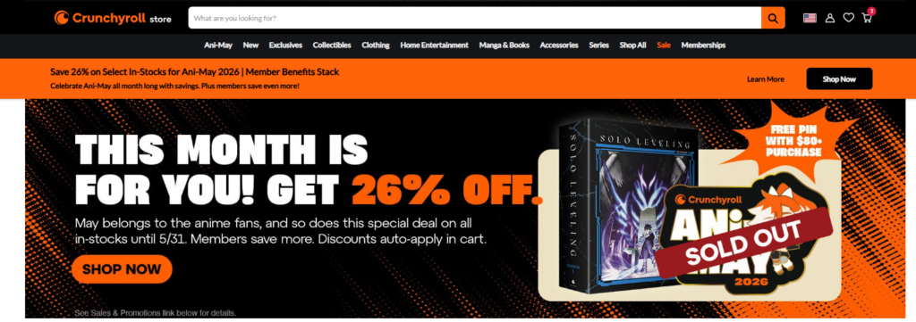
The hero area became the strongest promotional space. It needed to capture attention immediately with bold graphics, campaign messaging, and a clear call to action.
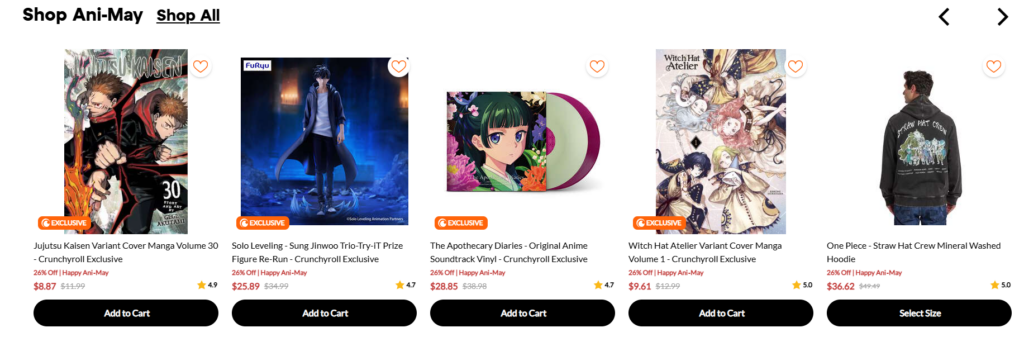
Below the hero, we placed product or collection cards that helped users move quickly into popular areas. These cards worked as shortcuts for shoppers who did not want to use the menu first.
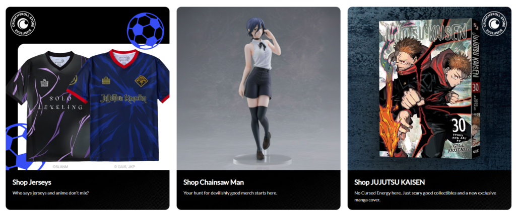
Category sections helped organize the large catalog. They made the store easier to scan and reduced decision fatigue.
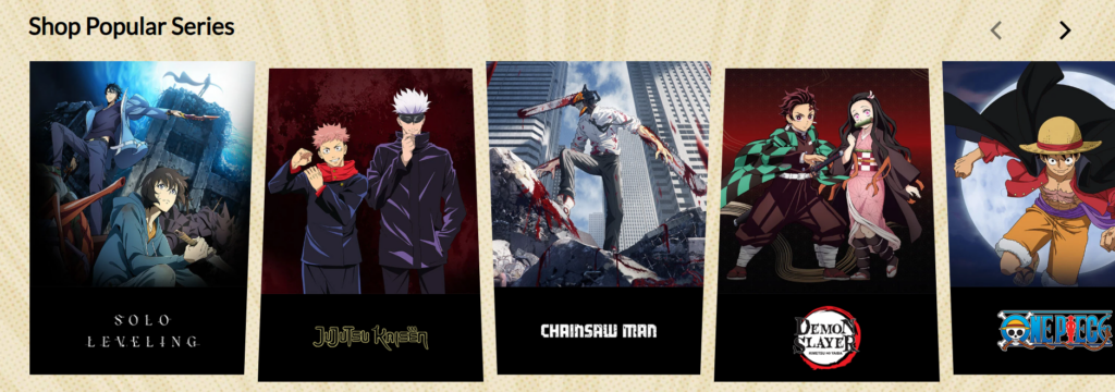
These sections supported repeat visitors and collectors who want to see what is fresh.
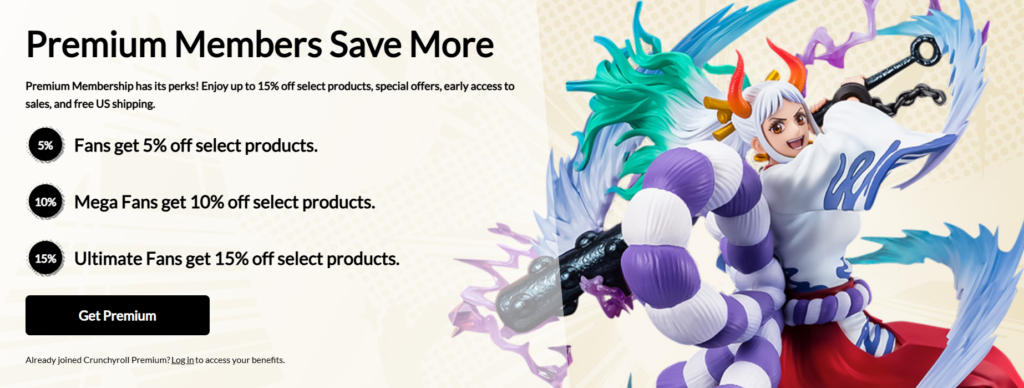
Sale campaigns, exclusive drops, member benefits, or limited-time offers needed their own space so they would not compete with regular product browsing.
The visual direction needed to match anime culture while keeping the site commercially clear. We balanced energetic graphics with clean eCommerce structure.
We used strong image zones, large banners, clear product grids, and high-contrast call-to-action buttons. The design had to feel like entertainment, but the purchase journey still needed to feel simple.
The key was control. Too many effects, colors, or competing visuals could make the site feel chaotic. Too little energy could make it feel generic. We designed the interface to sit between both extremes: expressive, but still usable.
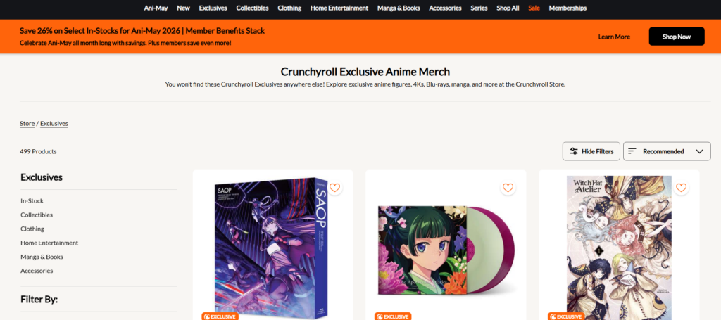
Product listing pages are where users make many shopping decisions. For a store with a large catalog, the listing page needed to feel clean, fast to scan, and easy to narrow down.
The official store uses filter categories such as product groupings and shopping options, allowing visitors to browse large collections more easily. We treated filtering as a core design feature, not a hidden technical detail.
We designed product cards with clear image areas, product names, pricing, and purchase-related actions. Product cards needed enough breathing room so users could compare items without visual pressure.
Filters help users narrow the catalog by category, series, department, size, price, or other shopping needs. A clear filter layout reduces frustration and helps users reach relevant products faster.
Product images may come from many different suppliers or product types. The layout needed to create consistency even when the product photography varied.
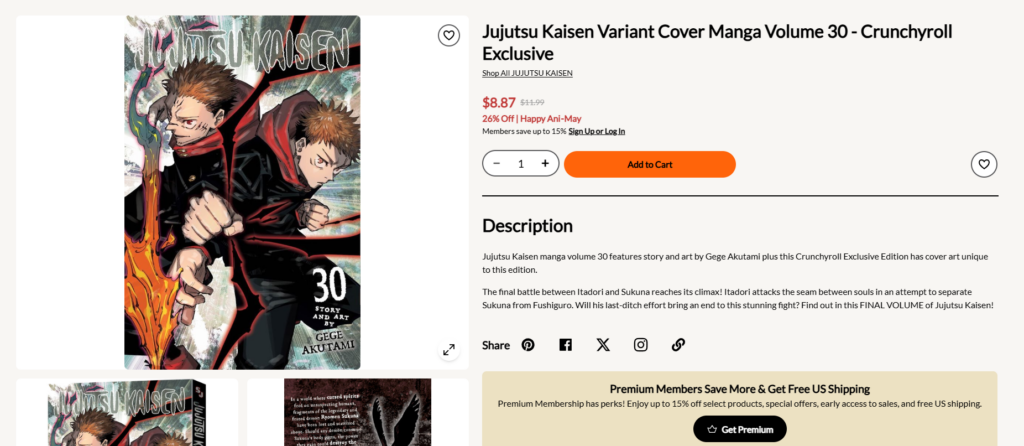
The product detail page needed to build trust and support confident purchase decisions.
For anime merchandise, users often care about details such as size, edition, material, release timing, licensing, series name, character, availability, and product imagery. We designed the product detail page to make these details easier to understand.
The image area needed to support close inspection. Collectors often want to see figure details, apparel graphics, packaging, and product finishes.
The title, price, availability, quantity selector, and call-to-action button needed strong hierarchy. Users should not need to search for the main buying action.
Product descriptions, shipping notes, pre-order information, and related recommendations needed to sit below the main purchase area in an organized way.
Related items help users continue browsing after viewing one product. For anime stores, this can include products from the same series, similar characters, matching apparel, or other collectibles.
Anime stores often contain thousands of items across many series and categories. Without strong structure, users can quickly feel lost.
We designed the experience around clear entry points. The homepage introduced major shopping paths. The navigation grouped categories logically. The listing pages used filters and clean grids. Product cards focused on fast recognition.
This helped users move from broad interest to specific products without feeling trapped in a huge catalog.
Anime retail often relies on bold campaigns, colorful artwork, and limited offers. These elements can improve excitement, but they can also distract from shopping.
We gave promotional content controlled spaces. The hero banner carried the strongest campaign message. Secondary promotions appeared lower on the page. Product sections stayed clean and structured.
This allowed the site to feel exciting without damaging readability or conversion flow.
Figures, hoodies, manga, Blu-rays, plush toys, accessories, and home goods all have different image proportions and selling points.
We created a flexible design system. Product cards followed consistent spacing, typography, and action placement. Category pages gave each product type enough room to shine, but the overall layout remained unified.
This made the store feel organized even when the catalog was diverse.
Anime fans often shop emotionally, but they still need practical information before buying.
We combined visual storytelling with clear product information. Large imagery created excitement. Clean pricing, filters, badges, and call-to-action buttons supported decision-making.
The result was a design that respected both fan culture and eCommerce performance.
The homepage hero needed to work like a campaign billboard. It introduced the main offer, set the tone, and gave users a direct action. We used large visuals, strong contrast, and a simple button structure to make the first screen feel powerful.
The hero section had three jobs:
The design needed to stop users from scrolling too quickly.
The message needed to be easy to understand within seconds.
The call-to-action needed to guide users into shopping immediately.
After the hero, we used category cards to give visitors simple choices. This section helped users who did not know where to start. Instead of forcing them to use the navigation menu, the page itself guided them into the store.
Categories such as exclusives, collectibles, clothing, manga, accessories, and sale items created a practical shopping map.
Product sections gave the homepage commercial strength. We designed these areas to highlight items that could drive clicks, such as new releases, trending products, and campaign products.
Each product card needed to feel clickable, readable, and visually consistent. The goal was not only to show many products, but to make each product easy to evaluate.
Promotional blocks helped the store communicate urgency. Sales, free shipping, exclusive drops, or member benefits can motivate action when presented clearly. We designed these areas with strong hierarchy so the user could understand the benefit quickly.
For a large anime store, category pages need to do heavy work. A visitor may enter through a search engine, social media, newsletter, or direct link. That means category pages cannot rely on the homepage to explain the experience.
We designed collection pages with clear titles, filter systems, product grids, and quick visual scanning.
Filters are especially important for anime merchandise because fans shop by different logic. Some shop by product type. Some shop by series. Some shop by price. Some shop by size. Some shop by availability.
A clean filter system reduces friction and helps users find products faster.
Product cards had to show the right amount of detail without becoming crowded. We focused on image clarity, readable names, pricing, badges, and clear action states.
This gives users confidence before they open a product page.
The product page needed to make the purchase decision feel simple. The upper section focused on images, title, price, availability, and purchase action. The lower section supported product education.
For collectibles and apparel, images sell the product. We designed image areas to feel large, clean, and easy to review.
Instead of burying information inside long paragraphs, we organized product details into easy-to-read sections. This helped users understand what they were buying, especially for pre-orders, limited items, or collectible products.
A good product page should not end the journey. Related products, same-series recommendations, and matching items help increase browsing depth and average order value.
The homepage created a more exciting entry point for anime fans. It introduced the store as a destination, not only a sales page.
The category structure, homepage sections, filters, and product grids helped users find relevant items faster.
Calls to action, product cards, and product detail layouts supported a smoother buying journey.
The design could support promotions, seasonal campaigns, new collections, exclusive drops, and product updates without needing the entire page to be redesigned each time.
The site design connected entertainment, fandom, and shopping into one visual system. This made the store feel more memorable and more aligned with anime culture.
Before designing screens, we considered the store’s audience, catalog size, shopping behavior, and conversion goals. Good website design starts with structure, not decoration.
We looked at how visitors move from homepage to category page, from category page to product page, and from product page to checkout. Every section needed a purpose.
Anime websites need personality. However, eCommerce websites need clarity. We made sure the design felt energetic while still helping users shop quickly.
The goal was not to create a site that felt overdesigned. The goal was to create a store that looked exciting, loaded with visual interest, and remained easy to use.
The final design direction positioned the anime store as a fan-first eCommerce experience. The homepage created strong campaign impact. The category pages gave users better control over browsing. The product pages helped visitors understand items clearly and move toward purchase with confidence.
The site design supported a wide catalog without making it feel confusing. It gave promotional content enough power without letting it overwhelm the shopping journey. It also created a visual system that could grow with future collections, seasonal campaigns, and new product releases.
Most importantly, the design understood the audience. Anime fans want more than products. They want connection, discovery, exclusivity, and a store that feels close to the culture they love.
Le Crunchyroll Store project shows how strong website design can turn a large anime merchandise catalog into a clear, emotional, and conversion-focused shopping experience. From the homepage to the collection pages and product detail pages, every section needed to guide users, support discovery, and make products feel desirable.
For brands in anime, collectibles, apparel, lifestyle goods, or fan-driven eCommerce, this type of design approach matters. A store should not only display products. It should create a memorable shopping journey that reflects the brand, speaks to the audience, and supports long-term sales growth.
Au AIRSANG, we specialize in website building and page design for cross-border brands that need a stronger online presence. We help businesses create visually polished, conversion-focused websites that connect brand storytelling with real shopping behavior.