


Aucun produit dans le panier.

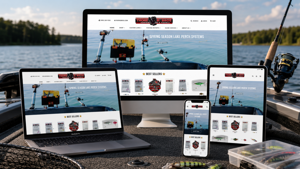
Fishing Addiction Gear presents a Shopify storefront that speaks directly to serious anglers through bold visuals, practical product organization, and a strong community-driven brand voice. The site does not rely on a generic outdoor retail look. Instead, it builds the shopping journey around real fishing scenarios, product confidence, seasonal urgency, customer proof, and a clear brand story. As designers, we see the website as a conversion-focused experience: every major section moves visitors from attention, to trust, to product discovery, to purchase intent.
The website’s navigation already shows a broad fishing-focused catalog, including planer board storage, tackle, trolling accessories, gift cards, apparel, sales, resources, wholesale, store locator, and contact options. This structure helps the Shopify store feel organized even though the product range covers many different fishing needs.
| Délai de livraison | Catégorie | Type de site Web |
| 19 jours | fishing gear | shopify |
| Concepteurs impliqués | Coût | Effet |
| Lin Zhang | $2400 | Sales📈263% |
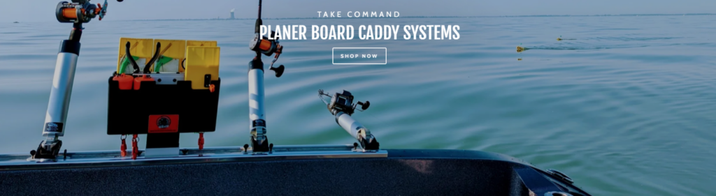
The homepage begins with a wide hero image showing a planer board caddy system installed on a boat, surrounded by open water. From a design perspective, this is the right way to introduce a practical fishing product because it shows the item in its natural environment. Instead of asking customers to imagine how the system works, the layout immediately places the product where it belongs: on the boat, during a real fishing experience.
The message “Take Command” and “Planer Board Caddy Systems” gives the hero section a confident tone. This wording works because it does not simply describe the product; it frames the product as a solution for control, organization, and efficiency on the water. The website uses this exact hero message and supports it with a direct “Shop Now” call to action.
We placed the headline in the center because the image already has strong product weight on the left side. A centered text block balances the composition and prevents the screen from feeling visually heavy. The white typography also works well against the blue water background because it creates contrast without making the design feel aggressive.
The “Shop Now” button uses a clean outline style instead of a loud filled block. That choice keeps the hero premium and direct. Since the image itself already carries movement and context, the button only needs to guide users forward. We do not want the call to action to fight the hero image; we want it to complete the first step of the buying journey.
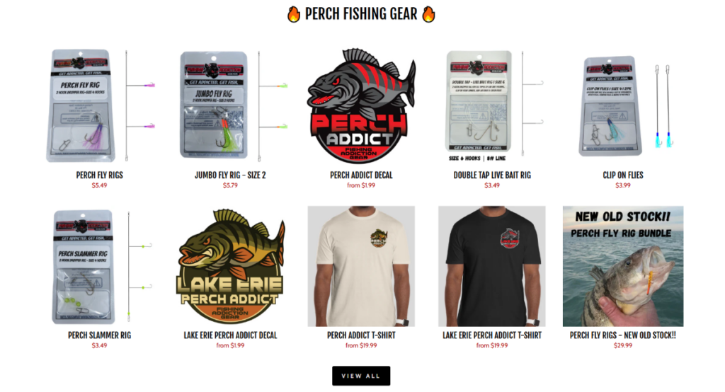
After the emotional hero, the page transitions into a clean product grid for Perch Fishing Gear. This section uses a white background because fishing rigs, decals, T-shirts, and packaged accessories already contain many shapes, colors, and small details. A busy background would make the product range harder to scan.
The site lists products such as Perch Fly Rigs, Jumbo Fly Rig, Perch Addict Decal, Double Tap Live Bait Rig, Clip on Flies, Perch Slammer Rig, and apparel items in this section. The grid gives users a quick overview of both tackle and brand merchandise.
We intentionally like this mix because it shows Fishing Addiction Gear as more than a tackle seller. The product grid includes practical fishing items, decals, and shirts, which helps the brand feel like a community. For anglers, that matters. Many fishing shoppers do not only buy tools; they also connect with identity, location, personal style, and shared passion.
The red pricing creates a small but important visual signal. It makes cost information easy to spot while still allowing product photos and names to remain the main focus. This helps users compare products quickly and lowers the friction that often happens when shoppers need to click into every product page just to understand the price range.
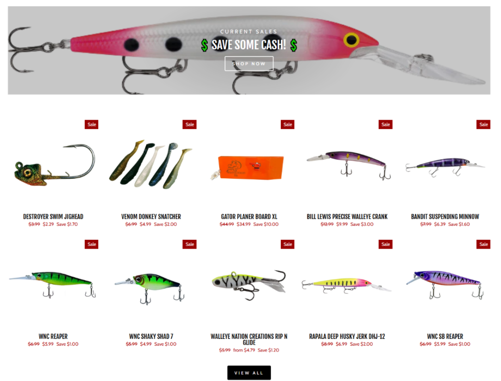
The “Current Sales” section uses a large lure banner with the message “Save Some Cash!” From a designer’s perspective, this works because it creates a clear shift in shopping mode. The previous section introduces the brand and product range; this section gives visitors a reason to act now.
The website presents current sale products with sale labels, original prices, discounted prices, and savings amounts, including items such as Destroyer Swim Jighead, Venom Donkey Snatcher, Gator Planer Board XL, Bill Lewis Precise Walleye Crank, and other fishing lures.
The red “Sale” tags are easy to recognize, but they do not overpower the product photos. This is important because the section contains many colorful lures. If the sale badge became too large, the grid would feel cluttered. By keeping the badges small, we preserve the clean Shopify shopping experience while still highlighting urgency.
Discount sections can easily become visually messy. Here, the evenly spaced product grid keeps the section organized and professional. Each item has enough breathing room, which helps customers compare shapes, colors, and prices without feeling overwhelmed. The “View All” button at the bottom gives users a natural next step after scanning the first set of deals.
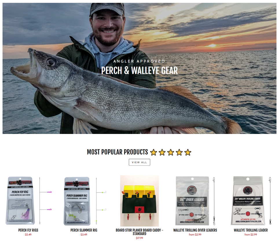
The next major section shows an angler holding a large fish at sunset with the message “Angler Approved” and “Perch & Walleye Gear.” This image creates emotional proof. It tells visitors that the products belong to real fishing moments, not just product shelves.
Below the hero image, the site introduces “Most Popular Products” with a five-star visual cue and a row of featured products, including Perch Fly Rigs, Perch Slammer Rig, Board Stor Planer Board Caddy, and Walleye Trolling Leaders.
The sunset background adds warmth, accomplishment, and memory. Fishing is not only about buying equipment; it is about chasing a result and remembering the day. By placing the fish and angler at the center of the story, the section builds a human connection before it asks the visitor to browse products.
This sequence is very effective from a conversion perspective. First, the visual story creates desire. Then, the product row answers the next question: “What should I buy?” The “Most Popular Products” title reduces decision pressure because it suggests that other anglers already trust these items.
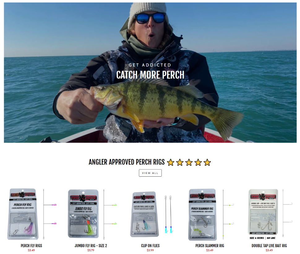
The “Catch More Perch” section narrows the page from broad fishing gear into a specific product intent. This is smart because anglers often shop based on fish species, season, technique, and water condition. A perch-focused hero image lets the site speak directly to a visitor who cares about that category.
The website follows the “Catch More Perch” visual with “Angler Approved Perch Rigs” and a product row featuring Perch Fly Rigs, Jumbo Fly Rig, Clip on Flies, Perch Slammer Rig, and Double Tap Live Bait Rig.
The angler holding the perch creates a direct, energetic feeling. The visitor does not see a still product image first; they see the result. As designers, we value this because result-driven visuals often create stronger motivation than feature-driven visuals alone.
The product row under this section stays clean and minimal. This makes the perch rigs easy to compare. When products are small, detailed, and similar in purpose, the layout needs to avoid distraction. A simple row with product names and prices gives the shopper enough information to continue without overloading the page.
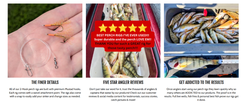
The three-column section is one of the strongest trust-building blocks on the page. It separates the message into three ideas: product detail, customer review, and real result. This structure works because it answers three different buyer concerns in one area.
The left column shows the rig close-up in a hand. This helps customers understand scale, construction, and what is included. The website explains that its two-hook perch rigs use premium Mustad hooks, include a swivel attachment point, and come with a snap for adding a sinker or changing sizes.
The center column focuses on customer confidence. The bright review graphic creates instant social proof, while the supporting copy encourages visitors to look at testimonials, success stories, catch pictures, and social media content.
The right column completes the story with fishing results. This matters because tackle customers want proof that the product works in real use. The design shifts from what the product is, to what other people say, to what the product helps anglers achieve.
As designers, we use this kind of content to reduce risk. A customer may like the product image, but still wonder about quality, real-world use, and effectiveness. This section addresses those concerns before the shopper reaches a product page. It makes the buying decision feel more informed and more confident.
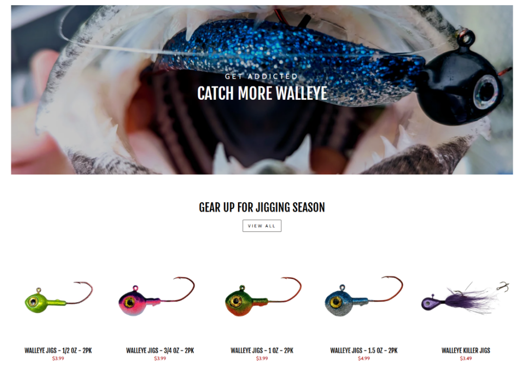
The walleye section uses a dramatic close-up of a lure in a fish’s mouth with the headline “Catch More Walleye.” This is a highly engaging choice because it puts the visitor inside the fishing action. The image feels intense, specific, and performance-driven.
Below the hero image, the site presents “Gear Up for Jigging Season” with a row of walleye jigs in different weights and styles, including 1/2 oz, 3/4 oz, 1 oz, 1.5 oz, and Walleye Killer Jigs.
“Jigging Season” gives the section a timely shopping reason. Seasonal framing works well in e-commerce because it creates relevance. Instead of saying “Here are some jigs,” the page says, “This is the gear you need for the moment you are preparing for.”
The jig row uses strong color variation against a white background. This makes the section visually appealing while also helping users compare different options quickly. Since these products are small, the spacing and contrast matter. The clean layout lets each jig stand alone and keeps the category easy to understand.
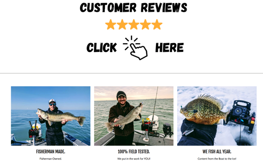
The customer review section uses a large “Customer Reviews” heading, five stars, and a bold “Click Here” action. This design makes social proof impossible to miss. Before visitors learn the full company story, they see that the brand wants them to explore customer feedback.
The lower part of the section uses three lifestyle cards: “Fisherman Made,” “100% Field Tested,” and “We Fish All Year.” These are short, powerful trust statements. The website also repeats these ideas in its footer and brand areas, using supporting lines such as “Fisherman Owned,” “We put in the work for YOU,” and “Content from the Boat to the Ice.”
For a fishing brand, authenticity matters. Stock images can make a site feel polished, but they may not convince serious anglers. Real fish, real boats, real ice fishing scenes, and real product use make the brand feel experienced. As designers, we use these images to communicate that the company understands the customer’s world.
The “Click Here” action looks simple, but it serves an important purpose. It tells users exactly what to do next. Review sections should not hide behind vague links. If customer feedback is a major trust asset, the path to that proof should be clear.
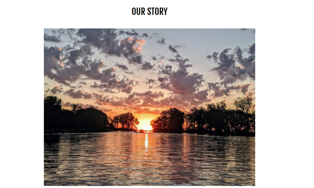
The brand story page begins with a centered logo, clear navigation, a free shipping bar, and a search field. This is important because the page is not isolated from shopping. Even when users read the story, they can still access product categories, search for gear, or move back into the store.
The “Our Story” page uses a narrow centered content area. This makes the page feel more personal and readable. A full-width text block would feel exhausting, especially with a long story. By controlling the content width, the design invites users to slow down and focus.
The company describes itself as an Ohio-based brand that manufactures planer board storage solutions, walleye tackle, perch tackle, and more, with roots in Great Lakes fishing and nationwide distribution. It also explains that the brand grew from Captain Mike Schmitt’s Fishing Addiction and real-time fishing content shared with anglers.
The strongest part of the story is the way it connects a real fishing problem to a product solution. The page explains that the original seat post mount planer board caddy system was designed in 2018 after years of big-water trolling and the need for better planer board storage and organization.
This origin story matters because it proves the product did not come from a random catalog decision. It came from a practical frustration on the water. As designers, we want this type of story to stay visible because it gives the product line credibility.
The story also explains how customer demand helped push the planer board caddy system into the public fishing community and how Fishing Addiction Gear was officially born in June 2020. It then connects that growth to branded products, perch rigs, retailer expansion, and field-tested gear.
This type of timeline builds trust. It shows that the company did not simply launch a store and wait for sales. It listened to anglers, adapted products, and expanded based on real demand.
The story page ends with the message “Get Addicted. Get Fish.” and repeats the three trust cards: “Fisherman Made,” “100% Field Tested,” and “We Fish All Year.” This gives the page a clear emotional ending. It turns the story into a brand promise.
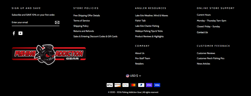
The footer creates a strong visual close. After a mostly white product-focused page, the black footer gives the site weight and finality. It also helps organize many links without making the page feel messy.
The email signup area offers a discount for the first order. This is a practical conversion tool because not every visitor buys during the first session. A newsletter capture gives the brand another chance to bring shoppers back.
The footer includes store policies, angler resources, online store support, company links, customer feedback, social media, currency options, and payment icons. From a design perspective, this creates reassurance. Customers can find shipping details, return information, fishing resources, reviews, and contact options without searching through the whole site.
Fishing Addiction Gear’s Shopify website works because it understands how anglers shop. It does not separate products from the fishing lifestyle. Instead, it builds a smooth journey through real boat scenes, species-focused hero sections, clean product grids, sale urgency, review proof, field-tested messaging, and a founder-driven brand story. As designers, we would describe this as a strong example of conversion-focused outdoor e-commerce design: every section gives visitors a reason to trust, browse, compare, and take action.
The site also shows how a Shopify store can feel personal instead of generic. It uses authentic fishing photography, direct copywriting, clear product organization, and simple calls to action to create a storefront that feels both practical and community-driven. For brands that want to build this kind of independent e-commerce presence, AIRSANG can help turn product value, visual storytelling, and conversion strategy into a professional website experience.


