


Aucun produit dans le panier.

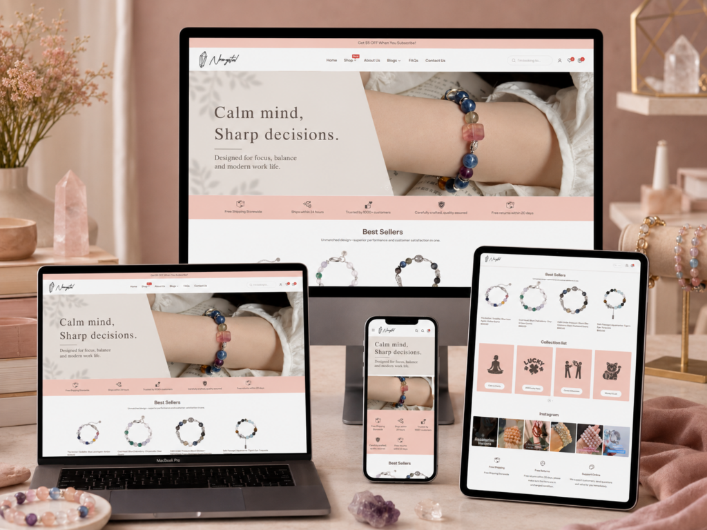
A crystal jewelry website needs more than attractive product images. It needs emotion, clarity, trust, and a shopping path that feels natural from the first screen to the final purchase decision. When we designed and analyzed the No7Crystal Shopify experience, we looked at the website as a complete brand journey rather than a group of separate pages. Every section needed to answer a different customer question: What does this brand feel like? Can I trust it? Which product matches my intention? What makes the bracelet meaningful? How easy is it to buy?
No7Crystal sells crystal bracelets, but the website does not present them as ordinary accessories. It frames each piece as a quiet daily companion for people who want calm, balance, emotional clarity, or personal symbolism in their everyday lives. That positioning shaped the visual direction of the whole store. We used soft color choices, generous white space, lifestyle images, clean product grids, trust-building service blocks, and intention-based navigation to create an e-commerce experience that feels gentle but still conversion-focused.
This article explains why each major page section was designed this way. The order follows the visual flow shown in the uploaded screenshots: the homepage hero, service strip and best sellers, collection list and Instagram feed, service/About preview section, blog area, product detail page, and full About Us page. From a designer’s perspective, each part serves a clear purpose in building emotional connection, shopping confidence, and brand value.
| Délai de livraison | Catégorie | Type de site Web |
| 20 jours | Jewelry | shopify |
| Concepteurs impliqués | Coût | Effet |
| Nancy | $2300 | Sales📈274% |
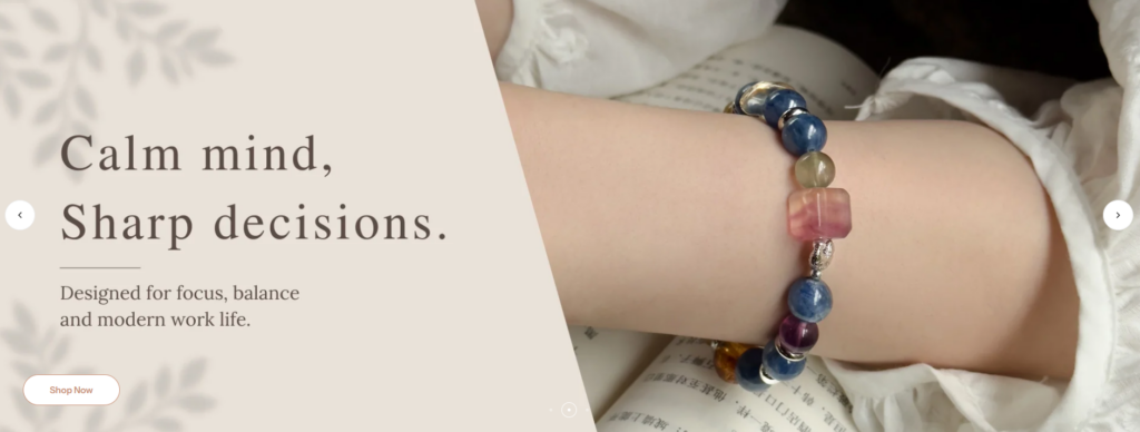
The homepage hero section is the first emotional handshake between the brand and the visitor. For No7Crystal, we did not want the hero to feel loud, commercial, or overly promotional. Crystal jewelry carries emotional and symbolic meaning, so the first screen needed to feel peaceful, personal, and visually soft.
That is why the hero image shows a bracelet worn on the wrist in a lifestyle setting. Instead of placing the product on a plain background, we show it as part of a real moment. The customer can imagine wearing the bracelet while reading, resting, working, meditating, or moving through a quiet daily routine. This approach helps the product feel more personal because customers do not only see what the bracelet looks like; they also sense how it may fit into their life.
The soft lighting, natural skin tone, and gentle fabric texture create a warm and intimate mood. The bracelet becomes the visual focus without feeling isolated. The product feels close, wearable, and emotionally approachable. That matters because crystal jewelry often sells through meaning as much as appearance.
The hero uses an angled text panel on the left and a lifestyle image on the right. This diagonal division gives the design more movement than a standard left-right split. The slanted edge naturally leads the eye from the headline into the bracelet image, creating a smooth visual transition.
From a design perspective, this choice also prevents the hero from feeling static. A straight rectangle can work well for many e-commerce websites, but No7Crystal needed something softer and more expressive. The diagonal layout adds elegance while keeping the section simple.
The headline, “Calm mind, Sharp decisions,” gives the hero a clear emotional promise. It speaks to customers who may feel overwhelmed, distracted, or mentally tired. The supporting text, “Designed for focus, balance and modern work life,” connects crystal jewelry to a daily lifestyle need instead of presenting it only as decoration.
We placed the text on a warm beige background to avoid visual noise. The serif typography feels refined, emotional, and slightly poetic. It gives the brand a softer personality than a basic sans-serif headline would. The button stays simple and rounded, allowing the call to action to remain visible without breaking the calm atmosphere.
Overall, this hero section sets the tone for the whole website. It tells visitors that No7Crystal is not simply selling bracelets. It is selling a feeling of balance, intention, and quiet confidence.
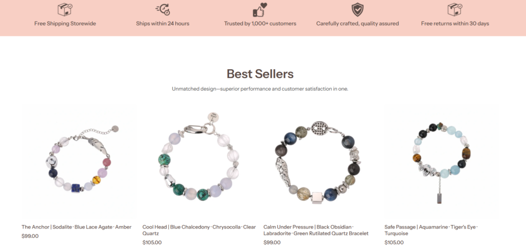
After the hero section, the website introduces a service strip that highlights key shopping benefits: free shipping, fast shipping within 24 hours, customer trust, quality assurance, and free returns within 30 days. We placed this section near the top because customers often hesitate before buying from a new online store. They may like the product, but they still ask practical questions: Will shipping cost extra? How fast will the order ship? Can I return it? Is the store reliable?
By showing these answers early, the design lowers friction before the visitor reaches the product grid. The icons make the information easy to scan, while the soft pink background connects the service strip to the emotional visual identity of the brand. This keeps the trust section from feeling cold or overly corporate.
The Best Sellers section uses a centered heading, a short subtitle, and a four-column product layout. We designed this section to feel clean, premium, and easy to browse. The white background gives each bracelet room to breathe, and the consistent product image presentation helps the store look organized and professional.
For jewelry, product clarity matters. Customers need to compare bead colors, metal accents, shapes, and overall style. A crowded grid would reduce that clarity. By giving each product enough space, we allow the bracelets to become the main visual focus.
“Best Sellers” is more than a product category. It is a trust signal. Many shoppers feel more confident when they see what other customers are already buying. This section helps new visitors start with popular options rather than forcing them to explore the full catalog immediately.
The product names also carry emotional and symbolic language, such as “The Anchor,” “Cool Head,” “Calm Under Pressure,” and “Safe Passage.” These names help the products feel more meaningful. Instead of only listing materials, the brand connects each bracelet to a state of mind or personal intention. This makes the shopping experience more memorable.
The prices appear clearly below each product title. This supports transparency and allows visitors to evaluate products quickly. The price range feels premium but still accessible for a meaningful gift or personal accessory. From a conversion perspective, visible pricing reduces unnecessary clicks and helps qualified customers move forward faster.
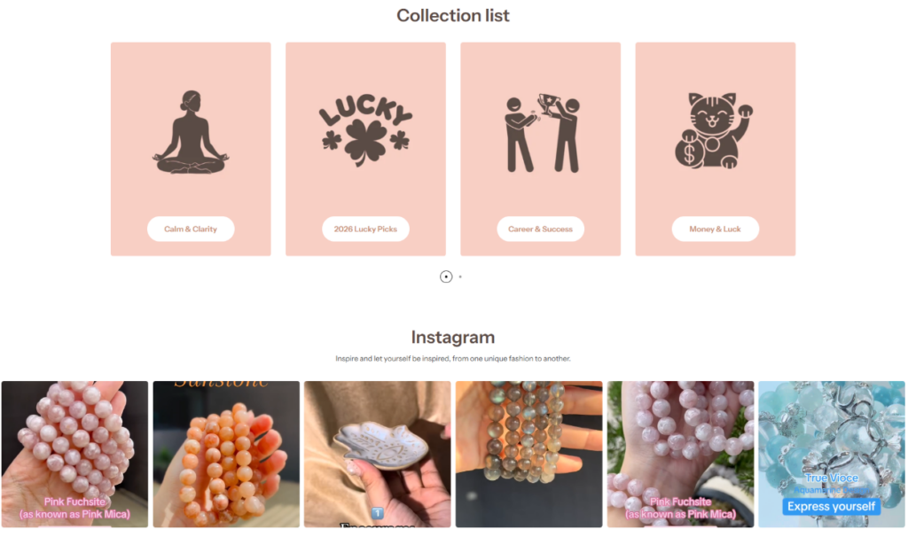
The Collection List section organizes products by emotional or lifestyle themes such as Calm & Clarity, 2026 Lucky Picks, Career & Success, and Money & Luck. This is an important design decision because crystal jewelry customers often do not shop only by color, size, or material. They shop by intention.
Some customers want emotional calm. Others want confidence, luck, prosperity, protection, or focus. By turning these motivations into clear collection cards, we make the shopping path easier and more personal.
Each collection card uses a soft pink background and a simple dark icon. The icons communicate the meaning of each category quickly: meditation for calm, a lucky symbol for good fortune, achievement figures for career success, and a lucky cat for money and luck.
We avoided complex photography in this section because the goal is not to sell a specific product immediately. The goal is to help visitors choose a direction. Simple icons make the categories easy to scan, especially on mobile.
The four cards sit in a neat row with consistent spacing. The rounded buttons add softness and make each category feel approachable. This visual system keeps the store organized while still matching the gentle identity of the brand.
A collection section like this works especially well for Shopify stores because it improves navigation without overwhelming the customer. Instead of sending visitors directly into a large product catalog, the page offers guided choices.
Below the collection list, the Instagram section introduces a more lifestyle-driven layer. The images show crystals, bracelets, textures, hands, and close-up moments. This makes the brand feel active, visual, and connected to real people.
Instagram-style content adds authenticity. Product photos are polished and controlled, but social-style images feel more spontaneous. They help customers imagine how the jewelry looks in daily use, how stones appear under natural light, and how the brand communicates outside the store.
The collection list gives the page structure. The Instagram feed gives it energy. Together, they create a strong balance. One section helps visitors decide where to shop, while the other inspires them emotionally. This combination keeps the homepage from becoming too transactional.
For a brand like No7Crystal, that balance is essential. Customers need both clarity and feeling. They want to find the right product, but they also want the purchase to feel meaningful.
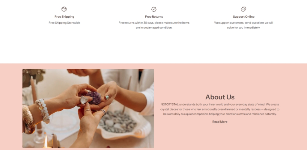
The next service section presents three key benefits: Free Shipping, Free Returns, and Support Online. Unlike the earlier service strip, this version gives each benefit more breathing room and includes short explanatory text. We used a minimal icon style so the section stays clean and does not distract from the brand’s calm visual language.
This block works like a reassurance checkpoint. After browsing products and collections, customers may still need confirmation that the store will support them after purchase. The service section answers that need in a simple way.
The generous white space around these three service points makes the information feel more trustworthy. When trust information appears in a crowded or aggressive layout, it can feel like a hard sell. Here, the spacing gives the message a calm, confident tone.
For jewelry and wellness-adjacent products, emotional trust matters as much as logistical trust. The page should not pressure the visitor. It should gently guide them.
Below the service benefits, the page transitions into an About Us preview with a soft pink background. This transition is important because it shifts the visitor from practical shopping information into brand meaning.
The layout places a lifestyle image on the left and text on the right. The image shows hands interacting with crystals, which feels personal and human. It suggests care, selection, and connection. The text explains the brand’s purpose: crystal pieces for people who feel emotionally overwhelmed or mentally restless, designed as quiet companions for daily life.
We chose a human-centered image because the brand story should not feel abstract. Customers need to see that crystals are touched, chosen, worn, and experienced by people. Hands are especially effective in jewelry design because they communicate intimacy, craftsmanship, and ritual.
The soft pink background supports warmth and emotional comfort. It also creates visual continuity with earlier sections, making the homepage feel unified rather than pieced together.
The “Read More” link is simple and understated. We did not design it like a large sales button because the purpose of this section is storytelling, not immediate checkout. A subtle link respects the visitor’s pace while still inviting deeper exploration.
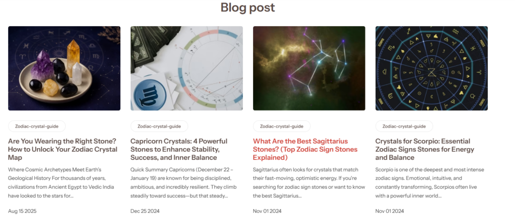
The Blog post section adds an educational layer to the website. For No7Crystal, blog content plays an important role because many customers want to understand the meaning behind stones, zodiac associations, and crystal symbolism. A blog gives the brand a place to answer those questions in depth.
From a design perspective, we treated the blog area like a content gateway. It should look organized, credible, and visually engaging. The large heading clearly signals the section’s purpose, while the four-column layout makes several articles visible at once.
Each blog card includes a large image. The visuals feature crystals, zodiac charts, constellations, and astrology-inspired graphics. These images match the emotional and symbolic world of the brand. They attract attention before the visitor reads the title.
This matters because blog cards compete with product images for attention. A weak thumbnail would make the content feel secondary. Strong thumbnails make the blog feel like a meaningful part of the brand experience.
Each article card follows a consistent structure: image, category tag, title, short excerpt, and date. This hierarchy helps visitors scan quickly. The category tag organizes the content, the title creates interest, the excerpt provides context, and the date makes the blog feel active and maintained.
We gave the titles enough visual weight because the blog depends on curiosity. A title like “Are You Wearing the Right Stone?” immediately invites the reader to explore. Other zodiac-focused titles help customers connect their personal identity to crystal selection.
A blog section also supports search visibility. Articles about zodiac crystals, stone meanings, and bracelet guides can attract visitors who are researching before they buy. This means the blog does not only serve existing customers; it can bring new customers into the brand ecosystem.
More importantly, educational content helps customers feel more confident. When people understand why a stone may match their intention, they feel more connected to the product. That connection can improve both conversion and long-term brand loyalty.
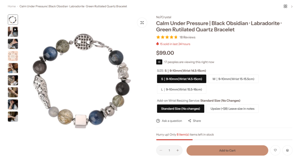
The product detail page uses a large product image on the left and purchase information on the right. This is a familiar e-commerce structure, but the details matter. Jewelry customers need a clear view of the bracelet before they choose size or add it to cart. The large image gives the product enough visual presence to communicate quality, texture, bead color, and metal detail.
The vertical thumbnail gallery allows shoppers to explore more product views, lifestyle shots, and detail images without leaving the page. This creates a richer product experience while keeping the main layout simple.
On the right side, the product information follows a clear hierarchy: brand name, product title, star rating, review count, urgency message, price, live viewing message, size options, resizing service, action links, stock warning, quantity selector, and Add to Cart button.
This order matches how customers make decisions. First, they identify the product. Then they check trust signals. Next, they review price and options. Finally, they decide whether to purchase.
Good product page design does not make customers search for information. It places each detail exactly where the customer expects it.
The star rating and review count create trust. The “sold in the last 24 hours” message and low-stock note create urgency. The live viewing message adds a sense of activity. These elements encourage action, but they need to feel balanced. If a page uses too many urgency signals aggressively, it can feel pushy. In this design, the urgency details appear in small areas around the core product information, so they support conversion without overpowering the page.
The size options appear as clean buttons, which makes the selection process easy to understand. Since bracelets depend on wrist fit, size clarity is essential. Customers should not feel uncertain about which option they selected. The active state appears visually stronger, helping the customer confirm the choice.
The add-on wrist resizing service also appears as a button selection. This makes customization feel manageable. Instead of hiding the option inside a long description, the page presents it directly in the purchase flow.
The Add to Cart button uses a warm color that connects to the site’s soft pink and beige palette. It is large, rounded, and clearly placed near the bottom of the purchase panel. This makes it easy to find without feeling visually aggressive.
The button’s color choice matters. A bright red or harsh black button could increase contrast, but it might break the calm brand atmosphere. The warm muted tone keeps the shopping experience elegant while still guiding the visitor toward action.
The product page succeeds because it balances emotion and function. The bracelet feels premium through the large imagery and clean layout. At the same time, the customer can easily review options, understand urgency, and purchase. This is the core goal of a good Shopify product page: make the product desirable, then make the decision simple.
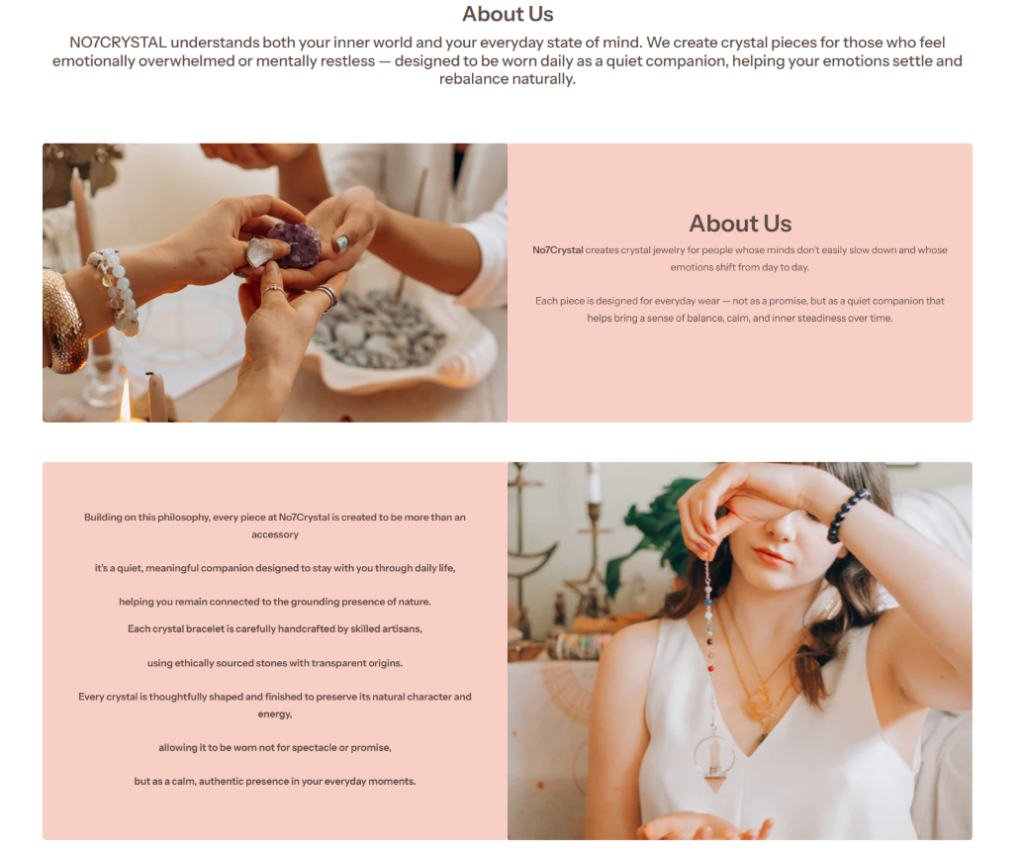
The About Us page opens with a centered brand message that explains who No7Crystal serves and why the products exist. This introduction is important because it immediately positions the brand around emotional balance and daily companionship.
We kept the opening section clean, centered, and spacious. This gives the message more importance. Instead of overwhelming visitors with long paragraphs at the top, the page offers a focused summary that sets the emotional direction.
The main content begins with a two-column layout: lifestyle image on one side and soft pink text panel on the other. Then the next row reverses the structure, placing text on the left and an image on the right. This alternating pattern creates rhythm. It prevents the page from feeling repetitive and encourages visitors to keep scrolling.
The images show people interacting with crystals and jewelry in calm, intimate settings. These visuals support the brand story more effectively than generic product photos would. They show that the jewelry belongs in human moments: choosing, wearing, reflecting, and connecting.
The pink text panels give the page a soft editorial style. They make the content feel curated rather than purely informational. This is useful for a jewelry brand because customers often respond to atmosphere. The About Us page should not feel like a corporate profile. It should feel like a brand story.
The typography remains simple and readable, allowing the message to feel sincere. The text explains that each piece is designed for everyday wear, not as an exaggerated promise, but as a quiet companion. This language feels thoughtful and responsible. It avoids overclaiming while still giving the jewelry emotional meaning.
The large horizontal lifestyle image in the middle of the About Us page creates a visual pause. It shows a model wearing jewelry in a peaceful outdoor setting. This expands the brand mood beyond the indoor crystal-selection scenes and connects the jewelry to nature, breath, and openness.
From a design perspective, this large image works like a cinematic moment. It gives the page emotional scale. After reading about craftsmanship and daily companionship, the visitor sees the jewelry as part of a broader lifestyle: mindful, grounded, expressive, and personal.
The “Why Choose Us” section gives the brand more credibility. It discusses a variety of crystals, symbolic meanings, traditional gemology, modern minimalist design, individuality, intentions, ethical sourcing, eco-friendly packaging, and responsible craftsmanship.
This section is important because emotion alone is not enough. Customers also want rational reasons to trust the brand. The About page needs to answer both sides of the decision: “Do I feel connected to this brand?” and “Do I believe this brand cares about quality?”
By placing this section after the emotional storytelling, the page creates a natural progression. First, it builds feeling. Then, it provides reasons.
The testimonials section adds customer voices near the bottom of the About Us page. This makes the brand story feel less one-sided. Instead of only saying what the brand believes, the page shows that customers have responded positively to the products.
The testimonial cards use a clean layout with star ratings, short comments, and customer locations. This structure makes the feedback easy to scan. The white card design also keeps the section light and consistent with the rest of the page.
The footer uses the same soft pink tone as other brand sections, creating a consistent ending. It includes contact information, support links, service policies, shop categories, newsletter signup, social icons, and payment icons.
A footer often gets overlooked, but it plays an important trust role. Customers who scroll to the bottom may look for shipping policy, refunds, privacy, contact details, or payment methods. By organizing these links clearly, the design helps visitors feel that the store is complete and reliable.
The strongest part of the No7Crystal design is its consistency. The homepage, product page, blog section, and About Us page all share the same emotional direction: calm, soft, personal, and meaningful. The color palette, typography, lifestyle photography, and copy all support that feeling.
This matters because inconsistent design weakens trust. If the homepage feels elegant but the product page feels generic, customers may lose confidence. No7Crystal keeps the experience aligned across key pages.
The site does not rely only on standard jewelry categories. It organizes products by emotional and symbolic needs, such as clarity, luck, career, success, money, protection, zodiac signs, and chakra-related themes. This makes the shopping experience more personal.
For crystal jewelry, intention-based navigation is a smart design choice. Customers often enter the site with a feeling or goal, not a specific SKU. The website meets them where they are emotionally.
The site includes free shipping, fast shipping, free returns, support, customer trust, reviews, stock messages, and product detail information. These elements support conversion, but they do not dominate the design. They appear in clean, simple formats that match the brand’s calm identity.
This balance is important. A store can increase trust without making the page feel aggressive. No7Crystal shows that conversion design can still feel elegant.
The website guides visitors through several stages:
First, the hero creates emotion.
Second, the service strip builds confidence.
Third, best sellers simplify discovery.
Fourth, collections help visitors shop by intention.
Fifth, Instagram adds real-life inspiration.
Sixth, About sections explain the brand philosophy.
Seventh, blog content educates and improves long-term trust.
Eighth, product pages make purchase decisions clear.
Finally, the full About Us page deepens the brand relationship.
This is not random page assembly. It is a structured journey.
No7Crystal’s Shopify website works because it treats crystal jewelry as both a product and an emotional experience. The design does not depend on loud promotions or complicated visuals. Instead, it uses soft color, clean spacing, lifestyle storytelling, intention-based categories, educational content, and clear product-page structure to build trust step by step.
From a designer’s perspective, every major section has a purpose. The hero creates calm. The service strip reduces hesitation. The best sellers guide product discovery. The collection list helps customers shop by meaning. The Instagram feed adds authenticity. The blog builds authority. The product page supports confident buying. The About Us page turns the brand philosophy into a full story.
This approach shows how a Shopify store can feel beautiful, emotional, and conversion-focused at the same time. A strong e-commerce design should not only display products; it should explain why they matter, help customers feel understood, and make every next step easy. That is the core design value behind this No7Crystal experience, and it is also the kind of independent website design thinking that AIRSANG brings to cross-border e-commerce brands.


