Introduction
Outdoor living products have become one of the fastest-growing segments in global eCommerce. Consumers increasingly want to transform their backyards into relaxing spaces with pergolas, gazebos, patio furniture, and outdoor accessories. However, selling these products online requires more than simply listing items in a catalog. Large outdoor products demand strong visual storytelling, clear navigation, and a trust-driven design structure that guides visitors from inspiration to purchase.
This project involved designing the Shopify storefront for Erommy, a brand specializing in outdoor living structures such as pergolas, gazebos, sheds, and patio accessories. The goal was to create a visually immersive shopping experience that reflects the lifestyle of outdoor relaxation while maintaining a clean and conversion-focused structure.
Rather than approaching the project from a purely technical perspective, the focus remained on strategic Shopify design—structuring content, creating a compelling visual hierarchy, and optimizing the customer journey so visitors can easily explore products, discover inspiration, and confidently complete a purchase.
This article explores the design thinking, creative process, and visual strategy behind the project, highlighting how thoughtful Shopify design can significantly elevate a brand’s online presence.
| Délai de livraison | Catégorie | Plateforme d'application |
| 21 jours | Outdoor Products | shopify |
| Concepteurs impliqués | Coût | Effet |
| Lin Zhang | $1300 | Repurchase Rate📈251% |
Comprendre la marque et le marché
The Outdoor Lifestyle Positioning
Before any design decisions were made, the first step was understanding the brand’s position in the market.
Erommy targets homeowners who want to upgrade their outdoor spaces with structures such as:
- Pergolas
- Gazebos
- Carports
- Outdoor sheds
- Patio accessories
These products are not impulse purchases. They are considered investments that improve the home environment. Therefore, the website needed to communicate three key messages immediately:
- Quality and durability
- Lifestyle inspiration
- Trust and reliability
This understanding shaped every design decision.
Target Customer Profile
The primary audience includes:
- Homeowners in North America
- Families interested in outdoor entertainment
- Consumers planning backyard upgrades
- DIY home improvement enthusiasts
These users often browse multiple websites before making a decision. As a result, the website had to deliver an experience that is both visually inspiring and structurally efficient.
Good design helps visitors quickly answer questions such as:
- What products are available?
- How do they look in real environments?
- Are they reliable and well-reviewed?
- Is this a trustworthy brand?
The homepage became the central hub for answering these questions.
Stratégie de conception de page d'accueil
Créer une forte première impression
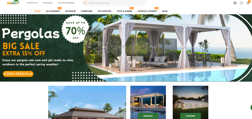
The homepage serves as the most important page for any Shopify store. For a brand like Erommy, the homepage must instantly communicate the outdoor lifestyle vision.
The hero section was designed to showcase a large lifestyle image featuring a pergola next to a pool, immediately placing visitors inside the experience of outdoor relaxation.
Key design elements include:
- Full-width lifestyle photography
- Messages promotionnels clairs
- A simple visual hierarchy
- A bold category focus
Instead of overwhelming users with text, the design prioritizes visual storytelling.
Designing a Lifestyle-Driven Hero Section
Visual Storytelling
Outdoor products sell best when customers can imagine them in real life. The hero banner was designed to display a spacious backyard pergola setup surrounded by natural light and greenery.
This image accomplishes several goals:
- It demonstrates the product in use
- It communicates the outdoor lifestyle
- It establishes a premium brand atmosphere
Promotional Clarity
The hero section also includes a clear promotional message such as a seasonal sale offer. This encourages immediate engagement and helps convert visitors who arrive during promotional periods.
The visual hierarchy ensures that users see:
- The product environment
- The promotional message
- The call to action
This structure keeps the layout clean while guiding user attention.
Product Category Navigation Design
Simplifying Product Discovery
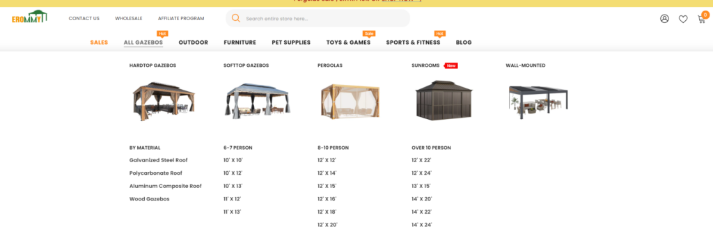
Outdoor product catalogs can quickly become complex. The design strategy focused on helping users discover categories without friction.
A visual category grid was introduced near the top of the homepage to highlight major product groups:
- Pergolas
- Gazebos
- Carports
- Sheds
- Canopies
Each category uses a large visual tile with a lifestyle image, rather than a simple text link.
This approach improves usability in two ways:
- Users immediately recognize the product type.
- The images create inspiration rather than feeling like a catalog.
Designing a Visual Navigation System
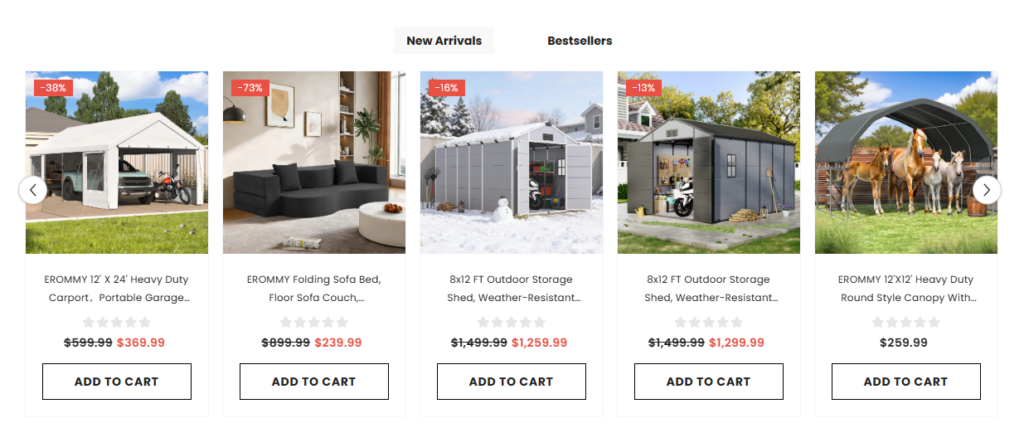
The category grid uses consistent design patterns:
- Equal image sizes
- Minimal text labels
- Hover-style interaction cues
- Espacement propre
This makes navigation intuitive even for first-time visitors.
The grid layout also creates a balanced visual rhythm, preventing the homepage from feeling crowded.
Instaurer la confiance par le design
Trust Signals and Customer Confidence

When selling large home products online, trust is essential.
To reinforce credibility, the homepage includes several trust-building elements:
- Free shipping messaging
- Customer service availability
- Return policy information
- Secure payment indicators
These elements were placed directly below the category section to reassure users early in their browsing journey.
This design choice helps reduce hesitation before customers explore products.
Integrating Social Proof
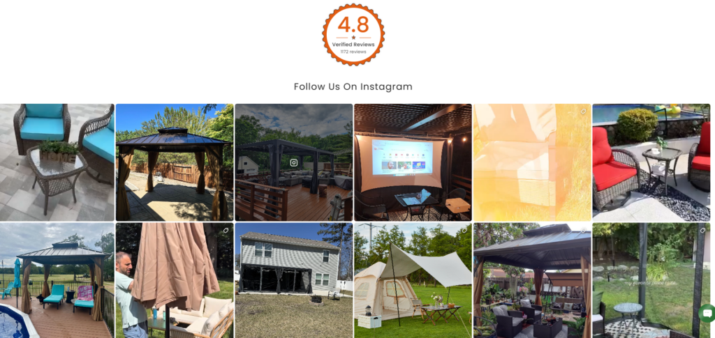
Social proof is another critical design component.
The homepage prominently features:
- Verified customer reviews
- A review score indicator
- Lifestyle photos from customers
Instead of hiding these elements on product pages, they appear directly on the homepage to build confidence early.
Product Showcase Design
Highlighting Featured Products
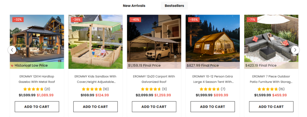
A section dedicated to featured or new arrival products was designed to guide users toward popular items.
The product cards use a clean structure that includes:
- Product image
- Price and discount display
- Product title
- Add-to-cart functionality
Spacing between cards ensures visual clarity and avoids overwhelming the visitor.
Designing Effective Product Cards
Well-designed product cards are critical for Shopify stores.
Key design principles applied include:
- Images de produits grand format
- Minimal text clutter
- Clear price hierarchy
- Strong purchase buttons
These cards maintain consistency across the store, ensuring a cohesive browsing experience.
Lifestyle Inspiration and Social Integration
The Role of Lifestyle Content
Outdoor products rely heavily on inspiration. Customers want to see how structures fit into real backyards.
To support this, the homepage integrates a social lifestyle gallery featuring user-generated content.
This section serves two important purposes:
- It showcases real-world installations
- It creates a sense of community around the brand
Customers browsing the gallery can imagine their own outdoor spaces transformed.
Instagram Integration
The Instagram feed section displays authentic customer environments.
This content feels more natural than traditional product photography and helps create an emotional connection with visitors.
Lifestyle content plays a major role in increasing conversion rates because it answers the question:
“What will this product look like in my backyard?”
Enhancing the Storytelling Experience
Video Section for Brand Atmosphere
The homepage also includes a cinematic video section that reinforces the brand’s outdoor living philosophy.
Video adds depth to the storytelling experience by showcasing:
- Landscape environments
- Relaxing outdoor moments
- Community lifestyle scenes
This content builds an emotional bridge between the product and the customer’s aspirations.
Supporting Business Growth
B2B and Affiliate Program Sections
Beyond retail customers, the brand also targets:
- Wholesale buyers
- Affiliate partners
Dedicated homepage sections highlight these opportunities.
The design uses illustrated visuals and simple messaging to explain:
- Bulk ordering opportunities
- Commission partnerships
This ensures the website supports multiple growth channels.
Content Marketing Integration
Blog and Educational Content
Educational content plays a major role in SEO and customer engagement.
The homepage includes blog previews that discuss topics such as:
- Outdoor renovation ideas
- Pergola installation inspiration
- Patio design trends
These articles help position the brand as an authority in outdoor living.
They also support organic search traffic.
Défis et solutions de conception
Challenge 1: Large Product Catalog
Outdoor living brands often offer dozens of product variations.
Without careful design, this can overwhelm visitors.
Solution
The homepage focuses on category discovery first, rather than listing too many individual products.
This simplifies the initial browsing experience.
Challenge 2: Balancing Lifestyle and Commerce
Outdoor brands rely heavily on visual storytelling, but too much imagery can slow down product discovery.
Solution
The design balances lifestyle imagery with structured product grids, ensuring the experience remains both inspiring and practical.
Challenge 3: Building Trust Quickly
High-value products require trust.
Customers need reassurance before exploring deeper.
Solution
Trust signals, reviews, and customer imagery were strategically placed near the top of the homepage.
The Design Methodology
A Design-First Approach to Shopify
Rather than focusing on code or technical implementation, the project prioritized:
- narration visuelle
- User experience structure
- Brand atmosphere
- Mises en page axées sur la conversion
This approach allows Shopify stores to communicate brand value clearly.
Structured Design Process
The design process followed several stages:
Research and Brand Analysis
Understanding the product category and audience.
UX Structure Planning
Defining homepage flow and content hierarchy.
Visual System Creation
Establishing typography, color usage, and layout consistency.
Conversion Optimization
Designing elements that guide visitors toward purchase decisions.
Final Results
The final Shopify storefront delivers a cohesive and engaging shopping experience.
Key outcomes include:
- A visually immersive homepage
- Clear category navigation
- Strong lifestyle storytelling
- Improved trust and credibility
- Structured product discovery
The result is a store that not only displays products but also communicates a lifestyle.
Visitors can easily imagine transforming their outdoor spaces with the brand’s products.
Conclusion
Design plays a critical role in the success of modern Shopify stores. A well-structured storefront does more than present products—it creates an experience that inspires, informs, and guides customers through their buying journey.
Le Erommy project demonstrates how strategic Shopify design can elevate an outdoor living brand. By combining lifestyle storytelling, structured navigation, trust signals, and visual consistency, the website becomes a powerful marketing tool rather than just an online catalog.
Projects like this highlight the importance of thoughtful design strategy in eCommerce. From homepage architecture to product presentation and social proof integration, every visual element contributes to building a stronger connection with customers.
At the end of the day, successful Shopify stores are built on clear design thinking and a deep understanding of user behavior. This philosophy drives the work delivered through AIRSANG, where design expertise helps brands create engaging, conversion-focused Shopify experiences that stand out in competitive global markets.