Shopify Supplement Website Design for Better Conversions

Introducción

In today’s competitive health and wellness market, a brand’s website must do more than showcase products—it must communicate trust, clarity, and scientific credibility while delivering a seamless shopping experience. For supplement brands like Sports Research, design plays a critical role in translating product efficacy into user confidence.

This project focused on crafting a Shopify storefront that balances clean aesthetics with conversion-driven structure. By aligning visual storytelling with user intent, we transformed the browsing journey into a guided path toward purchase, ensuring that every design decision contributes to clarity, engagement, and long-term brand trust.

Tiempo de entregaCategoríaPlataforma de aplicaciones
25 díasDietary Supplementsshopify
Diseñadores implicadosCosteEfecto
Nancy$2600Turnover📈215%

Entendiendo la marca y su posición en el mercado

Before diving into layout and visuals, we began by analyzing the brand’s positioning within the supplement industry.

A Brand Built on Trust and Science

Sports Research emphasizes:

  • Scientifically backed ingredients
  • Transparent sourcing
  • Performance-driven results

These pillars required a design language that feels:

  • Clean and clinical, but not cold
  • Professional, yet approachable
  • Informative without overwhelming

Target Audience Insights

The core audience includes:

  • Fitness enthusiasts
  • Health-conscious consumers
  • Individuals seeking preventative wellness

These users typically:

  • Compare multiple products
  • Look for proof (certifications, reviews)
  • Prefer quick access to key benefits

Design Goal: Reduce friction and increase confidence through clarity-first design.

Estrategia de diseño de página de inicio

The homepage acts as the brand’s first impression and must immediately communicate value.

Hero Section: Instant Credibility and Clarity

Shopify Supplement Website Design for Better Conversions-Homepage Design Strategy-Hero Section: Instant Credibility and Clarity

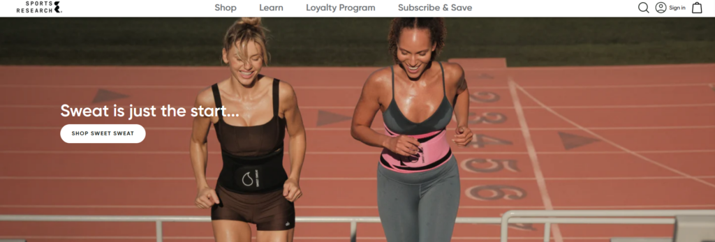
We designed a hero area that:

  • Highlights flagship products
  • Uses lifestyle-driven imagery (fitness, vitality, daily routines)
  • Includes concise benefit-focused messaging

Instead of overwhelming users with dense text, the hero focuses on:

  • One key message
  • One primary CTA
  • Fuerte jerarquía visual

Product Categorization for Fast Navigation

Shopify Supplement Website Design for Better Conversions-Homepage Design Strategy-Product Categorization for Fast Navigation

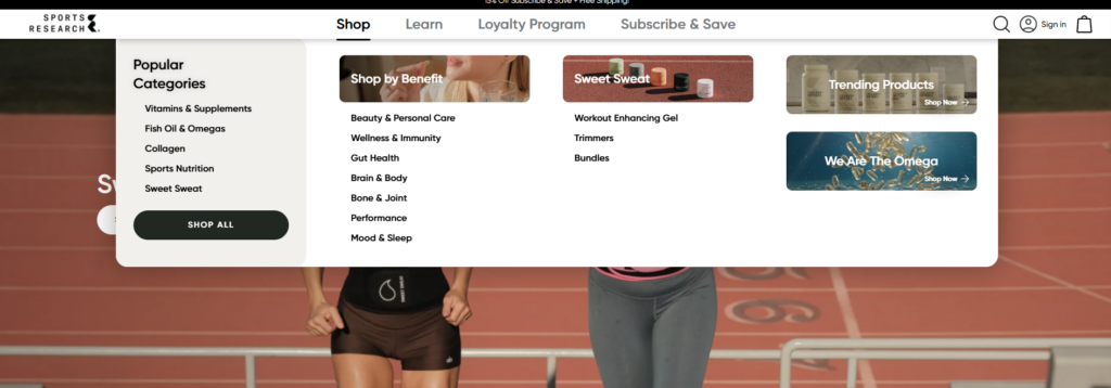
To improve usability, we structured product categories into:

  • Vitamins & Supplements
  • Collagen Products
  • Sports Nutrition

Each category is presented with:

  • Clear icons or imagery
  • Short descriptors
  • Quick-access links

This allows users to immediately identify where they belong.

Trust Signals Integrated Early

Shopify Supplement Website Design for Better Conversions-Homepage Design Strategy-Trust Signals Integrated Early

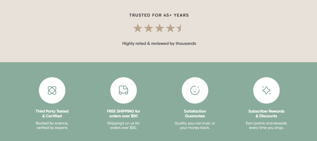
Rather than hiding credibility elements deeper in the site, we placed them prominently:

  • Certifications (non-GMO, third-party tested)
  • Customer reviews
  • Brand claims (e.g., quality sourcing)

These elements reduce hesitation within the first few seconds.

Product Page Design: Turning Information into Conversion

Product pages are where design directly impacts sales performance.

Structuring Information for Scannability

We organized product pages into clear sections:

  • Key benefits (top-level highlights)
  • Ingredients breakdown
  • Usage instructions
  • Customer reviews

This layered approach allows users to:

  • Quickly scan
  • Dive deeper when needed

Visual Hierarchy and Content Balance

Instead of long paragraphs, we used:

  • Bullet points
  • Icons
  • Section dividers

This improves readability and keeps users engaged.

Lifestyle Imagery for Emotional Connection

We incorporated imagery that shows:

  • Real-life usage scenarios
  • Active lifestyles
  • Wellness routines

This bridges the gap between product features and real-world benefits.

Design System and Visual Language

Consistency across the site is essential for brand recognition and usability.

Estrategia de color

We used a palette that reflects:

  • Health (greens, neutrals)
  • Energy (accent tones)
  • Cleanliness (white space dominance)

The goal was to:

  • Maintain a clinical feel
  • Avoid looking sterile or overly technical

Opciones tipográficas

Typography was selected to:

  • Ensure readability across devices
  • Support hierarchy (headlines vs body text)
  • Reinforce professionalism

We avoided overly decorative fonts to maintain clarity.

Iconography and Micro-Visuals

Custom icons were used to represent:

  • Benefits
  • Certifications
  • Product features

These small details:

  • Improve comprehension
  • Add visual rhythm
  • Reduce reliance on text

Designing for Conversion: UX Principles Applied

Clear Call-to-Action Placement

We ensured that CTAs are:

  • Visible above the fold
  • Repeated at logical intervals
  • Consistent in style

This guides users naturally toward purchase.

Reducción de la carga cognitiva

To simplify decision-making:

  • We minimized unnecessary elements
  • Grouped related information
  • Used whitespace strategically

Mobile-First Considerations

Given that a large portion of traffic comes from mobile:

  • Layouts were optimized for vertical scrolling
  • Buttons were sized for touch interaction
  • Content blocks were simplified

Nuestro proceso de diseño

A structured process ensures consistent and high-quality outcomes.

Discovery and Research

We started by:

  • Analyzing competitors
  • Reviewing existing brand assets
  • Identifying user pain points

Wireframing and Structure Planning

Before visual design, we mapped:

  • Jerarquía de páginas
  • Content flow
  • User journey

This ensures that design decisions are intentional.

Visual Design Execution

We translated strategy into visuals by:

  • Creating cohesive layouts
  • Applying consistent branding
  • Balancing aesthetics with usability

Iteration and Refinement

Design is never one-and-done. We:

  • Tested layouts
  • Adjusted based on usability insights
  • Refined visual hierarchy

Challenges and Solutions

Challenge 1: Balancing Science and Simplicity

Problema: Too much technical information can overwhelm users.
Solución:
We simplified content into digestible sections while preserving credibility.

Challenge 2: Standing Out in a Competitive Market

Problema: Many supplement websites look similar.
Solución:
We introduced:

  • Strong visual storytelling
  • Clear brand differentiation
  • Consistent design language

Challenge 3: Improving User Trust Quickly

Problema: Users hesitate without proof.
Solución:
We integrated trust signals early and consistently across pages.

Resultados e impacto

The redesigned Shopify storefront delivers:

Improved User Engagement

  • Clear navigation reduces bounce rates
  • Structured content increases time on site

Higher Conversion Potential

  • Simplified product pages improve decision-making
  • Strategic CTA placement drives action

Stronger Brand Identity

  • Consistent visuals reinforce recognition
  • Professional design builds credibility

Extending Design Beyond the Homepage

While the homepage sets the tone, we ensured consistency across:

Collection Pages

  • Clean grids
  • Filter-friendly layouts
  • Quick product comparisons

About Page

Shopify Supplement Website Design for Better Conversions-Extending Design Beyond the Homepage-About Page
  • Brand story presentation
  • Mission and values
  • Emotional connection with users

Blog and Educational Content

Shopify Supplement Website Design for Better Conversions-Extending Design Beyond the Homepage-Blog and Educational Content

Educational content is key in the supplement industry. We designed:

  • Readable article layouts
  • Clear sectioning
  • Visual aids for better understanding

Why Design Matters for Shopify Supplement Brands

In the health and wellness space, design is not just about aesthetics—it directly impacts trust and conversions.

Una tienda Shopify bien diseñada:

  • Communicates credibility instantly
  • Simplifies complex information
  • Guides users toward confident purchases

Without strong design, even the best products can struggle to convert.

Conclusión

Designing a high-performing Shopify supplement website requires a deep understanding of both user psychology and brand positioning. By focusing on clarity, trust, and usability, we transformed the Sports Research storefront into a conversion-driven experience that aligns with modern consumer expectations.

En AIRSANG, we specialize in crafting Shopify design experiences that go beyond visuals. We build strategic, user-focused storefronts that help brands stand out, communicate effectively, and convert consistently in competitive global markets.

Entregado en todo el mundo

AIRSANG ofrece soluciones rentables de diseño web, identidad visual de marca y comercio electrónico. Desde Shopify y WordPress hasta imágenes de productos de Amazon, ayudamos a las marcas globales a construir, elevar y hacer crecer su negocio en línea.

Diseñar y construir un sitio web WordPress o sitio corporativo con un sistema completo de comercio electrónico para usted.

Diseñar y construir un sitio web WordPress o sitio corporativo con un sistema completo de comercio electrónico para usted.

Rango de precios: desde $200.00 hasta $2,500.00
Requisitos personalizados o presupuestos especiales

Requisitos personalizados o presupuestos especiales

El precio original era: $2.00.El precio actual es: $1.00.

¿Listo para transformar su empresa?

Reserve una llamada para obtener más información sobre cómo nuestra agencia de marketing digital puede llevar su negocio al siguiente nivel.