


No hay productos en el carrito.

When selling wireless Bluetooth headphones on Ozono, visual clarity is not optional—it is the deciding factor between scrolling past and clicking through. Buyers on Ozon make decisions fast, often within seconds, and the main image set must communicate value instantly, without relying on long descriptions.
In this project, our goal was to design a complete Ozon main image sequence for wireless Bluetooth headphones that clearly explains functionality, comfort, battery life, and usability—while maintaining a clean, premium, and trustworthy visual language. Every image was designed to answer a specific customer question, reduce hesitation, and guide the user smoothly toward purchase.
Below, we break down each image in the sequence and explain why it was designed this way, from a professional design and conversion perspective.
| Tiempo de entrega | Categoría | Plataforma de aplicaciones |
| 7 días | Wireless Bluetooth headphones | Ozono |
| Diseñadores implicados | Coste | Efecto |
| Lin Zhang | $110 | Sales📈268% |
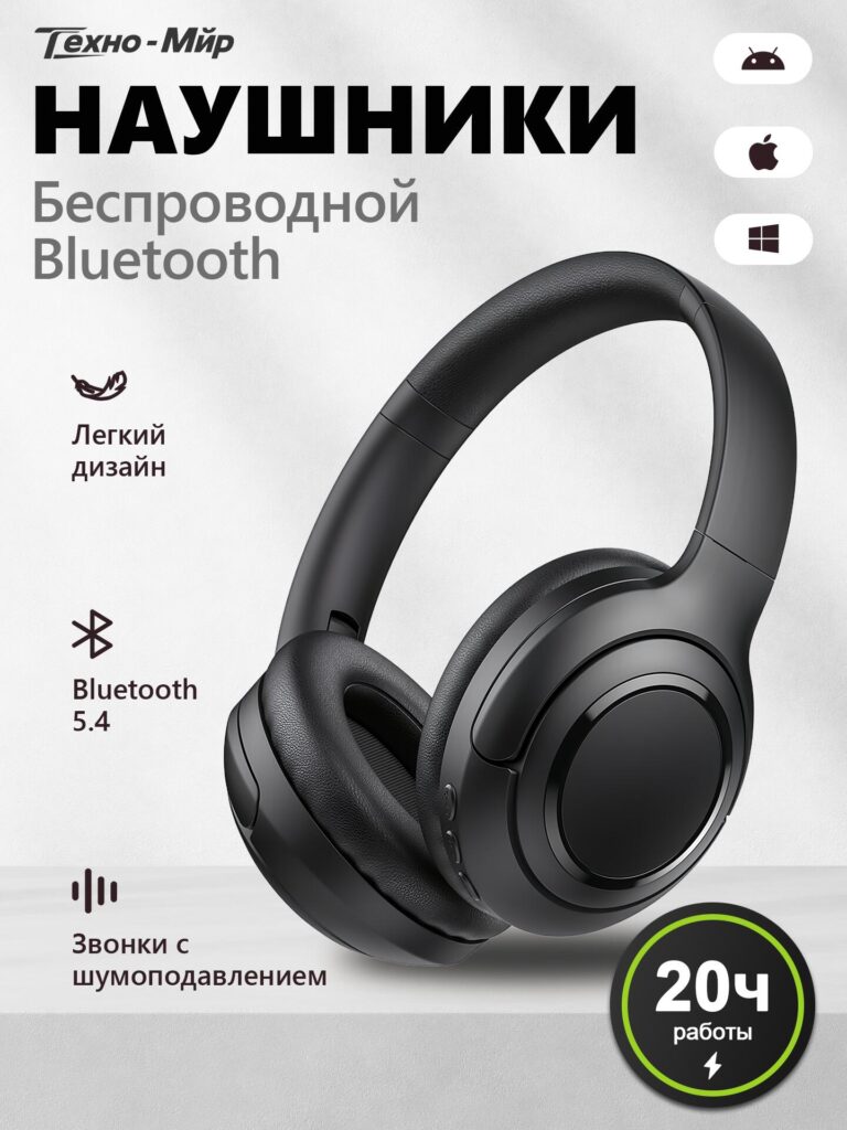
The first image introduces the product in the most direct way possible: wireless Bluetooth headphones displayed at a three-quarter angle on a clean, neutral background.
We intentionally chose a minimalist composition to avoid overwhelming the viewer. The headphones are large, centered, and sharply lit, allowing users to immediately understand the product form—over-ear, padded, foldable, and modern.
Decisiones clave de diseño:
Platform compatibility icons (Android, iOS, Windows) appear on the side to quickly reassure users that the headphones work across devices. On Ozon, this reassurance reduces friction and prevents users from leaving the page to check compatibility.
This image functions as a visual product summary: what it is, what it does, and who it’s for—all in one glance.
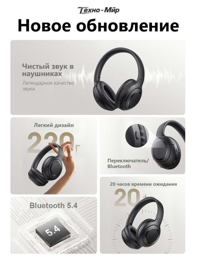
The second image shifts attention from identity to performance, introducing the product as a newly updated model.
Here, we emphasized sound quality using subtle sound-wave graphics radiating from the headphones. These visual cues help users “feel” the audio experience without hearing it.
Design strategy:
This image reassures customers that they are not buying an outdated model. On marketplaces like Ozon, where similar products compete aggressively, signaling “updated” or “improved” makes a measurable difference in click-through and conversion rates.
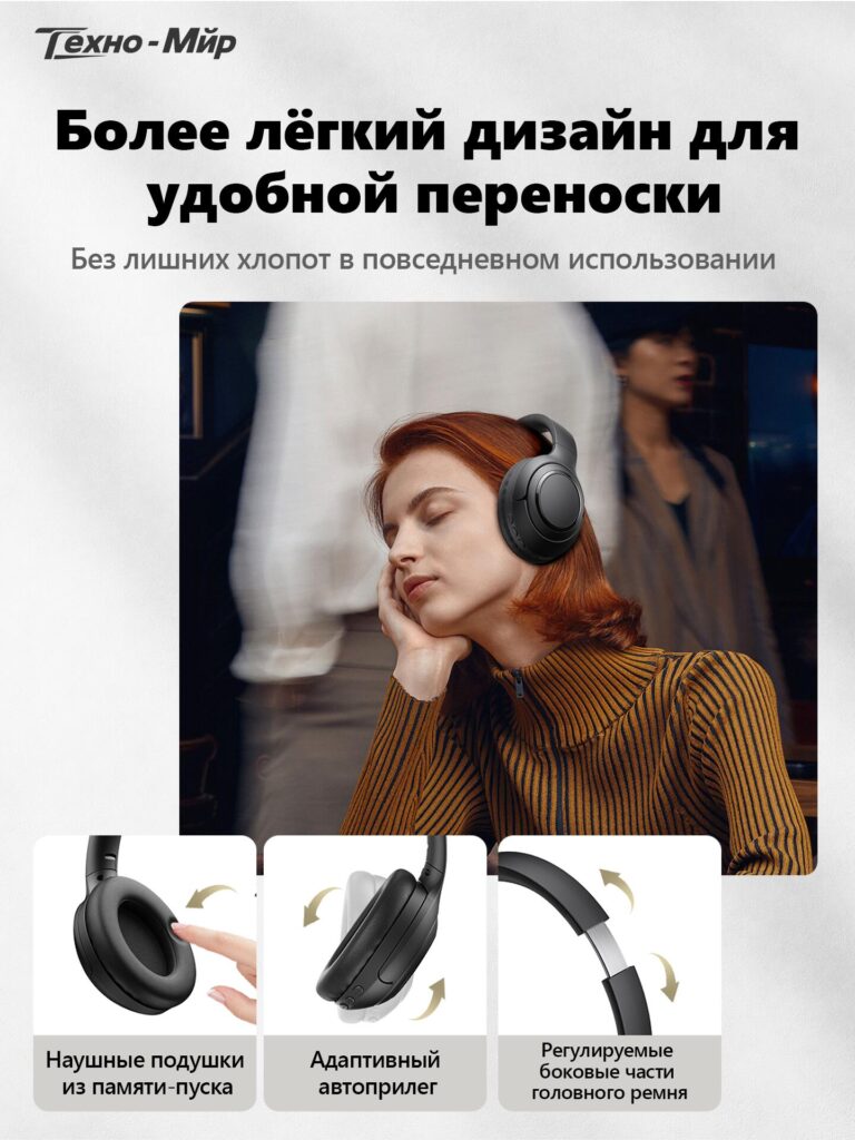
Comfort is critical for over-ear headphones, so the third image focuses entirely on lightness and wearability.
We visually demonstrate the 220g lightweight design by showing the headphones held effortlessly with two fingers. This removes doubt more effectively than text alone ever could.
Below the lifestyle image, three feature modules explain how comfort is achieved:
The combination of human interaction and product close-ups builds trust. Users can imagine themselves wearing the headphones during commuting, working, or relaxing—an essential emotional trigger for purchase.
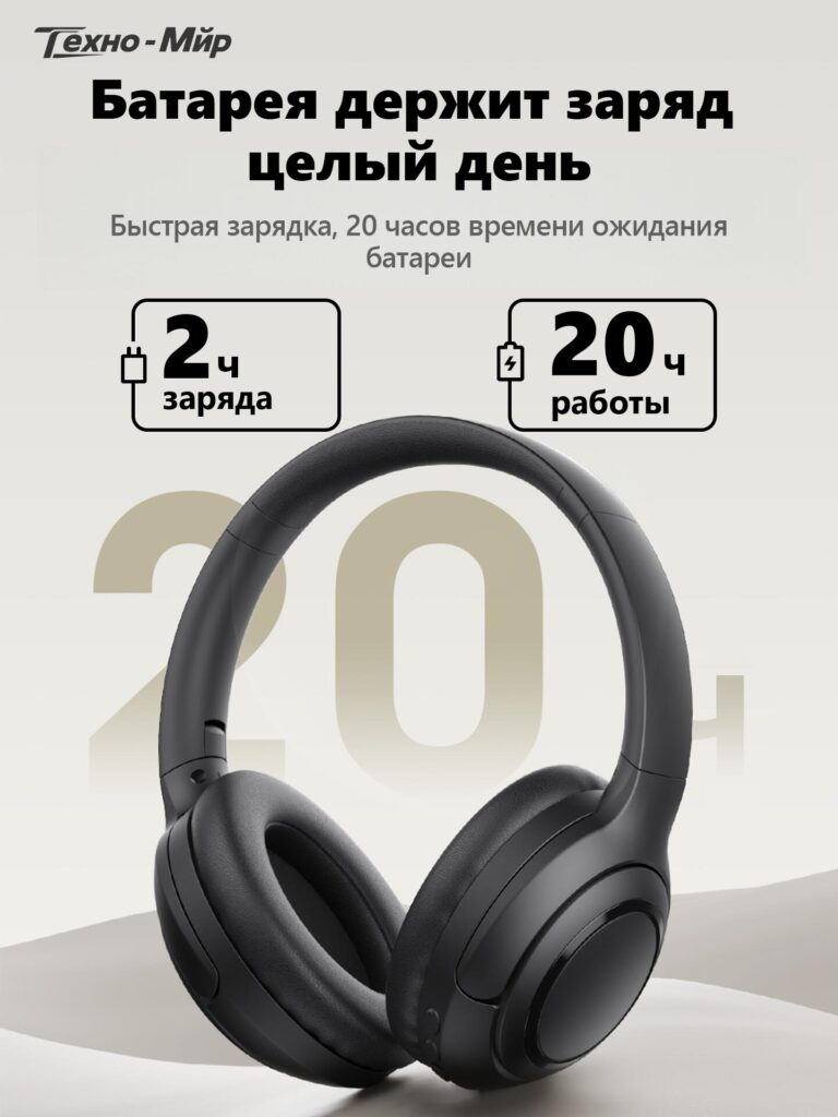
Battery anxiety is one of the biggest barriers in wireless audio purchases. The fourth image tackles this directly with a bold, numbers-first layout.
We prominently display:
Large typography ensures these numbers remain readable even on small screens. The headphones remain centered, reinforcing that battery life is a core strength of the product—not an afterthought.
From a design standpoint, we avoided excessive technical jargon. Instead, we focused on outcomes: all-day use, fewer charging interruptions, and reliable daily performance.
This image works especially well for Ozon’s mobile-heavy audience, where clarity and immediacy matter more than depth.
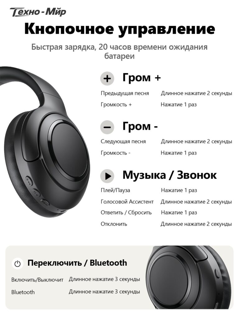
Many users prefer physical buttons over touch controls, but confusion around button functions can cause hesitation. The fifth image solves this by visually mapping every button function.
We show a close-up of the headphone earcup alongside a clean, text-based explanation:
Each action is paired with press duration instructions, eliminating uncertainty. This image reduces post-purchase frustration and lowers return rates—an often overlooked but critical aspect of good marketplace design.
For Ozon buyers, this level of clarity builds confidence and signals a well-designed, user-friendly product.
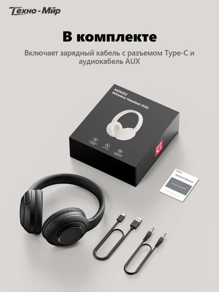
The final image completes the buyer’s mental checklist by clearly showing everything included in the package.
Displayed items include:
We intentionally used a clean, flat-lay composition to avoid visual noise. Showing both wireless and wired options (via AUX) adds versatility to the product and subtly increases perceived value.
This image answers the last remaining questions before purchase: What exactly will I receive? Do I need to buy anything extra?
This image sequence is not decorative—it is strategic.
Each image:
Instead of repeating the same product angle with different slogans, we designed a narrative image flow:
This approach improves engagement time, lowers bounce rates, and increases conversion—especially for electronics categories where trust matters.
Eficaz Ozono main image design is not about adding more text or louder visuals. It’s about precision, hierarchy, and empathy for the buyer’s decision process.
By carefully structuring this wireless Bluetooth headphones image set, we transformed technical specifications into clear visual stories that sell without overwhelming. Each image has a purpose, and together they form a cohesive, high-converting presentation.
This is exactly how we approach cross-border marketplace design—combining platform logic, user psychology, and clean visual systems.
That design philosophy is at the core of how AIRSANG helps brands turn ordinary products into confident, high-performing listings.


