No hay productos en el carrito.

En un entorno de comercio electrónico altamente competitivo, la claridad visual y la conexión emocional suelen determinar si un visitante se convierte en cliente. Esto es especialmente cierto en categorías de nicho como los videojuegos retro, donde los compradores se guían no solo por las especificaciones del producto, sino también por la nostalgia, la estética y la identidad de la comunidad.
Este estudio de caso explora cómo nos asociamos con Para Retro para diseñar un Shopify Una tienda que se siente inmersiva, intuitiva y centrada en la conversión, sin depender de una personalización técnica excesiva. En su lugar, nos centramos en la estrategia de diseño, la lógica de la maquetación, la narrativa visual y una estructura centrada en el usuario para transformar un catálogo de productos en una experiencia de marca atractiva.
En lugar de abordar este proyecto como una simple "configuración de tienda", lo tratamos como un diseño de sistema visual completo: uno que equilibra la flexibilidad promocional, la capacidad de descubrimiento del producto y el atractivo emocional, sin dejar de ser escalable para futuras campañas y lanzamientos de productos.
| Tiempo de entrega | Categoría | Plataforma de aplicaciones |
| 22 días | consola de juegos | Shopify |
| Diseñadores implicados | Coste | Efecto |
| Lin Zhang | $2800 | Tasa de compra📈241% |
ToRetro atiende a un público global de entusiastas de los videojuegos retro, coleccionistas y compradores primerizos que se sienten atraídos por las consolas portátiles inspiradas en épocas clásicas de los videojuegos. El reto era claro:
¿Cómo diseñar una fachada de tienda que transmita nostalgia sin parecer anticuada?
Desde el principio, nuestra dirección de diseño se centró en tres percepciones fundamentales de la marca:
A través de nuestras primeras investigaciones y conversaciones con clientes, identificamos varios comportamientos clave de la audiencia:
Estos conocimientos dieron forma a cada decisión de diseño que tomamos, desde la estructura de la página de inicio hasta el diseño de la tarjeta del producto.
Antes de pasar a la ejecución visual, definimos objetivos claros y basados en el diseño para el proyecto.
Nuestro papel no fue modificar la funcionalidad subyacente de Shopify, sino maximizar lo que la plataforma ya hace bien a través de decisiones de diseño bien pensadas.
Comenzamos con una auditoría visual completa del sitio web existente y revisamos las tiendas de juegos retro y electrónica de la competencia. Esto nos ayudó a identificar:
A partir de esto, establecimos un principio de diseño:
Cada sección debe ganarse su lugar visual y estratégicamente.
La página de inicio se convirtió en la base de toda la experiencia.
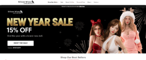
El banner del héroe fue diseñado para hacer más que anunciar promociones: establece el tono emocional de la marca.
Las opciones de diseño clave incluyeron:
Esta sección comunica entusiasmo de inmediato y al mismo tiempo permite que el mensaje sea fácil de leer.
Directamente debajo del héroe, presentamos una fila de indicadores de confianza basados en íconos:
Estos elementos son sutiles, pero juegan un papel fundamental para reducir las dudas de quienes visitan el lugar por primera vez.
En lugar de abrumar a los usuarios con un sinfín de productos, estructuramos la página de inicio en torno a colecciones seleccionadas, como:
Cada bloque de colección utiliza estilos de tarjeta, espaciado y comportamiento al pasar el mouse consistentes para crear un ritmo visual.
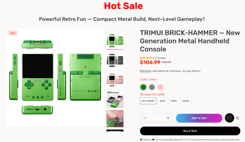
Sin alterar el sistema de productos principal de Shopify, perfeccionamos la presentación centrándonos en:
Esto permite a los usuarios comparar opciones rápidamente sin abrir varias pestañas.
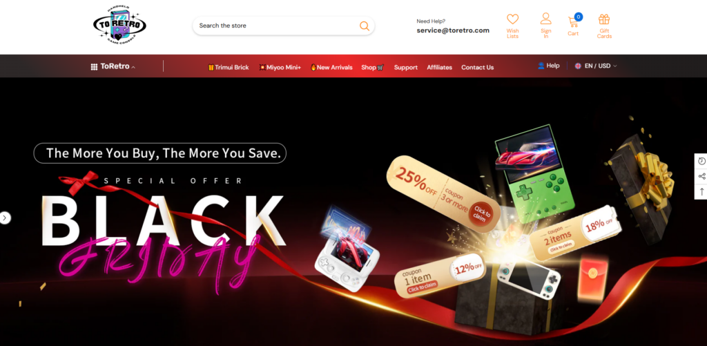
Una de las necesidades clave de ToRetro era la capacidad de ejecutar promociones frecuentes: Black Friday, ofertas de stock limitado y ventas temáticas.
Nuestra solución fue diseñar secciones listas para la campaña que se puedan actualizar visualmente sin reestructurar la página.
Los ejemplos incluyen:
Al mantener el diseño modular, la tienda puede permanecer visualmente fresca y al mismo tiempo conservar la consistencia.
Con docenas de SKU, el riesgo era la sobrecarga visual.
Nuestra solución de diseño:
Este enfoque permite que la página de inicio sea escaneable y al mismo tiempo muestra variedad.
La estética retro puede volverse rápidamente desordenada o difícil de leer.
Nuestra solución de diseño:
El resultado parece inspirado en el pasado, pero claramente construido para los usuarios de hoy.
Una parte importante del tráfico de ToRetro proviene de usuarios móviles.
Nuestras consideraciones de diseño incluyeron:
Cada sección fue revisada desde una perspectiva visual adaptada a dispositivos móviles para garantizar la claridad en pantallas más pequeñas.
Después de implementar el nuevo sistema de diseño, la tienda ToRetro logró varios resultados clave:
Lo más importante es que ahora el sitio se siente cohesivo: cada página y sección habla el mismo lenguaje visual.
Creemos que un buen diseño de Shopify no se trata de código personalizado ni desarrollo complejo. Se trata de:
Este proyecto demuestra cómo un diseño bien pensado puede mejorar la experiencia de comercio electrónico y respaldar objetivos comerciales reales.
El Para Retro Shopify Nuestro sitio web es un claro ejemplo de cómo el diseño estratégico puede transformar una tienda centrada en el producto en una experiencia de marca memorable. Al centrarnos en la lógica del diseño, la narrativa visual y una estructura centrada en el usuario, ayudamos a crear una tienda atractiva, confiable y con ganas de crecer.
Este enfoque refleja cómo ayudamos a las marcas a convertir Shopify en algo más que una plataforma de ventas: se convierte en una extensión visual de su identidad.
En el centro de este proyecto se encuentra la misma filosofía que aplicamos a todo nuestro trabajo en AIRSANGEl diseño no sólo debe verse bien, debe trabajar duro para la marca.