Project overview
In Li Lab’s WordPress website, we organize pages around “Research Topics and Academic Information Navigation.” We established a homepage theme around light and nanophotonic materials, and organized the research direction, laboratory introduction and team entrance into a continuous reading path. Through orange highlights, black navigation, nanostructure images and clear scientific research information partitions, the brand theme, specific content and follow-up communication are arranged at different levels, allowing visitors to continue to understand the project along a clear path.
| Dienstleistungen | Industry | Plattform |
| WordPress website design and construction | Enterprise services | WordPress |
| Project requirements | target market | design style |
| Navigating research topics and academic information | International Academic Readers, presented in English | Orange emphasis, black navigation, nanostructure image and clear scientific research information partition |
| Project quotation | Delivery content | Delivery time |
| ¥6,300 | Home page, research direction, academic achievements, member introduction, contact page and responsive page design | 14 days |
design challenge
We need a place for branding and specific information on the research laboratory website. Navigating around research topics and academic information, the page should not only explain the content direction, but also allow visitors to find the next step. We arranged the overall theme, subdivided content and communication areas in layers to prevent different tasks from being crowded on the same screen.
Design Strategy: Research Topics and Academic Information Navigation
Explain the topic first, then go into the specific content
We established a homepage theme around light and nanophotonic materials, and organized the research direction, laboratory introduction and team entrance into a continuous reading path. The home page splits the research vision and theme description into independent modules, and scientific research images and text complement each other; we use title scale and white space to distinguish overview and further reading.
Connect pages with fonts, colors, and white space
Roboto and Abel in page styles provide the font basis for titles and text; we establish hierarchy through font size, font weight and paragraph width. Orange highlights, black navigation, nanostructure images and clear scientific research information partitions are used throughout the main page. A wide spacing is maintained between columns, and the same information group connects images and descriptions at a closer distance.
Make the entrance close to the current reading task
We have arranged the table of contents, detailed instructions and contact entries in their own page context. When browsing, scroll through the page to expand the content section by section, and navigation links connect different pages; the entry copy and location jointly explain the next step, keeping reading and operation connected.
Home: Research Topics and Academic Information Navigation
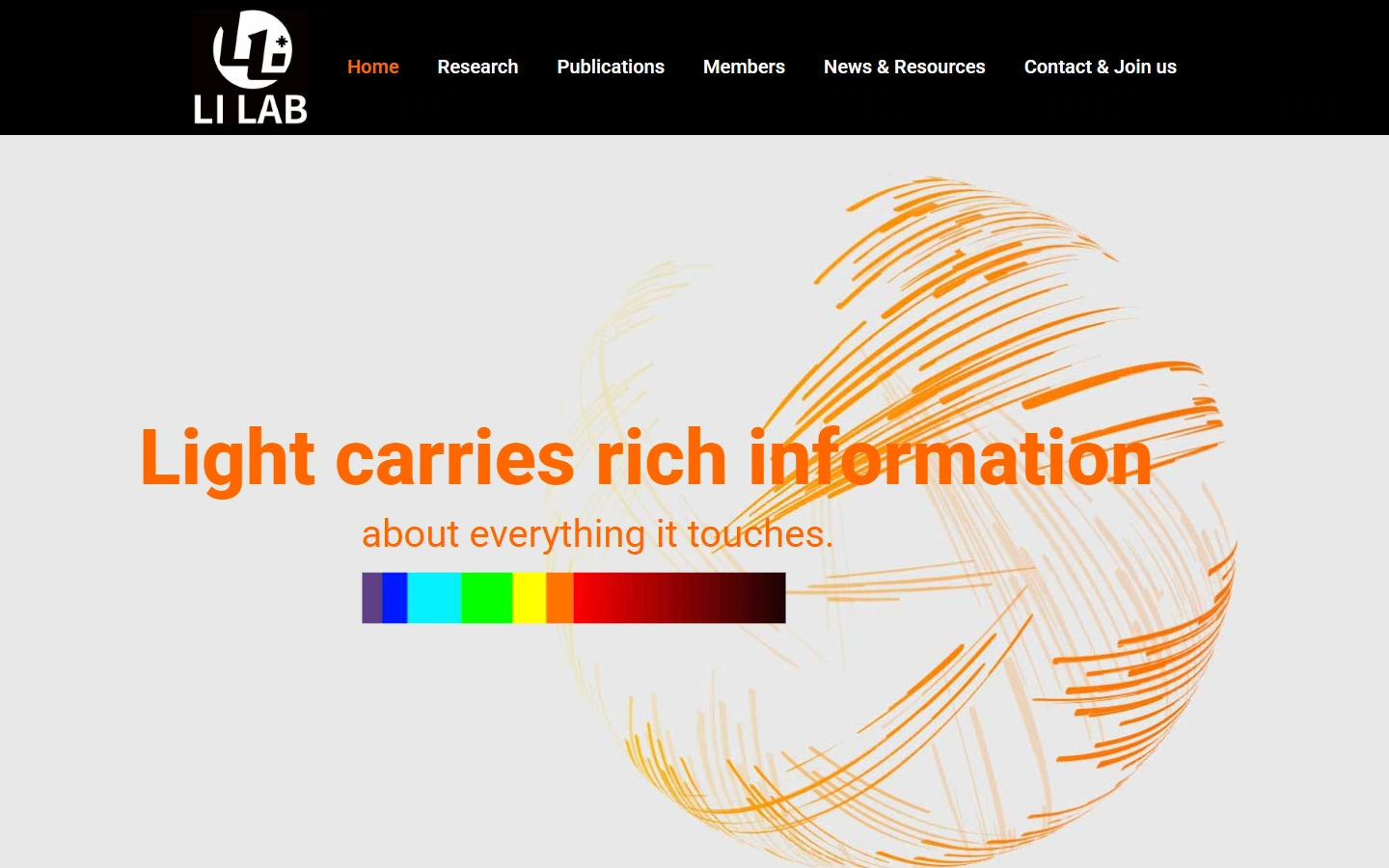
We established a homepage theme around light and nanophotonic materials, and organized the research direction, laboratory introduction and team entrance into a continuous reading path.
This screen is identified with orange accents, black navigation, nanostructure images and clear scientific research information partitions. Thematic text is kept adjacent to the main entrance, and pictures, titles, and supplementary descriptions are separated by scale and spacing to keep the first layer of information focused.
Home page content: Organize different topics separately
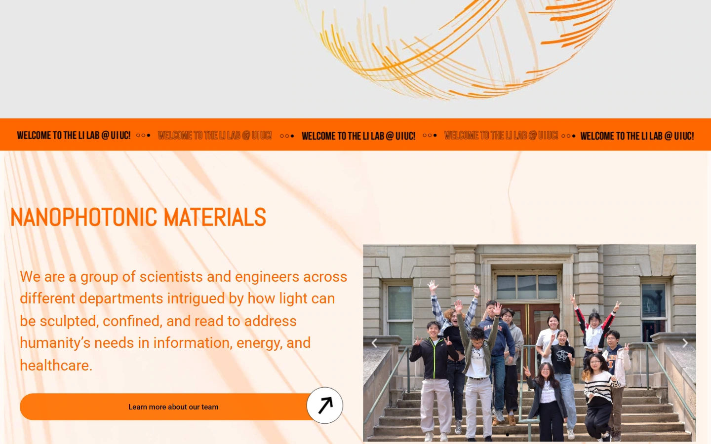
Our homepage splits the research vision and topic description into independent modules, and scientific research images and text complement each other; we use title scale and white space to distinguish overview and further reading.
We use module boundaries and image and text alignment to establish a reading order: the content within the group is kept compact, and pauses are maintained between groups to make the direction of column switching and continued browsing clear and discernible.
Research Direction: Set the reading level for the research direction
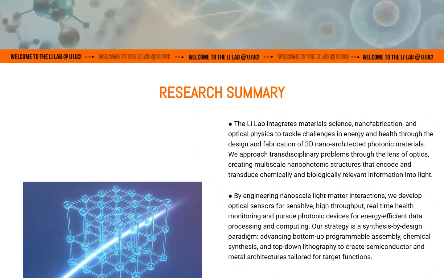
Our research page sets titles, images and descriptions for each research direction, and longer professional content is grouped by topic to facilitate readers with different backgrounds to choose the direction of interest.
This page continues to use orange highlights, black navigation, nanostructure images and clear scientific research information partitions. We use the difference in word weight between the title and the main text to indicate the priority, connect the same group of information with an alignment relationship, and distinguish different tasks through white space to maintain visual continuity across pages.
Academic achievements: Make achievement entries easily accessible
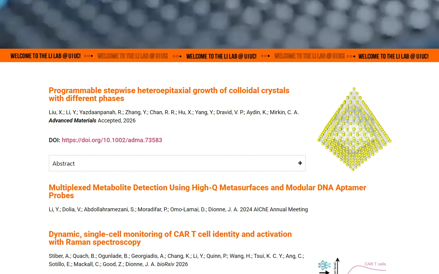
Our paper pages organize results according to actual items, with title, author and publication information forming a continuous reading hierarchy; we let text alignment and spacing between groups serve as search clues.
This page continues to use orange highlights, black navigation, nanostructure images and clear scientific research information partitions. We use the difference in word weight between the title and the main text to indicate the priority, connect the same group of information with an alignment relationship, and distinguish different tasks through white space to maintain visual continuity across pages.
Member introduction: present member information item by item
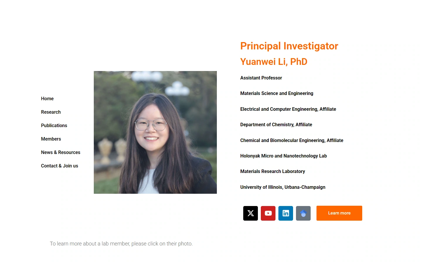
Our member pages pair character images with names and identity descriptions, unify the card scale, and extend the team introduction from individual information to the overall organization.
This page continues to use orange highlights, black navigation, nanostructure images and clear scientific research information partitions. We use the difference in word weight between the title and the main text to indicate the priority, connect the same group of information with an alignment relationship, and distinguish different tasks through white space to maintain visual continuity across pages.
Contact page: Give communication information a clear place
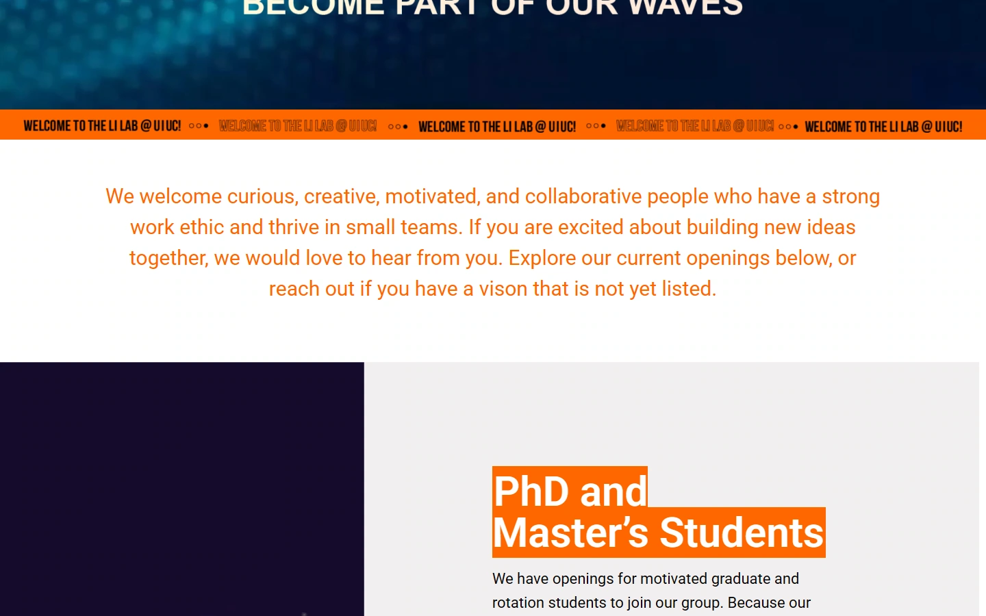
Our Contact and Join page centrally presents communication methods and information about joining the lab, with headings and paragraphs grouped to provide a clear starting point for different visit purposes.
This page continues to use orange highlights, black navigation, nanostructure images and clear scientific research information partitions. We use the difference in word weight between the title and the main text to indicate the priority, connect the same group of information with an alignment relationship, and distinguish different tasks through white space to maintain visual continuity across pages.
Mobile homepage: reallocate space according to narrow screen
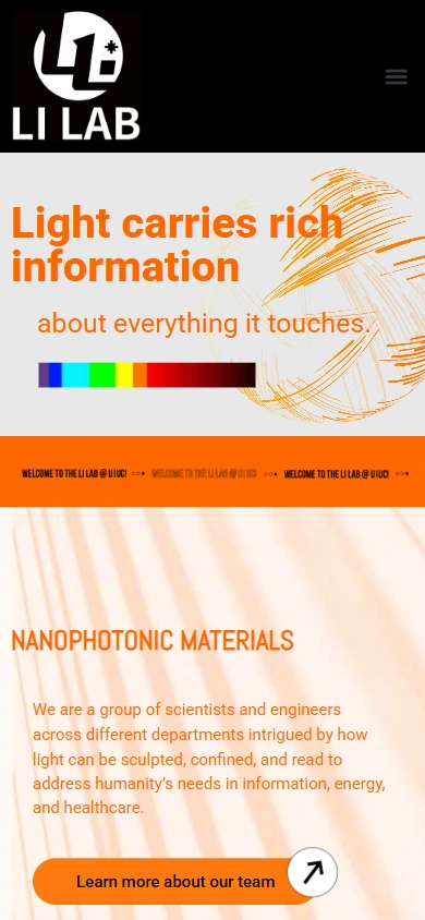
On mobile, we expand the images, titles, and descriptions on the homepage to the currently available width. The image retains the brand identity and the actual content of the corresponding page, and is arranged vertically so that each set of information has an independent reading area.
We maintain hierarchy through title wrapping, image scale, and white space between groups, so that the main content is seen first, and subsequent instructions appear in order; the top navigation is transformed into an entry form suitable for narrow screens, continuing the color and text language of the desktop.
Mobile phone research direction: reallocate space according to narrow screen
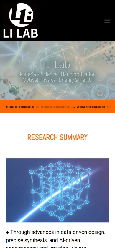
On mobile, we expand the images, titles, and descriptions in the research direction to the currently available width. The image retains the brand identity and the actual content of the corresponding page, and is arranged vertically so that each set of information has an independent reading area.
We maintain hierarchy through title wrapping, image scale, and white space between groups, so that the main content is seen first, and subsequent instructions appear in order; the top navigation is transformed into an entry form suitable for narrow screens, continuing the color and text language of the desktop.
Design summary: Let different pages unfold around the same path
In Li Lab’s website, we use research topics and academic information navigation as clues for content organization, using orange highlights, black navigation, nanostructure images and clear scientific research information partitions to connect different pages. The home page establishes direction, the inner pages carry specific information, and the mobile layout continues to retain the same reading level, allowing brand identification and business content to remain consistent.
Plan a clear WordPress website for your brand
You can provide us with your existing website address, brand materials and required page range, and together we can sort out the content, visuals and functions suitable for your business.