Project overview
Xero Shoes is a global footwear brand specializing in barefoot, natural gait and lightweight athletic footwear for running, hiking, fitness and everyday wear. As the brand scale and overseas markets continue to expand, customers hope to use Shopify to reorganize the visual experience of the online mall so that the website can not only reflect the brand concept of “natural movement, freedom and comfort”, but also more intuitively convey core product advantages such as wide toe boxes and flexible soles.
Therefore, the customer came to us and hoped to focus on optimizing the homepage, product category page and product detail page of the Shopify website. Through clearer visual hierarchy, lifestyle scenes, product close-ups, infographics and modular layout, we can solve the problem of the original page having too much information and insufficiently prominent brand selling points, and at the same time improve product browsing efficiency and purchase conversion. The project ultimately completed the overall e-commerce visual upgrade around the shoe category, allowing brand image, product education and sales paths to form a more unified shopping experience.
| Dienstleistungen | Industry | Plattform |
| Website design and decoration | Shoes and bags | shopify |
| Project requirements | target market | design style |
| Optimize website structure and user browsing experience | Global | Sporty and simple, natural outdoor, functional and professional |
| project budget | Delivery content | Delivery time |
| ¥19800 | Website construction and full-site page design | 25 working days |
Project Challenges
The biggest challenge of this project is how to maintain the professional sports brand image of Xero Shoes while transforming product concepts such as “barefoot shoes, natural gait, wide toe, and flexible soles” that require education for users to understand into a simple, intuitive and attractive Shopify page. The original amount of information is large. If you rely too much on text, it will affect the browsing rhythm and conversion efficiency.
Before starting the project, we first sorted out the brand positioning, core product selling points and target consumer groups, and conducted visual and page structure analysis of similar shoe brand websites. At the same time, we study product photography, font levels, color matching, white space methods and user browsing paths, plan the information priority of homepage, category pages and product detail pages in advance, and establish unified standards for subsequent visual design, information graphics and modular page structure.
Home: The heart of a digital, high-performance experience
The homepage of a Shopify store is the most valuable display area on the entire website. It’s like a brand flagship store in the heart of Manhattan. For Xero Shoes, we designed the homepage to be a complete brand narrative journey, allowing users to gradually understand the brand concept, product features and reasons for purchasing during the browsing process.
First screen area: sense of movement and drive for action

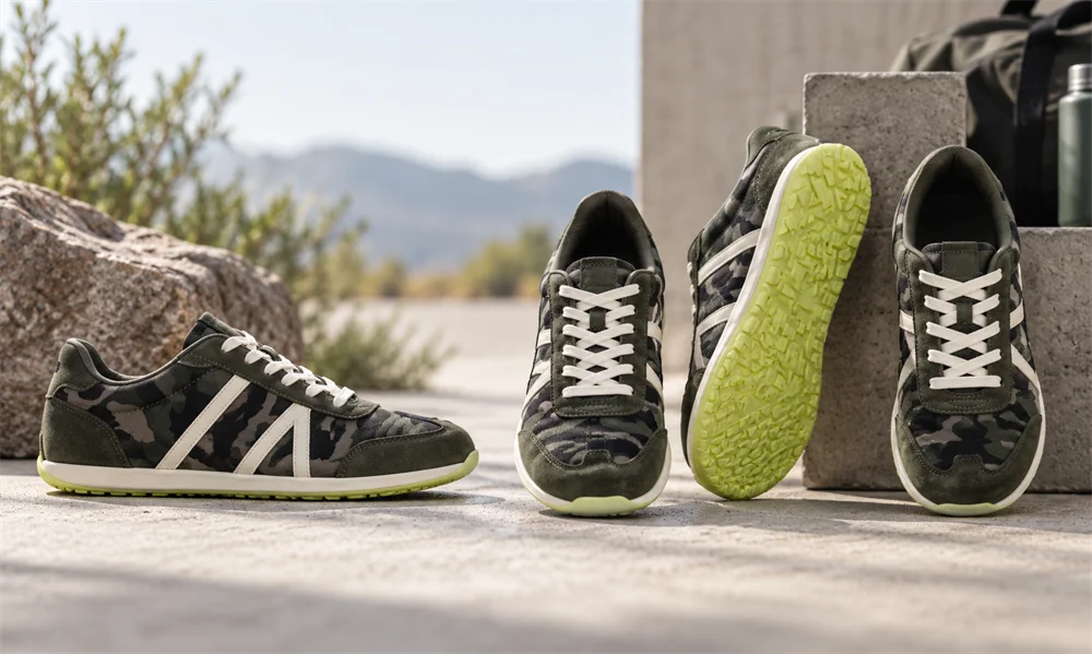
The core goal of the first screen of the homepage is to attract users’ attention immediately and prevent users from swiping away quickly. We use high-quality lifestyle imagery to showcase products in real-life contexts, such as outdoor trails, gyms, and city streets.
By choosing images with a clear sense of movement and dynamics, we hope to strengthen users’ yearning for free movement, healthy living and outdoor exploration.
Font and visual hierarchy design
The font on the first screen adopts a bold but not overly ostentatious design, and establishes a clear font size hierarchy according to different device sizes to ensure that the core information maintains sufficient visual impact on desktop, tablet and mobile devices.
CTA button design
The action buttons use a clearly distinguishable color and add a slight shadow to make the button visually more “clickable.” This design can quickly tell users where to click next, thereby guiding users more naturally into the product browsing and shopping process.
Go deep into the inner pages: not just the homepage
The real performance of a website often depends on the details in the internal page design. Therefore, we extend the visual standards and design logic used on the homepage to the product collection page and product detail page to ensure that the entire Shopify store maintains a unified browsing experience.
Product Collection Page Strategy: Improve Visual Browsing Efficiency
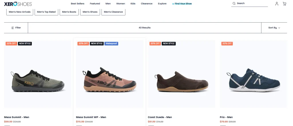
In product collection pages, we prioritize a “quick visual scanning” experience for users.
We designed a clear grid system so that the silhouettes and shapes of different shoes can be quickly identified. All product images use a uniform, neutral background to reduce visual distractions and allow the color, material and shape of the shoe to stand out.
Product hover interaction
We also designed hover states for product images. When users move their mouse over a product image, they can quickly view the side, sole, or other angles of the shoe.
This interactive method allows users to obtain more product information without frequently entering product detail pages, reduce the cognitive load in the browsing and filtering process, and find suitable shoes faster.
Product product detail page: Transform real touch into digital experience
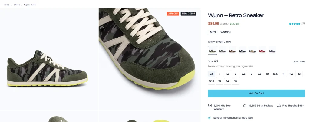
Since online users cannot try on or touch the shoes directly, the product detail page needs to provide a “virtual touch” as close to the real experience as possible.
Through high-magnification product close-ups and page layouts that emphasize material details, we allow users to more clearly see the texture of the shoe upper, sole structure, and product craftsmanship, visually enhancing the realism and quality of the product.
Xero DNA product selling point icon design
In order to express the core product features of Xero Shoes more intuitively, we designed an exclusive icon system to display the brand’s unique “Xero DNA” product selling points.
Minimalist linear icon style
All icons adopt a clean, concise thin line style, consistent with the overall minimalist vision of the brand. Compared with long paragraphs of text, this method can help users understand product functions and differential advantages more quickly.
Reduce operational resistance during the purchasing process
From the size selector to the “add to cart” button, every interactive element in the product detail page is designed around “easy to click, easy to understand, and easy to operate.”
We use reasonable white space, clear color distinctions and clear information levels to reduce users’ hesitation and operational obstacles in the purchasing process, making the entire shopping path smoother.
Design is the silent spokesperson of the brand
“Design is the silent spokesperson of the brand. When you are not present, it expresses it for you; when words are not enough to convince users, it builds trust and reasons for buying for you.”