In the design of the Coupang primary and secondary product images of the integrated pet harness, we organize the content around the telescopic structure and wearing method. Through the pink and blue color scheme, light gray background, structural close-ups and step diagrams, product identification, partial descriptions and scene information are arranged at different levels, allowing readers to continue to understand the product in a clear sequence.
| Dienstleistungen | Industry | Plattform |
|---|---|---|
| Coupang primary and secondary product images design | pet supplies | Coupang |
| Project requirements | target market | design style |
| Telescopic structure and wearing method | Korean content display | Pink and blue color, light gray background, close-up of structure and step diagram |
| Project quotation | Delivery content | Delivery time |
| ¥400 | 6 product primary and secondary product images | 4 days |
Design challenge: Separate different reading tasks
This set of primary and secondary product images should not only retain the identity of the integrated pet harness, but also accommodate different themes such as telescopic structure and wearing methods. Instead of letting each picture carry all the information repeatedly, we separated the whole, parts and scenes, and controlled the distance between titles, pictures and descriptions.
Our design strategy
We use pink and blue color scheme, light gray background, structural close-ups and step diagrams to establish a continuous visual language so that the subject can be clearly identified from the background. The title uses an obvious font size and weight hierarchy, and the supplementary description is relegated to the next level to avoid decoration, photos and text competing for attention at the same time.
In terms of content organization, we divide chapters according to the themes of real works: use larger pictures to establish overall relationships, use parts and diagrams to explain details, and then use bounded text areas or lists to organize supplementary information. Each image has different responsibilities, and consistent margins and information placement maintain the continuity of the entire set.
Overview of dual color combinations: Preserve outlines with misaligned displays
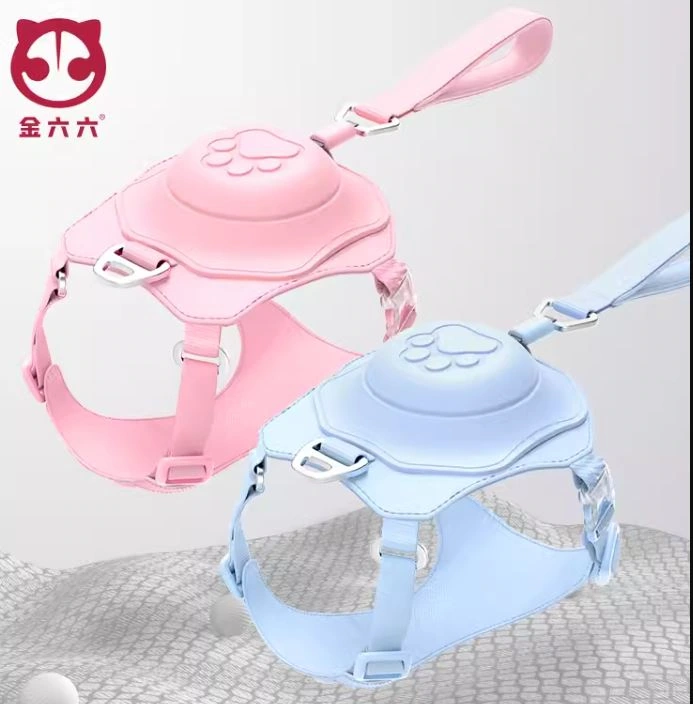
We placed the pink and blue chests and backs in a staggered position, and the light gray ground provides a slight sense of space. There is a gap between the main bodies, and the relationship between the shell, the webbing and the handle can be clearly seen.
Wearable situations: Connecting different dogs with a photo grid
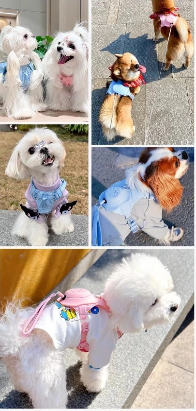
We use multiple wearing photos to show the proportions of the product and the dog, with the larger photo below providing a closer view. Unified margins organize different backgrounds into a set of scene information.
Telescopic theme: use directional lines to guide the line of sight
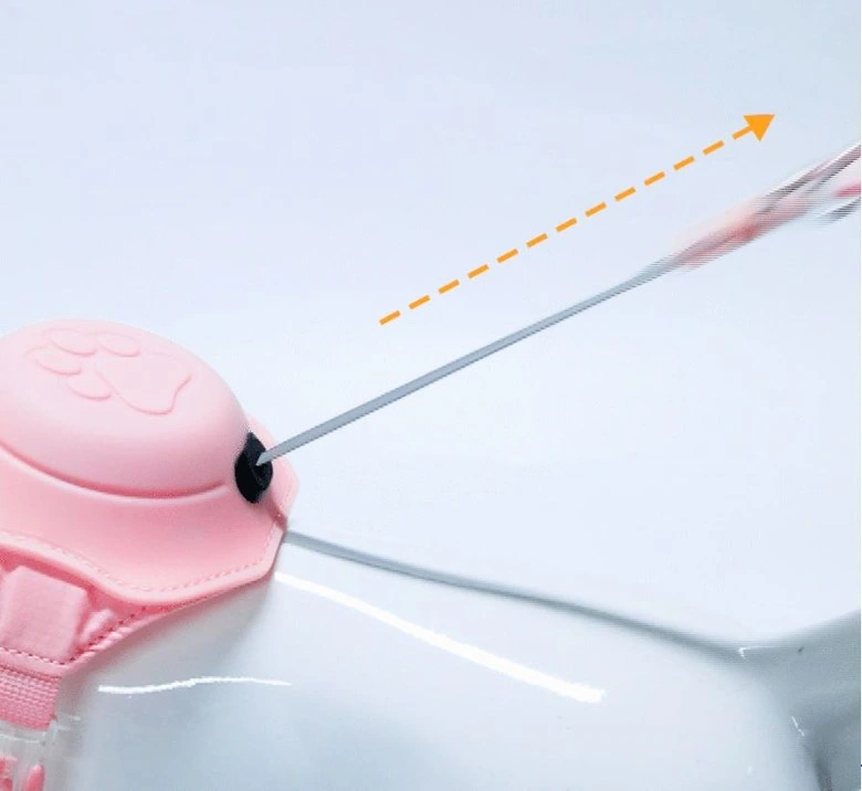
We zoom in on the connection between the shell and the pulling line, and use an orange dotted arrow to indicate the extension direction. The gradient light base and less text keep the structural theme focused.
Internal diagram: The shell and components are unfolded layer by layer
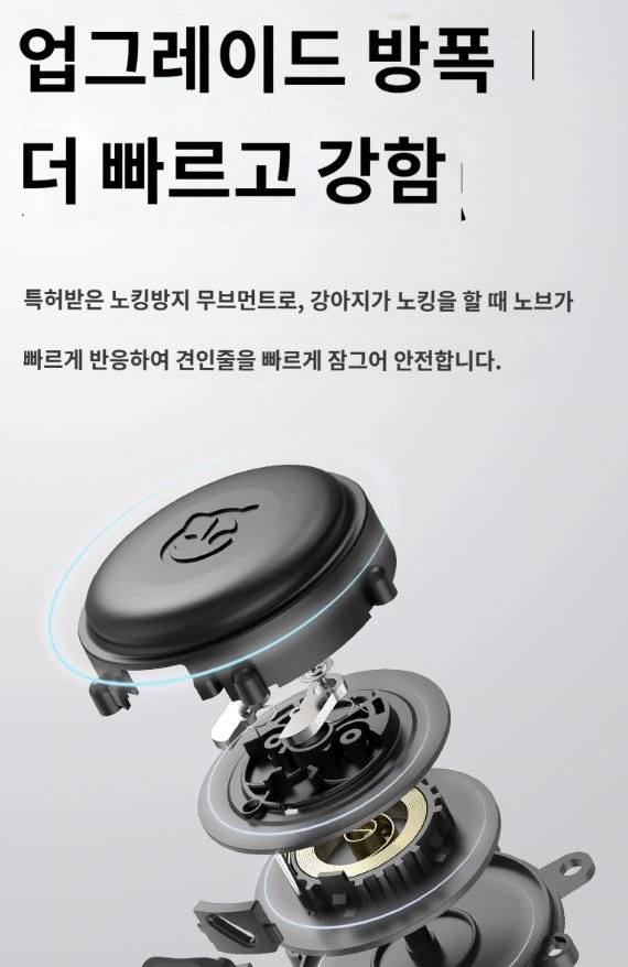
We separate the circular casing and internal parts, with the title on top. The dark parts maintain contrast on the light ground, and the distance between parts helps the reader discern the layers.
Partial bright lines: deep bottom highlights webbing details
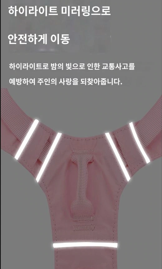
We let the chest and back webbing occupy the lower part of the frame, with the bright lines forming a focal point against the dark gray background. The text is concentrated in the upper part to avoid covering the connection locations that need to be observed.
Wearing steps: two illustrations arranged in parallel
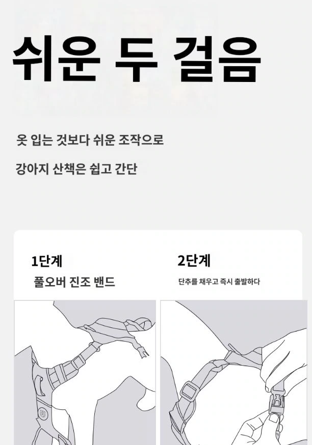
We use two line drawings to organize the sequence of operations, and the titles and step instructions use obviously different font sizes. With the background simplified, the relationship between the webbing and hand movements is easier to discern.
Deliver and design value
Through this set of 6 product pictures, we established a continuous reading path around the telescopic structure and wearing method. The pink and blue color scheme, light gray background, structural close-ups and step diagrams connect different chapters. The image scale, text level and white space jointly distinguish the priorities, allowing the product overview and local instructions to complement each other.
Develop a clear Coupang visual expression for your product
You can provide us with product links, existing materials, and key points that need clarification. We will combine the product structure, style and usage scenarios to plan the appropriate picture group or product detail page content and layout.