Project overview
The customer is a cross-border ecommerce brand that specializes in women’s shoes. It mainly sells flat shoes, loafers, wedge sandals, boots and other products to overseas female consumers through the SHEIN platform. As store styles continue to increase, the customer hopes to improve the original visual lack of uniformity and insufficient product classification. Therefore, he came to us and hoped to redesign the entire set of store posters. The project requirements include home page atmosphere posters, shoe series display, category navigation, new product recommendations, and multi-color product display. It also requires the overall fashion, natural, and authentic female dressing atmosphere to be maintained. While strengthening the visual unity of the brand, it helps consumers quickly understand product styles and usage scenarios of different shoe styles.
| الخدمات | Industry | منصة |
| shein online store design | Shoes and bags | شين |
| Project requirements | target market | design style |
| Improve click-through rate | عالمي | Retro elegance, natural relaxation, lifestyle sense |
| project budget | Delivery content | Delivery time |
| ¥600 | 7 shein posters | 4 working days |
The core challenge of this project is to maintain a unified store vision for different shoe types, different seasons and different styles of products in SHEIN’s fast-paced product browsing environment, while avoiding too cluttered posters and unfocused products. In the early stage, we first sorted out the customer’s existing shoe styles, main series, colors and classification structures, and analyzed the dressing preferences of target female consumers and the visual display logic of the SHEIN platform. Then, we unified the planning of warm-color lifestyle scenes, model dressing directions, font levels, layout rhythm and product display methods, and established consistent design standards for subsequent homepage atmosphere, category navigation, new product recommendations and series of posters.
The first picture: Use multiple models to establish the overall style of the store
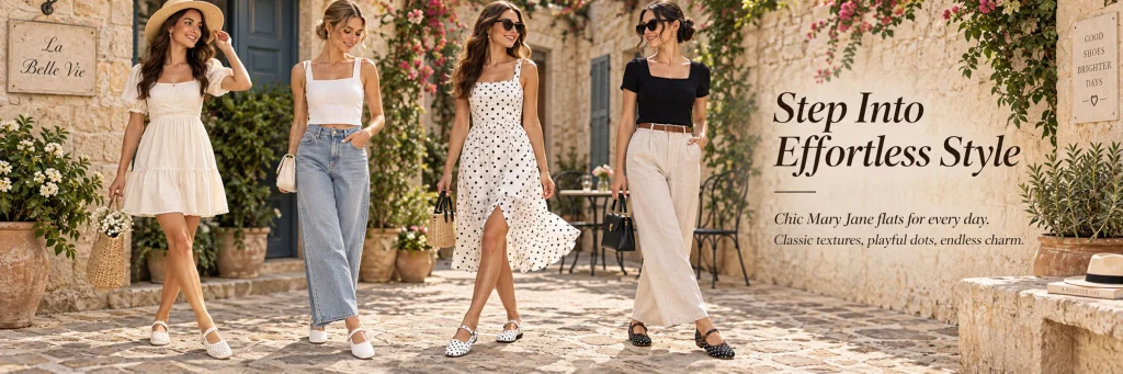
The first poster is responsible for setting the visual tone of the entire store, so instead of displaying only a single shoe style, we arranged for four models to appear at the same time and present a variety of Mary Jane flats with different clothing combinations.
We choose off-white dresses, jeans, polka-dot skirts, and basic black and white outfits to create differences in the clothing, but the overall tone remains coordinated. This approach can quickly tell consumers that these shoes are not limited to a certain style. They can be matched with sweet skirts, and can also enter casual, retro or even mature daily looks.
The right side retains a larger text area, and uses “Step Into Effortless Style” to strengthen the core impression of ease, nature, and good matching.
We deliberately did not add too many promotional graphics and complex decorations, because the first screen of SHEIN women’s shoes homepage needs to establish the aesthetic first, rather than piling up sales tags from the beginning. Through large-area living scenes, natural sunlight and stone wall texture, we give the store a visual experience closer to the fashion brand Lookbook.
Second picture: Zoom in on the wearing experience of a single shoe
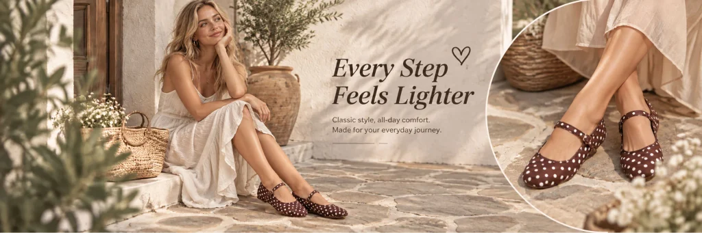
The second poster focuses on brown polka-dot Mary Jane flats.
We use the method of “character scene + partial close-up of the shoe on the right” so that consumers can not only see the effect of the shoes in real wear, but also more clearly observe the polka dots on the upper, buckles, shoe shape and upper toe proportions.
Compared with simply enlarging the product, this design method makes it easier to create a purchasing imagination.
The model on the left wears a white thin long skirt, which is combined with warm stone walls, rattan bags and natural plants to create a soft holiday feel. The brown polka-dot shoes create a moderate visual contrast in the overall light-colored environment, so even without using a highly saturated background, the product can still become the center of attention.
We arranged “Every Step Feels Lighter” as an emotional title in the middle, and then used short auxiliary copy to supplement the information of “daily, comfortable, easy to wear”. Such a copy structure will not take away from the product vision, and at the same time, it can help consumers quickly understand the design theme.
Picture 3: Expanding product scenarios through seasonal changes
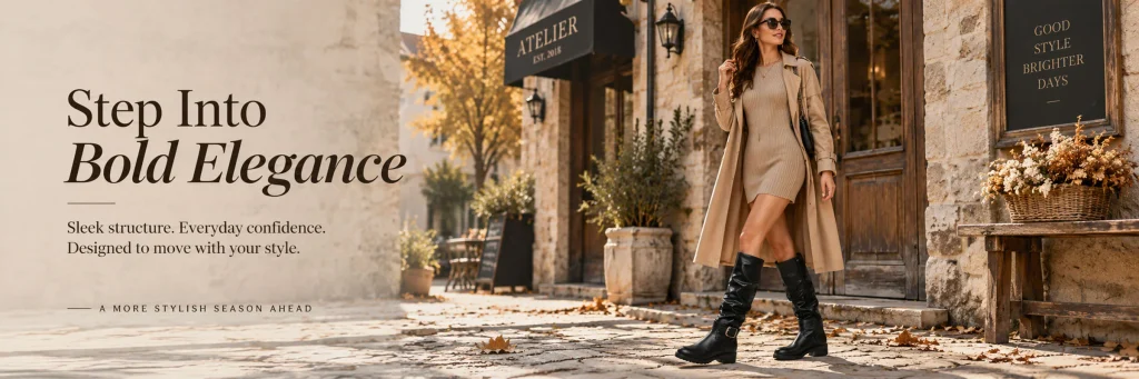
The third poster is obviously different from the first two, as we begin to shift from the lightness of spring and summer to the urban wear of autumn.
The model in the picture is wearing a knitted skirt, a long windbreaker and black boots, with fallen leaves, wooden doors, stone walls and warm autumn sunshine in the background.
We designed it this way so that the store’s vision is not limited to a single season.
When a shoe store sells flats, sandals, and boots at the same time, it can easily lead to product positioning confusion if all posters feature the same summer scene. Therefore, we use color temperature, clothing and environmental changes to allow consumers to naturally feel the seasonal attributes corresponding to different shoe styles.
A large area of white space is used on the left side to place “Step Into Bold Elegance” to emphasize the neatness and stronger styling attributes of the boots. The characters and copywriting form a stable structure on the left and right, allowing this piece to play the role of rhythm change in the entire store.
The fourth picture: Strengthening the series recognition of polka dot elements
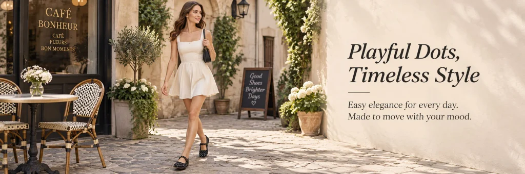
The fourth poster continues to focus on the polka-dot Mary Jane shoes, but instead of repeating the sitting composition of the second poster, we have the model walking on the street outside the cafe.
The walking state can make the shoes look more life-like and more in line with the theme of “Everyday Style”.
The left side of the picture retains the cafe tables, chairs, vases and shop windows, while the right side uses a clean light-colored wall as a natural text background. We arranged the title on the right side without adding additional color blocks, so the overall picture still has a strong sense of real photography.
“Playful Dots, Timeless Style” combines the playful feel of polka dots with the classic shoe shape. This expression is more brand-like than simply writing “Polka Dot Shoes” and can also help the store establish a series theme instead of making the products look like SKUs that have nothing to do with each other.
Picture 5: Use classified posters to improve store browsing efficiency
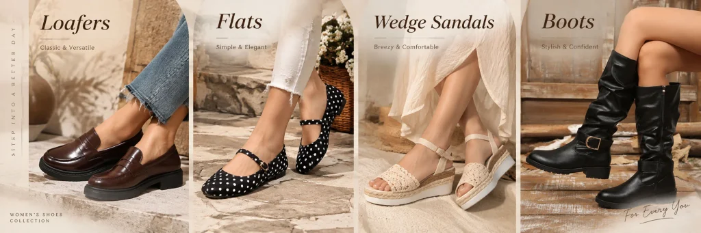
The fifth one is a very important category navigation poster.
We divided the screen into four areas: Loafers, Flats, Wedge Sandals and Boots. Each area uses real on-feet pictures instead of simply displaying white background pictures of the product.
This kind of design first solves the problem of “what is in the store” for consumers.
After entering the SHEIN store, users usually do not browse all the products one by one, so the category entrance needs to be as intuitive as possible. We make each shoe name correspond to a clear shoe type and wearing picture, so users can quickly determine which product direction they want to enter without reading too much information.
Visually, we kept the four areas with a unified warm beige tone, while creating variations through different shoe types, clothing and background materials, so that the classification module is neat without looking mechanical.
This type of poster is particularly suitable as a classification guidance module in the middle of the homepage.
Picture 6: Create key recommendation areas around new products
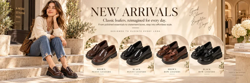
The sixth poster is used to highlight NEW ARRIVALS.
If the new product module only lists a few pairs of shoes, it will easily look like an ordinary product list. So we designed it as a complete visual scene.
On the left side, a model is arranged to sit on the steps wearing brown loafers, directly creating the on-feet effect of the new product; on the right side, four groups of loafers are continuously displayed, including brown, black and bow styles.
Each group of products is placed in an independent arched visual area, which not only forms a unified order but also strengthens the sense of new product display.
We set “NEW ARRIVALS” as the most eye-catching information on the screen so that consumers can know the purpose of this section at first glance. Next, different colors and styles are distinguished by product names.
This layout combines the functions of “atmosphere poster” and “product shopping guide” and is very suitable for the new product area of SHEIN stores because it is not as information-intensive as traditional product detail pages, nor does it lack product choices like pure model blockbusters.
Picture 7: Use multi-color display to drive single series conversions
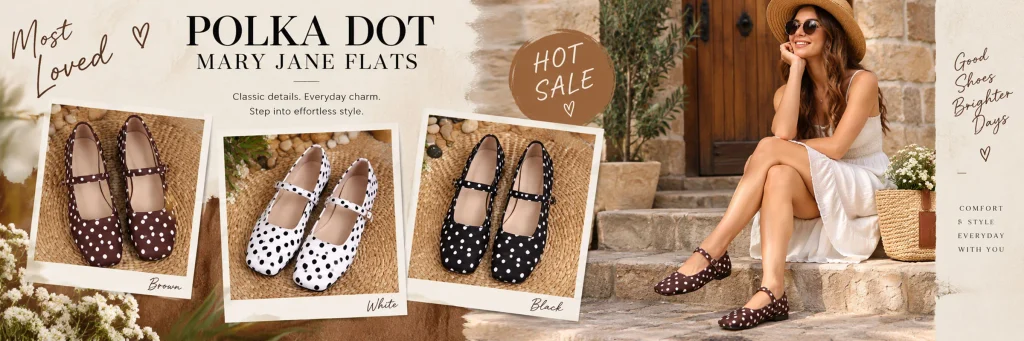
The last poster highlights the different colors of the polka dot Mary Jane series.
We used three Polaroid-like product cards showing brown, white, and black shoes, and had the model actually wear the brown version on the right.
This design directly solves a very common question among consumers: What colors are available for the same shoe?
Rather than tile three colors in a row, we used a slightly staggered photo-like structure to give the page a more lifestyle magazine feel while keeping the color information clear.
“Most Loved” and “HOT SALE” in the picture serve as sales reminders, but instead of using traditional big red promotional labels, we use brown, handwritten fonts and soft graphics to allow the promotional information to continue to integrate into the overall brand style.
This is also a point we attach great importance to when designing this set of SHEIN women’s shoe posters: the promotion can be obvious, but it cannot destroy the overall visual tone.
Why does the whole set of posters adopt a unified warm-color lifestyle vision?
Looking at the entire design, we did not have a completely different style for each image, but continued to repeat several key visual elements: warm beige background, natural sunlight, stone wall street scene, green plants, cafes, rattan accessories and real women’s outfits.
Together, these elements form a unified store visual asset.
When consumers browse different sections continuously, they will naturally feel that they belong to the same store. Even if the product switches from Mary Jane flats to loafers, wedge sandals and boots, the overall brand feel will not be interrupted.
At the same time, we constantly change the composition through multiple people’s outfits, close-ups of single products, autumn scenes, classified layouts, new product displays, and multi-color displays, so that the page will not appear repetitive due to a unified tone.
This is also a very critical balance in SHEIN store poster design: unity does not mean that all pictures are the same, and richness does not mean that each picture needs to re-establish a visual system.
Shift from “showing shoes” to “helping consumers imagine outfits”
In this set of designs, we always put the shoes in a real wearing context.
When consumers buy women’s shoes, they not only pay attention to the front appearance of the shoes, but also consider whether they coordinate with skirts, jeans, windbreakers, and clothing in different seasons. Therefore, we actively supplement the information that cannot be expressed in product pictures through the model’s full body shape, close-ups of legs and feet, and living environment.
At the same time, we add partial enlargement when we need to emphasize the details of shoes, use columns when we need to introduce categories, and use centralized display when we need to promote new products.
Each poster undertakes a different task, rather than simply “making another good-looking picture.”
Ultimately, this set of SHEIN women’s shoes store vision formed a complete browsing path from brand atmosphere, product outfits, series selling points, seasonal scenes, to category navigation, new product recommendations and color selection. We hope that after entering the store, consumers can understand the product more quickly, find the shoes they are interested in more easily, and form a clearer brand memory in a unified visual environment.
For brands that need SHEIN women’s shoe store decoration, classified posters, new product posters, event visuals, and a complete set of cross-border ecommerce visual design, AIRSANG can continue to establish a unified visual system with transformation logic based on product characteristics, target markets, and store structure.