Project overview
This project comes from a cross-border ecommerce brand that specializes in wedding dresses and bridal gowns. The client plans to further enhance the overall visual performance of the store on the SHEIN platform and strengthen the romantic atmosphere and brand quality of the wedding dress products, so they approached us for visual design of store posters. The client hopes that the entire set of posters can not only highlight the styles, collars, lace and skirt details of different wedding dresses, but also enhance consumers’ sense of involvement through the wedding scene, European architecture, natural light and floral elements. At the same time, the design also needs to adapt to the fast-browsing e-commerce environment of the SHEIN platform. On the basis of maintaining a unified high-level vision, it takes into account series display, style classification, scene shaping and promotion guidance to help consumers understand the products more intuitively and enhance the overall appeal of the store.
| الخدمات | Industry | منصة |
| shein store design | clothing apparel | شين |
| Project requirements | target market | design style |
| Improve click-through rate | عالمي | Romantic and elegant | light luxury and high-end | soft light and dreamy |
| project budget | Delivery content | Delivery time |
| ¥600 | 7 posters | 6 working days |
Project Challenges
The core challenge of this project is to keep the wedding dress romantic, high-end and ceremonial while making the entire set of visuals truly suitable for the quick browsing scene of the SHEIN platform. We need to solve the problem that different wedding dress styles are prone to visual repetition, white products are not prominent enough on light backgrounds, and the styles of multiple posters are consistent but the content cannot be monotonous. In the early stage of design, we first sorted out the customer’s wedding dress categories, collar types, skirt types and main styles, and then analyzed the common visual expressions of SHEIN wedding dress categories and user browsing habits. At the same time, we planned the functional positioning, number of characters, scene direction, copywriting level and overall tone of each poster to ensure that the subsequent design has a unified brand sense and can clearly display the selling points of different products.
The first picture: Use multiple wedding dresses to create a sense of series
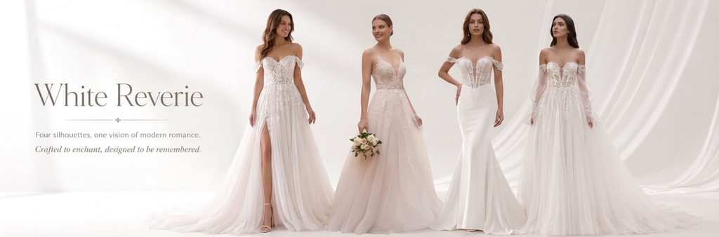
The first poster plays the role of series display and store image establishment.
We selected four models to appear on the right side of the screen at the same time, and each showed white wedding dresses with different silhouettes, including A-line skirts, spaghetti straps, fishtails, and sleeve designs. This kind of composition allows users to quickly perceive the brand product line after entering the store, instead of only seeing a single product.
The background uses a large area of white space and soft drape fabric, without adding complicated scenes. We hope that through this processing method that is close to a wedding photography studio, we can highlight the material and shape of the wedding dress itself, and at the same time enhance the overall visual sense of high-end.
A large area of white space is reserved on the left side for copy layout. “White Reverie” is presented in an elegant serif font, combined with thin line decoration and small font size subtitles to make the information structure lighter. The characters are concentrated on the right side and the text is concentrated on the left side, which also makes the picture form a clear visual division.
This poster does not pursue a strong sense of promotion, but first establishes the brand temperament so that users can feel that this is a wedding dress series with a unified aesthetic.
The second picture: Enhance the romantic wedding imagination through European street scenes
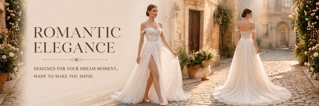
The second poster shifts from a pure studio shot to a more story-telling outdoor environment.
We set the scene in a warm-toned European street, using stone walls, arches, cobblestone pavements, floral arrangements and sunset light to create a romantic atmosphere. Compared with simply displaying wedding dresses, such a scene can help consumers quickly enter the scene of the wedding day.
The picture shows both the front and back of the model. The figure on the front is responsible for highlighting the neckline, waistline and skirt structure, while the figure on the back is used to show the back design and trailing effect of the wedding dress. For wedding dress products, the structure on the back is often information that users are very concerned about, so we proactively use the composition of two figures to increase the amount of product information.
The large title “ROMANTIC ELEGANCE” on the left is consistent with the visual temperament of the entire scene. We used a dark brown font, rather than a high-contrast pure black, so that the text blends more naturally into the off-white and warm gold background.
Through this poster, we hope that users will not only see a wedding dress, but also imagine themselves wearing this wedding dress and walking into the wedding scene.
The third picture: Use the outdoor wedding scene to convey a sense of freedom and lightness
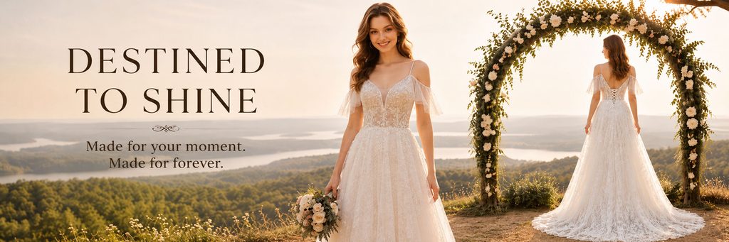
The third poster continues to enhance the scene-based experience, but we switch the visual environment from urban buildings to natural outdoors.
The background of the picture is hills, lakes, meadows and sunset, while adding a large floral wedding arch. Compared to the European-style street scene in the previous photo, this one is more focused on a destination wedding, lawn wedding or outdoor ceremony.
We placed one model on the right side of the center of the picture, focusing on the lace details, bodice structure, and skirt layers of the wedding dress from the front; the other model stood under the floral arch and supplemented the product information with the back pose.
This double-layer space design gives the picture a clear relationship between the foreground and the distant view, and also makes the wedding dress appear lighter under natural light.
“DESTINED TO SHINE” on the left uses a large serif font, forming a clear visual focus through simple top and bottom layout. We did not stack a lot of description text, but left enough white space to make the overall picture more advanced.
The design focus of this piece is not on sales parameters, but on emotional expression. We hope that when users see the poster, they will directly think of keywords such as “wedding day”, “outdoor ceremony” and “romantic dusk”, thereby enhancing their emotional identification with the product.
Photo 4: The composition of two models highlights different wedding dress styles
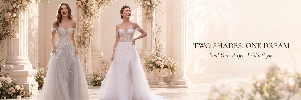
The fourth poster returns to an indoor wedding scene, but still maintains soft and natural light overall.
We use European-style columns, light-colored walls, floral arrangements and large areas of warm white space to create an atmosphere close to a wedding hall or a manor ceremony area.
The two models showed different wedding dress styles respectively, forming an intuitive contrast by standing side by side. One is more off-white lace, and the other is more pure white tutu, so consumers can feel the difference between different styles in the same poster.
We intentionally kept the models with natural, relaxed expressions, rather than the very formal postures seen in traditional wedding dress ads. This processing can reduce the sense of distance, make the overall vision younger, and is more in line with the browsing habits of SHEIN platform users.
There’s plenty of clean space on the right side for “TWO SHADES, ONE DREAM” and the subtitle. The text does not obscure the characters, nor does it destroy the silhouette of the wedding dress.
This poster actually plays the role of “style comparison”, letting users know that even if they are all romantic wedding dresses, they can have different colors, textures and temperaments.
Picture 5: Help users quickly choose styles through four collar styles
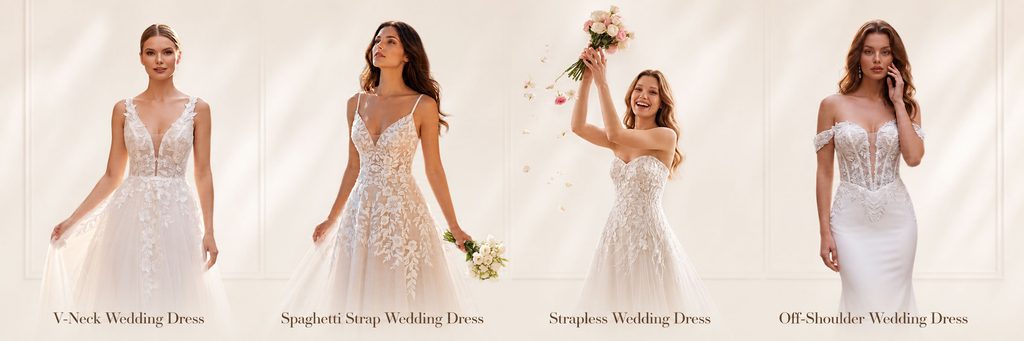
The fifth picture is the one with the clearest product classification function in the entire series.
We did not continue to use complicated scenes, but used four models to show four different wedding dress neck styles side by side, including V-neck, spaghetti straps, strapless and one-shoulder designs.
This kind of layout is very suitable for category navigation or product collection entrance inside SHEIN stores. Consumers do not need to read complicated instructions, they can quickly find their preferred wedding dress type by simply observing the model’s style.
The background uses a very restrained light beige interior space to reduce visual interference. The distance between the four models is approximately the same, and the height of the characters is as uniform as possible, making the entire layout neater.
The name of the wedding dress type is placed correspondingly at the bottom, so that the picture has both visual display and classification guidance functions.
The design logic of this picture is different from traditional brand advertising. It emphasizes the efficiency of e-commerce usage. Users can quickly understand the product structure through a picture, thereby reducing selection costs and increasing willingness to continue browsing.
Picture 6: Use sunset and double styling to enhance “classic elegance”
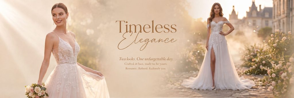
The sixth poster returns to a strong emotional scene.
We used the warm golden sunset as the main light source to give the entire picture a soft, romantic and cinematic visual effect. The model on the left uses a close-up composition to focus on the lace, neckline and waist details of the upper body of the wedding dress; the model on the right uses a full-body composition to fully demonstrate the proportions of the skirt and the wearing effect.
This combination of near and far can simultaneously satisfy consumers’ observation needs for “details” and “overall”.
The middle area serves as a visual buffer and houses the main title “Timeless Elegance”. The combination of serif fonts and handwritten fonts enhances the wedding feel while preventing the image from being too commercial.
Rather than directly using promotional language such as “new product” or “hot sale”, we hope that this one will convey the long-term value of the wedding dress itself, so we emphasize concepts such as “Timeless” and “Elegance”.
This also makes the entire SHEIN wedding dress vision not only price-oriented, but also gradually establishes a more complete wedding dress brand impression.
The seventh picture: Complete the series ending and promotional guidance with a group portrait composition
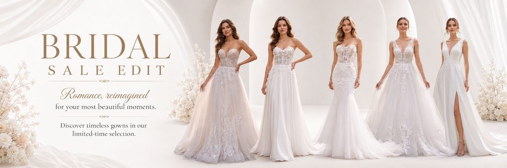
The last poster is responsible for summarizing the entire series and its sales conversion role.
We arranged five models wearing different wedding dresses on the right side of the screen, forming a complete product array with different collar types, skirt types and fabrics. Compared with the first picture, there are more models here and the product coverage is richer, so it can more directly reflect the store’s selection scale.
The background still continues the ivory white and off-white tones, and adds curved architectural structures, white draperies and light floral arrangements to keep the overall style consistent with the previous posters.
The left side uses “BRIDAL SALE EDIT” as the main visual title. A large serif font is used to attract attention, a handwritten font is used to add a romantic atmosphere, and a short copy below conveys a limited-time selection of information.
We deliberately did not use bright red, fluorescent colors or exaggerated discount labels, because although such elements can create a sense of promotion, they will weaken the high-end temperament of the wedding dress category. We chose to balance conversion and aesthetics through “branded promotional visuals” that kept the sales message visible but not overly disruptive to the overall picture.