Project overview
This case shows 6 Ozon Russian works from the purple technology-themed digital home appliance series. They connect different products with a common visual system, and then change the display focus around the structure, use and specifications of each product. The key point of the explanation is: use a unified background to connect the key points of information of different products. For brands and sellers who need to plan a series of product images, this arrangement provides a specific reference between unified identification and single product differences.
| الخدمات | Industry | منصة |
| Ozon series product main product image design | Digital 3C | الأوزون |
| Project requirements | target market | design style |
| Use a unified background to connect the key points of information for different products | Russia | Purple technology, visual impact, parameter guidance |
| project budget | Delivery content | Delivery time |
| ¥400 | 6 case display pictures | 5 working days |
design challenge
The work includes handheld consoles, watches, fans and desk lamps. Some handheld console images are supplemented with content and screens. The design needs to maintain a sense of series, while changing the parameters and scenes according to the actual category, so as not to misrepresent different products as secondary product images of the same product.
Design strategy: Let the entire group of works form a clear information relationship
01 First distinguish the product objects, and then determine the focus of each picture
The work involves “handheld configuration → watch appearance → fan → game theme → desk lamp → handheld screen”. Each picture organizes the content around the corresponding product, and does not combine the capacity, power or functions of different products into one model. What the series have in common is the visual identity, while the information tasks are determined individually by product characteristics.
02 Use a consistent visual language to connect different reading tasks
Purple light and flowing shapes penetrate the background, while the silver and dark bodies maintain outlines. Yellow and purple digital labels organize specifications, and some pages are referenced with game screens and operating accessories. The unified style serves the entire group identification, and composition changes serve different contents; the main title, auxiliary labels and product proportions in the picture jointly determine the reading order.
03 Let different products retain their own purchase issues
Connecting the information points of different products with a unified background is the organizing focus of this body of work. Lists, parameters, parts and scenes are suitable for different products: first look at what each product needs to explain, and then select the corresponding screen, instead of applying the same parameter layout to all products.
Dismantling the work: explaining the screen arrangement and information responsibilities of each picture
Figure 1|Handheld configuration: organizing technical themes around the whole
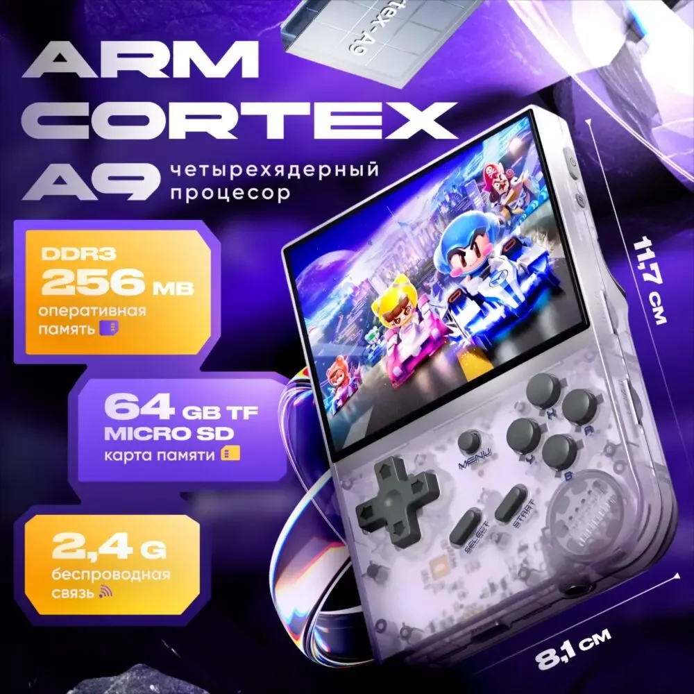
The transparent handheld device is placed diagonally, and the cards on the left show the processor, memory, storage and wireless themes respectively, and the size lines are arranged along both sides of the fuselage.
The parameters are adjacent to the whole machine, the category labels have clear positions, and the first page establishes a reading entrance based on configuration and appearance.
Figure 2|Watch Appearance: Use the screen as the visual subject
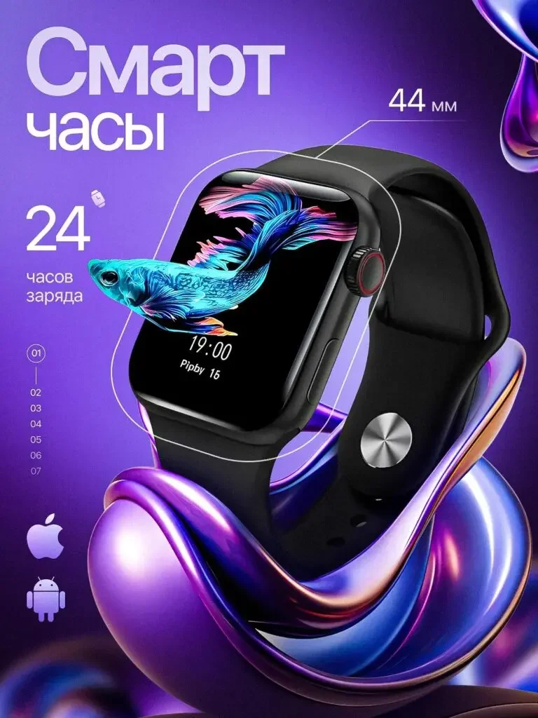
The black watch is displayed tilted to a larger proportion, with a colorful fish-shaped image extending out of the screen, and size and connection logos distributed along the sides.
The image bears the theme of the screen, and the numbers bear the specification prompts; visual extension is a creative expression, not an actual three-dimensional display proof.
Figure 3|Fan theme: connecting wind direction, control and appearance
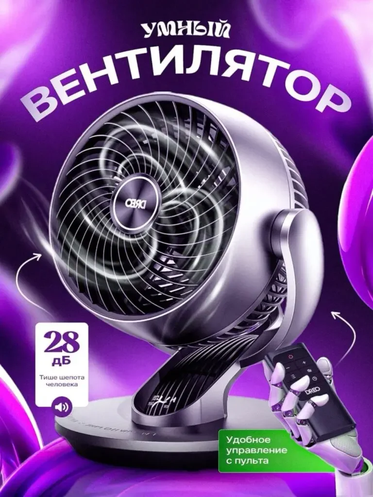
The front of the fan occupies the main body, with curved arrows prompting rotation, and the remote control and 28dB mark are arranged at the lower part.
Appearance, action and control are presented separately, and users can find the entrance to multiple related issues from the same picture.
Figure 4|Game theme: map the amount of content to the screen
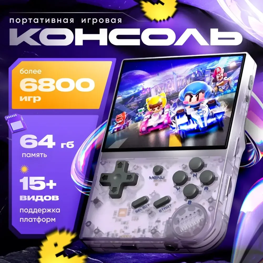
The game screen is displayed on the handheld screen, and cards are used on the left to organize the number of games, storage and platform themes.
Screens are responsible for establishing purposes, cards are responsible for organizing quantities, and configuration diagrams form different information responsibilities.
Figure 5|Table lamp theme: explaining the structure with curved lamp arms
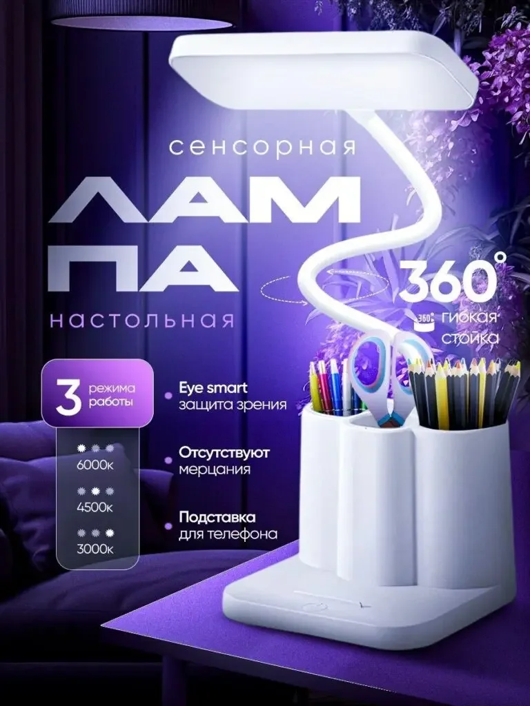
The white desk lamp is placed on the tabletop, with the curved lamp arm and luminous surface intact, with a 360° focus on the sides and three color temperature themes.
The lamp arm shape corresponds to the adjustment theme, and the color temperature card provides an index for selection, without directly claiming that the eye protection effect has been verified.
Figure 6|Handheld screen: focus on display area and specifications
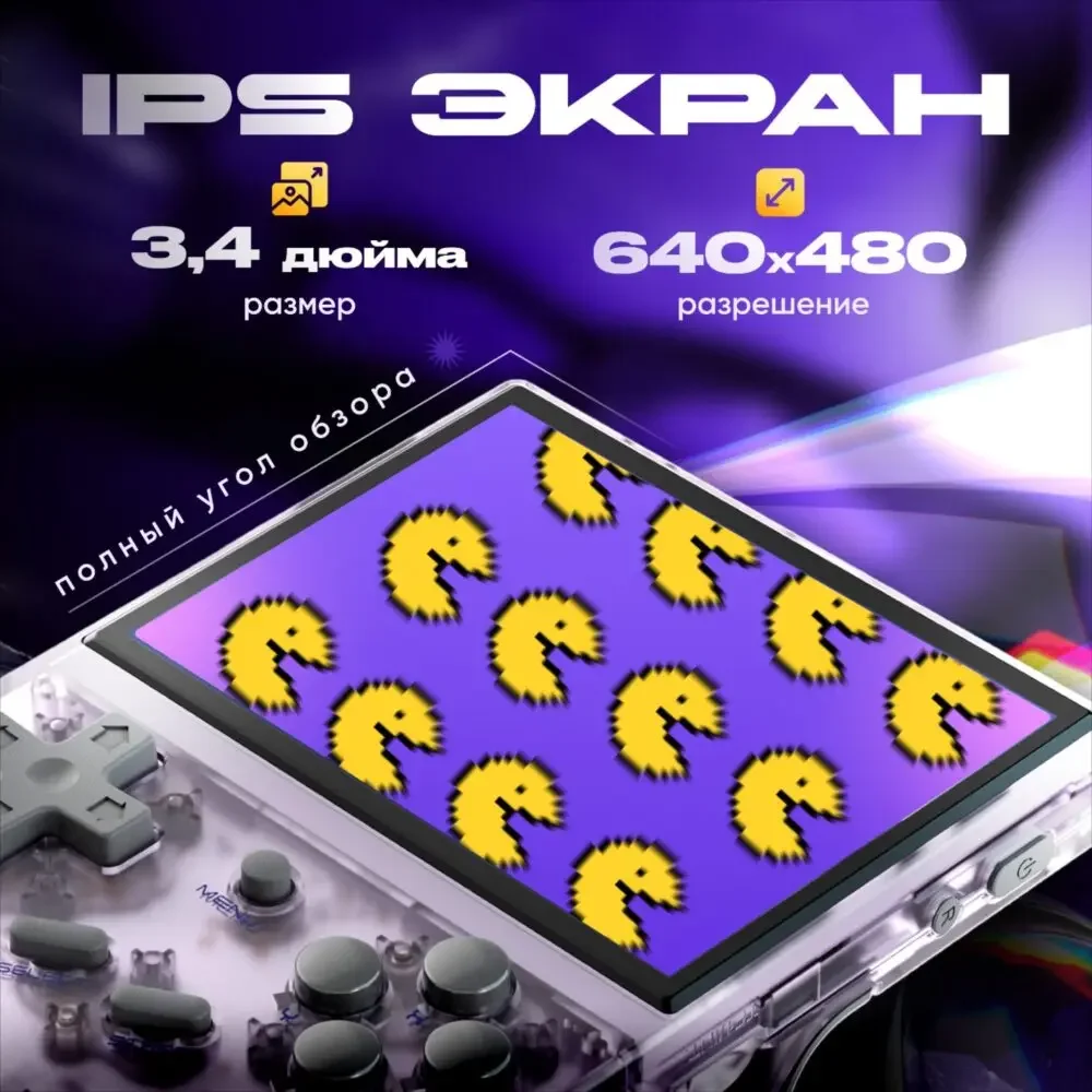
The screen is enlarged at a close range, with IPS, 3.4-inch and 640×480 displayed independently on the top. The screen retains the buttons and transparent body.
The partial close-up answer shows what the area looks like, and the specification bar supports verification, which complements the first complete machine parameters.
Delivery summary and design value
The entire team delivers with a clear division of labor
The six works in this case cover “handheld configuration → watch appearance → fan → game theme → desk lamp → handheld screen”. The number of images depends on the actual content, and each image has its own theme while maintaining an overall identity through color, text hierarchy, or composition.
Procurement issues can be more easily mapped to specific information
Focusing on the purple technology-themed digital home appliance series, the work will “use a unified background to connect the key points of information of different products” and implement it into different pictures. When brands plan similar designs, they can first list the content that consumers need to identify, understand and check, and then determine the tasks and order of primary and secondary product images.
Value is based on interpretive methods and authentic works
The whole machine, part, scene and information cards provide different reading entrances, helping to organize product descriptions more clearly. The value of this case is the visible design expression and information division of labor; changes in click-through rates, sales, and conversion rates require additional statistical or test data support.
The parameters, materials and functions in this article are used to explain the content of the accompanying pictures. The specific specifications, applicable conditions and accompanying items are subject to the product information of the corresponding model.
Plan clearer product images for your Ozon products
If your Ozon purple technology-themed digital home appliance series also needs to plan primary and secondary product images, you can submit product links, existing pictures or product information to AIRSANG, explain the target market and required picture group range, and communicate the information organization and visual direction suitable for the product.
Consultation email: [email protected] · Telephone: 177-5952-2770