Project overview:
The client is a beauty brand that specializes in lipstick products and sells mainly to overseas consumers through the Amazon platform. As competition among similar products intensifies, the customer’s original product images lack sufficient visual appeal in terms of texture performance, color display, and selling point communication, and it is difficult to quickly establish consumers’ trust in the product. Therefore, AIRSANG was approached in the hope of re-optimizing the visuals of the entire set of Amazon products. The project focuses on systematic design around lipstick texture, moisturizing and glossy effects, real color testing, different skin tone adaptations, and product ingredients and safety information. While enhancing the brand’s sense of professionalism and luxury, it also reduces consumers’ concerns about color selection and purchase, and ultimately improves Listing’s browsing experience and conversion performance through clearer visual sales logic.
| الخدمات | Industry | منصة |
| E-commerce main product image design | جمال | AmazonAmazon |
| Project requirements | target market | design style |
| Improve click-through rate | USA | Simple, advanced and outstanding products |
| project budget | Delivery content | Delivery time |
| ¥450 | 7 primary and secondary product images | 3 working days |
Project goals
Lipstick belongs to a product category on Amazon where visual competition is very fierce and it is highly dependent on consumers’ perceptual judgment. Consumers often use pictures to judge whether a product is worth buying in a very short period of time.
Therefore, when designing pictures for lipstick and beauty products, the focus is not just on “making the pictures beautiful.”
Consumers are mainly concerned about several aspects:
- Is the product color true?
- How is the texture of the lipstick?
- Is it moisturizing?
- Is it sticky or thick?
- Glossy feeling after applying to lips
- Is it suitable for your skin tone?
- Does the product look credible?
Many consumers have already formed a purchasing tendency through pictures before even carefully reading the text introduction.
Therefore, the core goal of this set of lipstick product pictures is to let consumers quickly feel the product:
Moisture, luster, true color and adaptability to different skin tones.
At the same time, all pictures need to conform to the visual environment of the Amazon platform, and through a reasonable order of pictures, consumers’ purchasing confidence can be gradually built up.
Picture 1: Product + Texture Display
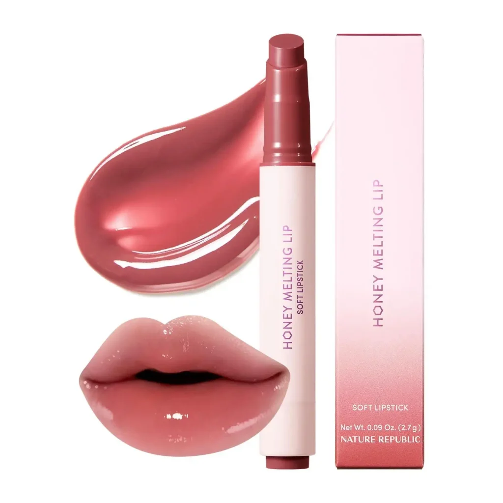
Establish consumers’ first awareness of product quality
The first picture mainly shows:
The lipstick product itself + lipstick paste/application texture + actual mouth effect.
It undertakes the most basic task of the entire set of detailed pictures – letting consumers know at first glance what product it is and its actual texture after use.
The design puts the physical lipstick together with the flowing and high-gloss lipstick application texture, which can quickly tell consumers:
This lipstick is not dry, heavy or sticky in texture, but rather smooth, moisturizing and glossy.
At the same time, the design needs to ensure that the colors in the three places are as consistent as possible:
Lipstick paste color → application color → actual color of model’s lips
This can improve the authenticity of the color number.
Because when buying lipstick online, a very common question is:
The color in the picture is different from the actual mouth color.
Color difference is also one of the important reasons for the return of beauty products.
Keeping the background clean allows consumers to focus on the product itself and color performance.
So the first picture actually assumes:
Establish first impression + product identification + texture communication + shade authenticity.
Picture 2: Display of core selling points
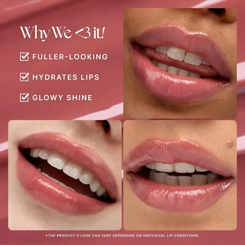
Why consumers like this lipstick
The second image highlights three main selling points:
Rich visual effects
Moisturizing
natural luster
Instead of cramming a lot of text into the layout, a relatively simple list of selling points is used, along with close-ups of real lips.
The reasons for this are:
For lipstick, simply using icons or words to tell consumers that it is “moisturizing” and “glossy” has limited persuasiveness.
Consumers are more willing to believe:
The effect of using real lips.
Therefore, through the partial display of different mouth shapes and different lip textures, it is easier for consumers to immerse themselves in their own usage scenarios.
This picture actually answers a question in consumers’ minds:
“Will this lipstick really look good on my lips?”
Therefore, the most important function of this page is not to introduce parameters, but to:
Reduce purchasing hesitation.
Picture 3: Comparison before and after use
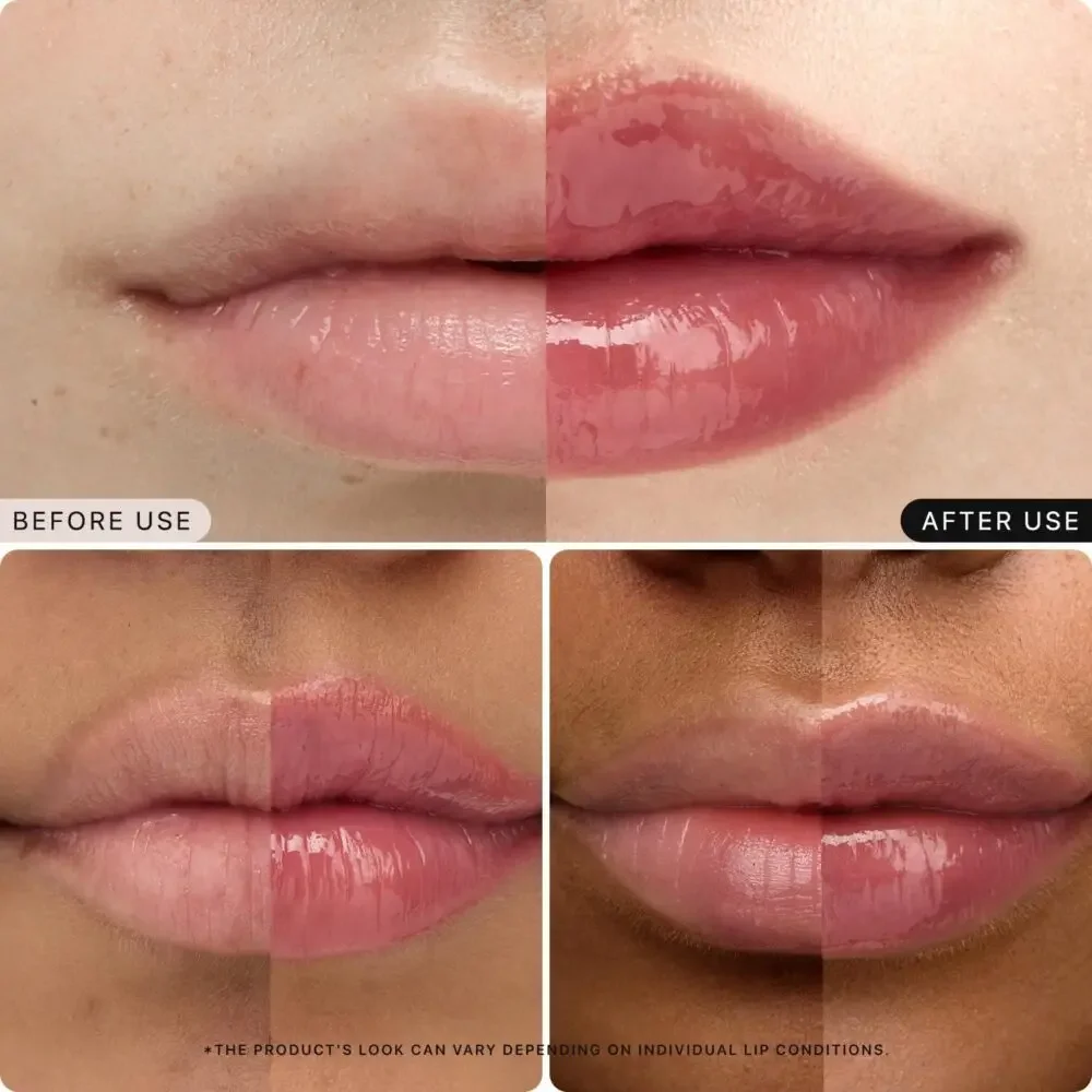
Prove product performance with real results
Before & After is a very effective display method for beauty products.
This page passes:
Before use
و
After use
Compare the condition of your lips.
Models with different skin tones are also used so that consumers can see how the lipstick actually performs on different groups of people.
However, the design focus here is not to over-exaggerate the effect.
The original article emphasizes that the design deliberately avoids over-emphasis on the so-called “lip enhancement” effect, but instead displays it more realistically:
- Moisturizing level of lips
- Visual effect after improvement of lip lines
- surface smoothness
- gloss
By splitting layouts left and right or top and bottom, consumers can make comparisons very quickly.
At the same time, if you indicate in the picture:
“Actual results may vary from person to person”
On the contrary, it helps to improve credibility.
Because on the Amazon platform, instead of over-promising, it is better to adopt a more authentic product expression.
In the long run, this will not only help increase conversion rates, but also reduce negative reviews caused by high consumer expectations.
Sheet 4: Product details and ingredients
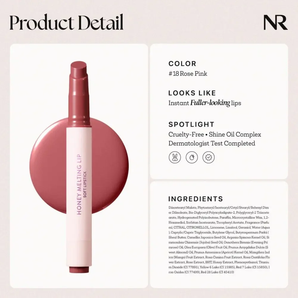
From emotional attraction to rational trust
The previous pictures mainly solve:
“Does it look good?”
This one starts to solve:
“Is the product reliable?”
Therefore, the visual style will become cleaner and more professional, similar to a beauty magazine or brand album.
The main displays include:
Color number: #18 Rose Pink
and something like:
- No animal testing
- Skin test
- Ingredient information
- Product related instructions
This information is mainly aimed at consumers who are more rational and pay more attention to product safety and formula.
Don’t use icons too much because too many icons can make the page look cheap or like a generic e-commerce promotion image.
Use icons sparingly to achieve both:
Sense of high-end + information reading efficiency.
This page is mainly aimed at consumers who are already interested in the product and continue to browse for details.
They want further confirmation:
Whether product safety, formula and quality are trustworthy.
Picture 5: Testing different colors
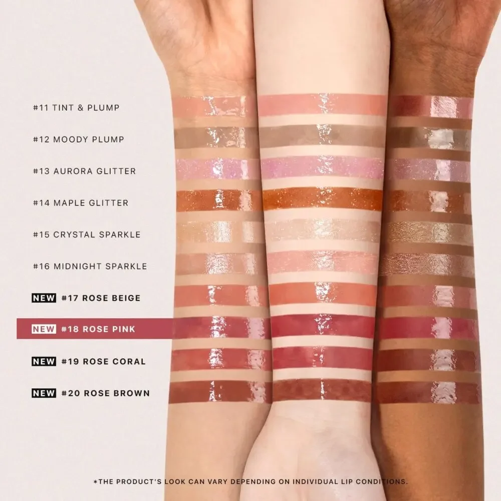
Solving the biggest problem in buying lipstick online – color selection
One of the biggest difficulties when selling lipstick online is:
Consumers cannot try colors on site.
Therefore, this one uses arms with different skin colors for color testing.
And multiple color numbers are arranged vertically so that consumers can compare them intuitively.
Here is a very important design idea:
Show off not just light skin tones, but darker skin tones as well.
There are two reasons:
First, it can show how suitable the product is for different skin tones.
Second, it can make the picture look more realistic.
At the same time, highlight current products in all shades:
#18 Rose Pink
In this way, consumers can clearly know:
“Which color am I looking at now?”
You can also browse other color numbers at the same time.
The biggest function of this page is:
Reduce the situation where consumers give up purchasing because of uncertainty about the color.
This increases confidence in adding to your shopping cart.
Picture 6: Help consumers choose according to color system
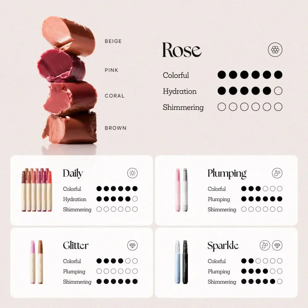
This one no longer introduces a single SKU, but classifies the colors of the entire series.
على سبيل المثال:
Beige – beige
Pink——pink color
Coral – Coral color
Brown——brown color
This is a very important e-commerce design idea. Because many consumers don’t know the specific color name.
They may not say, “I want color 18.”
But they will know: “I want a pinker one.”
Or:
“I want to buy a lipstick with a brown tone.”
Therefore, the difficulty of selection can be reduced through color series classification.
Consumers can first choose:
color direction
Then select:
Specific color number.
It can also be further combined with:
- Moisturizing level
- Glossiness
- Shine level
Help consumers continue to filter.
This design approach improves the browseability of the entire product range while encouraging consumers to view more colors and even purchase multiple shades.
Picture 7: Single model renderings
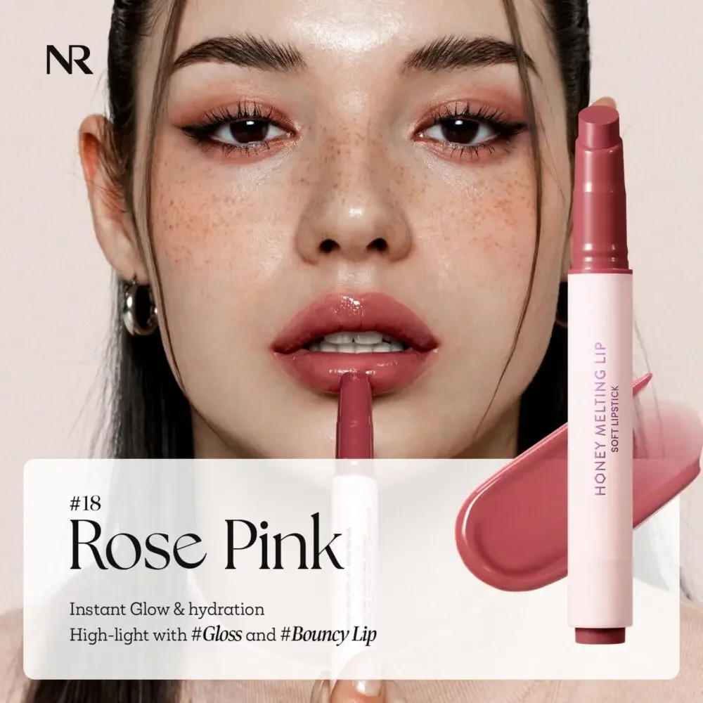
Create emotional and brand connections
At this stage, consumers have basically understood:
What is the product, what are its selling points, what is the color, and how effective it is.
What needs to be solved now is:
“How do I feel after using it?”
Therefore, a large picture of the model is used here.
Model wearing current featured color.
The lighting focuses on highlighting the glossy effect of the lips without overexposing them.
At the same time, the model’s real skin texture is preserved.
The reason is simple:
Excessive skin polishing and excessive beautification will make the product lose its authenticity.
Natural skin texture can make it easier for consumers to feel connected.
This image is actually done from:
منتجات
Arrive
real people
connection between.
Let consumers no longer just see “a lipstick”, but start to imagine:
“If I use this lipstick, what effect will it have?”
The core of this stage is not rational information, but:
Emotional value.
Picture 8: Display of multiple models and skin colors
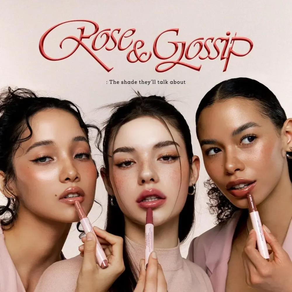
No text-based social proof required
The last one uses multiple models with different skin tones showing off the same lipstick.
It looks like an ordinary beauty model picture, but it actually plays a very important role in brand trust.
There is no need to deliberately write:
“Suitable for all skin tones”
أو
“Diversity and Inclusion”.
As long as models of different skin colors appear at the same time, consumers will naturally understand.
This visual approach can convey:
Adaptability
Diversity
modern brand image
Use confidence
Especially on a global market-oriented platform like Amazon, consumers from different countries and ethnic groups will see products.
Therefore, multi-skin display can directly affect consumers’ perception of the brand.
Finally, let consumers form an impression:
This is a lipstick that is broadly applicable, modern, and suitable for a variety of consumers.
Why do these 8 pictures have to be in this order?
The original text specifically emphasizes:
It’s not enough for a single image to be beautiful.
What really affects conversion is:
The sequence of information for the entire set of images.
These 8 pictures actually form a complete consumer decision-making path:
- Products and textures
- core selling point
- Proven results
- Product details and safety information
- Color number accuracy
- Reduce the difficulty of selection
- Make emotional connections
- Build inclusivity and brand trust
When consumers browse all the way from the first page, their psychological changes are actually as follows:
What is this?
↓
What are the benefits?
↓
Does it really work?
↓
Is the product reliable?
↓
Which color is right for me?
↓
How should I choose?
↓
What will it look like after I use it?
↓
This brand suits me.
This is the complete visual selling logic.