Project overview
TENWAYS is an urban electric bicycle brand targeting the global market. Its products focus on simple design, smart riding and environmentally friendly commuting experience. As the brand business continues to expand, the customer hopes to further strengthen the brand image through the official website, and at the same time allow users to more intuitively understand different models, product features and brand concepts, so they approached AIRSANG and asked us to assist in optimizing the overall visual and page structure of the website.
This project is based on WordPress platform During the design and construction, we focused on the browsing habits of users in the electric bicycle industry and re-planned the homepage, product display, brand content and information levels. We also used large-sized riding scenes, clear product modules and a simple and modern layout to create an international brand official website that takes into account brand display, product introduction and user conversion.
| Services | Industry | Platform |
| Website design and decoration | Sports and outdoor | WordPress |
| Project requirements | target market | design style |
| Support subsequent marketing activities, new products and business expansion | Global | Minimalist Modern|Urban Technology|Lifestyle |
| project budget | Delivery content | Delivery time |
| ¥12000 | Website construction and full-site page design | 20 working days |
Project Challenges
TENWAYS’s products have a strong sense of design and technical attributes, but if the information level of the website is too complex, it is easy for users to create browsing burdens between car model selection, functional understanding, and brand recognition. Therefore, the core challenge of this project is to establish a clearer product display logic while maintaining a high-end brand feel, while taking into account the mobile reading experience and conversion efficiency.
Before starting the project, we first sorted out the brand positioning, target users, electric bicycle industry websites and competing product pages, and also sorted out the existing product categories, vehicle model selling points, visual materials and content structure. Based on these preliminary analyses, we further planned the information architecture, homepage content sequence, product display modules and visual specifications of the WordPress website to establish a unified and sustainably scalable design basis for subsequent page design.
Homepage design: Create a first impression that drives conversions
First screen area: Combination of lifestyle and product functions
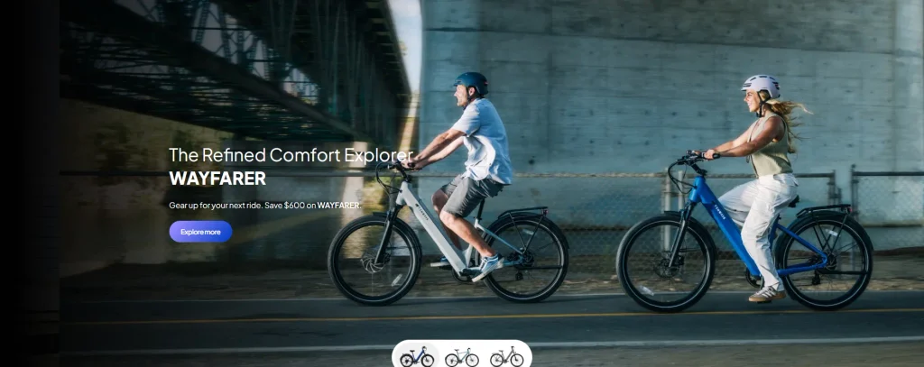
The homepage uses visually impactful cycling lifestyle pictures as the first-screen banner, allowing users to quickly connect the product with free travel, urban life and cycling experience after entering the website.
core design elements
- Simple and clear fonts and copywriting expressions
- clear visual hierarchy
- Reduce unnecessary interference and guide users to focus on core content
This part not only plays the role of the first impression of the brand, but also establishes a unified visual tone and browsing experience for the entire website.
Product Highlights: Reduce the difficulty of selection through clear classification
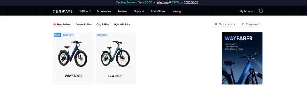
In order to avoid showing too many models and information to users at once, we re-planned the product display area and divided different core models in a clearer and easier-to-understand way.
Each product module includes
- Simple and clear product vision
- Core advantages and vehicle model differences
- Directly enter the browsing entrance of the product product detail page
Such a structure can help users quickly understand the entire product series, reduce browsing resistance, and increase their willingness to view further product details.
Trust endorsement and brand authority module
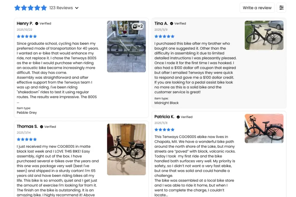
In order to enhance consumers’ trust in the brand, we have added multiple content modules to the homepage that can strengthen the brand’s credibility.
The main contents include
- Media reports and professional reviews
- Brand story and brand mission
- sustainable development concept
These contents are reasonably arranged in the user’s browsing path, providing more trustworthy basis for the user’s purchasing decision without interrupting the overall experience.
Product product detail page design: taking into account information clarity and conversion efficiency
Clear content hierarchy
Each product detail page is designed around the user’s browsing and decision-making process, guiding users to gradually understand the product in a natural sequence.
Page content structure
- Product visual introduction
- Core functions and main advantages
- Technical parameters and performance highlights
- Product Lifestyle Scenario
- Brand and service trust information
Technical content will not be stacked in large quantities at once, but will be presented in a more concise and easy-to-understand manner, allowing users to obtain the corresponding information at the appropriate browsing stage.
Visual-focused content storytelling
Rather than providing large amounts of text descriptions, we focus more on helping users quickly understand the product through visual content.
Main forms of expression
- High quality product images
- Realistic and immersive riding scenes
- Simple icon-based function selling point display
This design method can make page browsing more interesting while keeping the information expressed concisely and clearly.
Facilitates comparison of different models
Considering that electric bicycle consumers usually compare between multiple models, we unified the display of product information in the page design.
Contrasting design strategies
- Maintain a unified page structure for different models
- The core parameters are consistent with the information location
- Clearly highlight key differences between models
Through unified information logic, users’ decision-making costs can be reduced, allowing consumers to more quickly determine which model suits their needs, thereby increasing the possibility of conversion.
Auxiliary page design: improve the overall website experience
Category pages and navigation pages
We designed the category page to be a browsing portal that guides users to choose products, rather than just a simple product list.
Key points in category page design
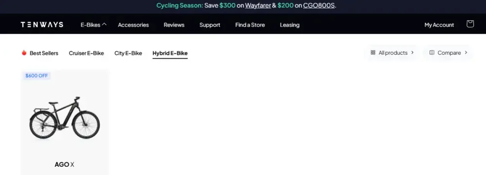
- Reasonably divide products according to different needs such as urban commuting, mixed riding, and cargo carrying
- Provide a short and clear description for each category
- Keep the visual style of all category pages consistent
Such a structure can help users narrow down their choices faster and improve product discovery efficiency.
Brand story and content page
In order for the website to not only undertake the product sales function, but also help the brand establish a deeper emotional connection with consumers, we systematically planned the brand content page.
Main display content
- Brand concept
- sustainable development action
- User community and cycling lifestyle
This content can help users further understand the brand value and transform the brand from a mere product provider to a brand with lifestyle attributes.
Service and support page
For products with high unit prices such as electric bicycles, complete after-sales and service information is an important factor affecting users’ purchasing decisions, so we have focused on optimizing the relevant support pages.
Main service content
- Delivery and Service Instructions
- Product warranty information
- FAQ and Help Center
Through a clear layout and concise information structure, users can quickly find the service content they need and further enhance their purchasing confidence.
Design systems and visual consistency
Simple and advanced overall visual style
The entire website adopts a visual language that is in line with the brand positioning of modern urban travel, allowing the page to maintain a professional feel while also reflecting lifestyle attributes.
core visual features
- Leave a large area blank
- Neutral colors paired with accent colors
- Simple and modern font layout
This design approach creates a more premium, lightweight and modern brand experience, consistent with TENWAYS’s urban electric mobility positioning.
Unified UI component system
In order to ensure a consistent browsing experience across different pages, we have established a unified set of page components and visual specifications.
The main specifications include
- Reusable page block templates
- Unified button style
- Consistent spacing, alignment and typography rules
Through a unified design system, we can ensure that users can get a coherent and consistent website experience no matter they enter the homepage, product page, category page or brand content page.