Project overview
This project is the visual design of the Shopee personal care store in Thailand. It creates a series of store posters around products such as forehead care patches, facial lifting patches, slimming patches, body care patches, and acne patches. We combined the aesthetics and consumption scenes of the Thai market, using young Asian female models, Thai localized typography and soft and bright color systems to present the use parts and care scenes of different products. We also connected product displays and discount promotions through a unified visual language to enhance the overall recognition and browsing experience of the store.
| Dịch vụ | Industry | Nền tảng |
| shopee store design | Beauty and personal care | Shopee |
| Project requirements | target market | design style |
| Improve click-through rate | Toàn cầu | Soft | Light luxury | Fresh |
| project budget | Delivery content | Delivery time |
| ¥450 | 6 shopee posters | 4 working days |
Project Challenges
The core challenge of this project was how to form a unified Shopee store vision for multiple personal care products with different functions, usage parts and packaging styles, while avoiding each poster being too similar. We need to take into account Thai typesetting, mobile information recognition, proportions of characters and products, and the expression of different care scenes. We need to distinguish products through differentiated color matching and composition, and unify model style, light and visual texture, so that consumers can quickly understand the purpose of the product while maintaining a complete visual experience of the brand.
1. Forehead care poster: Use warm gold to create a sense of professional care
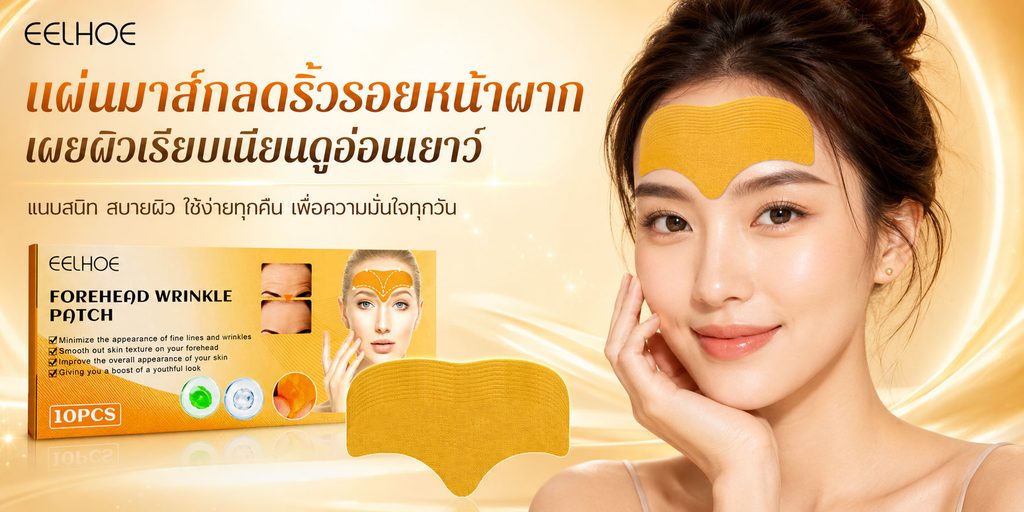
The first poster shows a forehead care patch.
We chose warm gold and cream as the main visual colors, and let the model occupy a large space on the right side of the picture. The yellow care patch is displayed directly on the model’s forehead, allowing consumers to quickly understand where to use the product without reading too much text.
This is the most important visual logic of this poster—— Let consumers understand it first, and then let them read the selling points.
The left side is responsible for the main information display function. We put the brand logo at the top, the large Thai title in the visual center, and used orange and dark brown to form a text hierarchy. Rather than making all text the same color, this treatment allows the core keywords to stand out more while maintaining the soft feel that beauty care products require.
Product packaging and individual care patches are placed on the lower left. The packaging is responsible for establishing product identification, and the enlarged care stickers further demonstrate the product form and materials.
The golden streamer in the background is not purely decorative. We connect the products on the left with the characters on the right through streamlines, allowing consumers to naturally move their eyes from the title and packaging to the model’s face, while enhancing the sense of care technology and sophistication in the picture.
2. Face lift poster: let the product be explained directly through the actions of use
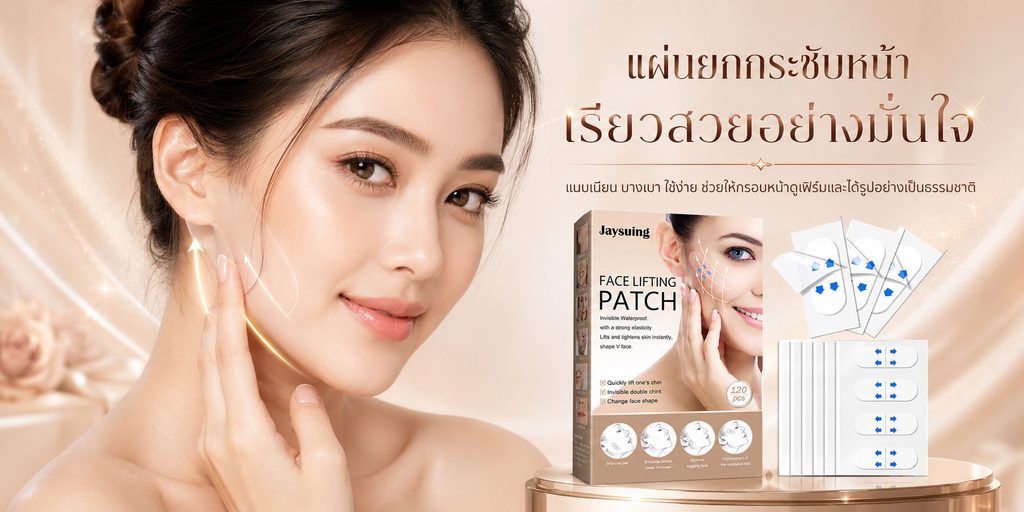
The core product of the second poster is facial lifting strips.
Compared with the warm golden look in the first photo, we use softer nude pink, apricot and champagne colors in this one, hoping to create a gentle, comfortable and refined facial care atmosphere.
In terms of composition, we placed the model on the left side, making the character’s face the first visual focus. The model gently touches the chin area with her hand, while adding upward light arrows to visually emphasize the care area and direction of use.
The right side focuses on displaying Thai titles, product packaging and stickers.
The advantage of this layout is that consumers can form a clear information path in a very short time:
Character status → Facial care area → Product packaging → Product form.
We do not use a large number of complex icons to explain the product, but directly express the usage logic of the product through character actions and visual arrows. For mobile e-commerce environments, this method is more intuitive than long text.
The product display area uses a circular display stand to support the packaging and patches, while adding a slight metallic texture to give the product a more stable visual placement and make the overall picture closer to a beauty brand advertisement rather than an ordinary product puzzle.
3. Slimming poster: Use purple to strengthen the body management theme
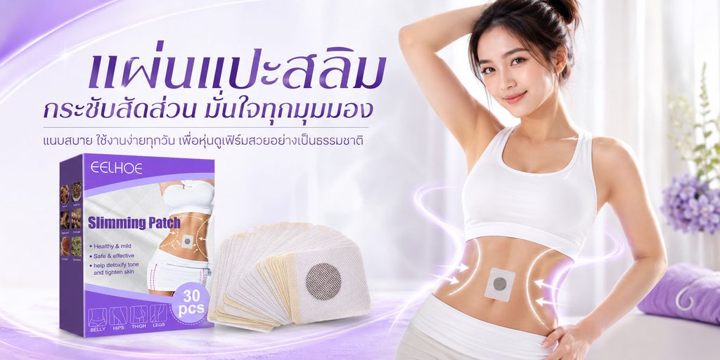
The third poster went into the body care category, so we proactively changed the color rhythm of the entire set.
We use purple as the core identification color and match it with a large white background to make the whole picture lighter and younger, while forming a clear distinction from the previous two facial care products.
The model is on the right, wearing a simple white sportswear and showing off a belly patch. Such a look can quickly establish a visual association of “body management”.
Instead of an overly complex gym or outdoor exercise scene, we opted for a bright, clean indoor environment. This can reduce background interference on the product, and also make the vision closer to women’s daily home care scenes.
A large purple Thai title is used on the left to establish the first level, with product packaging and multiple patches placed below.
In order to strengthen visual guidance, we added soft purple light and directional elements to the waist and abdomen area of the character, so that consumers can naturally pay attention to the main use area of the product.
At the same time, the packaging, text and light effects use a unified purple system, allowing consumers to remember this product category through color even if they quickly scroll the page.
4. Body care posters: Use soft pink to express daily self-care
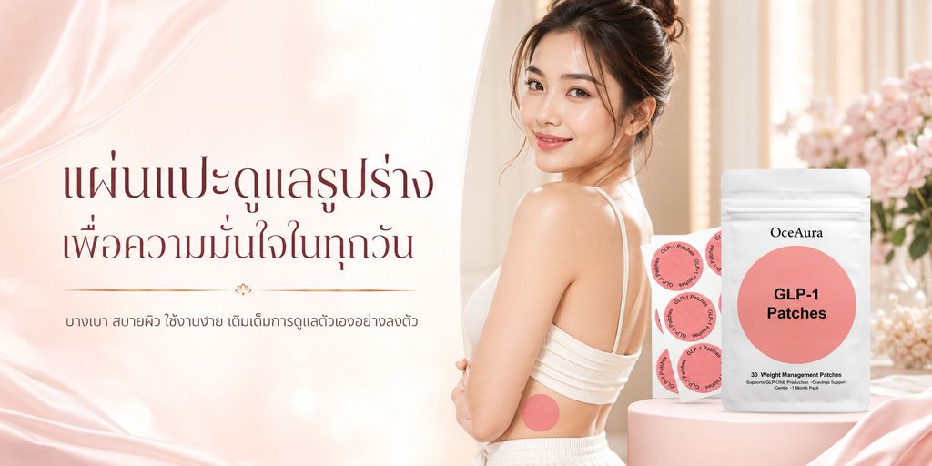
The fourth poster continues to focus on body management products, but instead of continuing the sporty purple color of the previous one, we switch to soft pink and cream colors.
We wanted this poster to convey not a strong sense of movement or functionality, but “easy care that can be done every day.”
Therefore, the character modeling is more life-like. The model is wearing a simple white housecoat, her body is slightly turned sideways, and a pink circular patch is directly displayed on her waist.
The product packaging on the right uses a combination of white and pink, which is consistent with the entire environment. The flowers, soft fabrics and circular display stand in the background work together to create a scene that is feminine, comfortable and has a sense of quality of life.
The text area is concentrated on the left side, leaving enough white space.
This is something we pay special attention to in the entire design: It does not mean that the fuller the screen is, the richer the product information will be.
For personal care products, large areas of white space can actually improve text readability and allow characters and products to gain a clearer visual focus.
In this way, we transform the product from a purely functional patch into a daily self-care product, making the visual expression closer to the lifestyle of young female consumers.
5. Acne posters: Improve affinity through rejuvenating elements
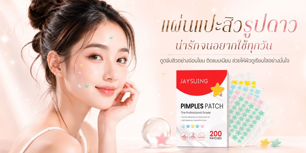
The fifth poster shows colorful star-shaped acne patches.
This product itself has very obvious youthful attributes, so we took the initiative to reduce the mature care sense in the previous posters and instead used a visual language that is lighter, cute and socially communicative.
The model is on the left, with star-shaped patches of different colors displayed directly on her cheek and forehead. When consumers first see the characters, they can immediately understand how to use the product.
The right side displays red and white product packaging and multiple acne patches of different colors, forming a complete product display area.
In terms of color, we used light pink and cream as the background, while making the red packaging a strong visual focus in the picture. Yellow, green, blue and pink star-shaped patches provide more youthful colors.
We also added transparent spheres, faint starlight and other elements, but controlled the number of decorations.
Because for this type of product, cuteness can help build emotional value, but if used too much, it can weaken the credibility of the product itself. Therefore, we let the decoration serve the product rather than letting the decoration take away the attention of the product.
This poster ends up having a completely different youthful feel than the previous four, while still maintaining the unity of the entire set through similar character lighting, clean backgrounds, and text structure.
6. Discount event poster: natural transition from product introduction to sales conversion
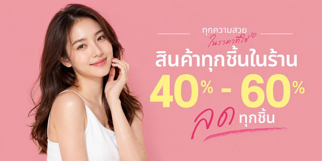
The first five posters address “why consumers pay attention to these products”, and the last discount poster is responsible for solving “why buy now”.
Therefore, we proactively changed our design strategy.
This one no longer displays specific products, but focuses on discount figures.
We used a large pink background and placed the model on the left, leaving a complete area for promotional information on the right. The white Thai main title combined with the oversized yellow “40%–60%” discount numbers allows consumers to capture the intensity of the event immediately even if they browse quickly on the mobile terminal.
We specifically zoom in on the discount numbers because the core of promotional posters is not explanation but quick communication.
At the same time, we added Thai decoration and brush elements with a handwriting feel to weaken the overly rigid feeling of traditional promotional advertisements, so that the event information still conforms to the overall vision of the female personal care store.
The characters did not take products, nor did they add complex scenes. This approach can prevent promotional posters from competing with previous product posters, allowing consumers to focus on the price offer itself.