Project overview
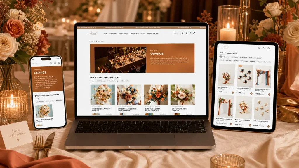
The client is a cross-border ecommerce brand that specializes in wedding floral arrangements and wedding decorations. It mainly targets brides, wedding planners and event decoration purchasers. As the product series continues to be enriched, the original page is more biased towards traditional product display, which is difficult to fully convey the romantic atmosphere of the wedding scene and is not conducive to customers’ quick purchase based on color, wedding area and product type. Therefore, customers come to us hoping to Shopify The orange wedding decoration special page has been redesigned on the platform. The focus of the project includes page visual design, content hierarchy sorting, product classification display, wedding scene guidance and conversion path optimization. Focusing on wedding color themes such as orange, terracotta, and sunset, we integrate bouquets, arch floral arrangements, table decorations, aisle decorations and other products into complete wedding inspiration scenes, giving the page a sense of brand storytelling and a clear and efficient shopping experience.
| Dịch vụ | Industry | Nền tảng |
| Website design and decoration | Agriculture and Horticulture | shopify |
| Project requirements | target market | design style |
| Establish a professional and unified brand official website image | Toàn cầu | Romantic nature · Warm retro · Scene immersion |
| project budget | Delivery content | Delivery time |
| ¥18700 | Website construction and full-site page design | 23 working days |
Project Challenges
The core challenge of this project is to maintain the romantic atmosphere of the wedding brand while solving the problems of scattered information on the page, insufficiently intuitive product classification, insufficient sense of scene, and unclear user browsing path. We need to allow customers to quickly understand the uses of different wedding decoration products after entering the page, and improve the efficiency of staying and purchasing through visual guidance. In the early stage, we first sorted out the brand’s existing products, target groups, wedding usage scenarios and page structure, and also analyzed the visual performance and purchase path of similar Shopify wedding brands. Then determine the color direction, content level, product classification logic and scene-based display method of the page, and organize the picture materials suitable for Hero, classification area and product recommendation area in advance to establish a unified visual and conversion basis for subsequent page design.
Page design with homepage as the core
Hero Above the Fold: Create an Orange Wedding Feeling
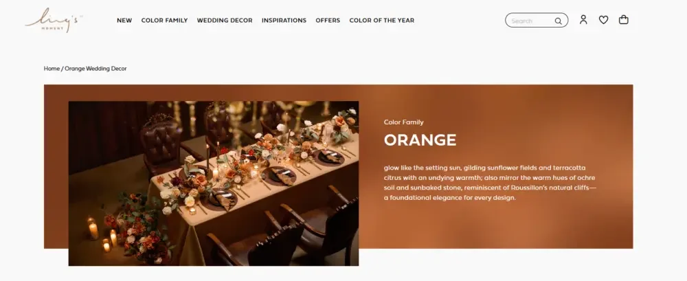
The above-the-fold area of the orange wedding theme page plays a very important role. It needs to convey the page theme quickly and emotionally. Orange wedding decorations can represent the warmth of a sunset, the romance of terracotta, the softness of peach, the natural texture of country style, and the energy of the season. Therefore, we need to clearly convey this visual experience from the first moment the user enters the page.
We did not simply treat the Hero area as a normal Banner, but used it as an “atmosphere establishing area” for the entire page. The main title is responsible for clarifying the orange theme and color direction, while the auxiliary copy further establishes warm visual associations. The core goal is to allow consumers to quickly imagine how these colors will actually look at the wedding venue.
At the same time, a well-themed Hero area also helps improve the SEO relevance of the page. Placing the core topic of the page clearly at the top can help users and search engines understand the main content of the page faster.
Color families: establishing a clear theme positioning
Color family panels help create a more distinct visual identity across the entire page. Rather than understanding orange as a single, fixed color, we experience it as a range of different color moods.
Orange can be bright and lively, or natural and rustic; it can present the warmth of gold, the softness of peach, or the retro texture of clay. This design method can give consumers greater choice, allowing them to find the most suitable orange tone according to their wedding style.
This section also enhances the brand’s sense of planning and professionalism. A well-designed color introduction can make the page more like a wedding design guide, not just an ordinary product category page.
Orange color series: Help consumers determine wedding style direction
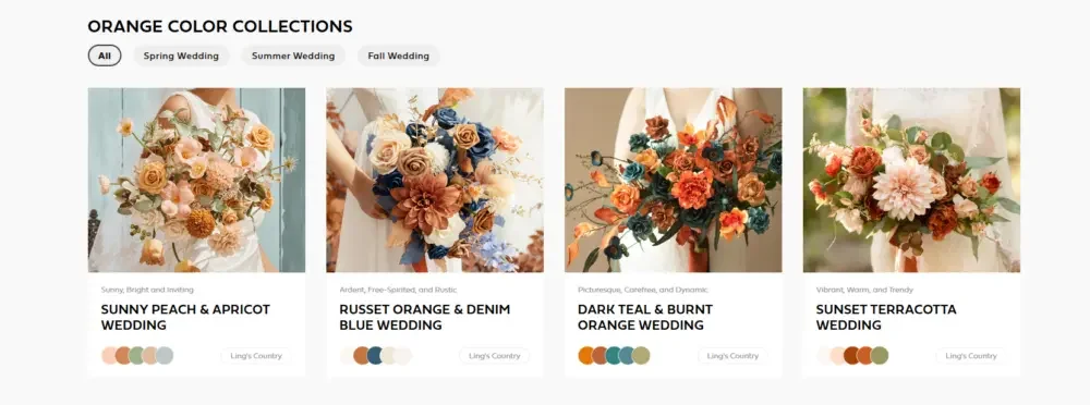
The orange color series section allows consumers to explore different wedding styles under the same orange color system. This is important because consumers who like orange do not necessarily want the exact same visual effect.
Some consumers may prefer the sunny peach and apricot color combination, while others prefer the rustic russet orange, orange and denim blue, deep teal and burnt orange, or the terracotta color style with a sunset atmosphere.
By presenting different color series in a clear and intuitive visual way, the page can help consumers determine the wedding design direction more quickly.
At the same time, this section can also promote related sales. After consumers decide on a certain color series, they usually further browse and purchase a variety of wedding decoration products in the series.
Shop by wedding area: Turn inspiration into actual purchases
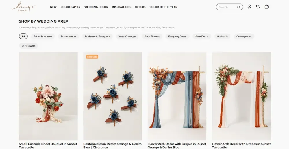
“Shop by wedding area” is one of the very important conversion sections on the entire page. After consumers determine their favorite color direction, the next step is a more practical and efficient way to browse products.
We’ve reorganized this section around the decorating needs of real weddings, including:
bridal bouquet
groom corsage
Bridesmaids holding flowers
wrist flower
wedding arch floral arrangements
entrance decoration
wedding aisle decoration
garland decoration
Desk Center Floral Arrangement
DIY flowers
This structure is more in line with the way consumers actually think about preparing for a wedding, and also makes the entire shopping process simpler.
Rather than having users scroll through a long list mixed with a large number of products, we set up clear browsing entry points for different needs.
Brides can choose directly from the bouquet; wedding planners can focus on arch floral arrangements and aisle decorations; consumers who like to decorate their own weddings can go directly to the DIY flower material category.
This structure can significantly improve the usability of the page, while strengthening consumers’ purchasing intentions and page conversion capabilities.
Page auxiliary content design
Color inspiration: enhance purchasing confidence through matching solutions
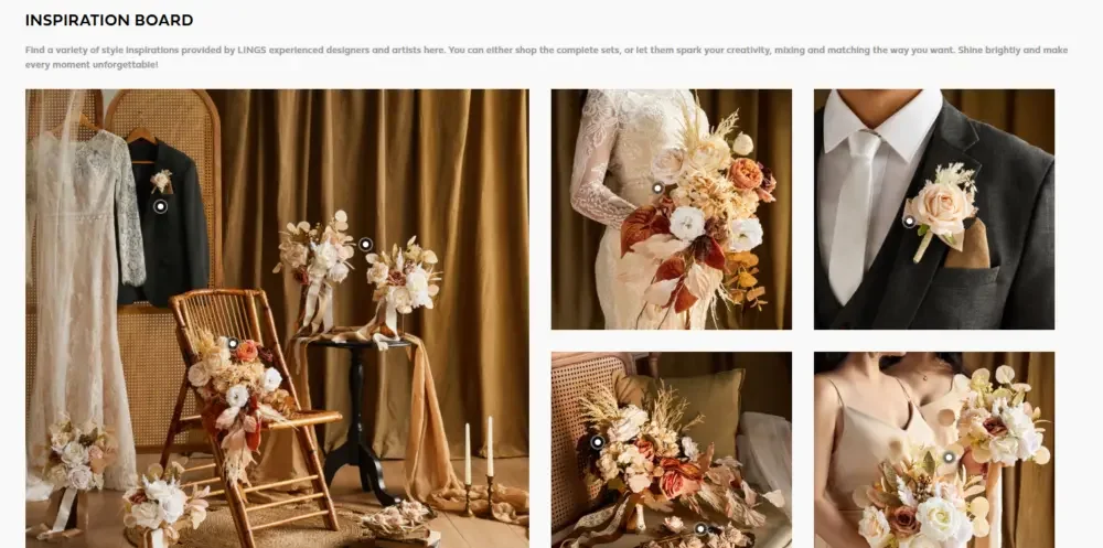
A color inspiration section further enriches the entire shopping experience. Before purchasing, wedding consumers usually need to see the actual effect of different products combined in order to make a decision with more confidence.
Through inspiration content, consumers can intuitively understand the complete wedding scene, the matching relationship between different colors, and the actual effect of various decoration methods.
This type of content can also enhance the editorial feel and content value of the page, establish a more distinctive design expression for the brand, and make the entire page not only undertake the function of selling goods, but also become an important reference resource for consumers looking for wedding inspiration.
Ling’s Brides: Enhance social identity and sense of scene through real weddings
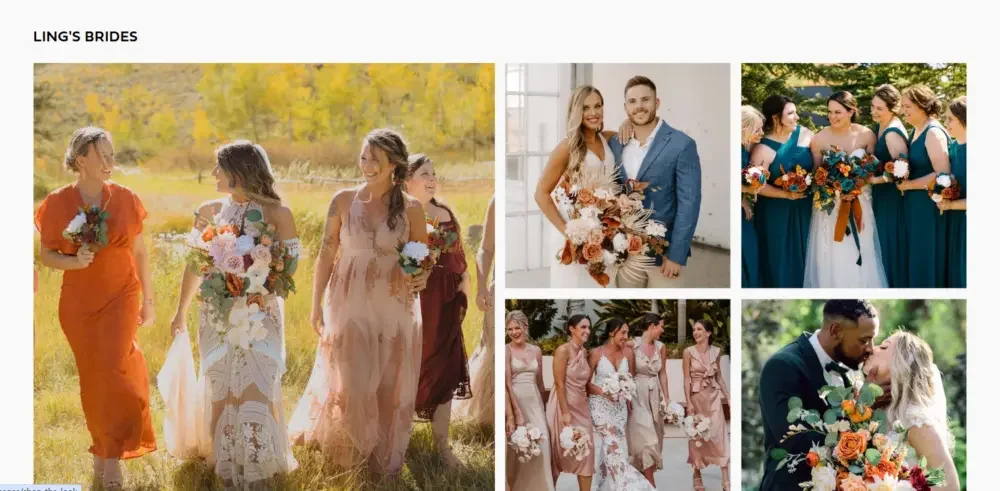
Real wedding content can effectively enhance consumers’ trust in products and brands.
When visitors see how other real brides used these floral and décor products in their own weddings, the entire page becomes more authentic and easier to connect with emotionally.
This sector can further enhance consumer purchasing confidence. It proves that these products are not only attractive in studio and product images, but can also create impressive visual effects at real weddings.
For wedding brands, this proof of trust from real users and real scenarios will greatly influence consumers’ final purchasing decisions.
Other colors: Encourage consumers to continue browsing
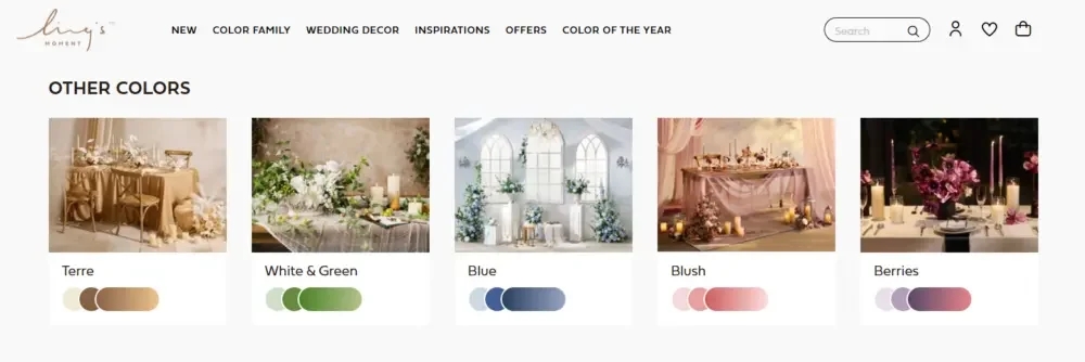
The “Other Colors” section provides a very natural path for consumers to continue browsing.
Not every consumer who enters the orange page will immediately decide to choose orange. Some users may also compare orange to other wedding colors such as nude pink, berry, blue, white-green, or earth tones.
So, by showcasing related color families on the page, even if the user doesn’t end up choosing orange, they can still continue exploring other wedding themes instead of leaving the site directly.
This design can effectively reduce the page bounce rate and provide a clear next browsing direction for consumers who have not yet decided on the wedding color scheme. This is a very practical and conversion-worthy page design strategy for a Shopify wedding supply store with multiple color families.